How to Build an AI Automated Reporting Pipeline
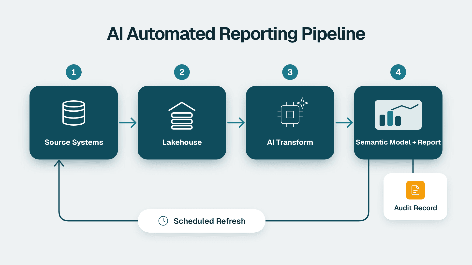
You will build a scheduled reporting loop that pulls data from your source systems, applies an AI transformation layer, publishes to Power BI, and writes an audit record for every run. For one report with two or three sources, a capable analytics lead should plan roughly two to three weeks, including testing and sign-off. This guide uses Microsoft Fabric as the backbone.
What You'll Need
- A Fabric capacity. Pay-as-you-go is the easier choice while you prototype, because you can pause it. Reserved capacity makes sense once the workload is steady. Compare both in the Azure portal before committing. If you plan to use Copilot, you need a paid Fabric capacity of F2 or higher, or Power BI Premium P1 or higher. A Pro or Premium Per User licence alone is not enough, and trial capacities are excluded (Microsoft Learn, 2026).
- Roles. Fabric Administrator or Capacity Administrator to assign a workspace to a capacity. Workspace Admin to create items. Purview Audit access (for example the Audit Reader role) to search logs.
- Licences. Power BI Pro at $14 per user per month for people who build and share reports, or Premium Per User at $24 per user per month if you are not on a capacity that covers viewers.
- Source access. A read-only service account for each source system (ERP, billing, EHR extract, or general ledger) and the connection details for each.
- An AI endpoint. An approved model endpoint, such as Azure OpenAI in your tenant, with a key stored in Azure Key Vault. Do not paste keys into notebooks.
- A written data classification. A one-page list of which columns are sensitive. In healthcare that means patient identifiers. In financial services it means account numbers and personal data.
- One target report. Pick a single report with a named owner, such as a weekly revenue variance pack. Do not start with five.
Step 1: Design the Four-Layer Architecture on Paper
Before you open any tool, draw four boxes left to right and name what lives in each:
1. Sources: ERP, CRM, billing, clinical or claims extracts.
2. Bronze and silver (storage): raw landing tables, then cleaned and typed tables, in a Fabric Lakehouse.
3. AI transformation layer: a notebook that produces classifications, summaries, or commentary from the cleaned data.
4. Serving: a Power BI semantic model and report, plus any secondary tool.
Under the boxes, add a fifth strip called Audit, which runs the full width. Every box writes to it.
What you should see: one page where each arrow has a label (batch copy, notebook call, Direct Lake read) and each box has an owner. If an arrow has no owner, nobody will fix it at 2 a.m. For a more detailed reference, see our walkthrough of Microsoft Fabric architecture for finance reporting. Healthcare teams who want a diagram can adapt the same layers and add a de-identification step between silver and the AI layer.
Step 2: Create the Workspace and Lakehouse
1. In the Fabric portal, open Workspaces in the left rail and select New workspace.
2. Name it with an environment suffix, for example `Reporting-Prod`. Create a separate `Reporting-Dev` workspace now so you never test in production.
3. Expand Advanced, set License mode to Fabric capacity, choose your capacity, and select Apply.
4. Inside the workspace, select New item, then Lakehouse. Name it `lh_reporting`.
5. In the Lakehouse, confirm the two folders Tables and Files exist in the Explorer pane.
6. Create three schemas by right-clicking Tables and choosing New schema: `bronze`, `silver`, `gold`.
What you should see: a diamond icon next to the workspace name, which means it is attached to a capacity, and an empty Lakehouse with three schemas. If there is no diamond, the workspace is on shared capacity and Fabric items will not run.
Set access now, not later
Open Manage access on the workspace. Give report authors the Contributor role, report viewers no workspace role (share the report or app instead), and keep Admin to two people. For regulated data, read our guide to Fabric data governance for HIPAA, GDPR and PIPEDA before you load anything real.
Step 3: Ingest Sources with a Data Pipeline
1. In the workspace, select New item, then Data pipeline. Name it `pl_ingest_daily`.
2. On the canvas, select Copy data assistant.
3. Under Choose data source, pick your source type (for example Azure SQL Database or Oracle), then enter the server, database, and the service account credentials. Use Test connection and wait for the green confirmation.
4. Select the tables you need, not the whole schema. Start with the smallest set that feeds your target report.
5. For the destination, choose Lakehouse, select `lh_reporting`, and set the table name to `bronze.<source_table>`.
6. Set Table action to Overwrite for small reference tables and Append for transaction tables that have a reliable modified-date column.
7. Select Save + Run.
What you should see: the Output tab lists each Copy activity with status Succeeded and a row count. Open the Lakehouse and check that the row count in `bronze` matches the source query. If you want to trigger the pipeline from external events instead of a clock, see how to automate Fabric pipelines with n8n.
Clean to silver
Add a Notebook or Dataflow Gen2 activity after the copy that converts bronze to silver. At minimum, it should enforce data types, drop exact duplicates, and standardise date formats. Name the outputs `silver.<table>`. In regulated work, this is also where you drop or hash identifiers. A hypothetical example: a claims table with `member_id` gets a salted hash in `member_key`, and the original column never leaves bronze.
Step 4: Add the AI Transformation Layer
This is the layer that turns clean tables into something a reader would otherwise write by hand: variance commentary, category labels for free-text fields, or anomaly notes. Keep it narrow.
1. Select New item, then Notebook. Name it `nb_ai_commentary` and attach `lh_reporting` as the default Lakehouse.
2. In the first cell, load the aggregated data, not row-level records:
```
df = spark.sql("SELECT region, month, revenue, budget FROM silver.revenue_by_region")
```
3. Read the endpoint key from Key Vault in the second cell, using `notebookutils.credentials.getSecret`. Never hard-code it.
4. In the third cell, build one prompt per region. State the rules inside the prompt: use only the numbers provided, name the largest driver, and say "insufficient data" when the figures do not support a statement.
5. Write the output to `gold.ai_commentary` with these columns: `run_id`, `region`, `month`, `commentary`, `model_name`, `prompt_version`, `generated_at`.
What you should see: a `gold.ai_commentary` table with one row per region per month and a populated `prompt_version`. Spot-check five rows against the source numbers before you continue.
Keep the model away from raw sensitive data
Send aggregates or de-identified fields only. If a prompt needs a patient or account-level record to work, redesign the prompt. A model that never receives the identifier cannot leak it.
Require a human gate for external reports
Add a `review_status` column that defaults to `pending`. Your report should show commentary only where `review_status = 'approved'`. Our list of AI-generated report audit questions for finance teams is a good checklist for what the reviewer should verify.
Step 5: Build the Semantic Model
1. Open the Lakehouse and select SQL analytics endpoint in the top-right switcher.
2. Select New semantic model, name it `sm_reporting`, tick your `gold` tables and your dimension tables, and select Confirm.
3. Open the model in Model view. Drag `Region[RegionID]` onto `Sales[RegionID]` to create a one-to-many relationship with single cross-filter direction.
4. Create a date table and mark it: select the table, then Table tools, then Mark as date table.
5. Add your measures in the DAX editor, for example:
```
Revenue Variance % = DIVIDE([Revenue] - [Budget], [Budget])
```
What you should see: relationship lines in Model view with a `1` on the dimension side and `*` on the fact side. If you see dotted lines, the relationship is inactive and the filter will not flow.
Relationships first, LOOKUPVALUE second
Use a relationship whenever two tables share a key. It is faster, it is reusable by every visual, and it keeps the model readable. Reserve `LOOKUPVALUE` for the case where no relationship is possible, such as a lookup on two columns that do not form a clean key:
```
Region Name = LOOKUPVALUE(Region[RegionName], Region[RegionID], Sales[RegionID])
```
If you find yourself writing this on a large fact table, create the relationship instead. If your measures need to compare periods, our guide on SAMEPERIODLASTYEAR versus DATEADD covers the syntax.
Step 6: Schedule the Whole Loop
Order matters: ingest, then clean, then AI, then refresh. Chain them in one pipeline so the refresh never runs on half-loaded data.
1. Open `pl_ingest_daily` and drag the notebook activities after the Copy activity. Connect each with the green On success arrow.
2. Add a final activity, Semantic model refresh, and pick `sm_reporting`.
3. Add a Notebook activity on the On fail path that writes a failure row to the audit table and sends a Teams or Office 365 Outlook message to the owner.
4. Select Schedule on the Home ribbon, choose Daily or Weekly, set the time zone explicitly, and set a start time at least an hour before readers open the report.
5. Select Apply.
What you should see: the pipeline's Run history shows the first scheduled run with every activity green. For the details of semantic model refresh limits and failure handling, see how to set up a Power BI data refresh schedule without breaking reports.
Publish to Power BI and a second tool
Open `sm_reporting`, select Create report, and build the visuals. Then select Share and use an app for broad distribution. If a team also uses Looker Studio, publish the same `gold` tables to a database that its connectors can reach, rather than building a second pipeline. Confirm connector support first, and keep one set of metric definitions.
Step 7: Add the Audit Trail
An automated pipeline that no one can reconstruct will fail a review. Build two layers of audit.
1. Run-level audit table. Create `gold.audit_runs` with `run_id`, `pipeline_name`, `started_at`, `finished_at`, `status`, `rows_in`, `rows_out`, `prompt_version`, `model_name`, `reviewer`, `approved_at`. Write one row at the end of every pipeline run.
2. Platform audit log. In the Microsoft Purview portal, open Audit, set a date range and the Activities filter for Fabric and Power BI operations, and select Search. Purview Audit (Standard) keeps logs for 180 days (Microsoft Learn, 2026). If your regulator expects longer retention, export the results on a schedule into your own storage.
3. Prompt registry. Store each prompt in a table with a version number. When you edit a prompt, increment the version so any published sentence can be traced back to the exact instructions that produced it.
What you should see: after one run, one new row in `gold.audit_runs` and matching Fabric activity entries in Purview search results. If either is missing, fix it before you go live.
Step 8: Monitor Capacity and Cost
1. Install the Microsoft Fabric Capacity Metrics app from AppSource into a workspace you control, then connect it with your capacity name.
2. Open the Compute page and look at the utilisation chart for the hours your pipeline runs. Note any spike near 100 percent.
3. On the Overview tab, find the top items by consumption. Your notebook and refresh will usually be near the top.
4. If you are on pay-as-you-go, check the billing view in Azure Cost Management weekly for the first month. Billing is metered by capacity time, so a capacity left running is a cost even when nothing is happening.
5. Move to reserved capacity only after a month of stable usage that you can read from the app.
What you should see: a clear daily shape, a peak when the pipeline runs, and idle time otherwise. If the peak runs the capacity into throttling, move the AI notebook to a separate schedule or scale up one size.
Turn on Copilot only when the basics are in place
To enable Copilot, a Fabric Administrator opens Admin portal, then Tenant settings, and enables the Copilot setting for the right security group. The workspace must sit on a qualifying paid capacity, as covered in the prerequisites. Before you switch it on, run through our Power BI Copilot readiness checklist.
Common Mistakes
- Letting the model see row-level sensitive data. Aggregate or de-identify in silver, and pass only those tables to the notebook. Test by searching the prompt log for any identifier pattern.
- Scheduling refresh independently of ingestion. The report refreshes at 6:00 while the load finishes at 6:20, so readers see stale numbers. Chain the refresh as the last activity in the same pipeline.
- Publishing AI commentary with no approval state. A wrong sentence goes to the board. Add `review_status` and filter the report on `approved`.
- Using LOOKUPVALUE as a substitute for a relationship. The model slows down and measures become hard to follow. Create the relationship and delete the calculated column.
- Leaving pay-as-you-go capacity running overnight. Costs accrue without value. Pause the capacity in the Azure portal outside of pipeline windows if your schedule allows it, or set an alert in Cost Management.
Troubleshooting
- Pipeline succeeds but the report shows yesterday's data. The semantic model refresh ran before the notebook finished, or the report points at an import model that was not refreshed. Check the order of activities and confirm the refresh activity is last.
- The notebook fails with an authorisation error against the Key Vault. The workspace identity or your user lacks the Key Vault Secrets User role. Assign it in the Key Vault's Access control (IAM) blade and rerun.
- Copilot options are greyed out or missing. The workspace is on a trial or an unsupported capacity, or the tenant setting is not enabled for your group. Check the workspace license mode first, then the tenant setting.
If you want a second pair of hands setting up governance, audit, and the AI layer for a regulated environment, our AI automation consulting team can scope it with you.
---
About Lets Viz: Lets Viz has delivered analytics and AI automation since 2020, serving financial services, healthcare, and other regulated industries. We hold a 5.0 Clutch rating and specialise in Power BI, Microsoft Fabric, and governed reporting pipelines.