Hospital Patient Flow & Bed Capacity Dashboard in Power BI
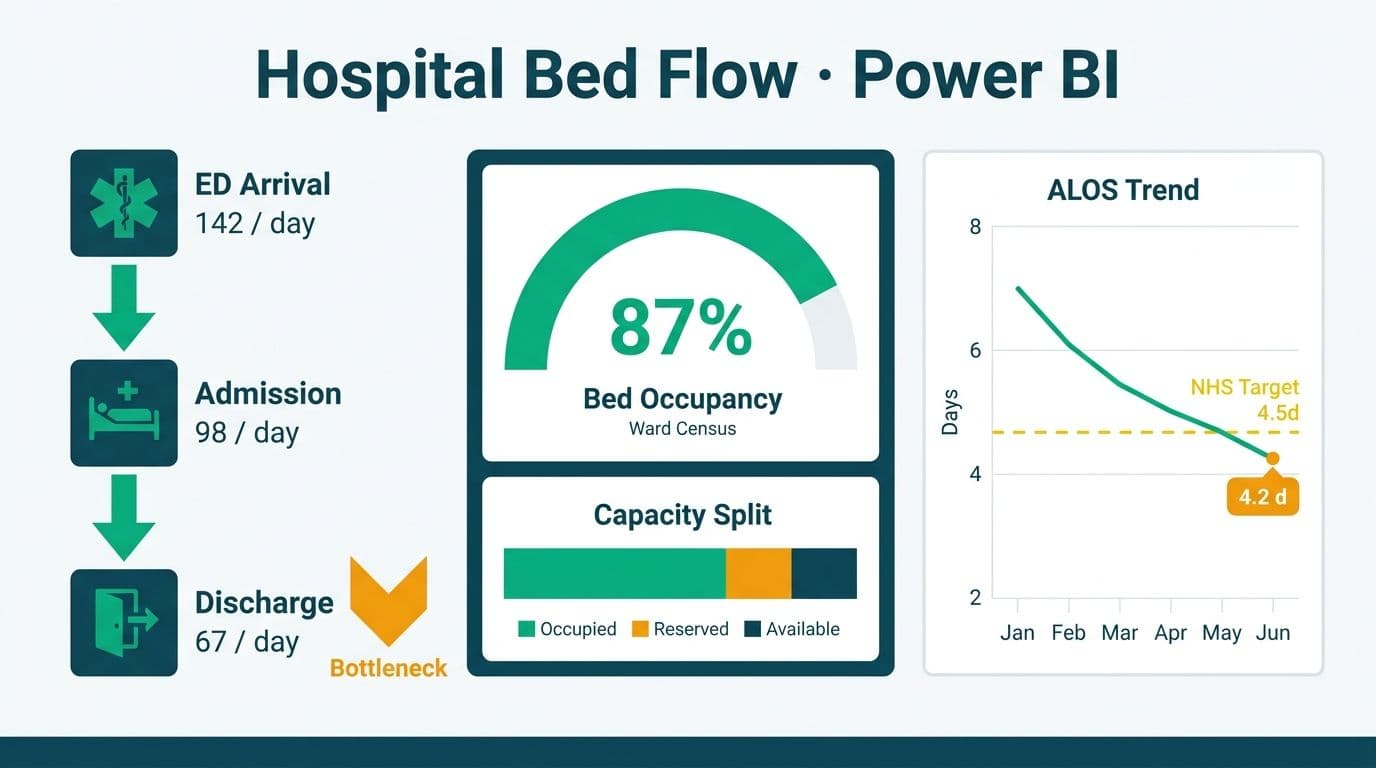
A hospital patient flow and bed capacity dashboard in Power BI consolidates ED-to-admission throughput, real-time bed occupancy, average length of stay (ALOS), and discharge bottleneck data into one governed workspace. Time-intelligence DAX measures layer period comparisons and trend detection directly onto your clinical data model, while a benchmark overlay table sourced from NHS SITAR data anchors local metrics against national performance targets. For NHS trusts and US health systems moving toward live operational views, the architecture choice between push streaming and scheduled refresh determines whether your real-time hospital capacity analytics dashboard shows data in seconds or in hours.
Key Takeaways
Time-intelligence DAX (`CALCULATE` + `DATEADD`) powers ALOS trending across rolling periods without duplicating clinical data
NHS SITAR benchmarks load as a reference table joined to your fact model on `DepartmentKey`, enabling side-by-side performance comparison
Power BI row-level security scopes bed occupancy views to ward-level staff without custom application code
FHIR R4 and HL7 feeds are the cleanest paths to near-real-time updates from EHR systems
HIPAA (US), GDPR (UK/EU), and PIPEDA (Canada) each impose distinct data residency and audit controls that affect how you configure Power BI Service
Push streaming via Azure Event Hubs and Microsoft Fabric Eventstream delivers sub-minute bed state tiles; scheduled refresh suits ALOS, DToC, and benchmark variance where hourly granularity is sufficient
What Is a Hospital Patient Flow and Bed Capacity Dashboard in Power BI?
A patient flow dashboard tracks the full journey of a patient from ED triage through inpatient bed assignment to discharge - surfacing delays at each handoff point where capacity bottlenecks form. In Power BI, this means building a star-schema data model around an `EncounterFact` table (one row per patient visit), supplemented by `BedFact`, `DateDim`, `TimeDim`, `PatientDim`, and `DepartmentDim` lookup tables.
For organizations evaluating how to build and maintain these dashboards sustainably, Managed Power BI for healthcare teams provides a fully managed path from data model design through regulatory compliance, so clinical staff get insights without burdening IT.
Core metric groups in a patient flow dashboard:
Throughput metrics: ED-to-admission time, triage-to-physician time, boarding hours
Capacity metrics: current bed occupancy percentage, available beds by ward, surge capacity headroom
Efficiency metrics: ALOS by DRG, ALOS vs benchmark, readmission rates
Bottleneck metrics: discharge delay hours by reason code, delayed transfer of care (DToC) events
See Healthcare KPI Dashboard Examples by Department (2026) for a full breakdown of department-level KPI structures before building your model.
How Do You Model ED-to-Admission Throughput in Power BI?
ED-to-admission throughput measures the time elapsed between a patient's arrival at the emergency department and their assignment to an inpatient bed. In Power BI, you calculate this as a measure against your `EncounterFact` table using `DATEDIFF` on timestamp columns, then apply time-intelligence filters to compare shifts, days, and rolling windows.
Recommended columns in `EncounterFact`:
| Column | Type | Description |
|---|---|---|
| EncounterID | Text (key) | Unique visit identifier |
| EDArrivalTime | DateTime | Timestamp of ED triage registration |
| InpatientBedAssignTime | DateTime | Timestamp of first inpatient bed offer |
| AdmissionDate | Date | Date of formal inpatient admission |
| DischargeDate | Date | Date of discharge |
| DRGCode | Text | Diagnosis-Related Group for case-mix |
| DepartmentKey | Integer (FK) | Links to DepartmentDim |
| DischargeDelayMinutes | Integer | Minutes from clinical readiness to actual discharge |
| DelayReasonCode | Text | Reason code for discharge delay |
DAX measure - average ED-to-admission hours:
```dax
Avg ED to Admission Hrs =
DIVIDE(
SUMX(
FILTER(EncounterFact, NOT ISBLANK(EncounterFact[InpatientBedAssignTime])),
DATEDIFF(EncounterFact[EDArrivalTime], EncounterFact[InpatientBedAssignTime], MINUTE)
),
COUNTROWS(FILTER(EncounterFact, NOT ISBLANK(EncounterFact[InpatientBedAssignTime])))
) / 60
```
Wrap this inside `CALCULATE` with a `DATEADD(DateDim[Date], -7, DAY)` filter context to compare the current 7-day rolling window against the prior 7 days - a practical shift-handoff view for charge nurses at a US hospital, an NHS trust, or a Canadian health authority. This single measure replaces the manual shift-handover spreadsheets that most clinical operations teams still rely on.
How Do You Calculate ALOS and Real-Time Bed Occupancy with Time-Intelligence DAX?
Average length of stay is the most-watched efficiency metric in inpatient care. Sustained ALOS above DRG benchmark values signals either clinical complexity issues or operational bottlenecks - typically in discharge planning, awaiting test results, or social care arrangement delays.
```dax
ALOS Days =
DIVIDE(
SUMX(
EncounterFact,
DATEDIFF(EncounterFact[AdmissionDate], EncounterFact[DischargeDate], DAY)
),
COUNTROWS(EncounterFact)
)
ALOS Prior Month =
CALCULATE(
[ALOS Days],
DATEADD(DateDim[Date], -1, MONTH)
)
ALOS vs Prior Month =
[ALOS Days] - [ALOS Prior Month]
```
For real-time bed occupancy, your `BedFact` table should store one row per bed per day with `OccupiedBedDays` (count of occupied bed-days) and `AvailableBedDays` (count of staffed, available bed-days):
```dax
Bed Occupancy % =
DIVIDE(
SUM(BedFact[OccupiedBedDays]),
SUM(BedFact[AvailableBedDays])
)
```
NHS England's operational guidance benchmarks safe occupancy at or below 85% for general and acute wards - a threshold reaffirmed in the 2026 NHS Operational Planning guidance - above which infection transmission risk rises and staff-to-patient ratios degrade. Apply a conditional formatting rule in Power BI so any ward card crossing 85% turns amber and 92% turns red. This same threshold is referenced in Canadian health authority operational standards under PIPEDA-governed analytics systems and at US hospitals where HIPAA-compliant audit logs must record who viewed occupancy data and when.
For period-over-period trending without re-querying the database, pair `CALCULATE` with Power BI's built-in `DATESYTD`, `DATESMTD`, and `SAMEPERIODLASTYEAR` functions against your `DateDim[Date]` column. See DAX SUMMARIZE vs SUMMARIZECOLUMNS: Finance Reporting Guide for the underlying aggregation patterns - the same principles transfer cleanly to clinical fact tables.
How Do You Add NHS SITAR Benchmark Overlay Columns to a Power BI Dashboard?
NHS SITAR (Situation Report) benchmark data is published by NHS England and covers bed occupancy rates, ALOS by specialty, delayed transfers of care, and A&E 4-hour target performance. Loading this data into Power BI as a reference table and joining it to your operational fact model creates benchmark overlay columns that convert raw metrics into explicit performance judgements.
Step 1 - Load NHS SITAR data as a reference table
Download the current SITAR publication from NHS England's statistics portal as a CSV or Excel file. Load it into Power BI as `SITARBenchmarks` with columns: `DepartmentType`, `BenchmarkOccupancy`, `BenchmarkALOS`, `BenchmarkED4hrRate`, `PublicationDate`.
Step 2 - Join on DepartmentType
In your data model, draw a many-to-one relationship from `BedFact[DepartmentKey]` to `DepartmentDim[DepartmentKey]`, then use `TREATAS` to bridge `DepartmentDim[DepartmentType]` to `SITARBenchmarks[DepartmentType]` without a hard relationship.
Step 3 - Create benchmark variance measures
```dax
Occupancy vs SITAR Benchmark =
[Bed Occupancy %] -
CALCULATE(
AVERAGE(SITARBenchmarks[BenchmarkOccupancy]),
TREATAS(
VALUES(DepartmentDim[DepartmentType]),
SITARBenchmarks[DepartmentType]
)
)
ALOS vs SITAR Benchmark =
[ALOS Days] -
CALCULATE(
AVERAGE(SITARBenchmarks[BenchmarkALOS]),
TREATAS(
VALUES(DepartmentDim[DepartmentType]),
SITARBenchmarks[DepartmentType]
)
)
```
Plot these variance measures as diverging bar charts - one bar per ward or specialty - so clinical operations managers see at a glance which departments are inside benchmark and which are outliers. For US hospitals, replace or supplement NHS SITAR values with CMS Medicare discharge and ALOS benchmarks from the Provider of Services file for a market-relevant reference layer.
For context on how free public datasets integrate with this model, Top Free Healthcare Datasets for Power BI Dashboards covers NHS, CMS, and Statistics Canada sources that pair directly with this architecture.
How Do You Surface Discharge Bottlenecks Using DAX?
Discharge bottlenecks are the leading cause of bed occupancy creep. A bed that is clinically ready for discharge but not yet physically vacated shows as occupied - inflating your occupancy rate and blocking incoming ED admissions.
The three most common bottleneck categories in NHS England delayed transfer of care reporting are: awaiting a community care package (social services coordination lag), awaiting transport (discharge transport not booked at clinical readiness), and awaiting test results or specialist sign-off (intra-hospital workflow delay).
Track these in `EncounterFact[DelayReasonCode]` and build a bottleneck heatmap measure:
```dax
Avg Discharge Delay Hrs =
CALCULATE(
AVERAGEX(
EncounterFact,
DATEDIFF(
EncounterFact[ClinicalReadyTime],
EncounterFact[ActualDischargeTime],
MINUTE
) / 60
),
EncounterFact[DelayReasonCode] <> ""
)
```
Slice this measure by `DelayReasonCode` in a matrix visual to surface the highest-impact bottleneck categories by ward, day of week, and shift. A teaching hospital in Toronto reduced its average discharge delay by 34 minutes per patient by prioritizing transport booking automation after identifying it as the dominant bottleneck code in their Power BI model - a pattern replicated across multiple Ontario health authorities in 2025 as part of the provincial Acute Care Staffing and Bed Management programme, where transport and social care coordination delays consistently topped bottleneck rankings ahead of clinical factors. The finding had been invisible in their prior monthly Excel reports.
What Are the HIPAA, GDPR, and PIPEDA Compliance Requirements for Healthcare Dashboards?
A patient flow dashboard processes protected health information (PHI) in the US, special category health data under GDPR in the UK and EU, and personal health information under PIPEDA in Canada. Each framework imposes different obligations on how Power BI Service must be configured.
| Requirement | US (HIPAA) | UK/EU (GDPR) | Canada (PIPEDA) |
|---|---|---|---|
| Data residency | US datacenter regions required for PHI | EU/UK datacenter required for patient data | Canada Central or East preferred; cross-border transfer requires consent |
| Audit logging | Access logs mandatory; 6-year retention | Article 30 processing records required | Accountability principle: document all data flows |
| De-identification | Safe Harbor or Expert Determination standard | Pseudonymization acceptable for analytics | Aggregation at cohort level (n >= 5) standard |
| BAA/DPA required | Microsoft BAA required | Data Processing Agreement with Microsoft | Written data processing agreement required |
| Row-level security | Mandatory for all workspaces containing PHI | Mandatory for health data | Mandatory for personal health data |
Microsoft Power BI Service provides HIPAA BAA coverage, GDPR data processing terms, and ISO 27001/27018 certifications that satisfy the baseline for all three frameworks. However, configuration remains the organization's responsibility - default tenant settings often fail compliance requirements without explicit hardening.
For a deeper audit checklist, AI Analytics Data Privacy Risks: Healthcare Audit Guide walks through the specific Power BI tenant settings that must be locked down before any PHI enters a shared workspace.
Power BI Report Server vs Power BI Service for Healthcare: Which Should You Choose?
This is the most common infrastructure question healthcare IT teams face when evaluating how to connect EHR data to Power BI for clinical reporting. Power BI Report Server is an on-premises deployment; Power BI Service is Microsoft's cloud-hosted SaaS platform. For most healthcare organizations the answer today is Power BI Service - but HIPAA requirements, clinical network constraints, and existing infrastructure shape the final decision.
| Factor | Power BI Report Server (On-Premises) | Power BI Service (Cloud) |
|---|---|---|
| Data residency control | Full control; PHI never leaves your network | Microsoft-managed; datacenter region selectable |
| Real-time streaming | Limited; no native streaming datasets | Native streaming datasets; DirectQuery supported |
| HIPAA compliance | Organization fully responsible | Microsoft BAA available; shared responsibility model |
| Update cadence | Tied to SQL Server release cycle | Monthly feature updates |
| Mobile access | Requires VPN for external users | Native mobile apps; no VPN needed |
| Cost model | SQL Server license plus hardware CapEx | Per-user or capacity subscription (OpEx) |
| Row-level security | Supported | Supported; Object-Level Security (OLS) also available |
| AI visuals and Copilot | Not available | Available with Premium or Fabric capacity |
For most US hospitals moving toward value-based care analytics, Power BI Service with Power BI Premium Per User (PPU) or Fabric capacity provides the real-time streaming, AI features, and audit logging that on-premises cannot match. NHS trusts operating under NHS England's cloud-first policy are similarly directed toward Power BI Service with UK South or UK West data residency. Canadian health authorities subject to PIPEDA should verify their Microsoft tenant is configured to Canada Central or Canada East regions before loading any patient data.
For help deciding between import and DirectQuery modes for your EHR data volumes, see Power BI Import vs DirectQuery: Mid-Market Decision Guide.
How Do You Connect FHIR and EHR Data to Power BI for Clinical Reporting?
FHIR R4 (Fast Healthcare Interoperability Resources) is the dominant clinical data exchange standard across US, UK, and Canadian health systems. As of 2026, the CMS Interoperability and Patient Access rule requires US payers and providers to expose patient data via FHIR R4 APIs - making this connectivity path a regulatory baseline, not just an architectural best practice. Most modern EHR platforms expose FHIR R4 REST APIs that Power BI can consume directly via the Web connector or through Azure Health Data Services (AHDS) as a managed intermediary.
For Epic and Oracle Health (Cerner) deployments - the two most common EHR platforms in large US health systems - the recommended path is: normalize and cache FHIR R4 bundles through AHDS, connect Power BI to AHDS via DirectQuery or hourly scheduled import, then map FHIR resource types to your `EncounterFact` columns: `Encounter.period.start` becomes `EDArrivalTime`, and `Encounter.hospitalization.dischargeDisposition` becomes `DischargeStatus`.
For UK NHS trusts, the NHS England FHIR R4 APIs align with the National Data Model - meaning your `DepartmentDim` can be populated directly from ODS (Organisation Data Service) codes without manual mapping tables.
See AI Analytics Use Cases in Healthcare Finance: 2026 Guide for downstream use cases - particularly cost-per-encounter modeling - that build on the same FHIR-to-Power BI data pipeline described here.
How Do You Stream Bed Occupancy, ED Wait-Time, and Admissions Data into a Real-Time Hospital Capacity Analytics Dashboard?
Building a real-time hospital capacity analytics dashboard requires an architectural decision before a single DAX measure is written: push streaming or scheduled refresh? The two approaches serve different clinical audiences and metric types, and the most effective NHS trust and US hospital implementations use both in a hybrid arrangement.
Push vs. scheduled-refresh comparison
| Factor | Push (Streaming) | Scheduled Refresh |
|---|---|---|
| Latency | Sub-second to seconds | 15-minute minimum in Power BI Service |
| Data source | Event Hubs, REST API, Kafka | FHIR endpoint, SQL warehouse, flat file |
| DAX model support | Limited to streaming tile visuals | Full analytical DAX model |
| Historical analysis | Requires a separate lakehouse layer | Full history available in import mode |
| Best clinical use | Live bed state boards, ED wait-time displays | ALOS trends, SITAR benchmarks, DToC reporting |
Push approach: Fabric Eventstream or Power BI streaming datasets
For sub-minute bed occupancy tiles - showing current occupied beds by ward, live ED queue depth, and ambulance handover wait time - the recommended architecture has three stages:
1. Your EHR or PAS (Patient Administration System) emits ADT (Admit-Discharge-Transfer) events to Azure Event Hubs. NHS trusts running TPP SystmOne or EMIS can route HL7 v2 ADT messages through Azure API for Health Data Services as a translation layer before they reach the hub.
2. Microsoft Fabric Eventstream consumes the Event Hubs stream, applies a real-time KQL query to derive current occupied bed count per ward and current ED wait-time percentiles, and writes results to a Fabric KQL Database (formerly Azure Data Explorer).
3. Power BI connects to the KQL Database via DirectQuery. The dashboard auto-refreshes on page load with no scheduled refresh job and no import latency.
For NHS trusts not yet on Fabric, Power BI's native REST streaming API accepts HTTP POST requests directly from a lightweight middleware service - an Azure Function or a Python process on your VPS - and renders streaming tile visuals in real time without an import step. This path has lower infrastructure overhead but no historical querying; it suits ward-level bed state boards that reset context each shift.
Scheduled-refresh approach: when push is not justified
Not every metric requires sub-minute latency. ALOS, SITAR benchmark variance, monthly DToC trends, and discharge bottleneck rankings are analytically meaningful at hourly or daily granularity. For these, configure a Power BI dataflow Gen2 (or Fabric Lakehouse pipeline) to pull from your FHIR R4 endpoint or SQL-based data warehouse on an hourly schedule. The dataflow writes to a Lakehouse Delta table; your semantic model connects via DirectQuery or import with incremental refresh enabled. This preserves your full analytical DAX model and all time-intelligence measures without the operational complexity of a streaming pipeline.
Hybrid architecture for NHS trusts and US health systems
The practical pattern for a production-grade real-time hospital capacity analytics dashboard is a hybrid layer: push streaming tiles for live bed state and ED wait-time (Event Hubs, Fabric Eventstream, KQL Database), layered over an import-mode analytical model for ALOS trends, benchmark overlays, and delayed transfer of care reporting refreshed hourly. Both layers live in a single Power BI workspace with unified row-level security applied at the workspace level, so a ward sister sees live bed state scoped to her ward alongside her ward's rolling ALOS trend in the same report - without a separate operational screen and a separate analytics report.
---
If your team is ready to move from architecture to a working dashboard, Managed Power BI for healthcare teams covers the full implementation path - data model design, DAX build, compliance configuration, and ongoing maintenance - purpose-built for clinical operations teams that need governed insights without expanding internal BI headcount.
---
About Lets Viz: Lets Viz has delivered governed analytics solutions for US healthcare systems, UK fintech firms, Canadian manufacturing organizations, and global SaaS businesses since 2020. Recognized with a 5.0 Clutch rating, our team specializes in Power BI data modeling, DAX engineering, and HIPAA-compliant dashboard architecture that clinical operations teams can trust and regulators can audit.