Healthcare KPI Dashboard Examples by Department (2026)
Healthcare KPI dashboard examples vary by department because each unit is accountable for a different leadership question. An ED director asks about throughput; an OR chief tracks room utilization; a CFO monitors payer mix and margin; a population health officer closes care gaps before quality penalties are calculated. A well-designed dashboard surfaces each leader's answer in under 30 seconds - without a data analyst in the room.
Key Takeaways
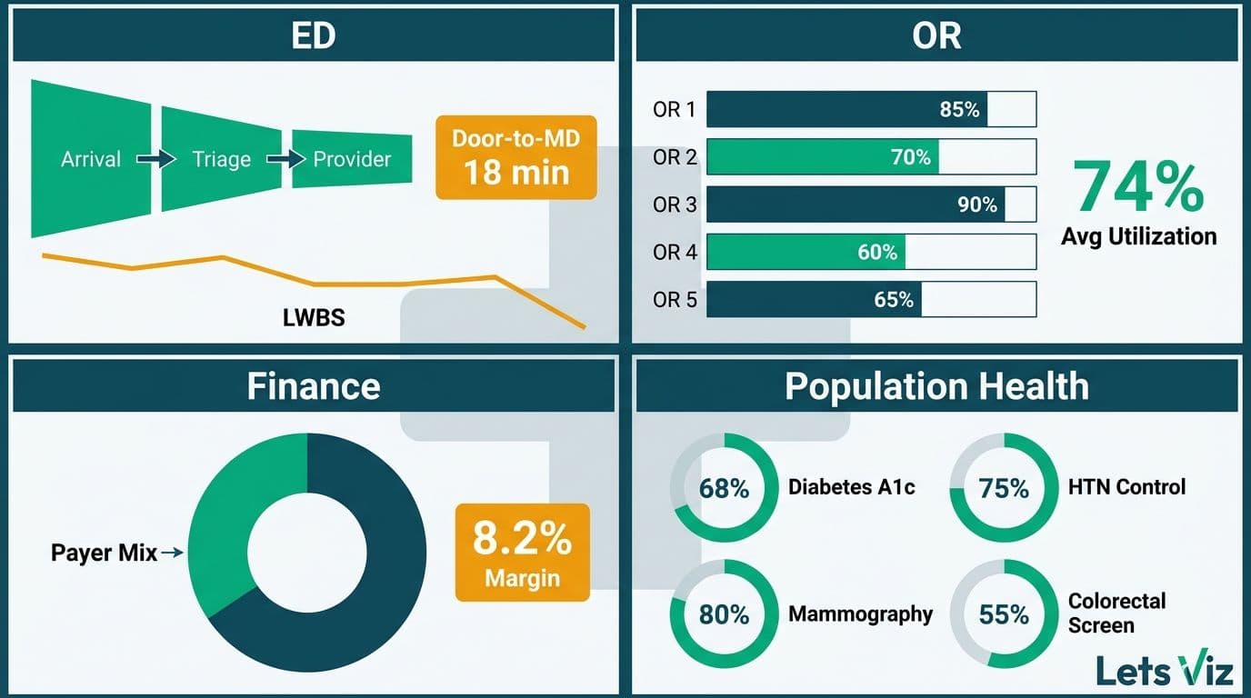
ED dashboards lead with door-to-provider time, LWBS rate, and boarding hours to expose throughput bottlenecks.
OR dashboards prioritize room utilization, first-case on-time starts, and case-mix index to maximize surgical margin.
Finance dashboards track net revenue per adjusted discharge, cost per case, and payer mix shift under value-based contracts.
Population health dashboards monitor care gap closure rates, readmission risk tiers, and chronic disease panel control rates.
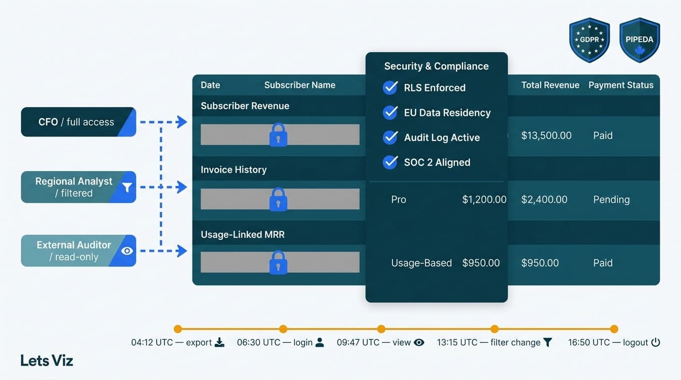
Every dashboard type requires HIPAA-compliant role-based access and PHI-safe aggregation - design governance before visuals.
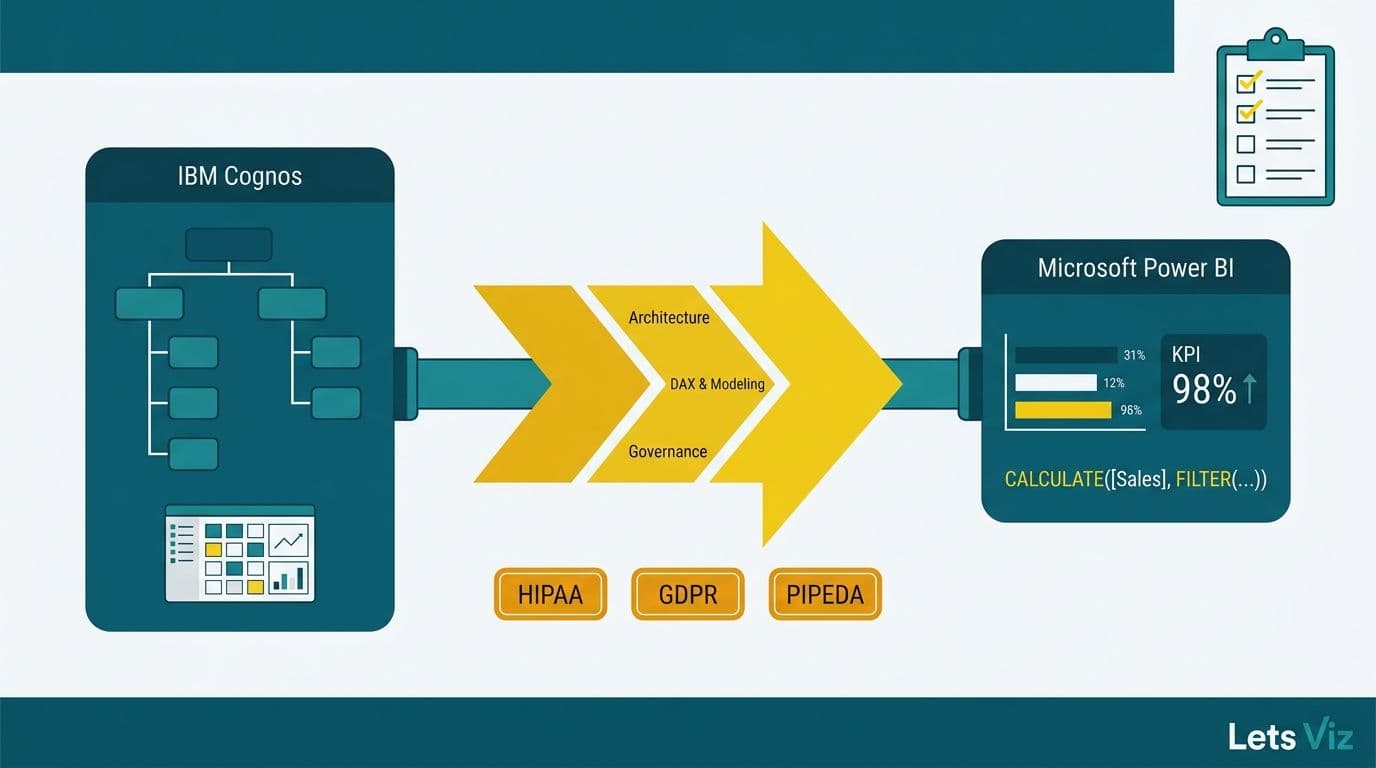
Lets Viz delivers Managed Power BI services for healthcare and finance teams -- fully managed analytics, from data model to decision-ready dashboard.
What Makes a Healthcare KPI Dashboard Effective?
A dashboard earns sustained use when it answers one specific leadership question without requiring a separate report or analyst call. The primary metric should change behavior: green means carry on, red means act.
According to a 2026 analysis by MedInsight, three themes now dominate US healthcare analytics strategy: value-based care (VBC), AI-driven analytics, and payer analytics innovation - each demanding dashboards that connect operational volume to financial and quality outcomes, not activity alone.
Four principles apply regardless of department:
One primary question per page: state it in the page title, not buried in a sub-tab.
Traffic-light thresholds: calibrated to your own benchmarks and contractual targets, not generic national averages.
Drill paths with access control: authorized roles click through to encounter-level detail; others see only the summary.
Automated refresh: ED and OR dashboards need 15-minute cadence minimum; finance dashboards refresh at daily close.
For a layout framework that meets clinical workflow requirements, see healthcare dashboard design best practices for hospitals.
Healthcare KPI Dashboard Examples by Department: A Side-by-Side View
The table below shows which KPIs belong in each department and the leadership question each dashboard page should answer.
| Department | Leadership Question | Primary KPIs | Refresh Cadence |
|---|---|---|---|
| Emergency Department | Are patients moving through fast enough? | Door-to-provider time, LWBS rate, boarding hours | Every 15 min |
| Operating Room | Are we maximizing revenue per available OR minute? | Utilization rate, FCOTS, case-mix index, turnover time | Daily prior-day close |
| Finance (CFO) | Are we sustainable under our current payer mix? | NPR/adj. discharge, cost per case, AR days, payer mix | Daily or monthly |
| Population Health | Are we closing care gaps before quality penalties hit? | Care gap closure %, readmission risk tier, HbA1c control | Weekly |
The Healthcare Financial Analytics Market is projected to expand at an 8.58% CAGR from 2025 to 2035 (Market Research Future, 2026), driven by value-based care mandates and AI integration - explaining why department-level dashboard investment is accelerating across US health systems.
For a full metric breakdown by care setting, see what metrics a healthcare analytics dashboard should track.
What Should an Emergency Department KPI Dashboard Show?
The leadership question: "Why are patients leaving before being seen, and where is throughput breaking down?"
The ED director's accountability is flow. Every minute a patient waits without evaluation is a LWBS risk, a satisfaction penalty, and a lost revenue event simultaneously.
Door-to-provider time is elapsed minutes from registration to first physician or APP contact. High-performing EDs target 20 minutes or below; averages above 30 minutes signal a staffing gap or triage bottleneck a flow model can attribute to a specific shift or acuity lane.
Left-without-being-seen (LWBS) rate is the percentage of registered patients who leave before evaluation. Rates above 2% reflect overcrowding or an intake failure. Breaking LWBS down by shift and triage acuity level lets the ED medical director distinguish a volume-driven problem from a process-driven one - the interventions differ entirely.
ED boarding hours - total hours admitted patients spend waiting for an inpatient bed - is often the strongest predictor of LWBS rate. Surfacing boarding hours by destination unit (ICU, med-surg, behavioral health) lets the house supervisor intervene upstream before a cascade builds.
Screenshot description: A Power BI ED operations page with a ribbon chart of door-to-provider time by shift for 14 days. A KPI card shows current-shift LWBS rate with a red threshold at 2.0%. A patient-flow funnel (Arrived - Triaged - In Room - Seen - Disposition) refreshes every 15 minutes. Drill-through opens a case-level timestamp table showing de-identified tokens rather than names or MRNs, satisfying the HIPAA minimum-necessary standard.
For the governance controls that make near-real-time clinical feeds HIPAA-safe, the HIPAA-compliant analytics dashboard best practices checklist covers technical and administrative safeguards in detail.
What KPI Examples Belong on an Operating Room Dashboard?
The leadership question: "Are we leaving surgical revenue on the table through underutilized rooms and avoidable late starts?"
Surgical services represent 40-60% of total hospital revenue for most US acute care facilities. An OR chief's dashboard must answer utilization and efficiency questions before the morning huddle.
OR utilization rate is actual surgical minutes divided by available room minutes, benchmarked at 75-85%. Below 75% is unused capacity translating directly to revenue loss; above 85% risks overruns and overtime. A room-by-room heatmap by day of week reveals whether underperformance is systemic or service-line-specific.
First-case on-time start (FCOTS) rate is the share of first-scheduled cases beginning within 15 minutes of scheduled time. FCOTS below 70% cascades through the entire day. Displaying it by surgeon, service line, and room provides the specificity needed to isolate whether the root cause is patient prep, equipment, or anesthesia.
Case-mix index (CMI) is the average DRG weight of cases performed. Declining CMI in spine or cardiac often precedes margin compression before it surfaces on the income statement.
Turnover time - average minutes between wheels-out and wheels-in - targets under 30 minutes for elective cases. Room-by-service-by-time-of-day breakdowns pinpoint where to intervene.
Screenshot description: Left panel: a 12-room heatmap by day of week, colored by utilization (green above 75%, yellow 60-75%, red below 60%). Right panel: a scatter plot of CMI versus actual OR minutes by surgeon with a service-line average reference line. Header bar shows today's FCOTS rate and a 30-day sparkline.
For data model patterns applicable to OR cost-accounting and scheduling feeds in Power BI, see building a Power BI financial dashboard for healthcare.
What Do Healthcare Finance KPI Dashboard Examples Look Like?
The leadership question: "Are we financially sustainable under our payer mix, and are cost trends inside our value-based contract parameters?"
A CFO needs a dashboard that bridges clinical volume to margin - a connection monthly PDF reports consistently fail to make visible in time to act. According to Future Market Insights (2026), the AI consulting services market supporting healthcare analytics is now valued at USD 13.4 billion in 2026, on a trajectory to reach USD 90.99 billion by 2035 at a 26.2% CAGR - reflecting how aggressively health systems are investing in decision-ready financial intelligence.
Net patient revenue per adjusted discharge (NPR/AD) is the margin metric most watched by CFOs. A declining NPR/AD visible before month-end gives finance and revenue cycle teams time to investigate coding gaps or denial spikes in the same period rather than 45 days later.
Cost per case by service line, benchmarked against DRG norms, surfaces the other side of the margin equation. Teams using AI workflow automation for healthcare analytics can now flag cost outliers within 48 hours of case close - catching supply chain and length-of-stay anomalies before they compound.
Payer mix trending shows discharges by payer category over a rolling 12 months. A shift of two percentage points toward government payers can compress margin by millions annually at scale. A 90-day forward projection based on current referral mix gives leadership time to respond.
Days in AR by payer class reveals denial patterns that revenue cycle can address through coding education or payer escalation before cash flow is affected.
Screenshot description: Top row: four KPI cards - NPR/AD versus prior year, cost per adjusted discharge, AR days, and operating margin - each with a directional arrow and variance. Center: a waterfall chart showing the margin bridge from the prior quarter (volume, rate, payer mix, and cost effects). Bottom: payer mix stacked bar by month for 12 months with a 90-day projection line.
The AI analytics for healthcare finance teams 2026 guide details how predictive models embedded in these dashboards surface deteriorating margin trends before close.
How Do Population Health KPI Dashboards Answer Population-Level Questions?
The leadership question: "Which patient cohorts are at highest readmission risk this week, and are we closing care gaps before the measurement period ends?"
Population health management sits at the intersection of clinical operations and value-based contract performance. A CMO or VP of Population Health needs a dashboard that moves from aggregate risk scores to actionable care management queues - and refreshes often enough that care teams are not working from 30-day-old data.
Care gap closure rate is the percentage of attributed patients with open HEDIS measures who complete the required service within the measurement period. Most VBC contracts penalize rates below 80% on measures like diabetic HbA1c testing, colorectal screening, and well-child visits. Showing closure by measure, by care manager, and by risk tier lets the team direct outreach where quality points are still earnable.
Readmission risk score distribution segments the panel by 30-day readmission risk tier. High-risk patients without a follow-up scheduled within seven days of discharge are the primary intervention target. Health systems using daily alert views in 2026 report 15-20% reductions in 30-day readmissions among high-risk cohorts when care managers act on discharge alerts within 24 hours - turning a predictive score into a same-day action list rather than a weekly review artifact.
Chronic disease panel control rates - HbA1c below 8% for diabetic patients, BP below 130/80 for hypertensive patients - link clinical outcomes directly to shared savings calculations under ACO and direct-contract arrangements.
ED utilization by attributed patients reveals high-risk individuals using the emergency department as a primary care access point - each avoidable visit is both a quality gap and a cost driver that proactive outreach can reduce.
Screenshot description: Left: a risk stratification pyramid (low, medium, high) with patient counts and average risk score per tier. Center: a care gap heatmap by HEDIS measure type (rows) and care manager assignment (columns), colored red to green by closure percentage. Right: a 30-day readmission trend line at the contracted threshold, plus a daily alert list of high-risk patients discharged in the last 72 hours without a follow-up appointment.
For the infrastructure that makes population health dashboards HIPAA-compliant from raw claims to permissioned care manager views, the HIPAA-compliant analytics dashboard best practices checklist provides implementation-level guidance.
How Should Healthcare KPI Dashboards Be Structured for HIPAA Compliance?
Effective clinical dashboards protect patient privacy through design, not as a layer added after deployment. Four controls apply across all department types described above.
Role-based access control (RBAC) ensures an ED charge nurse cannot see the finance margin dashboard and a billing analyst cannot access identifiable patient throughput records. Every dashboard requires a documented access matrix reviewed quarterly.
PHI aggregation thresholds require that any cell containing fewer than 11 unique patients be suppressed or masked to prevent re-identification. This applies to drill-through detail views equally with top-level summary cards.
Audit logging captures every data access event - user identity, timestamp, and data set accessed. This satisfies the HIPAA Security Rule and enables breach investigation if an incident occurs.
De-identification at the display layer means operational dashboards requiring near-real-time patient data display de-identified tokens in the primary view. Identified detail is accessible only through a separately permissioned drill path with its own audit trail.
---
Ready to move from static department reports to live KPI dashboards your clinical and operational leaders will actually use? Managed Power BI for healthcare teams delivers governed, HIPAA-aligned dashboards built around the questions your department heads ask every morning - no internal BI team required.
---
About Lets Viz: Lets Viz has delivered data analytics and business intelligence solutions to healthcare, finance, and professional services organizations since 2020. Our consultants hold certifications in Power BI and Microsoft Fabric and have designed department-level KPI dashboards for hospital systems ranging from critical access facilities to multi-site regional health networks. We specialize in translating complex clinical and regulatory data requirements into governed, decision-ready reporting that meets HIPAA standards.