Hospital Executive Dashboard Power BI KPIs: CFO & CMO Guide
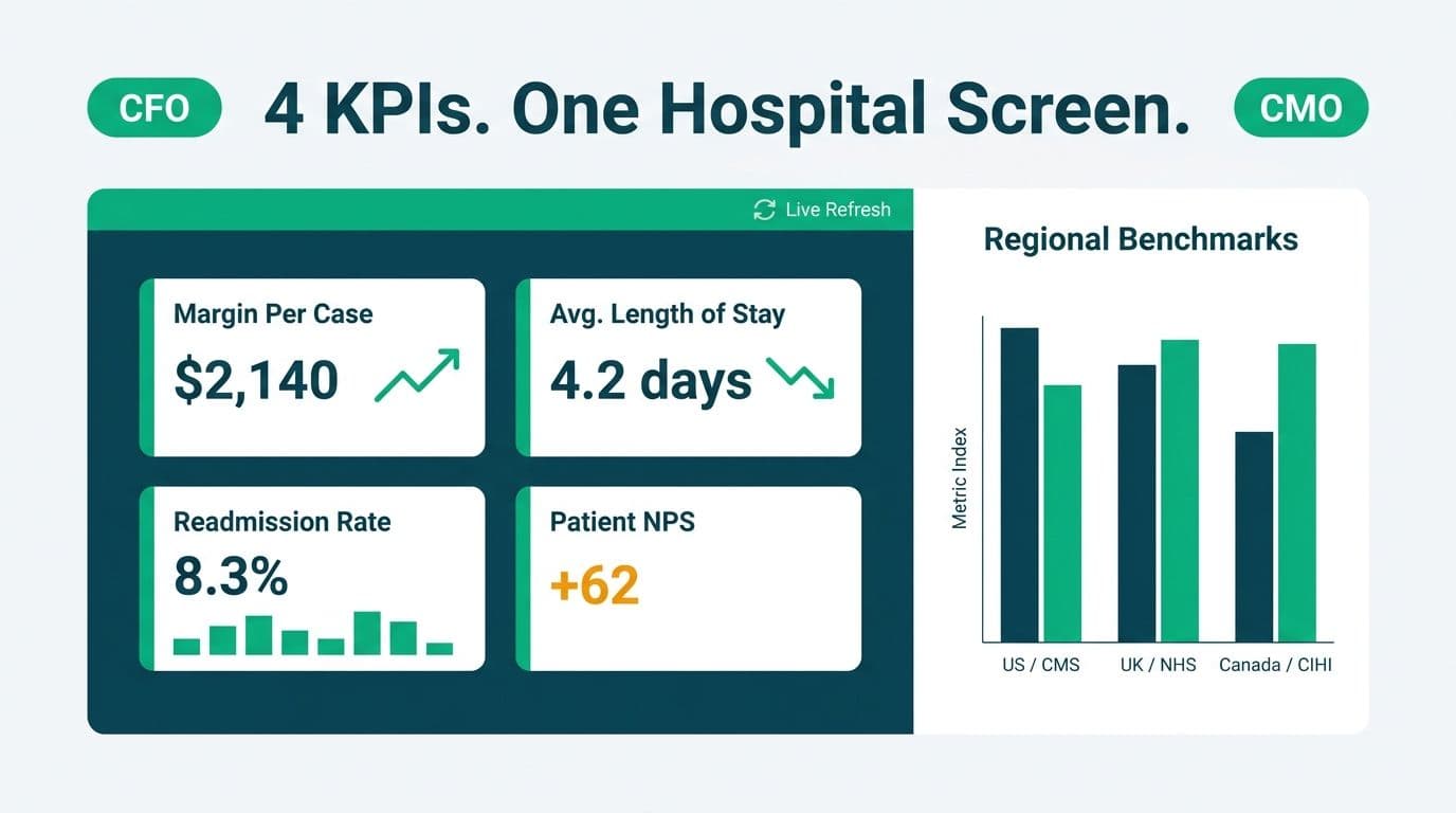
A hospital executive dashboard built in Power BI surfaces the four metrics that drive operational and financial decisions - margin per case, average length of stay (ALOS), readmission rate, and patient NPS - on a single screen, refreshed from source systems without manual exports. When layered with multi-region benchmarks from CMS (US), NHS Digital (UK), and CIHI (Canada), the dashboard gives a CFO or CMO a comparative picture that a point-in-time report cannot match.
Key Takeaways
- A well-built hospital executive Power BI dashboard limits the first screen to four to six core KPIs: margin per case, ALOS, 30-day readmission rate, patient NPS, bed occupancy, and operating ratio.
- Multi-region benchmarking requires a dedicated benchmark dimension table and slicers that toggle between CMS, NHS Digital, and CIHI reference ranges.
- HIPAA compliance in Power BI relies on row-level security (RLS), Microsoft Purview sensitivity labels, and workspace-level access controls - not just dashboard passwords.
- DAX measures for each KPI should be defined once in a shared certified dataset so CFOs and CMOs always reference the same denominator.
- A phased build - starting with financial KPIs, then adding clinical and experience metrics - reduces go-live risk and earns executive adoption faster than a big-bang launch.
What KPIs Should Appear on a Hospital Executive Power BI Dashboard?
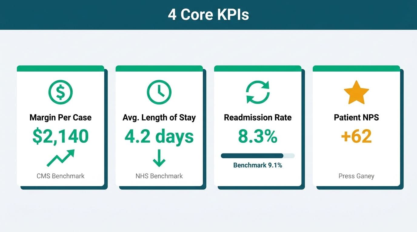
The shortest answer: limit the first screen to six metrics or fewer. Executives stop reading dashboards that require scrolling before coffee.
The four KPIs that appear consistently in US health system leadership reviews are:
1. Margin per case (net revenue minus direct cost divided by case volume) - the primary financial pulse of a DRG-based system.
2. Average length of stay (ALOS) - an operational efficiency signal, benchmarked against CMS geometric mean LOS for each DRG.
3. 30-day readmission rate - directly tied to CMS Hospital Readmissions Reduction Program (HRRP) penalties, which can reach 3% of total Medicare base payments.
4. Patient NPS - derived from HCAHPS survey responses or a purpose-built post-discharge NPS survey. UK NHS trusts use Friends and Family Test (FFT) scores in the same position on their executive views.
Supporting KPIs that typically sit one drill-through level below the main screen include bed occupancy rate, case mix index (CMI), operating expense ratio, and denial rate.
For teams building this from scratch, Managed Power BI for healthcare teams covers the end-to-end model design, from data source connection through certified dataset publishing.
How Do CFOs and CMOs Structure a Single-Screen Power BI View?
A single-screen executive view works only when the layout follows the natural reading pattern of the audience. Healthcare executives scan top-left first for the critical financial number, then move right and down for operational and experience metrics.
Recommended layout for a 16:9 executive screen (landscape):
- Top-left quadrant: Margin per case (current month vs. prior year, vs. budget). Use a large KPI card with conditional formatting - red if below budget threshold, green if above.
- Top-right quadrant: ALOS waterfall or bullet chart comparing actual vs. CMS geometric mean LOS, filterable by DRG family or service line.
- Bottom-left quadrant: 30-day readmission rate trend line (12-month rolling), with a reference line at the CMS national average and a penalty-trigger threshold marker.
- Bottom-center/right quadrant: Patient NPS gauge or dot plot by unit or service line, with a text card showing the latest verbatim NPS driver surfaced from survey free-text via an AI summarisation column in the dataset.
Slicer strip across the top: Facility, service line, payer type, and date range. Keeping slicers in a top strip rather than a side panel preserves the quadrant layout on any screen size, including 55-inch executive conference room displays.
Drill-through pages: Each quadrant card should be a drill-through entry point. A CFO clicking the margin per case card lands on a service-line breakdown with payer mix, direct cost waterfall, and revenue cycle lag. A CMO clicking readmission rate lands on a patient-cohort view with discharge destination and primary diagnosis.
The governance discipline behind this layout - who can see which facility's data, how sensitivity labels travel with exports - is covered in the Power BI Governance Best Practices: 12-Point Checklist.
Single-Dataset Architecture
The most common failure mode in hospital Power BI builds is competing definitions. The CFO's margin per case differs from the CMO's because one team pulled from the EHR and the other from the cost accounting system, and neither documented their denominator.
The fix is a single certified dataset in a dedicated healthcare analytics Power BI workspace. All executive dashboard report files connect to that one dataset via a live connection. If the margin calculation changes, it changes once - in the dataset - and every consumer sees the update immediately.
How Does Multi-Region Benchmarking Work in Power BI with CMS, NHS, and CIHI Data?
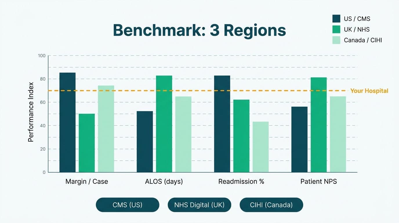
Multi-region benchmarking requires treating benchmark reference data as a first-class dimension table - not a hard-coded constant buried in a DAX measure.
Step 1 - Build a benchmark dimension table. Structure it with columns: `benchmark_source` (CMS | NHS | CIHI), `metric_name`, `drg_or_equivalent`, `benchmark_value`, `benchmark_year`, `benchmark_unit`. Load this from a maintained Excel or SharePoint file that the analytics team updates quarterly when each national body publishes its refreshed figures.
Step 2 - Create a benchmark source slicer. A single slicer tied to `benchmark_source` lets a CFO toggle from CMS to CIHI in one click. This architecture is the right choice when a health system operates facilities in both the US and Canada - a real scenario for large multi-national hospital groups.
Step 3 - Write benchmark-aware variance DAX:
```dax
Margin vs Benchmark =
VAR SelectedBenchmark = SELECTEDVALUE(BenchmarkDim[benchmark_value])
RETURN [Margin Per Case] - SelectedBenchmark
```
Benchmark sources by region:
| Region | Body | Key Metrics Available | Update Frequency |
|---|---|---|---|
| United States | CMS (cms.gov) | DRG geometric mean LOS, readmission rates, cost-per-case | Annual (IPPS rule) |
| United Kingdom | NHS Digital / NHS England | ALOS by specialty, FFT scores, RTT waiting time | Monthly / Quarterly |
| Canada | CIHI (cihi.ca) | ALOS, readmission rate, hospital standardised mortality ratio | Annual |
| European Union | ECDC / Eurostat | ALOS by country, ICU bed ratios | Annual |
A US health system benchmarking against CMS norms handles the data under HIPAA's minimum necessary standard - benchmark tables contain no patient-level information, so they sit outside the PHI boundary and can be stored in a standard Power BI dataset without additional de-identification steps.
A Canadian hospital team importing CIHI benchmarks alongside facility-identified CIHI submission data should confirm that data sharing agreements under PIPEDA are satisfied before loading that data into Power BI cloud workspaces.
What HIPAA Compliance Considerations Apply to Hospital Executive Power BI Dashboards?
HIPAA does not prohibit using Power BI for healthcare analytics - but it does require a Business Associate Agreement (BAA) with Microsoft, which Microsoft offers under the Microsoft Online Services Terms for commercial Power BI Pro and Premium licenses.
Beyond the BAA, three technical controls matter most at the executive dashboard layer:
Row-level security (RLS). A CFO should see enterprise-wide margin data; a regional VP should see only their region's facilities. RLS in Power BI is defined in the dataset using DAX filter expressions against a `[facility_region]` or `[facility_id]` column tied to the viewer's Azure Active Directory identity. Static RLS is easier to audit; dynamic RLS scales better for large health systems where facility assignments change frequently.
Sensitivity labels via Microsoft Purview. Label executive dashboard workbooks as "Confidential - PHI Adjacent" so that any export - PDF, PowerPoint, Excel - inherits the label and triggers Data Loss Prevention (DLP) policies. This prevents a CFO from emailing a cost-per-case breakdown to a personal account without an IT alert firing.
Workspace access control. Executive dashboards belong in a dedicated Premium workspace with access restricted to named individuals plus a break-glass service account. Never publish PHI-adjacent reports to "My Workspace" or to any workspace with public app access enabled.
For UK NHS trusts, the equivalent framework is the Data Security and Protection Toolkit (DSPT), which maps closely to the same technical controls. GDPR Article 9 also applies to health data processed within UK or EU cloud tenants, requiring documented lawful basis alongside the technical safeguards. Canadian hospital teams reference PIPEDA and provincial health information acts - such as Ontario's PHIPA - when deciding between Power BI cloud and a sovereign or on-premises deployment.
The ServiceNow ITSM for Healthcare IT Teams: HIPAA, GDPR and PIPEDA article covers the broader compliance landscape for healthcare IT tooling, including audit logging requirements that apply equally to BI platforms.
How Do You Calculate Margin Per Case, ALOS, Readmission Rate, and Patient NPS in Power BI DAX?
Each KPI needs a single canonical DAX measure in the shared dataset. Defining it once eliminates the competing-definitions problem across every report that connects to the certified dataset.
Margin per case:
```dax
Margin Per Case =
DIVIDE(
[Net Revenue] - [Direct Cost],
[Case Volume],
0
)
```
Direct cost should include direct labour, supplies, and implants - excluding overhead allocations unless the executive view is intended as an all-in cost view. Document the definition in the measure's Description field in Power BI Desktop so every consumer reads the same logic.
Average length of stay (ALOS):
```dax
ALOS =
DIVIDE(
SUM(Encounters[LOS Days]),
DISTINCTCOUNT(Encounters[EncounterID]),
0
)
```
Filter the encounter table to inpatient admissions only. Same-day surgery encounters distort ALOS downward when mixed into the denominator.
30-day readmission rate:
```dax
Readmission Rate 30d =
DIVIDE(
CALCULATE(
COUNTROWS(Encounters),
Encounters[Readmit30Flag] = TRUE()
),
[Case Volume],
0
)
```
`Readmit30Flag` should be calculated in the data warehouse layer, not in DAX. Identifying a readmission requires matching each discharge date to the next admission date across patient IDs - a row-by-row lookup that belongs in SQL or a Power BI dataflow, not evaluated at report render time.
Patient NPS:
```dax
Patient NPS =
VAR Promoters = CALCULATE(COUNTROWS(Surveys), Surveys[Score] >= 9)
VAR Detractors = CALCULATE(COUNTROWS(Surveys), Surveys[Score] <= 6)
VAR Total = COUNTROWS(Surveys)
RETURN DIVIDE(Promoters - Detractors, Total, 0) * 100
```
The HCAHPS "Recommend this hospital" item (scored 0-10) maps directly to the standard NPS promoter/detractor split. If a third-party NPS survey vendor supplies the data, confirm that patient identifiers are stripped before the file enters Power BI - NPS scores in aggregate are not PHI, but scores linked to named patients are.
For the full implementation cost breakdown - including data modelling hours, RLS configuration, and ongoing dataset maintenance - the Power BI Healthcare Reporting: Implementation Cost Guide covers build-versus-managed-service tradeoffs for systems of all sizes.
When Should a Hospital Move From Static Reports to a Live Power BI Executive Dashboard?
The transition makes sense when three conditions exist simultaneously: report assembly takes more than two hours per cycle, the CFO and CMO are referencing different numbers in the same leadership meeting, and the organisation has at least one stable data source with a supported Power BI connector or API.
A phased approach minimises disruption and manages HIPAA risk incrementally:
- Phase 1 (Weeks 1-6): Financial KPIs only - margin per case, operating ratio, revenue cycle lag. Data sourced from the cost accounting system. No PHI in scope; HIPAA complexity is low. This phase proves value and builds executive trust before clinical data enters the picture.
- Phase 2 (Weeks 7-14): Clinical KPIs - ALOS, readmission rate, case mix index. Data from the EHR. PHI enters scope - implement RLS and sensitivity labels before go-live.
- Phase 3 (Weeks 15-20): Experience metrics and benchmarking layer - patient NPS, HCAHPS composite scores, and the CMS/NHS/CIHI benchmark dimension table.
US academic medical centres and Canadian regional health authorities have both followed this phased pattern successfully. The common failure in both geographies is attempting all source-system connections in Phase 1 - the data cleansing effort overwhelms the team before any executive has seen a working screen.
For teams evaluating whether to build in-house or partner with a managed service, How to Evaluate a Power BI Managed Service Provider provides a 10-question vendor evaluation framework applicable to healthcare environments.
---
About Lets Viz: Lets Viz has designed and maintained Power BI environments for US healthcare systems, UK fintech firms, Canadian manufacturing companies, and global SaaS businesses since 2020. The team holds a 5.0 Clutch rating and specialises in HIPAA-aligned dataset architecture, row-level security configuration, and executive-layer dashboard design that connects directly to EHR, cost accounting, and patient experience platforms.
Ready to move your leadership team from static spreadsheets to a live, benchmark-aware executive view? Managed Power BI for healthcare teams describes how a managed engagement accelerates the build and keeps your dataset current as source systems evolve.