Looker Studio Sales Dashboard Tutorial: Build in 6 Steps
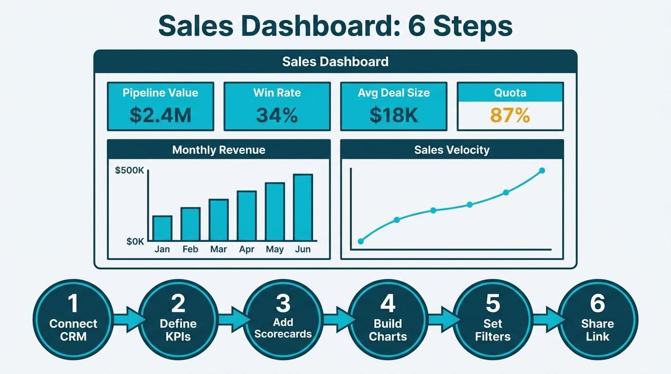
Building a Looker Studio sales dashboard takes under two hours. This practical walkthrough of how to build a sales dashboard in Looker Studio covers the end-to-end setup: connect your CRM as a data source, define the six KPIs that drive revenue decisions - pipeline value, win rate, sales velocity, average deal size, quota attainment, and churn - then arrange scorecards and time-series charts on a single canvas. Revenue teams across the US, UK, and Canada can follow the same steps and add a multi-currency layer to display pipeline figures in USD, GBP, or CAD within a single shared report. Share a view-only link or schedule a PDF email delivery without any additional software license.
Key Takeaways
Looker Studio is Google's free browser-based reporting tool; it is not the same product as Google Looker, the enterprise platform with LookML data modeling - the distinction matters at budget time.
Any CRM that exports to Google Sheets, BigQuery, or a supported connector can feed a Looker Studio sales dashboard with minimal setup.
Six KPIs cover the full revenue cycle: pipeline value, win rate, sales velocity, average deal size, quota attainment, and net revenue retention.
Sharing is link-based with Google account controls - no additional software license is required for viewers.
Healthcare and finance teams in the US, UK, and Canada must configure data-residency and access controls before sharing dashboards outside the organization.
What Is a Looker Studio Sales Dashboard?
A Looker Studio sales dashboard is a live, browser-rendered report that pulls CRM data into visual KPIs, refreshed on a schedule or in near-real time. Unlike a static spreadsheet export, it updates automatically when the underlying source changes, giving CIOs, finance directors, and data team leads a single shared view of revenue performance without manual data pulls each morning.
One terminology point that matters for budget conversations: Looker Studio (formerly Google Data Studio) is a free, browser-based reporting layer. It is a different product from Google Looker, the enterprise analytics platform that uses LookML for semantic data modeling and carries an enterprise license cost. The Looker Studio vs Power BI 2026 comparison covers how both tools fit into a mid-market analytics stack. For sales reporting at the mid-market level, Looker Studio is typically the faster and lower-cost starting point.
For organizations building a more complex multi-source dashboard with row-level security, working with a Certified Looker Studio consulting partner accelerates the architecture and data pipeline setup from the outset.
How Do You Connect a CRM Data Source to Looker Studio?
Looker Studio connects to CRM data through native connectors, partner connectors, or an intermediate layer such as Google Sheets or BigQuery. The right path depends on your CRM vendor, data volume, and refresh requirements.
For US, UK, and Canadian revenue teams building a shared pipeline view, the connection method also determines how cleanly you can layer in currency conversion later in the build. Google Sheets is the fastest option to validate the dashboard concept with real data, but BigQuery becomes the more maintainable path once the team adds currency fields, fiscal year offsets, or rep-level row security - all of which are easier to manage in SQL than in Sheets formula columns. Starting with the intermediate layer that matches your team's current technical capacity reduces rebuild time when the report inevitably grows beyond its initial scope.
Before opening Looker Studio, confirm three things with your CRM administrator: which export format is available (CSV schedule, API, or native connector), whether deal records include a currency code field, and whether rep and territory dimensions are consistent across historical records. Inconsistent owner names or currency labels in historical data are the most common cause of aggregation errors in a live sales pipeline dashboard, and they are faster to fix at the source than to compensate for with calculated fields inside Looker Studio.
Option A - Google Sheets (Fastest Setup)
If your CRM can schedule a daily export to Google Sheets, Looker Studio's built-in Google Sheets connector reads that file directly. This path works well for teams with fewer than 50,000 rows per sheet and a daily or weekly refresh cadence. A US SaaS finance team managing a mid-size inside sales operation might export pipeline data to Sheets each morning and connect it to Looker Studio in under 20 minutes.
Setup steps:
1. In your CRM, schedule a daily export of the Opportunities or Deals object to a Google Sheet in your organization's Google Workspace account.
2. Open Looker Studio (lookerstudio.google.com) and select Create > Report.
3. Choose the Google Sheets connector, select your spreadsheet and the relevant worksheet tab.
4. Click Add to Report. Looker Studio lists detected fields automatically.
5. Open Resource > Manage added data sources and rename fields for clarity - for example, rename "Amount" to "deal_value" and "CloseDate" to "close_date".
Option B - BigQuery (Production-Grade)
For datasets exceeding 50,000 rows, near-real-time refresh needs, or row-level access controls, route CRM data to BigQuery first, then connect Looker Studio using the native BigQuery connector. Per Google's Looker Studio documentation, the BigQuery connector supports scheduled query refreshes and row-level security through authorized views. This is the recommended path for US healthcare revenue cycle teams operating under HIPAA, where access to patient-adjacent financial records must be restricted to named individuals and logged for audit.
Setup steps:
1. Configure a CRM export pipeline to BigQuery - most enterprise CRMs support this natively or through an ETL connector.
2. In Looker Studio, select Create > Report > BigQuery.
3. Choose your project, dataset, and table or saved view.
4. Apply authorized views in BigQuery to enforce row-level access before Looker Studio renders any data.
Option C - Partner Connectors
Looker Studio's connector gallery lists hundreds of integrations built by third-party vendors. Before using a partner connector in a production environment, verify that it stores no data beyond a session cache. This is a compliance requirement for UK and EU organizations under GDPR, and for Canadian firms subject to PIPEDA, where third-party data processors must be documented and contractually bound before any personal or financial data flows through them.
What Are the 6 Core Sales KPIs for a Looker Studio Sales Dashboard?
The following six metrics span the full revenue cycle, from early-stage pipeline through post-sale retention. The table maps each KPI to its Looker Studio chart type, required data fields, and recommended refresh frequency.
| KPI | Chart Type | Required Fields | Refresh |
|---|---|---|---|
| Pipeline Value | Scorecard + Bar Chart | deal_value, stage, close_date | Daily |
| Win Rate | Scorecard | won_count, total_closed_count | Weekly |
| Sales Velocity | Time Series | deal_value, days_in_pipeline, win_rate | Weekly |
| Average Deal Size | Scorecard | deal_value (average aggregation) | Monthly |
| Quota Attainment | Scorecard + Comparison Metric | achieved_revenue, quota_target | Monthly |
| Net Revenue Retention | Time Series | churned_arr, expansion_arr, total_arr | Monthly |
Pipeline Value is the aggregate deal value of all open opportunities. Create a calculated field using `SUM(deal_value)` and apply a filter to exclude "Closed Lost" records. A UK fintech firm tracking multi-currency pipelines can add a currency dimension and an interactive filter control so each regional sales director views only their own territory without seeing competitors' deal details.
Win Rate is won deals divided by all closed deals in a period. Create a scorecard with the calculated field `COUNT_IF(stage = "Closed Won") / COUNT(deal_id)`, formatted as a percentage. Add a date range control above the scorecard so users can adjust the measurement window without editing the underlying report.
Sales Velocity measures the pace at which revenue moves through the pipeline. The composite formula is: `(number of qualified deals x average deal size x win rate) / average sales cycle in days`. Because Looker Studio does not perform row-level date arithmetic natively, calculate this metric upstream in a BigQuery view or Google Sheets formula column before import.
Average Deal Size is a single scorecard using the average aggregation on `deal_value`. Segment by industry, product line, or account tier using a dimension breakdown to help finance directors compare healthcare and commercial contract values side by side in the same view.
Quota Attainment compares achieved revenue to the period target. Add two fields - `SUM(won_deal_value)` and a static or CRM-sourced `quota_target` - and use the scorecard's built-in comparison metric to display the attainment percentage. For Canadian professional services organizations operating under PIPEDA, consider adding rep-level row-level security so each salesperson views only their own attainment row when the report link is shared broadly.
Net Revenue Retention is the metric most relevant to subscription healthcare and SaaS teams. A time-series chart with `churned_arr` displayed as a bar and `expansion_arr` as a line gives leadership a fast read on whether growth offsets attrition. Finance directors at US healthcare IT firms often pair this chart with a quarter-over-quarter comparison metric to track the impact of contract renewal initiatives on overall revenue health.
How Do You Build the Dashboard Layout in Looker Studio?
Layout determines whether a sales dashboard becomes part of the daily workflow or sits unused. A three-zone structure works reliably for sales and finance audiences at the mid-market level.
Zone 1 - Executive Summary (top row)
Place four scorecards across the top: Pipeline Value, Win Rate, Average Deal Size, and Quota Attainment. These answer the CIO's first question - "Are we on track?" - without any click required. Apply your organization's primary brand color to the scorecard background to signal this is the authoritative revenue view, not a draft or sandbox copy.
Zone 2 - Trend Analysis (middle section)
Below the scorecards, place a 12-month time-series chart for Sales Velocity alongside a stacked bar chart of the pipeline stage breakdown by rep or territory. Add a date range control and a dimension dropdown filter as interactive controls at the top of this zone. This lets a data team lead drill into any segment without waiting for a custom data pull from the analytics team.
Zone 3 - Detail Grid (bottom section)
A sortable data table showing individual deal records - deal name, owner, value, stage, and expected close date - gives finance directors the line-item visibility needed for board reporting and audit sign-off. Set a default filter to display only deals closing within the current quarter, and include a clear label so reviewers know how to expand the date range to see historical pipeline.
Branding and theme:
Looker Studio's Theme and Layout panel (File > Report settings > Theme) lets you apply a custom font, color palette, and report-level background. Consistent branding across zones reduces the cognitive load for stakeholders who review multiple reports each morning and need to identify the authoritative source quickly.
For teams benchmarking this layout against a more sophisticated financial reporting environment, the FP&A Dashboard in Power BI build guide covers comparable zone structure and finance-specific KPI definitions in the Microsoft stack.
What Looker Studio Sales Pipeline Dashboard Examples Work Best for RevOps and Sales-Ops Teams?
The three-zone executive layout above answers "are we on track?" The looker studio sales pipeline dashboard examples that drive the weekly RevOps and sales-ops operating cadence answer a different set of questions: where does the MQL handoff break down, how is ARR actually moving, and which reps are winning and losing at the deal level? Four visual patterns cover this layer without restructuring the underlying data model, provided your CRM export includes stage, owner, and deal-status fields at the row level rather than as pre-aggregated summaries.
MQL-to-SQL conversion funnel
A funnel chart with three stages - MQL, SAL (sales-accepted lead), SQL - gives the RevOps team a weekly read on where handoff friction lives. Build it by creating three calculated fields upstream in your CRM export: `count_mql`, `count_sal`, `count_sql`. In Looker Studio, use a bar chart with descending stage order and percentage labels enabled. Significant drops at either conversion step indicate a qualification criteria mismatch worth escalating before the weekly pipeline review. RevOps teams who surface this chart alongside the pipeline stage breakdown in Zone 2 consistently report faster diagnosis of top-of-funnel problems than teams relying on CRM summary reports alone.
ARR waterfall chart
An ARR waterfall shows how new bookings, expansions, contractions, and churn combine to move the annual recurring revenue line from one period to the next. Looker Studio does not natively render a waterfall chart, but you can replicate one using a stacked bar chart with positive and negative segments. Create four calculated fields: `new_arr`, `expansion_arr`, `contraction_arr` (as a negative value), and `churned_arr` (as a negative value). Stack them on a monthly time axis. Finance directors at subscription-model businesses use this chart in board presentations because it separates growth-driven movement from retention-driven movement at a glance - something a single NRR scorecard cannot do.
Win/loss by rep
A grouped bar chart with `owner_name` on the x-axis and two metric bars - `closed_won_count` and `closed_lost_count` - gives sales-ops managers the coaching signal they need without exporting to a spreadsheet. Add a calculated field for `win_rate_pct = closed_won_count / (closed_won_count + closed_lost_count)` and display it as a line on a secondary axis. Sort the chart by `win_rate_pct` ascending so the reps with the most improvement opportunity appear on the left. For UK and Canadian teams, apply BigQuery row-level security so each rep sees only their own bar when the shared link is distributed broadly - this satisfies both UK GDPR and PIPEDA individual-data requirements.
Multi-territory pipeline summary
A single scorecard row filtered by `region` dimension - US, UK, CA - lets a VP of Sales compare open pipeline across territories in one view. Pair it with the ARR waterfall filtered to the selected region so leadership can trace whether a territory's ARR movement is driven by new bookings or expansion. This pattern is particularly useful for RevOps teams that currently maintain three separate spreadsheet reports for each territory and want to consolidate without rebuilding their CRM data model.
How Do You Build a Multi-Currency Looker Studio Sales Dashboard for US, UK, and Canada Revenue Teams?
If you are following this sales dashboard build guide for a revenue team that operates across the US, UK, and Canada simultaneously, currency handling is the first architectural decision to get right. A single pipeline report that shows mixed USD, GBP, and CAD figures without a conversion layer gives finance directors an inflated or deflated headline number depending on the day's exchange rate. The six steps below configure a CRM-connected dashboard that handles multi-currency pipeline, conversion rate by region, and rep performance in a single report.
Step 1 - Add a currency field to your CRM export
Ensure your CRM export includes a `currency_code` field (ISO 4217 format: USD, GBP, CAD) alongside each deal's native `deal_value`. This field becomes the dimension you use to filter by territory or convert to a reporting currency. Without it, every aggregation in Looker Studio combines denominations silently.
Step 2 - Create a conversion rate lookup in the intermediate layer
For Google Sheets-backed pipelines, add a separate "Exchange Rates" tab with three rows: USD (1.0), GBP (current mid-market rate), CAD (current mid-market rate). Reference this tab in a calculated column - `deal_value_usd = deal_value / exchange_rate` - so all pipeline figures arrive in Looker Studio in a single reporting currency. For BigQuery-backed pipelines, join a daily-refreshed `exchange_rates` table via a scheduled query so the conversion logic sits outside Looker Studio and remains auditable.
Step 3 - Build a pipeline scorecard with a currency filter control
Add an interactive filter control to the top of the dashboard with `currency_code` as the dimension. A US sales director selects "USD" and sees pipeline in dollars; a UK director switches to "GBP" and sees the same underlying data in pounds - without creating three separate reports or duplicating the data source.
Step 4 - Add a conversion rate (win rate) breakdown by region
Create a calculated field: `win_rate_by_region = COUNT_IF(stage = "Closed Won") / COUNT(deal_id)`. Break it down by a `region` dimension (US, UK, CA) in a grouped bar chart. This single chart replaces three territory reports and lets a VP of Sales compare conversion rates across all three markets in one view without exporting to a spreadsheet.
Step 5 - Build a rep performance table
Add a data table with `owner_name` as the row dimension and five metric columns: `won_deal_value`, `win_rate`, `avg_deal_size`, `quota_attainment_pct`, and `open_pipeline_value`. Sort descending by `quota_attainment_pct` as the default so leadership sees the attainment gap immediately. Apply row-level access via BigQuery authorized views so each rep sees only their own row when the shared link is distributed broadly - this is a PIPEDA requirement for Canadian firms and a documented best practice under UK GDPR for any report that includes individual performance data.
Step 6 - Apply regional fiscal year offsets
UK and Canadian teams frequently operate on fiscal years that differ from the calendar year or from their US counterparts. Add a `fiscal_quarter` calculated field upstream in your BigQuery view or Sheets formula column and use it in Looker Studio instead of the native `QUARTER(close_date)` function. This prevents misaligned period comparisons in quarterly attainment charts when a US Q1 and a UK fiscal Q1 do not share the same calendar months.
How Do You Set Up Auto-Refresh and Scheduled Email Delivery for a Looker Studio Sales Dashboard?
An auto-refreshing sales pipeline dashboard removes the manual step of distributing updated screenshots each morning. Looker Studio handles refresh at the data source level, not the report level - configuring it correctly means your KPI scorecards reflect the latest CRM export without anyone opening a browser tab. The six steps below cover the full setup from data freshness to delivery.
Step 1 - Set the data source refresh interval
For Google Sheets sources, refresh is controlled by your CRM export schedule. If your CRM writes to a Google Sheet at 06:00 UTC, Looker Studio reads the current sheet state each time a user opens the report or when a scheduled email triggers a render - no additional setting is required in Looker Studio itself. For BigQuery sources, open Resource > Manage added data sources, select the connection, and set the Data freshness value. A 12-hour cache suits most daily pipeline reviews; set it to 0 to disable caching and query live on every load, which is appropriate for near-real-time tracking but increases BigQuery query costs.
Step 2 - Enable scheduled email delivery
In the report editor, select File > Schedule email delivery. Add recipient addresses, choose a frequency (daily, weekly, or monthly), and set the delivery time. The report renders as a PDF at the scheduled time using the current data state - if your CRM export runs at 06:00 UTC and the email fires at 07:00 UTC, recipients receive a PDF reflecting last night's closed deals and updated pipeline value.
Step 3 - Configure the email for executive recipients
Recipients do not need a Google account to receive the PDF. Set the subject line to match your internal naming convention - for example, "Pipeline Report - week ending [date]" - so the email threads predictably in inbox filters. Include the live report URL in the email body for recipients who want to explore the full looker studio sales dashboard beyond the static PDF snapshot.
Step 4 - Test the PDF render before distributing
Use Send now to trigger an immediate test delivery. Verify that scorecard values match your CRM's most recent export and that no filter state is locked to a specific date range that will become stale. A common layout issue: time-series charts wider than the default paper width are cropped in PDF output - resize them to fit within a 1200px canvas width before activating the schedule.
Step 5 - Add a staleness alert for the upstream source
Looker Studio does not natively alert you if an upstream source stops updating. For Google Sheets-backed dashboards, add a monitoring formula in a separate sheet tab that compares the maximum import timestamp against TODAY() and flags rows more than 24 hours stale. Connect this to a Google Sheets notification rule so the data team is alerted before executives notice a frozen pipeline figure in their morning PDF.
Step 6 - Review delivery recipients monthly
Scheduled email deliveries appear under File > Schedule email delivery > Manage schedules. Review recipient lists monthly - departed employees, forwarded inboxes, and stale distribution lists are a common source of pipeline data leakage in mid-market sales organizations. For UK and EU teams under GDPR, this review is a documented data hygiene step required for any report containing deal-level or contact-level fields.
How Do You Share a Looker Studio Dashboard With Stakeholders?
Looker Studio supports four sharing modes. The right choice depends on the sensitivity of the underlying data and the technical setup of your audience.
| Sharing Mode | Use Case | Compliance Note |
|---|---|---|
| Anyone with the link (view) | Non-sensitive internal summaries | Not suitable for deal-level or personal data |
| Named Google account access | Standard internal sharing | Minimum control for regulated environments |
| Google Workspace domain restriction | Internal-only dashboards | Appropriate for PIPEDA and internal HIPAA use |
| Scheduled email PDF | Executive briefings, board packs | No Google account required for recipients |
Named Google account access is the minimum acceptable control for US healthcare organizations where patient-adjacent financial records appear in the report. For UK and EU firms under GDPR, access to any personal data in the report must be restricted to specific named individuals with a documented legal basis, and that access log must be available for audit on request.
Scheduled email delivery sends a PDF snapshot on a daily or weekly schedule to a distribution list. This satisfies the "morning briefing" use case for board members or executive sponsors who do not hold Google accounts, without requiring them to navigate a web interface or authenticate through a new service.
Embedding the dashboard via iframe works for internal portals and intranet pages. For US healthcare teams, the embedding portal must sit behind your SSO provider to ensure that HIPAA access controls extend to the BI layer. For UK fintech and Canadian financial services firms, document the iframe integration in your third-party data processing register before the dashboard goes live.
For the full governance documentation required when sharing revenue data with external auditors or counterparties, the GDPR Compliant SaaS Financial Reporting checklist covers the steps UK and EU finance teams must complete before any external share.
When Should Sales Teams Use Looker Studio vs a More Advanced BI Platform?
Looker Studio is the right starting point when a team needs a fast, license-free reporting layer over an existing CRM and Google Workspace setup, with a working dashboard delivered in days rather than weeks. It becomes a limiting factor when the data model grows beyond what Google Sheets or simple BigQuery views can express - specifically when multiple fact tables need joining at query time, when semantic consistency across dozens of reports requires a governed data layer, or when row-level security must mirror a complex organizational hierarchy.
At that threshold, organizations tend to evaluate Google Looker's enterprise pricing and LookML governance capabilities to determine whether the benefits justify the license cost. A typical mid-market rollout - suppose a 100-seat North American sales team with CRM data already in BigQuery - can reach a production-ready Looker Studio sales dashboard in two to three weeks, covering data pipeline validation, KPI definition workshops, and stakeholder sign-off on the layout.
For US healthcare systems managing HIPAA-covered revenue cycle data, or Canadian wealth management firms subject to PIPEDA, the audit trail depth and access governance controls available in enterprise platforms often justify the additional investment beyond Looker Studio's baseline capabilities. The build-versus-buy decision for those regulated environments is worth scoping before committing to a reporting architecture.
---
Ready to build a sales dashboard that connects directly to your CRM and meets your compliance requirements? The team at Lets Viz delivers end-to-end dashboard builds through our Certified Looker Studio consulting practice, serving revenue, finance, and healthcare teams across the US, UK, and Canada.
---
About Lets Viz: Lets Viz is a data analytics consultancy serving US healthcare systems, UK fintech firms, Canadian manufacturers, and global SaaS companies since 2020. With a 5.0 Clutch rating and certified expertise across Google Looker Studio, Power BI, and Zoho Analytics, the team builds and maintains production dashboards for revenue, operations, and compliance reporting at the mid-market and enterprise level.