How to Visualize Patient Wait Times in Power BI
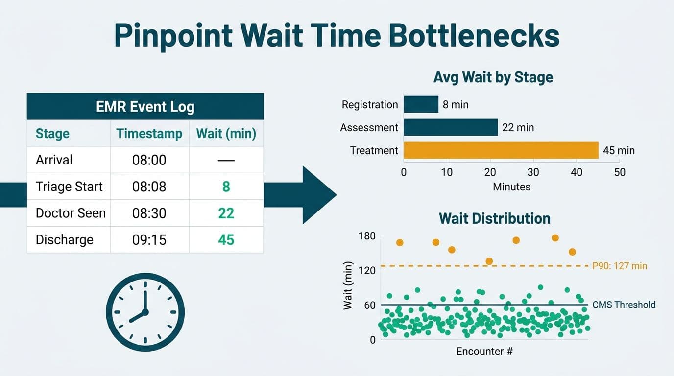
Visualizing patient wait times in Power BI means turning raw event-log timestamps from your EMR or HIS into actionable operational intelligence. The right combination of funnel charts, scatter plots, and percentile band visuals lets you pinpoint stage-by-stage bottlenecks, benchmark performance against NHS or CMS thresholds, and surface the outlier encounters that inflate your 90th-percentile figures without distorting your department average.
Key Takeaways
- Calculate wait times from paired event timestamps in your EMR - pre-aggregated fields often store missing values as zeros, which skews every downstream metric.
- Funnel charts reveal stage-by-stage throughput; scatter plots expose outlier encounters; percentile band visuals track compliance against NHS and CMS benchmark thresholds.
- NHS England's 4-hour ED target, CMS door-to-provider benchmarks, and Canada's CTAS urgency-level targets each require percentile-based DAX measures, not simple averages.
- HIPAA (US), GDPR (UK and EU), and PIPEDA (Canada) all require row-level security and data minimisation before a wait time dashboard reaches non-clinical staff.
- Our Managed Power BI for healthcare teams practice accelerates builds by handling data modelling, RLS, and compliance documentation in parallel.
What Data Sources Feed a Patient Wait Time Dashboard?
A wait time dashboard is only as accurate as the event timestamps it is built on. Most healthcare organisations already capture this data - it sits inside their EMR or HIS as discrete event records waiting to be joined, not manufactured.
For an ED build, the four timestamps that matter are: arrival time, triage completed time, first physician contact time, and disposition time (admit, discharge, or transfer). For outpatient clinics, the key events are: appointment time, check-in time, provider-seen time, and checkout time. Each pair generates a distinct wait segment that can be modelled and visualized independently.
Common US source systems include Epic ADT feeds, Cerner HL7 v2 event messages, Meditech Expanse logs, and Allscripts encounter exports. UK NHS trusts typically rely on System One and EMIS, which export structured encounter data via HL7 or API. Canadian provincial HIS systems vary by region but most expose HL7 or FHIR R4 interfaces that Power BI can consume directly through Power Query.
Critical quality check before modelling: confirm that missing timestamps are stored as null, not as the epoch zero value. This is a silent but common source of metric distortion. A home-services client support dashboard reported excellent first-response times - until we discovered the system stored 0 hrs, not null, for tickets never answered, so every ignored ticket counted as answered instantly. We rebuilt the metric on real response data and validated it row for row across 105,704 tickets with zero mismatches before going live. Healthcare wait time data carries the same risk: if a triage timestamp is absent and your source system writes the arrival time in its place, every affected patient shows a zero-minute triage wait, compressing your distribution and hiding the bottleneck entirely.
Before data reaches Power BI, strip the 18 PHI identifiers under HIPAA - name, date of birth, address, full MRN, and the remaining 14 - from the encounter fact table at extraction, replacing them with a hashed encounter ID. For UK NHS trusts under GDPR, the same applies under GDPR's data minimisation principle. For Canadian health authorities under PIPEDA, use only the minimum information necessary for the stated operational purpose.
How Do You Visualize Patient Wait Times in Power BI?
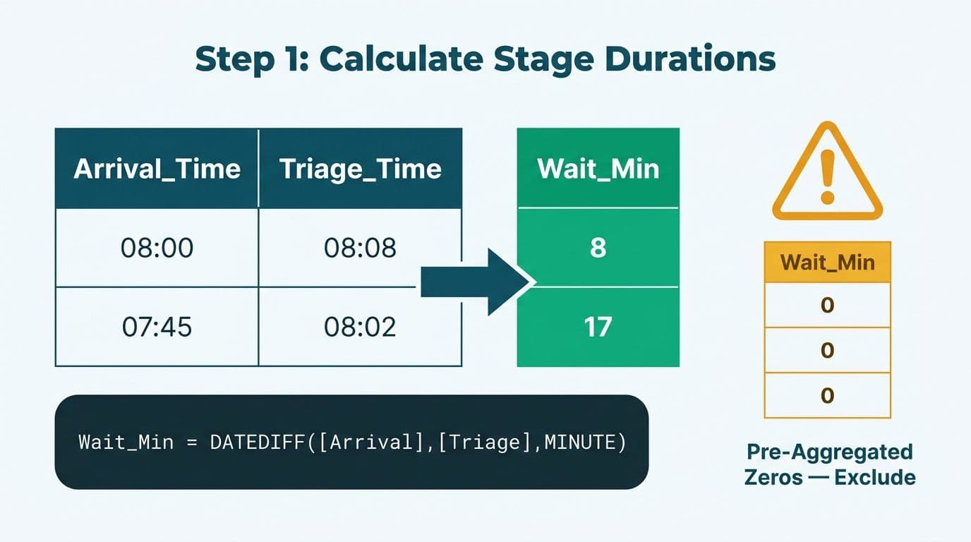
Visualizing patient wait times in Power BI follows five steps: connect to your event data, build a date-time dimension, write core DAX wait time measures, select the right chart type for each analytical question, and layer in benchmark reference lines.
The DAX step is where most first-time builds stall. The base measure for a single wait segment:
```dax
Wait_Triage_Mins =
DATEDIFF(
MIN(Fact_Encounters[ArrivalTime]),
MIN(Fact_Encounters[TriageTime]),
MINUTE
)
```
A mean across encounters is not useful for compliance reporting. Build percentile measures instead:
```dax
P90_Wait_Triage =
PERCENTILEX.INC(
Fact_Encounters,
[Wait_Triage_Mins],
0.9
)
```
Always publish P50, P75, P90, and P95 as separate measures. The P90 reveals the operational ceiling that averages obscure. A department with a 22-minute average triage wait and a 68-minute P90 has a throughput problem visible only at the tail - which is exactly where NHS, CMS, and CTAS compliance is evaluated.
For the semantic model, use a star schema: a central Fact_Encounters table joined to Dim_Date, Dim_Clinician, Dim_Department, and Dim_PatientType. Keep patient attributes in a separate Dim_Patient table under row-level security so aggregate dashboards for non-clinical managers never expose PHI.
What Chart Types Work Best for ED and Outpatient Wait Time Analysis?
Different analytical questions need different visuals. The table below maps each question to the recommended Power BI chart type.
| Analytical question | Chart type | Key measure |
|---|---|---|
| Where do patients wait longest? | Funnel chart | Mean wait per journey stage |
| Which encounters are outliers? | Scatter plot | Per-encounter wait vs. arrival hour |
| What share meets the benchmark? | 100% stacked bar | % within threshold by day or shift |
| How does P90 compare to target? | Line + reference line | P90 wait vs. threshold constant |
| When do peak waits occur? | Matrix heatmap | Average wait by hour and day-of-week |
Funnel charts show cumulative throughput across ED stages. Each band narrows as patients move through triage, physician contact, and disposition. A stage that barely narrows identifies the bottleneck. Use the built-in Funnel visual with each stage as a separate DAX measure so the chart responds correctly to date-range and department slicers.
Scatter plots answer the question averages cannot: which individual encounters are extreme outliers, and do they cluster at particular times or acuity levels? Plot one dot per encounter with wait time on the Y-axis and arrival hour on the X-axis, colour-coded by triage acuity or service line. For HIPAA-compliant views accessible to non-clinical managers, use a surrogate key as the encounter identifier - no field that could function as a quasi-identifier should be visible outside a clinical quality role.
Percentile band visuals overlay P50, P75, P90, and P95 trend lines on a single chart, revealing how your distribution shifts across days or weeks without requiring the viewer to interpret percentile arithmetic.
Matrix heatmaps answer the staffing question directly. A grid of average wait by hour-of-day and day-of-week immediately shows whether Saturday night shifts or Monday mornings are the recurring problem periods - intelligence daily averages cannot surface.
How Do You Set NHS, CMS, and CTAS Benchmark Lines in Power BI?
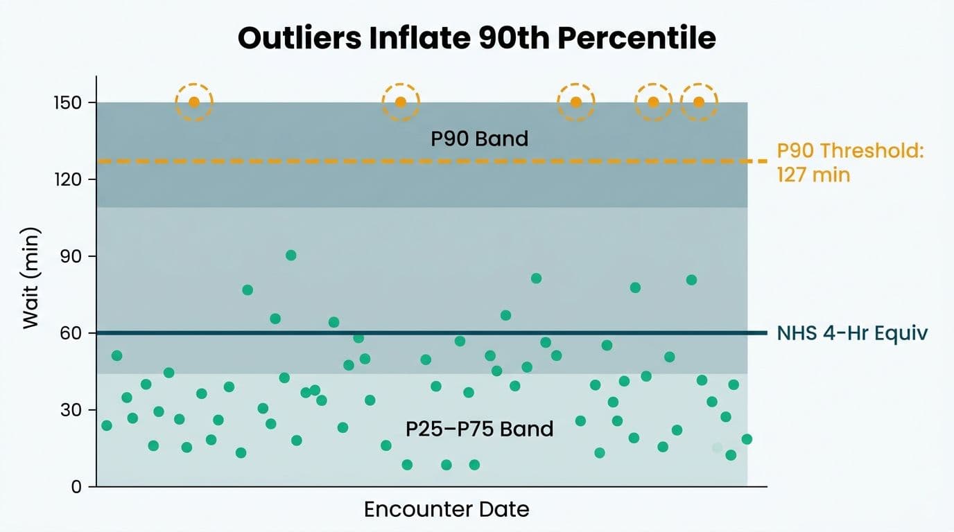
Benchmark reference lines anchor your visuals to the thresholds your organisation is externally accountable for - and they differ meaningfully by geography.
NHS England (UK): NHS England's 4-hour standard requires that 95% of ED patients be seen, treated, and either admitted or discharged within four hours of arrival (NHS England Emergency Care Data Set). In Power BI, create a constant measure NHS_Target = 0.95 and a compliance measure dividing encounters with door-to-disposition time of 240 minutes or fewer by total encounters. Plot both as lines and add an Analytics pane constant line at 0.95 coloured red so compliance gaps are visible at a glance.
US CMS: CMS publicly reports door-to-provider time and median ED throughput as part of the Hospital Compare quality programme. For STEMI patients, the door-to-balloon benchmark is 90 minutes. For general ED throughput, most US health systems benchmark their P90 against their own historical baseline, with JCAHO standards framing door-to-provider expectations. A slicer-driven reference line lets operational managers adjust the target as goals evolve without developer involvement.
Canada (CTAS): The Canadian Triage and Acuity Scale sets time-to-physician targets by urgency: Level 1 (resuscitation) immediate, Level 2 (emergent) within 15 minutes, Level 3 (urgent) within 30 minutes, Level 4 (less urgent) within 60 minutes. A Power BI report for a Canadian regional health authority should segment scatter plots and percentile bands by CTAS level with a per-segment reference line. Any patient-linked data here falls under PIPEDA. Hosting the workspace in Canada Central or Canada East keeps data within Canadian borders, satisfying PIPEDA's accountability obligation.
For GDPR-regulated UK and EU deployments, Power BI Premium workspaces include GDPR Article 28 data processor terms - confirm the workspace region is UK South or UK West before loading encounter-level data.
How Do You Ensure HIPAA Compliance in a Wait Time Dashboard?
HIPAA's Minimum Necessary standard means a wait time dashboard should not expose the 18 PHI identifiers unless the viewer has a documented clinical need. Power BI Row Level Security enforces this at the semantic model layer, before any data reaches the browser.
Configure at least two RLS roles:
- Clinical operations role: sees department-level aggregates, percentile bands, and benchmark compliance charts - no patient identifiers, no encounter drill-through.
- Clinical quality role: sees encounter-level scatter data with a surrogate encounter ID only - no direct patient identifiers unless the workspace is covered by a HIPAA BAA with Microsoft.
Deployment checklist:
1. Confirm the workspace is on a Premium or Fabric subscription with a signed HIPAA BAA (available through Microsoft's healthcare compliance programme).
2. Strip all 18 PHI identifiers from Fact_Encounters in Power Query before the model loads - substitute a hashed encounter ID.
3. Apply Microsoft Purview sensitivity labels to every dataset and report containing encounter data.
4. Map RLS roles to Azure Active Directory groups so access is controlled through HR provisioning, not manual sharing.
5. Review workspace access quarterly and revoke permissions for staff who have changed roles or left.
Our Power BI governance best practices checklist covers the full 12-point audit process for healthcare workspace governance.
What Does a Production-Ready Wait Time Dashboard Include?
A production-ready dashboard for an acute care hospital typically contains five pages, each serving a distinct audience.
| Dashboard page | Primary audience | Key content |
|---|---|---|
| Executive summary | C-suite and board | P90 wait, % within target, period-over-period trend |
| ED throughput funnel | Operations managers | Funnel by stage, refreshed daily from ADT feed |
| Outpatient wait analysis | Department heads | Scatter plot and percentile band by provider |
| Shift heatmap | Workforce planning | Average wait by hour and day-of-week |
| Compliance tracker | Clinical quality team | % within benchmark by week with outlier drill-through |
Refresh cadence: for operational dashboards driving staffing decisions, target 15-minute incremental refresh from the ADT or FHIR feed. For strategic dashboards reviewed weekly, daily refresh is sufficient and reduces Premium capacity cost.
Validation before go-live: cross-validate every calculated measure against your source system's own standard reports at the row level. Discrepancies almost always trace to timezone mismatches (UTC versus local) or the null-versus-zero problem described earlier. A metric that looks correct on average can be substantially wrong at the tails - which is where benchmark compliance lives and where errors carry clinical consequences.
For implementation cost ranges across different hospital sizes, see our Power BI healthcare reporting implementation cost guide. For teams deciding whether to build internally or engage a partner, our guide on how to evaluate a Power BI managed service provider covers the assessment criteria. Healthcare IT teams managing ITSM alongside clinical dashboards may also find our guide on ServiceNow ITSM for healthcare IT teams: HIPAA, GDPR, and PIPEDA a useful companion resource.
---
About Lets Viz: Lets Viz has delivered HIPAA, GDPR, and PIPEDA-compliant Power BI solutions for US hospitals, UK NHS trusts, and Canadian health authorities since 2020, with additional engagements across UK fintech, Canadian manufacturing, and global SaaS organisations. Our team holds a 5.0 Clutch rating and specialises in healthcare data models that pass clinical governance review on first submission.
If your ED or outpatient reporting is still running on spreadsheets or manual extracts, explore how Managed Power BI for healthcare teams can take your dashboard from concept to production in weeks.