How to Build Zoho CRM Reports and Dashboards for Sales
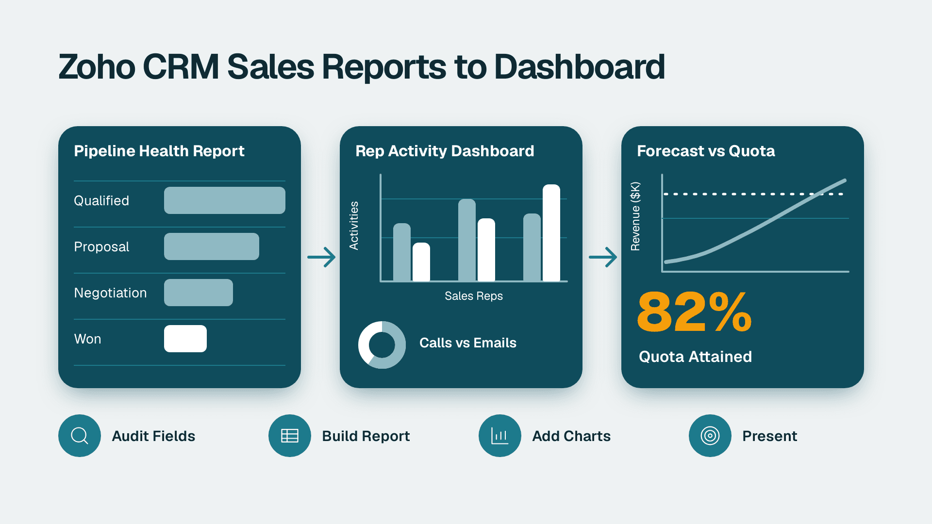
You will build three things inside Zoho CRM: a pipeline health report, a rep activity dashboard, and a forecast view you can present to leadership. Plan on three to four hours if your data is reasonably clean, plus extra time if you need to fix fields first. Everything below happens in the Zoho CRM web app.
What You'll Need
- A Zoho CRM account with an administrator or a custom profile that allows creating reports and dashboards. If Analytics is missing from your top navigation, your profile lacks permission.
- Deals, Activities and Users data that has been in the system long enough to chart (at least one full quarter is ideal).
- A Deals pipeline with stages already defined. Check under Setup > Customization > Modules and Fields > Deals > Layouts and Pipelines.
- Quotas for each rep for the period you want to forecast. You will enter them in Step 5.
- Your edition's limits in hand. Report, dashboard and component limits vary by Zoho CRM edition, so check Zoho's current pricing and help documentation (2026) before you plan a large dashboard.
- A screenshot tool. The annotation notes in each step tell you which frame to capture for your leadership deck.
Step 1: Audit the Fields Your Reports Depend On
Bad reports are almost always bad data. Before you build anything, check that the fields you will group by are actually filled in.
1. Open the Deals module and click the Filter icon on the left.
2. Under System Defined Filters or Fields, choose Stage, Amount, Closing Date, Deal Owner and Lead Source one at a time, and use the is empty condition.
3. Note how many records come back for each field.
What you should see: a short list of deals, ideally none, for Stage, Amount and Closing Date. If hundreds come back, fix them first with Mass Update (select records, then More > Mass Update) or make the field required in the layout.
A real example of why this matters: on one multi-region B2B engagement, the Country field was empty for all 19,643 contacts, and Mailing Country was filled on only 2.3%. Region was populated on 64%, so we built a fallback chain of Region first, then email domain. Any report grouped by Country on that data would have shown one giant blank bar. Do this audit and you avoid the same surprise on a slide.
Screenshot note: capture the filter panel showing an empty-field count. It makes a useful appendix slide on data quality.
Step 2: Build the Pipeline Health Report
This report answers one question: how much open value sits in each stage, and how old is it.
1. Click Analytics in the top navigation, then Reports in the left panel.
2. Click Create Report (top right) and choose the Deals module.
3. Choose Summary Report as the report type. Summary reports group rows and calculate totals, which is what you need here.
4. In the field selector, add Deal Name, Account Name, Amount, Stage, Closing Date, Deal Owner and Created Time.
5. Under Group By, select Stage. Under Aggregate, choose Sum of Amount and Count of Deal Name.
6. Under Filters, add the condition Stage is not Closed Won and Stage is not Closed Lost. This leaves open deals only.
7. Click Save and Run, name it Open Pipeline by Stage, and save it to a shared folder.
What you should see: one block per stage, each with a subtotal for deal count and amount, and a grand total at the bottom.
Add an aging column
Stale deals are the real health signal. Add a filter set for a second report called Stale Open Deals:
- Stage is not Closed Won or Closed Lost
- Modified Time is before 30 days ago (choose the relative date option, not a fixed date)
This returns deals nobody has touched in a month. Sort by Amount descending so the biggest risks sit at the top.
Screenshot note: annotate the grand total and the largest stale deal. A sales manager can say in one sentence what the number is and what you are doing about it.
Step 3: Turn the Report into Charts
Executives read charts faster than tables, so convert the summary into visuals.
1. Open Open Pipeline by Stage and click Chart above the results (or Add Chart, depending on your screen).
2. Choose Funnel for the stage view. Set the X-axis to Stage and the Y-axis to Sum of Amount.
3. Click Save Chart.
4. For the stale deals report, choose Bar and set the X-axis to Deal Owner and the Y-axis to Count of Deal Name.
What you should see: a funnel narrowing from early stages to late ones. If the shape is a column that widens at the bottom, your stage order is wrong or deals are being skipped. Check the pipeline definition from the prerequisites.
Keep stage names short. Long names get truncated in the chart labels and make a screenshot unreadable.
Step 4: Build the Rep Activity Dashboard
Activity reports show whether pipeline is moving because of effort or luck. You need data from three modules: Calls, Meetings and Tasks.
Create the activity reports
1. In Analytics > Reports, click Create Report and choose Calls.
2. Choose Summary Report, group by Call Owner, and aggregate Count of Subject.
3. Add the filter Call Start Time is This Week (relative date).
4. Save as Calls This Week by Rep.
5. Repeat with Meetings, grouping by Host, with the filter From is This Week. Save as Meetings This Week by Rep.
6. Repeat with Tasks, grouping by Task Owner, with the filter Status is Completed and Due Date is This Week. Save as Tasks Completed This Week.
Assemble the dashboard
1. Click Analytics > Dashboards, then Create Dashboard.
2. Name it Sales Team Activity, choose the folder, and set who can see it under Access. Start with Only me, then widen access after you check it.
3. Click Add Component, pick Report as the source, select Calls This Week by Rep, and choose Bar as the display.
4. Repeat for Meetings and Tasks, using Stacked Column or Bar consistently.
5. Add a KPI component using Open Pipeline by Stage with Sum of Amount as the metric, so pipeline value sits beside effort.
6. Drag components to the grid. Put the KPI top left, since it is the first thing a viewer reads.
7. Click Save.
What you should see: a grid with one KPI tile and three bar charts, each showing every rep. If a rep is missing, they have no records in the period or sit under a role your own profile cannot view. Zoho dashboards respect data-sharing rules, so you only see what your role permits.
Screenshot note: annotate the rep with the lowest meeting count and draw a box around the pipeline KPI. Presenting activity next to pipeline value keeps the conversation about outcomes, not about policing activity.
Step 5: Set Up Forecasts and Quotas
Zoho CRM has a dedicated forecasting feature, separate from the report builder. It compares quota against open, committed and closed amounts.
1. Click Setup (gear icon) and open Forecasts under Customization or the module settings. Availability depends on your edition, so confirm in Zoho's documentation (2026) if you do not see it.
2. Choose Forecast Based On: Deals is the usual choice, using Amount as the value.
3. Choose the Forecast Period (monthly or quarterly) and the fiscal year start.
4. Map Forecast Categories to stages: for example, early stages to Pipeline, later stages to Commit or Best Case, and Closed Won to Closed. Review every stage so none is left unmapped.
5. Enter each rep's Quota for the period, and use Save.
6. Open the Forecasts tab in the top navigation and select the current period.
What you should see: each rep as a row, with quota, closed amount, commit, best case and pipeline columns. Roll-ups appear at the manager level if your Roles hierarchy is set correctly.
Chart the forecast
On the forecast page, use the chart option to display quota against closed and committed amounts. For the dashboard, you can also build a report on Deals grouped by Closing Date (by month) and Stage, then add it as a Stacked Column component titled Expected Close by Month.
Screenshot note: annotate the gap between Commit and Quota with an arrow. That gap is what leadership will ask about.
Step 6: Prepare the Dashboard for a Leadership Presentation
A dashboard that works for you may not work in a boardroom.
1. Open Sales Team Activity and click Edit.
2. Give every component a plain-English title that states the point, such as Open pipeline value by stage, not Report 4.
3. Set a consistent Date Range filter at the dashboard level where available, so every chart covers the same period.
4. Open Dashboard Settings and set Refresh options if available. Note the timestamp on the dashboard and mention it when you present.
5. Use Share to set access for your leadership team. Choose Everyone in role or specific users, and decide between view-only and edit.
6. Under Schedule or Email options, if your edition offers them, send a snapshot weekly to the same group.
7. For the meeting, screenshot each section and paste it into slides with the annotations from earlier steps. Present live data only if you have tested the login on the meeting room machine.
What you should see: a clean dashboard with readable titles and no empty components. Run through it once as a different user to confirm they see what you expect.
When Zoho CRM's built-in views are not enough
If you need to blend CRM data with finance, marketing or support data, native reports hit a limit. Teams often move to a separate analytics layer. Our guide to migrating from Excel to Zoho Analytics covers one route, and Top 7 Zoho Apps Businesses Underuse shows what else sits in the Zoho suite. You can browse dashboard examples for layout ideas, and if your team reports across several systems, managed Power BI services are one option for a combined view. For a sense of how finance leaders think about reporting cadence, see real-time financial reporting best practices for FP&A.
Common Mistakes
- Grouping by a field that is mostly empty. The chart shows one large blank bar. Run the empty-field filter from Step 1 and backfill with Mass Update or a required field before you build.
- Including closed deals in the pipeline report. Totals look inflated. Add the two Stage is not conditions in Step 2 and re-run.
- Leaving stages unmapped in forecast categories. Deals in unmapped stages vanish from the forecast. Open the category mapping in Step 5 and assign every stage.
- Using fixed dates in filters. The report is right on the day you build it and wrong next week. Use relative values such as This Week, This Quarter or Last 30 Days.
- Sharing a dashboard before checking permissions. Viewers see data according to their role, so numbers differ between people. Open it as a test user from each audience first.
Troubleshooting
- A rep shows zero activity but you know they were busy. Their calls or meetings were logged outside Zoho, or logged against a different owner field (for example, the Host differs from the record owner). Check the owner field used for grouping in the report.
- The forecast page is empty or shows zeros. Either quotas were not saved for the selected period, or the period selected falls outside your fiscal year setup. Recheck the Forecast Period and quota entries in Step 5.
- A dashboard component says no data, or shows an error. The underlying report was edited, moved to a folder you cannot access, or deleted. Open the component, reselect the source report, and save.
If you want a second pair of eyes on your pipeline stages, forecast categories or role hierarchy before presenting, talk to the team behind Zoho CRM consulting.
---
About Lets Viz: Lets Viz has delivered analytics, CRM and reporting projects since 2020 for healthcare, finance, logistics, SaaS and professional services teams. We hold a 5.0 rating on Clutch. Our practitioners work hands-on with Zoho, so the steps in this guide come from real configuration work, not vendor brochures.