Data Visualization Examples in Public Health: WHO, CDC and NHS
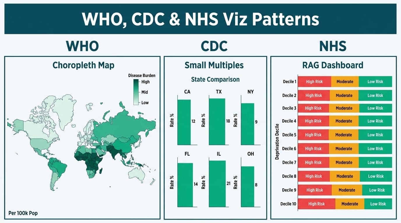
Data visualization examples in public health include WHO's interactive choropleth maps for disease burden, CDC's small-multiples grids for state-level comparison, and NHS England's RAG dashboards stratified by deprivation decile. These agencies share four core patterns: denominator-normalized rates, visible confidence intervals, plain-language narrative summaries, and layered audience access. Hospital analytics teams can replicate each of these patterns in HIPAA-compliant Power BI environments.
Key Takeaways
WHO uses interactive choropleth maps with downloadable open datasets, making confidence intervals and denominator context visible at every level.
CDC separates data narratives, interactive charts, and raw downloads into three distinct layers, a practice that reduces misinterpretation and maps directly to hospital reporting architecture.
NHS England embeds access-equity metrics alongside clinical KPIs, a design pattern directly applicable to US value-based care and CMS equity reporting.
Health Canada labels every chart with data provenance (source, methodology, reporting lag), which also supports HIPAA and PIPEDA audit readiness.
Power BI Q&A and natural language query features let hospital executives interrogate dashboards in plain English, eliminating the analyst bottleneck for routine queries.
What Makes Public Health Data Visualization Different From Enterprise Reporting?
Public health dashboards must communicate risk and uncertainty to audiences ranging from epidemiologists to elected officials to journalists. Unlike enterprise reporting that polishes complexity into clean KPI tiles, effective public health charts expose confidence intervals, data lag, and denominator counts.
Hospital analytics teams face the same translation challenge: the CFO wants a trend line, the clinical team needs a patient-level drill-down, and the board wants a headline number. The agencies below solve this with layered dashboards: a summary view, a regional breakdown, and a raw export, all from one interface. Teams building this architecture with Managed Power BI for healthcare teams can implement it using bookmarks, page navigation, and drill-through pages within a single report, with row-level security enforcing HIPAA-compliant access at every layer.
How Does WHO Visualize Global Epidemiological and Population-Health Data?
The WHO Global Health Observatory uses choropleth maps as its primary layer, encoding disease burden indicators -- mortality rates, disability-adjusted life years (DALYs), vaccination coverage -- using country-level color gradients. Users switch between dozens of indicators without leaving the interface. All underlying data is downloadable in CSV or JSON, enabling any downstream team to rebuild the same visualization in their own BI environment.
Three design choices define the WHO approach:
Visible confidence intervals. Every metric shows uncertainty bands alongside point estimates, signaling methodological honesty and preventing over-confident policy decisions.
Denominator context always on screen. Rates appear as "per 100,000 population," preventing raw-count misreads that make a large city look far worse than a rural community because of population size alone.
Time-series and map in the same view. Geographic and temporal data appear together so users see both where a trend is occurring and how it has evolved.
For a US hospital system, the denominator principle translates directly: always show "30-day readmissions per 1,000 discharges" rather than total readmission counts, and always display the date range. Our Hospital Patient Flow and Bed Capacity Dashboard in Power BI applies this with rolling 12-month denominators on every metric tile.
How Do CDC and US Health Agencies Approach Health Data Visualization?
The CDC's Data Modernization Initiative invested $1.7 billion between 2021 and 2025 to standardize public health data infrastructure across US jurisdictions — with interoperability requirements from that initiative now embedded in federal health IT certification standards as of 2026, directly enabling the open-data and layered-dashboard patterns hospitals are now adopting (CDC, 2026). CDC's public dashboards -- covering infectious disease, chronic conditions, and environmental health -- established a clear separation between data narratives (plain-English written summaries), interactive charts, and raw data downloads. A reader who cannot interpret a chart reads the narrative; a researcher needing granularity downloads the file. One interface serves three audience types without three separate products.
For US hospitals under HIPAA, the architectural lesson is direct: separate what-the-data-says (narrative) from the data itself (charts and tables). When a non-technical executive reads the narrative and the chart corroborates it, trust in the analytics function rises and meeting time spent re-explaining dashboards falls.
CDC also popularized small multiples -- a grid of identical charts, one per state or region -- for spotting geographic variation at a glance. A health system operating multiple US facilities can adopt the same layout in Power BI using a matrix visual or a page-per-facility bookmark set, giving each site leadership a consistent view of their own performance against a system-wide benchmark. For teams adding AI-generated narrative summaries on top of these charts, AI Workflow Automation for Healthcare Operations (2026) covers the integration pathway within a healthcare compliance framework.
What Design Choices Do NHS England and Health Canada Make in Public Health Dashboards?
NHS England publishes Integrated Care Board (ICB) dashboards that explicitly include access-equity metrics -- waiting times broken down by ethnicity, deprivation decile, and geography -- alongside standard clinical KPIs. This reflects the NHS's statutory equality duty under UK law, but the lesson transfers directly to US health systems where stratifying outcomes by social determinants of health (SDOH) is increasingly required by CMS and commercial value-based care contracts.
NHS dashboards apply a RAG (red-amber-green) traffic-light system for at-a-glance status. NHS England's 2026 ICB performance reporting guidance requires each published RAG threshold to be accompanied by a documented clinical rationale and an annual review date -- a governance discipline that prevents silent decay, where a threshold calibrated in one care environment becomes noise as population mix and protocols shift. US hospital quality teams replicating this pattern in Power BI can implement the equivalent by storing threshold values and review dates in a reference table rather than hardcoding them in DAX, making annual recalibration a data update rather than a model rebuild. UK organizations publishing population-health data must also document a lawful basis for processing personal data under GDPR, even when working with aggregate statistics derived from patient records.
Health Canada structures population-health publications around provincial data-sharing agreements governed by PIPEDA (Canada's Personal Information Protection and Electronic Documents Act). Its standout design choice is data provenance labeling: every chart carries a footnote showing the data source, collection methodology, and reporting lag. A Canadian hospital analytics team adopting this model, or a US team building cross-state reporting under HIPAA, can surface the same provenance metadata automatically through Power BI's data lineage view in Microsoft Purview, supporting both breach response and minimum-necessary determinations.
What Tools Do Public Health Agencies Use for Data Visualization in Public Health?
| Agency | Primary BI Approach | Delivery Format | Standout Design Choice |
|---|---|---|---|
| WHO (Global) | Custom web app with statistical backends | Browser-embedded interactive | Open downloadable datasets at every indicator level |
| CDC (US) | Third-party BI + custom JavaScript | Public web dashboard | Narrative-chart-download three-layer separation |
| NHS England (UK) | Power BI Embedded + Azure | ICB-level published reports | RAG traffic lights and equity metric stratification |
| Health Canada (Canada) | Commercial analytics platform + Excel exports | PDF + interactive web | Data provenance label on every published chart |
NHS England's use of Power BI Embedded is the most immediately applicable model for US hospital IT departments. Reports built in Power BI Desktop can be embedded in intranet portals or patient-facing web properties without requiring each viewer to hold a per-user Power BI license, a material cost factor for large health systems with hundreds of passive report consumers.
How Should Hospital Analytics Teams Apply These Data Visualization Examples in Public Health?
The gap between public health agency dashboards and hospital internal reporting is primarily one of audience design. Public health agencies invest heavily in making data readable by non-experts. Most hospital analytics teams optimize for the analyst who built the dashboard, embedding technical filter logic and cryptic field names that confuse executives and clinical staff alike.
Four practices drawn directly from the agency playbook:
1. Layered access. Follow the WHO model: a summary view (one headline metric per domain), a trend view (12-month rolling), and a detail view (patient-level or site-level drill-through). Users self-select depth. Board members stop at the summary; quality managers go to the detail.
2. Plain-language narrative summaries. Follow CDC practice: each report page should include two or three plain-English sentences interpreting the key finding. In Power BI this can be a static text box, a smart narrative visual that auto-updates with data, or a Copilot-generated summary on Microsoft Fabric.
3. Equity stratification. Follow the NHS England model and add at least one SDOH dimension -- zip code poverty index, primary language, or payer type -- to every outcomes report, positioning your team for evolving CMS requirements.
4. Provenance metadata. Follow Health Canada's discipline. Every report page should display data source, refresh schedule, and coverage period. Under Power BI natural language query healthcare compliance requirements, this metadata supports HIPAA audit readiness: you can demonstrate which data a report surfaces, when it refreshed, and who can access it.
Setting Up Power BI Q&A for Hospital Executives
Enabling natural language query in Power BI for non-technical users is one of the highest-leverage configuration changes a hospital analytics team can make. Executives type "show readmission rate by service line for Q3 2026" and receive an instant chart without opening an analytics ticket.
The first step is Power BI Q&A synonym configuration: map clinical abbreviations to full phrases in the semantic model's Q&A setup. Without synonyms, Q&A will not resolve "ED" to "Emergency Department" or "LOS" to "Length of Stay" and returns blank results. To add synonyms to Power BI Q&A: open Power BI Desktop, navigate to Modeling then Q&A Setup, select "Add synonyms" for each table and field, and enter the abbreviations your clinical and executive users actually use. Published synonyms apply globally to every Q&A session against that semantic model.
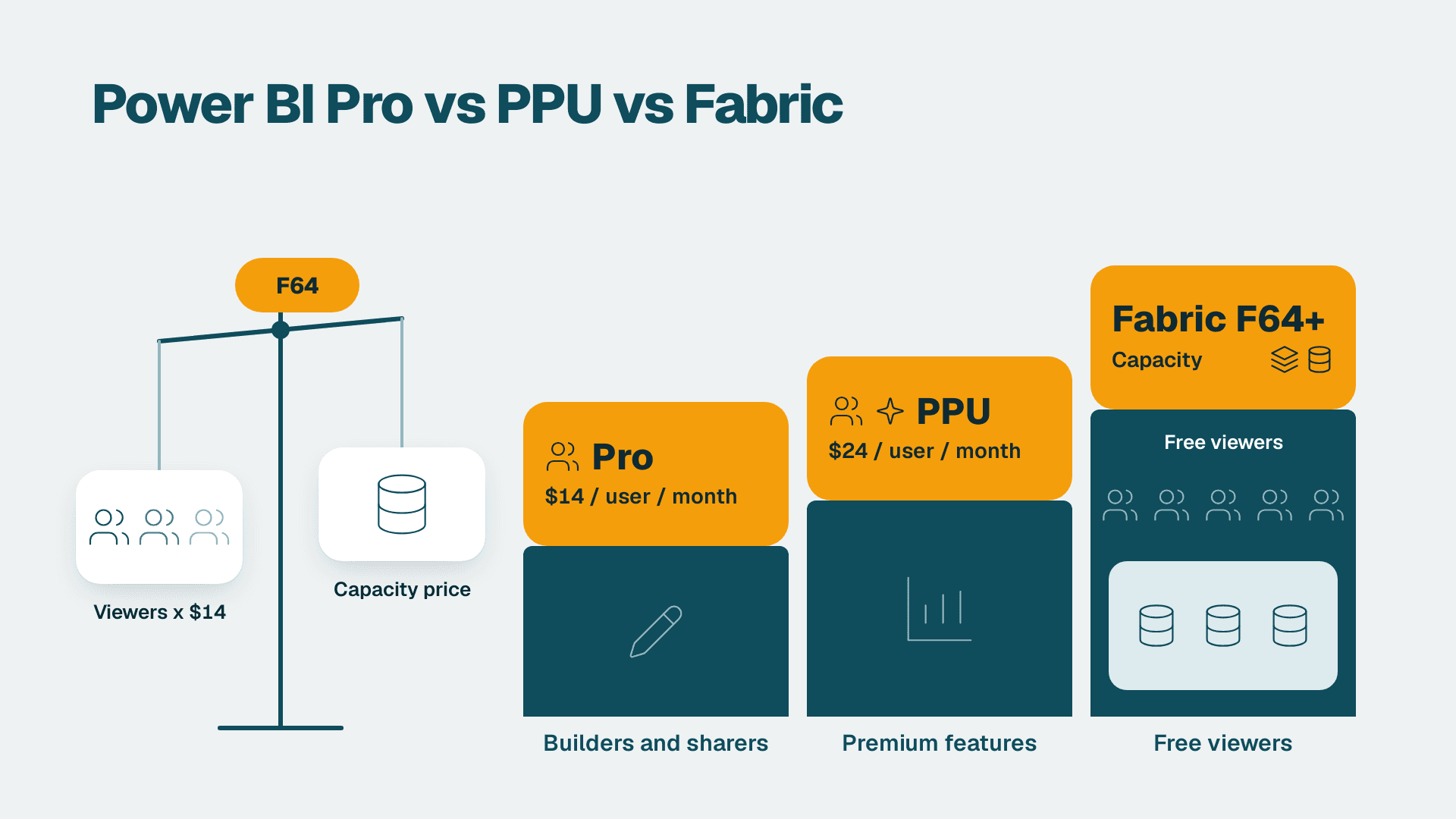
Understanding the Power BI Q&A versus Copilot natural language difference guides investment decisions. Q&A queries your semantic model in real time and returns an interactive visual. Copilot generates narrative summaries and suggests new visuals conversationally but requires Microsoft Fabric capacity, typically F64 SKU or higher. For most hospital teams starting a Power BI Q&A executive self-service reporting setup, Q&A is the right entry point: it works with existing Power BI Pro or Premium Per User licences and answers specific questions immediately. A full walkthrough is available in How to Use Power BI Q&A: Natural Language Query Guide.
What If Your Hospital Is Still Running Legacy Cognos Analytics?
Many US health systems, Canadian provincial health authorities, and NHS trust finance teams still run Cognos Analytics for financial and operational reporting. If your organization is evaluating whether to replace Cognos planning analytics with Power BI to enable the kind of interactive, embedded dashboards that CDC and NHS England deploy, the critical implementation question is validation.
To test a Cognos to Power BI migration in a healthcare context: run the same KPI set in both systems simultaneously for at least two complete billing cycles. This parallel-run period catches denominator differences, date-filter logic mismatches, and rounding discrepancies that unit tests alone will not surface. A common mismatch is fiscal-year date boundaries: Cognos defaults to calendar year while Power BI requires an explicit date table relationship, causing Q1 readmission counts to differ by 3-8% until the table is corrected. US health systems handling HIPAA-covered claims data and Canadian hospitals governed by PIPEDA should both conduct a formal row-level security review before go-live: the two platforms model access control very differently, and a gap here creates compliance risk and patient-privacy exposure. The technical security mapping is detailed in Cognos Security Model vs Power BI RLS: Side-by-Side Mapping, and the full validation sequence is in the Cognos to Power BI Migration Checklist: 7-Phase Guide.
Power BI Q&A executive self-service is often the milestone that signals a migration is culturally complete: when C-suite leaders query dashboards in plain English without analyst assistance, the shift from mediated to self-service reporting has taken hold.
Bring public health-grade visualization discipline to your hospital's reporting stack with Managed Power BI for healthcare teams.
---
Written by Lets Viz Editorial, Microsoft-certified Power BI analysts and leads of Lets Viz's healthcare practice, designing analytics systems for HIPAA-covered US health systems and NHS-affiliated UK trusts.
About Lets Viz: Lets Viz is a data analytics consultancy serving US healthcare, UK fintech, Canadian manufacturing, and global SaaS organizations since 2020. With a 5.0 rating on Clutch, our team designs and manages Power BI environments built for regulated industries -- from HIPAA-covered hospital reporting to GDPR-compliant UK financial dashboards and PIPEDA-governed Canadian health data products.