8 Healthcare Data Visualization Examples: Annotated Gallery
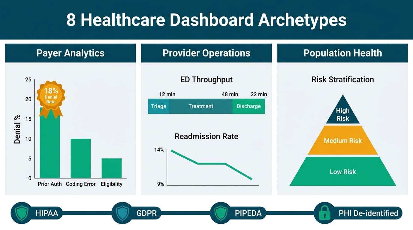
Healthcare data visualization examples span three domains - payer analytics, provider operations, and population health - and must satisfy different compliance rules depending on where the audience sits. A well-designed healthcare dashboard de-identifies or role-gates protected health information (PHI), presents actionable signals rather than raw records, and is built so that the same underlying data model can satisfy HIPAA, GDPR, and PIPEDA audit requirements simultaneously.
Key Takeaways
Eight archetypes cover claims denial, risk stratification, ED throughput, readmissions, clinical quality, chronic disease management, SDOH, and vaccination coverage
HIPAA, GDPR, and PIPEDA each impose distinct constraints that must be embedded in the dashboard layer - not patched in after build
Row-level security (RLS) and role-based access control (RBAC) are the two universal technical safeguards across all three regulatory regimes
The BI tool you select affects compliance: column-level security, certified data sources, and audit log depth differ substantially between platforms
Scoping build cost before vendor selection prevents compliance rework; the Instant project cost calculator baselines scope in under five minutes
Lets Viz provides Power BI consulting for mid-market and enterprise teams across the US, UK, and Canada -- from initial model design to ongoing optimisation.
What Makes a Healthcare Dashboard Compliant by Design?
Compliance in healthcare visualization is not a feature you add at the end - it is an architectural constraint that shapes every design decision from data model to access layer. A dashboard is compliant by design when access controls, data granularity, and audit logging are defined in the semantic layer, not in individual report settings that a report editor can override.
De-identification at the source layer. Data surfaced to the visualization layer should carry only the minimum attributes needed for the analysis. In the US, HIPAA's Safe Harbor method requires removing 18 specific PHI identifiers. UK GDPR and PIPEDA follow analogous data-minimization logic, though neither prescribes a fixed attribute list.
Role-based access control enforced at the data model. A claims analyst sees aggregate denial rates. A care coordinator sees individual patient flags. An executive sees trend lines only. These tiers must be enforced in the BI semantic model - not by building separate reports per role, which creates version-drift risk.
Audit logging that captures row-level access. Knowing who viewed which data and when is required under HIPAA Security Rule 164.312(b), GDPR Article 5(2), and PIPEDA Principle 9. Most enterprise BI platforms log report-level access; fewer log row-level drill-downs. Verify granularity before committing to a vendor.
For a full governance framework applicable to regulated environments, the Power BI Governance Best Practices: 12-Point Checklist extends directly to healthcare use cases across payer, provider, and population health contexts.
Eight Healthcare Data Visualization Examples, Annotated
The eight archetypes below are organized by domain: two payer dashboards, three provider dashboards, and three population health dashboards. Each entry covers what the dashboard shows, the core design rationale, and specific compliance callouts for HIPAA (US), GDPR (UK and EU), and PIPEDA (Canada).
1. Claims Denial Analysis Dashboard (Payer)
What it shows: Denial rate by reason code (CO-4, CO-97, PR-96), appeal win rate, rolling 12-month trend, and denial volume by service line.
Design rationale: A waterfall chart traces the conversion from submitted claims to paid claims, making the revenue impact of each denial category immediately legible. A heat map plotting denial reason against service line surfaces the concentrated set of codes that drive most write-offs (an illustrative 20/80 Pareto pattern, not a measured figure).
HIPAA: Aggregate denial data does not contain PHI, but the underlying claim records do. The ETL pipeline must execute under a Business Associate Agreement (BAA) with any cloud vendor. Individual claim drill-downs require role-gating and audit logging.
GDPR: UK insurers should establish legitimate interest as the lawful basis for processing aggregate claims data. Member-level data must be pseudonymized before reaching the visualization layer.
PIPEDA: Canadian insurers must respond to individual access requests even when the dashboard displays only aggregates. Retain audit logs of source data queries to satisfy Principle 9.
2. Member Risk Stratification Dashboard (Payer)
What it shows: Distribution of members across risk tiers (low, medium, high, catastrophic), predicted high-cost utilizers for the next 12 months, and care gap flags by chronic condition cohort.
Design rationale: A scatter plot mapping predicted risk score against actual prior-year cost reveals mis-tiered members - those with high cost but low predicted risk are candidates for model recalibration. Drill-down navigates to anonymized cohort profiles, not individual records.
HIPAA: Individual-level risk scores are PHI. The default view must show only population-level distributions. Authorized care coordinators access individual flags through a separately permissioned page, with every access event logged.
GDPR: Article 22 of UK GDPR restricts fully automated decision-making that produces significant effects on individuals. Risk stratification models that determine care routing or coverage assignment require human review checkpoints or explicit consent documentation - one of the most frequently overlooked GDPR constraints in payer analytics.
PIPEDA: Meaningful consent is required when sensitive health data is used to profile individuals. Document the model's purpose and data categories, and make that documentation available on request.
3. Emergency Department Throughput Dashboard (Provider)
What it shows: Door-to-triage time, door-to-physician time, left-without-being-seen (LWBS) rate, hourly arrival volume, boarding hours, and bed occupancy by zone.
Design rationale: Control charts with calculated limits distinguish normal variation from signals requiring intervention - essential where managers otherwise react to noise. A real-time Gantt view uses RAG color coding rather than patient names on shared screens, satisfying clinical utility and data-minimization requirements simultaneously.
HIPAA: The real-time bed board visible on shared ED screens should show bed status and acuity only - no patient name, date of birth, or diagnosis visible to passersby. Patient-identified views are restricted to authenticated clinical workstations. US hospitals using a cloud BI platform must confirm the vendor has signed a BAA.
GDPR: UK NHS trusts face the same shared-screen risk. UK ICO guidance on data minimization supports showing patient initials or a token identifier rather than full names on operational displays accessible to non-clinical staff.
PIPEDA: Provincial hospital authorities in Canada (Ontario PHIPA, BC HIA) align with PIPEDA's minimization principle. Aggregate throughput metrics exported to regional dashboards are low risk; individual-patient operational views require authentication controls.
4. Hospital Readmission Monitoring Dashboard (Provider)
What it shows: 30-day all-cause readmission rate, condition-specific rates for CHF, COPD, pneumonia, and knee/hip replacement, comparison against CMS national benchmarks, and a case manager drill-down for intervention prioritization.
Design rationale: Small multiples - one panel per condition - allow a quality officer to compare performance across the hospital's full CMS HRRP exposure in a single view. The case manager layer surfaces high-risk patients scoped to each coordinator's attributed panel only.
HIPAA: CMS HRRP reporting involves ePHI flowing to a federal program. All data handling must occur under a BAA with any cloud service in the pipeline. The case manager drill-down must log every access event.
GDPR: UK NHS providers track readmission metrics under the SHMI (Summary Hospital-Level Mortality Indicator) framework. Individual patient records used for risk flagging require a Data Sharing Agreement and DPA registration, with purpose limitation enforced.
PIPEDA: CIHI (Canadian Institute for Health Information) publishes pan-Canadian readmission benchmarks. Hospitals contributing data to CIHI feeds must have patient consent documentation or rely on statutory authority granted by provincial health information acts.
5. Clinical Quality Metrics Dashboard (Provider)
What it shows: HEDIS measure performance for colorectal cancer screening, diabetes HbA1c control, and blood pressure management; Star Rating component scores; and a care gap list for outreach prioritization.
Design rationale: Gauge charts anchored to the NCQA national average communicate Star Rating trajectory at a glance. A ranked bar chart of measure performance identifies which gaps are closest to closure - a prioritization signal for limited outreach resources. The care gap list is gated behind authentication and scoped to the coordinator's attributed panel.
HIPAA: HEDIS submission requires NCQA-certified data extraction software and strict chain-of-custody documentation. PHI transmitted to health plan contractors must be governed by BAAs at each step.
GDPR: UK equivalents include QOF (Quality and Outcomes Framework) measures for GP practices. Patient-level data feeding QOF dashboards is processed under NHS Digital Data Access agreements, with re-identification risk assessments required.
PIPEDA: Canadian accreditation bodies such as Accreditation Canada use analogous quality measures. Data shared across organizational boundaries for quality reporting should specify retention and destruction schedules in data sharing agreements.
6. Chronic Disease Management Dashboard (Population Health)
What it shows: HbA1c distribution across the diabetic population, hypertension control rates, BMI distribution, and medication adherence proxy (proportion of patients with a refill within the expected window).
Design rationale: Box plots for lab value distributions reveal skew and outliers that mean values conceal. A funnel visualization tracks the patient journey from diagnosis to controlled status, identifying where the population leaks out of the management pathway. Cohort comparison over four rolling quarters shows whether interventions are moving the distribution.
HIPAA: Population-level lab analytics are typically processed from de-identified data feeds. Individual patient views for care teams operate under the minimum necessary standard and require RLS scoped to each user's attributed panel.
GDPR: Health data is special category data under Article 9. Processing for population health management requires either explicit patient consent or a substantial public interest basis, with a Data Protection Impact Assessment (DPIA) completed before go-live. A UK integrated care board building this dashboard should document the DPIA in their Article 30 records of processing activities.
PIPEDA: The sensitivity of health information under PIPEDA requires organizations to limit data collection to what is strictly necessary and to obtain meaningful consent. Provinces with sectoral health information legislation (Ontario, Alberta, BC) add further specificity.
7. Social Determinants of Health Dashboard (Population Health)
What it shows: Housing instability index, food access scores, transportation barrier flags, and SDOH screening completion rates, visualized as choropleth maps layered over health outcome data by geography.
Design rationale: Choropleth maps use census tract level in the US, Lower Super Output Area (LSOA) in the UK, and Forward Sortation Area (FSA - first three postal code characters) in Canada. Linking SDOH scores to clinical outcome data on the same geographic canvas makes the case for non-clinical interventions that a purely clinical dashboard would miss.
HIPAA: Geographic data below the three-digit ZIP code prefix is a PHI identifier under Safe Harbor de-identification. County-level or three-digit ZIP mapping is safe; street-level or full ZIP+4 mapping of patient populations is not without Expert Determination.
GDPR: UK ICO guidance classifies location data as personal data when it can identify an individual indirectly. Aggregating to LSOA level (approximately 1,500 residents) is generally safe. Full postcode mapping of small patient cohorts may enable re-identification and requires a DPIA.
PIPEDA: Full Canadian postal codes (six characters) can identify rural individuals precisely enough to be re-identifying. FSA-level (three-character) mapping is the standard approach for population health visualizations under PIPEDA's data minimization principle.
8. Vaccination Coverage Dashboard (Population Health)
What it shows: Immunization coverage rates by age cohort and geography, gap identification against national target thresholds, and campaign velocity trend lines for active immunization programs.
Design rationale: Progress bars anchored to coverage targets give public health officers an immediate sense of proximity to goal. A heat map by geographic unit surfaces coverage deserts where outreach investment will have the highest marginal impact. Trend lines segmented by campaign phase allow program managers to compare rollout velocity across geographies.
HIPAA: Immunization Information Systems (IIS) data is PHI. Aggregated coverage statistics reported to state or federal agencies flow through approved IIS data-sharing pathways, not ad hoc BI pipelines. Individual vaccination records visible to outreach workers require HIPAA-compliant authentication and BAA coverage.
GDPR: UK NHS vaccination programs established a workable template: aggregate coverage statistics at LSOA level are lawful under public health interests (Article 9(2)(i)); individual vaccination records require consent or specific statutory authority.
PIPEDA: Provincial immunization registries (Ontario's Panorama, BC's PARIS) govern individual record access. Pan-Canadian aggregate reporting follows frameworks from PHAC (Public Health Agency of Canada) and is generally low risk when aggregated above postal code level.
How Do HIPAA, GDPR, and PIPEDA Shape Dashboard Design Differently?
The three regulatory regimes share a data-minimization philosophy but diverge on individual rights, breach notification timelines, and the treatment of automated decision-making. The table below distills the key design-layer differences for BI architects evaluating tool options across jurisdictions.
| Design Dimension | HIPAA (US) | GDPR (UK and EU) | PIPEDA (Canada) |
|---|---|---|---|
| De-identification standard | 18-identifier Safe Harbor or Expert Determination | Pseudonymization and anonymization - context-dependent | No fixed standard; contextual risk assessment |
| Automated profiling rules | No dashboard-layer restriction | Article 22 restricts fully automated significant decisions | Meaningful consent or clear purpose limitation |
| Individual rights | Access and amendment of PHI | Access, erasure, portability, restriction, objection | Access and correction |
| Breach notification | 60 days to HHS; media if 500+ affected | 72 hours to supervisory authority | As soon as feasible to OPC and affected individuals |
| Dashboard audit log | Required for ePHI - Security Rule 164.312(b) | Required under accountability principle - Article 5(2) | Recommended; required by some provincial health acts |
| Cloud data residency | US by default; BAA governs vendor | EU or UK residency; SCCs for international transfers | Canadian residency required in some sectors |
| Lawful basis for health data | Treatment, payment, or operations (TPO) | Explicit consent or substantial public interest - Article 9(2) | Consent, or statutory authority under provincial health acts |
A Canadian integrated care network that shares data with US academic medical centers faces all three regimes simultaneously. Building the data model to the strictest applicable standard across all three simplifies governance and avoids maintaining parallel pipelines.
For the IT governance layer beneath these dashboards, the ServiceNow ITSM for Healthcare IT Teams: HIPAA, GDPR and PIPEDA guide covers incident management and audit readiness in regulated environments. For detailed cost modeling by compliance tier, the Power BI Healthcare Reporting: Implementation Cost Guide provides a breakdown by dashboard type.
Which BI Tools Support Regulated Healthcare Reporting?
No single platform dominates regulated healthcare environments, but the compliance evaluation criteria are consistent across US, UK, and Canadian organizations. Evaluate any platform against four specific capabilities before committing to a vendor.
Column-level security prevents unauthorized users from seeing sensitive columns - such as diagnosis codes or member IDs - even when they access the same report. Not all platforms implement this natively; some require workarounds that create long-term maintenance burden.
Certified data sources provide a curated, governed subset of datasets that report authors can use without requesting new permissions. This prevents uncontrolled proliferation of PHI-containing datasets across a shared workspace.
BAA or DPA availability from the platform vendor is a prerequisite for cloud-hosted deployments in regulated markets. Confirm the vendor will sign the appropriate agreement for your jurisdiction before beginning technical evaluation - some vendors restrict this to enterprise licensing tiers.
Audit log completeness should cover not only report access but also dataset refreshes, RLS rule changes, and administrative actions. Logs should be exportable to your SIEM for centralized monitoring against HIPAA and GDPR requirements.
For a structured evaluation framework covering these criteria and additional due diligence questions, the How to Evaluate a Power BI Managed Service Provider guide applies directly to any regulated industry BI procurement process.
How Do You Estimate Build Cost Before Selecting a Tool?
Scope creep in healthcare BI projects almost always originates from compliance requirements not costed at the outset. A payer analytics team that starts with a claims denial dashboard and later discovers it needs column-level security, a DPIA, and a BAA amendment will see budget and timeline expand materially.
The right time to estimate is before vendor selection - when you still have flexibility to choose a platform whose native security features reduce custom engineering. A scoping exercise that maps each dashboard archetype to its compliance requirements, data source connections, and user role matrix produces a defensible cost baseline.
Use the Instant project cost calculator to generate a scoped estimate for your healthcare dashboard build. The calculator accounts for data source complexity, user count, governance requirements, and deployment environment - the four variables that most reliably predict project cost in regulated industries.
---
About Lets Viz: Lets Viz has delivered data and analytics solutions since 2020 for US healthcare payers and providers, UK fintech firms, Canadian manufacturing operations, and global SaaS companies. Our implementations in HIPAA-, GDPR-, and PIPEDA-governed environments have earned a 5.0 rating on Clutch, reflecting consistent delivery against compliance-sensitive briefs.
Ready to scope your regulated healthcare dashboard project? Use the Instant project cost calculator to get a project estimate in under five minutes - no sales call required.