What Metrics Should a Healthcare Analytics Dashboard Track?
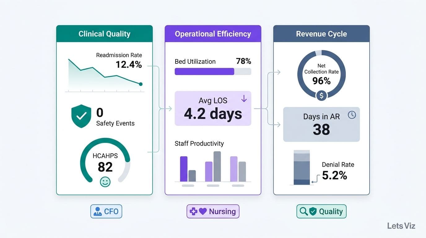
A healthcare analytics dashboard should track metrics across three core domains: clinical quality (readmission rates, patient safety events, outcome scores), operational efficiency (bed utilization, average length of stay, staff productivity), and revenue cycle (net collection rate, days in accounts receivable, denial rates). The right combination depends on role - a hospital CFO dashboard differs substantially from one designed for nursing leadership or a quality improvement team.
Key Takeaways
Clinical quality, operational efficiency, and revenue cycle management are the three non-negotiable metric domains for any hospital analytics dashboard.
HIPAA-compliant data architecture is a prerequisite before any patient-level KPI goes live in a dashboard.
Value-based care contracts require payer-mix tracking and quality-bonus metrics alongside traditional volume-based KPIs.
Healthcare analytics dashboards and EMR reporting modules serve distinct purposes; conflating them creates costly analytical blind spots.
Department-specific views - CFO, CNO, COO - within a shared data model reduce duplication and governance risk.
What Is a Healthcare Analytics Dashboard?
A healthcare analytics dashboard is a centralized visualization layer that aggregates data from clinical, operational, and financial source systems - EHRs, revenue cycle management (RCM) platforms, workforce scheduling tools, and payer data feeds - into role-specific KPIs for executives, administrators, and clinical teams.
Unlike a static report, a dashboard provides interactivity across time periods and organizational units. A hospital COO can identify a throughput bottleneck before it generates patient complaints; a CFO can detect a claims denial pattern before it pressures quarterly cash flow. The difference between high-performing and struggling health systems increasingly comes down to whether leadership acts on leading indicators or scrambles to explain lagging ones.
The Healthcare Financial Analytics Market is projected to grow at an 8.58% CAGR from 2025 to 2035, driven by regulatory pressure, value-based care adoption, and the structural shift from volume-based to outcome-based reimbursement (Market Research Future, 2025). That trajectory reflects the market internalizing what high-performing systems already know: you cannot optimize what you cannot measure with precision.
For a step-by-step build guide, How to Build a Power BI Financial Dashboard for Healthcare covers the data model architecture and KPI hierarchy specific to health system financial data.
What Metrics Should a Healthcare Analytics Dashboard Track?
The three core domains - clinical quality, operational efficiency, and revenue cycle - are not optional categories. They map directly to the three major risk areas that regulators, payers, and boards monitor simultaneously. Any dashboard missing one domain creates a blind spot that surfaces in patient outcomes, operational budgets, or payer contract negotiations.
| Domain | Primary Stakeholder | Key Decisions Supported |
|---|---|---|
| Clinical Quality | CMO, CNO, Quality Officer | CMS star ratings, MIPS scores, readmission penalty avoidance |
| Operational Efficiency | COO, CFO, Nursing Leadership | Capacity management, staffing ratios, throughput optimization |
| Revenue Cycle | CFO, Revenue Cycle Director | Cash flow, denial management, value-based contract performance |
Within each domain, metrics split into leading indicators - early warning signals that predict future outcomes - and lagging indicators - measures of results already realized. The most effective dashboards surface both: leading indicators for operations teams to act on daily, lagging indicators for leadership to report monthly.
As of mid-2026, three themes continue to dominate healthcare analytics strategy: value-based care, AI-driven analytics, and payer analytics innovation (Medinsight, 2026). Each theme increases the strategic value of cross-domain visibility. A readmission rate is simultaneously a clinical quality metric, an operational capacity constraint, and a CMS penalty risk to the revenue cycle.
What Clinical Quality Metrics Should a Hospital Dashboard Track?
Clinical quality metrics measure whether patients receive safe, effective, and evidence-based care. Every hospital dashboard should monitor a core metric set, with additional service-line-specific indicators layered by specialty.
The three pillars of clinical quality tracking are patient outcomes, safety events, and process adherence:
| Category | Metric | Regulatory Relevance |
|---|---|---|
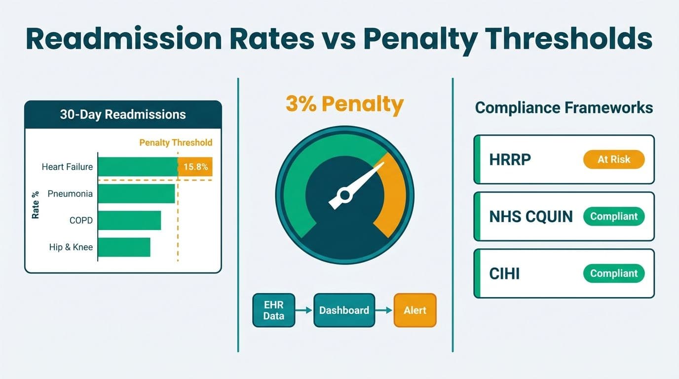
| Patient Outcomes | 30-day all-cause readmission rate | CMS Hospital Readmissions Reduction Program (HRRP) penalties |
| Patient Outcomes | Risk-adjusted inpatient mortality index | CMS star ratings, Leapfrog Hospital Safety Grade |
| Patient Safety | Hospital-acquired infection (HAI) rate | NHSN reporting; affects CMS value-based purchasing payments |
| Patient Safety | Adverse drug event (ADE) rate | AHRQ patient safety indicator; high cost per event |
| Process Adherence | Sepsis bundle compliance rate | Time-sensitive; directly correlated with mortality outcomes |
| Process Adherence | Core measure compliance by condition | Joint Commission accreditation requirements |
| Patient Experience | HCAHPS overall hospital rating | CMS Value-Based Purchasing payment modifier |
For hospitals operating under MIPS or MSSP ACO agreements, these metrics feed directly into quality bonus calculations. Tracking at the attending physician and service line level - not just facility averages - reveals the performance variation that quality improvement programs need to target. Averages routinely hide outliers; dashboards should surface them with sufficient case-mix context to distinguish statistical noise from genuine variation.
Beyond compliance minimums, clinical quality metrics in a healthcare KPI dashboard should support predictive analysis. A readmission risk model layered on historical discharge data can flag high-risk patients before discharge rather than counting them after. This shift from descriptive to predictive analytics is where value-based care organizations are investing - converting the dashboard from a reporting tool into a clinical decision-support layer.
What Operational Efficiency Metrics Matter Most for Hospital Operations?
Operational efficiency metrics quantify how effectively a hospital converts capacity into patient throughput - without compromising safety or overextending staff. A healthcare KPI dashboard for hospital operations should segment these metrics by facility, unit, and shift to enable targeted interventions that facility-level averages obscure.
Throughput and Capacity
Bed occupancy rate - industry target range is typically 75-85%; sustained occupancy above 90% signals throughput risk and frequently precedes patient diversion events
Average length of stay (ALOS) - segment by DRG, service line, and payer to isolate variation driven by clinical decisions versus administrative delays
Emergency department (ED) door-to-provider time - benchmark under 30 minutes; tracks both patient experience and downstream inpatient admission pressure
Operating room (OR) utilization rate - first-case on-time start percentage is a leading indicator of full-day OR efficiency and surgeon satisfaction
Workforce Productivity
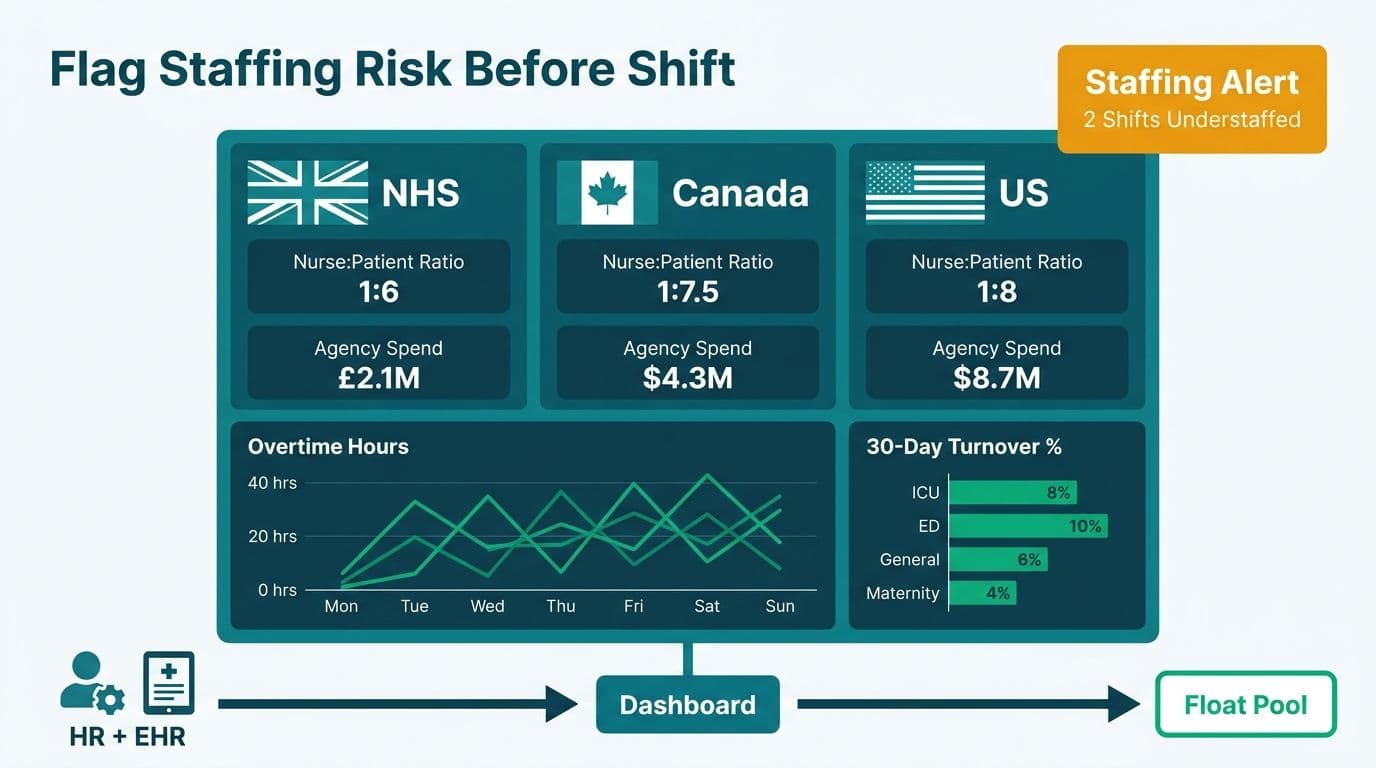
Nurse-to-patient ratio by unit - directly linked to both patient safety outcomes and staff satisfaction scores; unit-level visibility is essential for meaningful staffing management
Agency and overtime spend as a percentage of total labor cost - a real-time early warning for budget overruns and structural staffing gaps
Staff turnover rate by department - elevated turnover predicts future capacity constraints and downstream recruitment costs
For health-system HR and operations leaders, healthcare workforce analytics dashboard metrics go beyond headcount. Nurse-to-patient ratios carry direct regulatory weight: the US Centers for Medicare and Medicaid Services (CMS) finalized minimum nurse staffing standards for long-term care facilities in 2024, and similar safe-staffing frameworks are expanding across acute care settings as state legislatures respond to post-pandemic workforce pressure. In the UK, NHS England's nursing workforce standards require trusts to publish staffing levels on a ward-by-ward basis - a transparency mandate that has accelerated dashboard adoption across NHS trusts. Agency spend and overtime percentage are the most immediate signals of a staffing model under stress: when agency labor exceeds 8-10% of total labor cost, most systems are already past the point where corrective hiring can prevent budget overruns in the current fiscal year. Turnover rate by department closes the loop - it quantifies the downstream consequence of staffing gaps and is the most reliable leading indicator of future agency dependency. These four workforce metrics - ratios, agency spend, overtime percentage, and turnover - should be visible together in a single workforce analytics view, not buried across separate HR, scheduling, and payroll systems.
Supply Chain
Inventory days on hand for critical supplies - supply costs represent 15-20% of a hospital's total operating expense, making them the largest controllable cost lever after labor; a 1% reduction in supply spend typically delivers more margin improvement than an equivalent reduction in any other non-labor category, yet most health systems still manage this through annual contract reviews rather than live dashboard visibility
Supply cost per adjusted patient day - the normalized denominator that enables meaningful cross-facility and cross-period comparison
Hospital COOs reviewing these metrics on a weekly cadence consistently reduce reactive firefighting and build the data discipline that modern payer contracts increasingly require. What Metrics Should a Financial Reporting Dashboard Include provides cross-industry benchmarking context that applies directly to healthcare operational finance planning.
What Revenue Cycle Metrics Should a Hospital CFO Dashboard Include?
The hospital CFO dashboard is where clinical performance and financial health converge. Revenue cycle analytics translate patient encounters into cash - or reveal exactly where the pipeline leaks before a cash flow problem becomes a board conversation.
Core Revenue Cycle KPIs:
Net collection rate (NCR) - percentage of collectible revenue actually collected; benchmark above 95% for most acute care facilities
Days in accounts receivable (DAR) - target below 40 days; segment by payer for root-cause analysis of collection delays
Denial rate by payer - overall rate should stay below 5%; isolating by payer surfaces specific contract, coding, or eligibility issues
Clean claim rate - first-pass acceptance from payers; target above 95%; declines signal upstream coding or eligibility verification failures
Cost to collect - administrative cost as a percentage of net revenue collected; the efficiency benchmark for revenue cycle operations
Payer mix - distribution of Medicare, Medicaid, commercial, and self-pay volumes; shifts in mix change margin assumptions across all service lines
Cost per adjusted discharge - normalizes total cost by case complexity for meaningful cross-period and cross-facility comparison
Quality bonus revenue - value-based payment bonuses from CMS and commercial payers; frequently absent from CFO dashboards, yet representing 2-4% of net patient revenue depending on performance tier
Payer mix visibility and value-based payment tracking are the two most consistently underdashboarded areas in mid-size health systems. For a 300-bed hospital generating USD 250 million in net patient revenue, a 3% quality bonus tier represents USD 7.5 million - accruing or eroding quarter by quarter based on metrics the CFO often cannot see in real time. When quality bonus accruals are invisible to the CFO, value-based contract negotiations occur without the performance data that would support materially better terms.
The AI consulting services market supporting healthcare and financial analytics infrastructure reached approximately USD 14 billion in 2026 - up from USD 11.07 billion in 2025 - and is projected to grow to USD 90.99 billion by 2035 at a 26.2% CAGR (Future Market Insights, 2026). Health systems that build their analytical foundation now will hold a structural advantage in value-based payer negotiations throughout this decade.
Healthcare Analytics Dashboard vs EMR Reporting Tools: What Is the Difference?
EMR reporting modules and purpose-built analytics dashboards are frequently conflated - a mistake that limits how much value health systems extract from their data investments and creates analytical gaps that surface at critical moments.
| Dimension | EMR Reporting Module | Healthcare Analytics Dashboard |
|---|---|---|
| Data scope | Single source (EHR only) | Multi-source: EHR, RCM, HR, payer, scheduling, supply chain |
| Refresh latency | Typically daily batch | Near-real-time or configurable refresh rates |
| Customization | Vendor-constrained templates | Fully configurable KPIs, layouts, and calculations |
| Cross-department visibility | Limited; module-siloed | Native cross-functional views |
| Cost structure | Bundled with EMR license | Separate analytics investment |
| AI/ML augmentation | Emerging; vendor roadmap-dependent | Implementable today with the appropriate BI platform |
| Governance controls | EHR vendor-managed | Configurable row-level security, audit logs, and BAA support |
The practical implication: EMR reporting tells you what happened inside the clinical record. A healthcare analytics dashboard tells you why it happened, how it compares across facilities and time periods, and what the financial consequence was. EMR reporting answers documentation and compliance questions; analytics dashboards answer operational and strategic ones.
Health systems that rely exclusively on EMR reporting miss the revenue cycle, workforce, and supply chain dimensions that determine whether a hospital breaks even or generates surplus for reinvestment in care capacity. AI Services and Consulting for Finance and Healthcare Leaders explores how AI augmentation changes what is possible across both clinical and financial analytics layers when data is properly consolidated into a unified platform.
How Should a Healthcare KPI Dashboard Be Structured by Department?
The most effective healthcare dashboards use a shared data model with role-specific views - one trusted source of truth, multiple analytical lenses. This architecture eliminates the definition-mismatch problem (finance using one ALOS calculation, operations using another) and reduces HIPAA risk by enforcing access controls at the data model layer rather than relying on user discipline.
Executive (CEO / Board) View
Scorecard format: three to five headline metrics per domain - clinical, operational, financial - with trend sparklines and variance to budget or benchmark. No raw data. The executive view answers whether the organization is on track in under 30 seconds.
CFO / Finance View
Revenue cycle pipeline, payer mix waterfall, cost per adjusted discharge, labor cost variance, and quality bonus accrual. Drillable by facility, service line, and payer. Refreshed daily at minimum.
COO / Operations View
Bed occupancy heatmap by unit, ED throughput funnel, OR utilization by surgeon, and staff-to-patient ratios updated live by unit. Refreshed every 15-30 minutes for time-sensitive operational decisions.
CNO / Quality View
HAI rate by unit, readmission risk by attending physician, HCAHPS score trends, and sepsis bundle compliance. Linked to case-level review workflows for quality improvement action.
Analytics Team View
Data pipeline health, refresh timestamps, error logs, model accuracy indicators for any predictive layers, and dashboard usage telemetry to prioritize the development backlog.
This layered architecture avoids the most common failure mode: building a single all-purpose dashboard that ultimately serves no one's analytical needs. Outsourced Financial Analytics Services for Smarter Insights covers how health systems are using managed analytics models to maintain this architecture without scaling a large internal BI team.
What HIPAA Compliance Requirements Apply to Healthcare Analytics Dashboards?
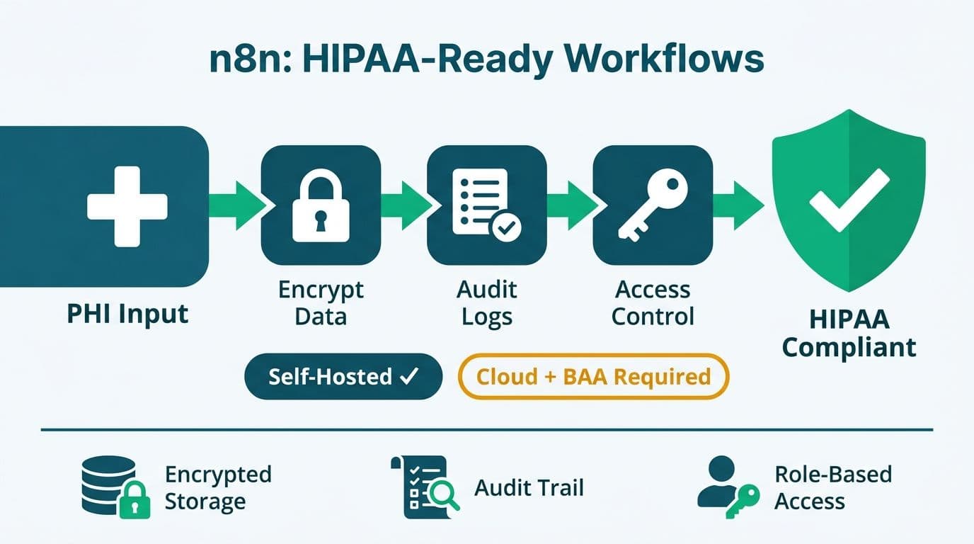
No KPI framework for US healthcare is complete without the compliance layer. Any dashboard displaying Protected Health Information (PHI) - including patient-level clinical or financial data - falls under HIPAA's Security Rule requirements for covered entities and their business associates.
Key governance controls for a compliant healthcare analytics dashboard:
De-identification at the right level - aggregate metrics such as a facility-level readmission rate are generally outside PHI scope; patient-level drilldowns require access controls and full audit logging
Role-based access control (RBAC) - a finance analyst should never access individual patient records; permissions must enforce this automatically at the data layer, not through user discipline
Audit logging - every data access event must be logged and retrievable for breach investigation or OCR compliance audit
Business Associate Agreements (BAAs) - any analytics platform or vendor processing PHI must have a signed BAA with the covered entity before data flows into that system
Minimum necessary standard - dashboards should surface only the data required for a given role's decisions, not the full dataset technically available
Power BI with workspace isolation, row-level security (RLS), and data sensitivity labels can meet these requirements when configured correctly. The governance architecture - not the visualization tool - is where HIPAA compliance is built or broken. Most analytics-related security incidents in healthcare trace to misconfigured access controls, not vendor software failures. The cost of retrofitting governance after a breach consistently exceeds the cost of building it in from the start - both in remediation spend and in the regulatory scrutiny that follows.
For a practical framework on AI and analytics risk governance, A CFO's 6-Question AI Risk Checklist for Power BI addresses the governance questions every analytics leader should answer before expanding dashboard access.
---
If your hospital or health system is ready to move from fragmented EMR reports to a unified KPI framework covering clinical, operational, and revenue cycle performance, the team at Lets Viz designs and manages healthcare analytics dashboards on Power BI - from data model architecture to executive-ready views, with HIPAA-compliant access controls built in from the start.
---
About Lets Viz: Lets Viz is an analytics consulting firm with over a decade of experience building data infrastructure and executive dashboards for healthcare, finance, and professional services organizations across the United States. The team holds credentials across Power BI, data engineering, and healthcare data standards, and has delivered analytics solutions for hospital systems, payer organizations, and specialty clinics that required both analytical rigor and HIPAA-compliant architecture.