What Metrics Should a Financial Reporting Dashboard Include?
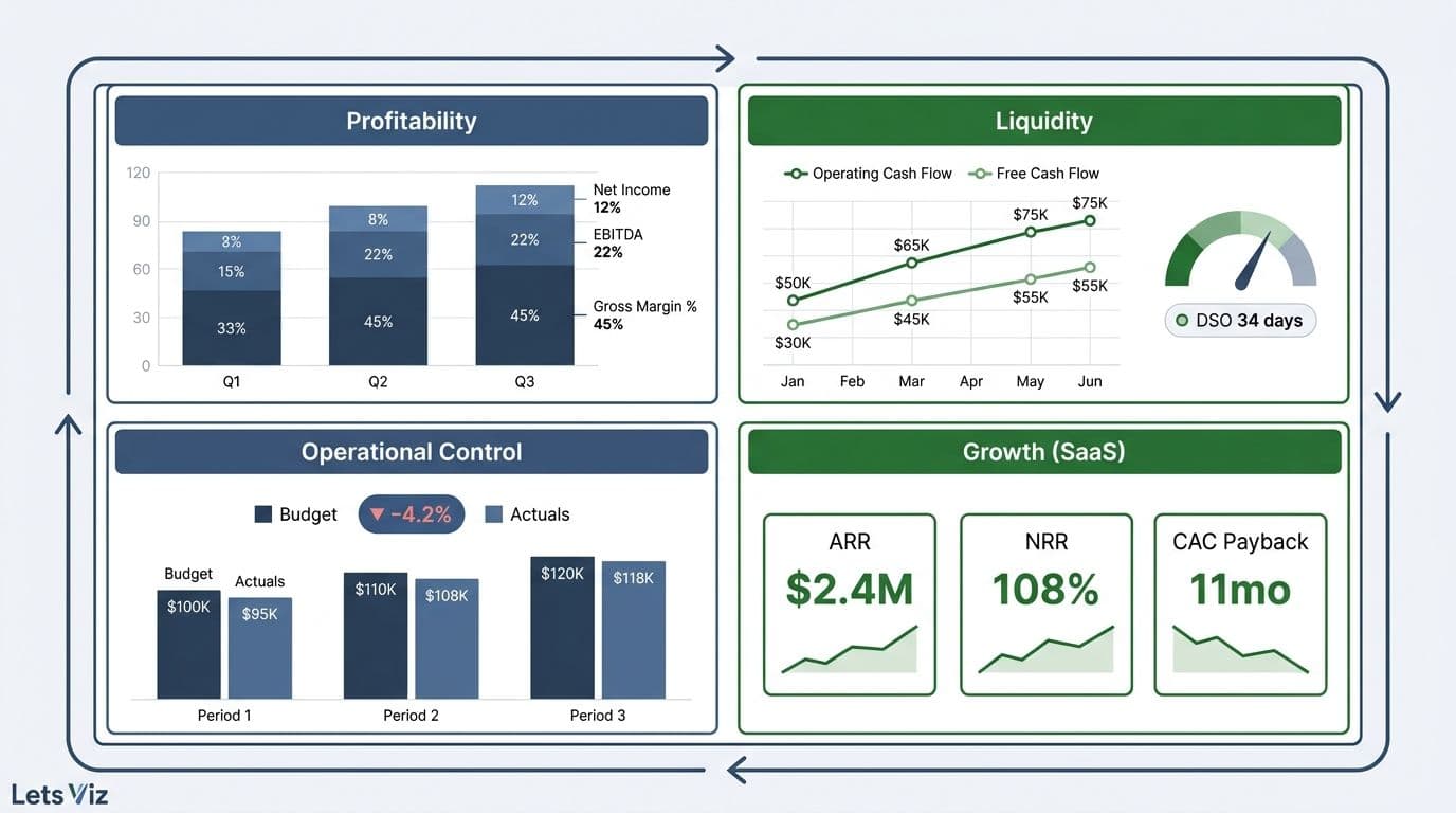
A financial reporting dashboard should include metrics across four pillars: profitability (gross margin, EBITDA, net income), liquidity (operating cash flow, free cash flow, days sales outstanding), operational control (budget variance, actuals vs. plan), and - for SaaS businesses - growth (ARR, NRR, CAC payback). These twelve core KPIs give CFOs, finance directors, and FP&A teams a complete performance picture without visual clutter.
Key Takeaways
Twelve KPIs across P&L, cash flow, receivables, and budget variance form the minimum viable finance dashboard
DSO and cash conversion cycle are the most overlooked metrics on enterprise dashboards, yet they directly predict liquidity risk
SaaS companies must layer ARR, NRR, and CAC payback on top of any standard enterprise KPI set
Budget variance should always be displayed as both an absolute dollar figure and a percentage against plan
Power BI financial dashboards that consolidate these metrics in real time reduce month-end close cycles by two to four business days on average — a compounding gain that frees FP&A capacity for forward-looking analysis rather than data assembly
What Metrics Should a Financial Reporting Dashboard Include?
Every finance dashboard should answer three questions at a glance: Are we profitable? Are we solvent? Are we on plan? The twelve KPIs below cover all three, structured as a reference for CFOs, FP&A teams, and finance directors building or auditing their reporting stack.
| Category | KPI | Formula | Why It Matters |
|---|---|---|---|
| P&L | Gross Margin % | (Revenue - COGS) / Revenue | Reveals pricing power and product economics |
| P&L | EBITDA | Operating income + D&A | Standard for lender covenants and valuation multiples |
| P&L | Net Income | Revenue - all expenses | Bottom-line accountability |
| P&L | Operating Expense Ratio | OpEx / Revenue | Tracks cost structure efficiency and operating leverage |
| Cash Flow | Operating Cash Flow | Net income + non-cash items +/- working capital | True cash generation from core operations |
| Cash Flow | Free Cash Flow | OCF - capex | Cash available after sustaining the business |
| Cash Flow | Cash Conversion Cycle | DIO + DSO - DPO | Speed of turning operations into cash |
| Receivables | Days Sales Outstanding | (AR / Revenue) x Days in period | Billing efficiency and collection risk signal |
| Budget | Revenue Variance | Actual - Budget ($ and %) | Measures top-line performance vs. commitment |
| Budget | OpEx Variance | Actual - Budget ($ and %) | Tracks spend discipline against plan |
| Budget | Headcount vs. Plan | Actual FTEs / Planned FTEs | Leading indicator for OpEx overruns |
| Liquidity | Current Ratio | Current Assets / Current Liabilities | Short-term solvency snapshot |
For a deeper look at the five metrics CFOs most frequently reference in board reviews, see 5 Key Financial KPIs Every CFO Should Track.
According to Future Market Insights, the AI consulting services market reached an estimated USD 13.97 billion in 2026 — up from USD 11.07 billion in 2025 — and is projected to reach USD 90.99 billion by 2035 at a 26.2% CAGR, reflecting how central automated analytics infrastructure has become to modern finance operations. Dashboards that still depend on manual data pulls will face a widening capability gap within three years.
How Do You Structure P&L Metrics on a CFO Dashboard?
A P&L section should show three time dimensions simultaneously: month-to-date actuals, prior-year same-period, and budget. Without all three in a single view, context collapses and every number requires a follow-up question.
Gross margin is the first number a CFO should see. It sits above everything else because it constrains every downstream decision. If gross margin is deteriorating, no amount of OpEx discipline will rescue the P&L. Display it as both a percentage and an absolute dollar value side by side.
EBITDA follows gross margin. For companies with significant depreciation or amortization, EBITDA is the metric boards and lenders use for covenant testing and valuation multiples. Show the trailing twelve months (TTM) alongside the current period to avoid seasonal distortions.
Net income is the bottom line. Display it with a waterfall chart: start at revenue, subtract COGS to reach gross profit, subtract each OpEx line to reach EBIT, then account for interest, taxes, and depreciation to arrive at net income. Waterfall charts force accountability at every line because they make each deduction visible and attributable.
Operating expense ratio (OpEx / Revenue) signals whether the business is scaling efficiently. A company growing revenue at 30% while holding OpEx flat as a percentage of revenue demonstrates operating leverage - the dynamic that drives valuation multiple expansion.
Many finance teams also display P&L by business segment or geographic region on the same dashboard. Segment-level gross margin is particularly revealing: it shows which parts of the business carry the weight and which are subsidized by overall profitability - a distinction that aggregate P&L views consistently obscure.
What Cash Flow Metrics Belong on a Finance Dashboard?
Profitability and cash generation frequently diverge, especially in businesses with long payment cycles or heavy upfront investment. That divergence is precisely why cash flow metrics deserve their own dashboard section.
Operating cash flow (OCF) is the most important cash metric. It shows whether the core business generates cash independent of financing or investment activity. A company reporting net income but negative OCF is a liquidity risk hiding behind accrual accounting. Track OCF monthly with a twelve-month trend line.
Free cash flow (FCF) subtracts capital expenditures from OCF. For asset-light SaaS businesses, FCF is often very close to OCF. For enterprises with physical infrastructure, the gap matters materially. Board discussions about dividends, acquisitions, and buybacks always start with FCF.
Cash conversion cycle (CCC) is the efficiency metric most dashboards omit. CCC = DIO + DSO - DPO. A shorter cycle means the business converts sales to cash faster, reducing reliance on working capital and external credit. Finance teams that automate their receivables process can compress CCC directly - our post on automated invoice tracking with Power BI and Power Automate shows how that works in practice.
Display cash flow metrics on a cumulative basis within the fiscal year, overlaid with the prior-year equivalent. This surfaces seasonal patterns in cash generation that monthly point-in-time snapshots consistently miss.
How Do You Calculate and Track Budget Variance?
Budget variance is the control layer of the finance dashboard. It answers the question every board member asks: how does actual performance compare to what we committed to at the start of the year?
Revenue variance is Actual Revenue minus Budget, expressed in both absolute dollars and as a percentage. A positive variance means you beat plan; negative means you missed. Always display both the current-month variance and the year-to-date variance to separate a single bad month from a systemic shortfall.
Operating expense variance follows the same formula but is interpreted in reverse: spending less than budget is generally favorable. However, blanket underspend is not always a positive signal. A finance team that ends Q1 15% under OpEx budget due to stalled hiring may look disciplined on paper while quietly falling six to nine months behind its product roadmap — a gap that typically surfaces as a revenue miss well before the headcount finally shows up. The number alone is not enough; context matters.
Headcount vs. plan is the leading indicator beneath OpEx variance. Most enterprise expense overruns trace back to unplanned headcount additions or delayed backfills. A simple filled-vs.-open roles chart per department catches these problems before they compound in the P&L.
When displaying budget variance, use a consistent color convention: green for favorable, red for unfavorable, amber for within 5% of plan. Visual consistency reduces interpretation time in board meetings and eliminates the need to read every label.
For CFOs evaluating how AI-assisted tools can surface budget anomalies automatically, our detailed review of Copilot for Power BI for finance teams covers what these tools can and cannot do in a live FP&A context.
What Is DSO and Why Does It Belong on Every Finance Dashboard?
Days Sales Outstanding (DSO) measures how long, on average, it takes to collect payment after a sale is made. The formula is: (Accounts Receivable / Total Revenue) x Number of Days in the period.
A rising DSO means customers are taking longer to pay - which strains working capital even when revenue is growing. A falling DSO means collections are improving, releasing cash that can be redeployed elsewhere. For most B2B businesses, a DSO below 45 days is healthy; above 60 days signals a collections problem worth a formal investigation. In 2026, B2B companies deploying AI-assisted AR automation are reporting DSO reductions of seven to twelve days on average compared to manual collection workflows — making sub-45-day performance achievable at scales that previously required a dedicated collections team.
DSO belongs on every finance dashboard for three reasons. First, it is a leading indicator of cash flow: DSO deterioration shows up before cash balances drop. Second, it reflects the effectiveness of the billing and collections function. Third, it is the first metric that declines before a customer default surfaces in the accounts receivable aging report.
A second metric worth tracking alongside DSO is Days Payable Outstanding (DPO) - the flip side of receivables management. DPO measures how long the company takes to pay its own suppliers. High DPO conserves cash but can strain supplier relationships. The spread between DSO and DPO directly determines working capital intensity.
Display DSO as a trend line over the trailing twelve months, with a horizontal reference line at your target. Add a secondary breakdown by customer segment or contract type - DSO often varies significantly between enterprise and SMB customers, and an aggregated figure hides that difference.
According to the Healthcare Financial Analytics Market report (Market Research Future, as of 2026), the healthcare sector - where billing complexity ranks among the highest of any industry - continues to invest at an 8.58% CAGR through 2035 specifically to address revenue cycle metrics including DSO and days in accounts receivable. The same analytical discipline has become standard in enterprise SaaS, professional services, and any business with complex billing arrangements.
Which KPIs Do SaaS Finance Teams Add to Standard Dashboards?
SaaS finance teams use all twelve core KPIs above, then layer subscription-specific metrics that standard enterprise dashboards do not address.
Annual Recurring Revenue (ARR) is the SaaS equivalent of revenue. Track it with a waterfall breakdown: beginning ARR + new ARR + expansion ARR - churn ARR - contraction ARR = ending ARR. This decomposition makes every ARR movement auditable and attributable to a specific growth or retention lever.
Net Revenue Retention (NRR) measures ARR retained and expanded from existing customers over twelve months, expressed as a percentage. NRR above 110% means the existing customer base grows revenue without any new sales - the compounding dynamic that drives SaaS valuations. Median NRR across public SaaS companies tracked in 2026 sits near 108% — down from the 113–115% range observed during the 2021 expansion peak, as enterprise buyers have tightened renewal and upsell budgets across most verticals; best-in-class businesses consistently exceed 120%, but that threshold has become increasingly rare, making 112–115% the practical benchmark for board-level credibility in growth-stage conversations.
CAC Payback Period is the number of months required to recover the cost of acquiring a customer from that customer's gross margin contribution. A payback period below eighteen months is considered efficient for enterprise SaaS — and in 2026, top-quartile companies are increasingly achieving sub-twelve-month payback by tightening ICP definition and compressing sales cycles, resetting competitive expectations at the board level; above thirty-six months signals a unit economics problem that no growth rate can paper over indefinitely.
Burn Multiple (net burn / net new ARR) is the efficiency metric investors use to evaluate capital allocation. A burn multiple below 1.5x is strong; as of 2026, the top quartile of growth-stage SaaS companies is running below 1.2x, compressing what "capital efficient" means in term sheet conversations — above 2x now requires a forward-dated path to sub-1.5x to satisfy most growth investors. In 2026, with growth-stage investors consistently prioritizing capital efficiency alongside topline trajectory, SaaS CFOs who cannot narrate their burn path in ARR terms — not just runway quarters remaining — face materially harder fundraising conversations than peers who surface this metric proactively in their board packs.
Medinsight (as of 2026) noted that across healthcare finance - one of the most data-intensive industry verticals - AI-driven analytics emerged as a dominant investment theme alongside metrics-based performance management. The same rigor now defines top-performing SaaS finance teams, where ARR decomposition and cohort-based retention analysis have become standard board-level conversations. For a closer look at how AI is reshaping ARR forecasting, see AI and ARR waterfalls: what works, what still needs a human.
How Does Power BI Compare to Excel for Financial Reporting?
FP&A teams evaluating their reporting stack face this question consistently. Power BI wins on scale, governance, and automation; Excel wins on speed for ad hoc analysis. Understanding this distinction is central to power bi financial reporting best practices for any CFO building a governed, real-time dashboard.
| Dimension | Power BI | Excel |
|---|---|---|
| Data refresh | Automated (scheduled or real-time) | Manual or scripted |
| Data volume | Millions of rows via DirectQuery | Practical limit ~1 million rows |
| Collaboration | Shared workspaces, row-level security | File sharing, version conflicts |
| Calculation layer | DAX (reusable, governed measures) | Formulas (per-file, fragile) |
| Audit trail | Dataset versioning, change tracking | Limited without third-party tools |
| Learning curve | Moderate - DAX requires dedicated training | Low for teams already proficient in Excel |
| Best for | Standing dashboards, board packs, governed KPIs | Ad hoc analysis, one-off models, scenario planning |
Most enterprise finance teams use both: Power BI for the standing dashboard — the twelve KPIs above, refreshed daily — and Excel for the monthly bridge analysis and scenario modeling that surrounds it. The migration tipping point is typically when a finance team exceeds three data sources or two analysts maintaining the same model — at that scale, version-control failures and stale numbers in Excel become a governance liability rather than an inconvenience, and the case for Power BI becomes self-funding in audit time alone. The two tools are complementary, not competitive.
For teams managing governance and AI risk in a Power BI environment, our CFO's AI risk checklist for Power BI covers the six questions your auditors are likely to raise before the next compliance review.
---
About Lets Viz: Lets Viz has delivered analytics consulting to finance, operations, and commercial teams across SaaS, professional services, and enterprise sectors for over eight years. Our Power BI and FP&A specialists have designed and maintained financial reporting dashboards for clients ranging from Series B SaaS companies to large enterprise organizations, applying best practices drawn from hundreds of dashboard implementations across healthcare, technology, and financial services.
If your team is ready to move from static spreadsheets to a governed, real-time financial reporting dashboard, explore our Managed Power BI services to see how we design and maintain the reporting infrastructure finance teams rely on.