Looker Studio Financial Dashboard: P&L, Budget & Cash Flow
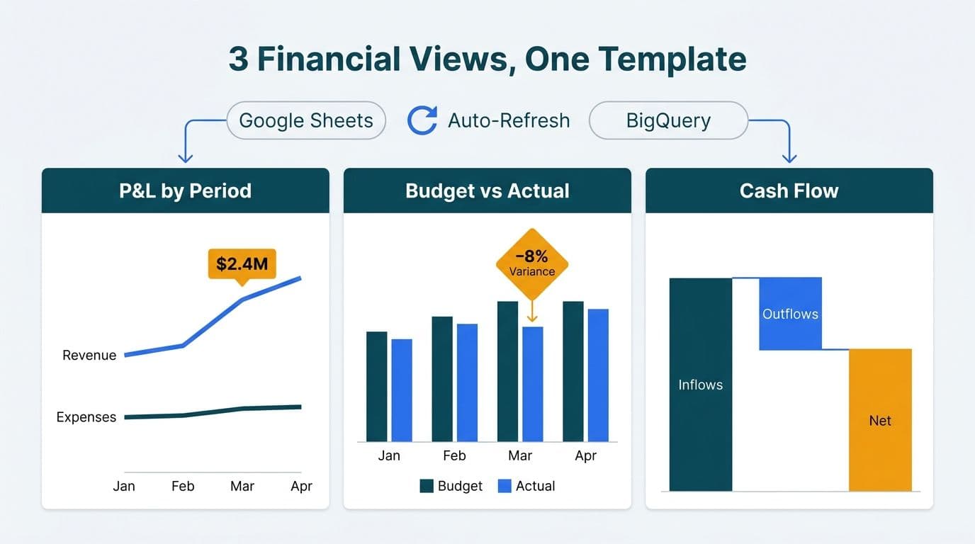
A looker studio financial dashboard template gives finance teams a pre-built starting point for visualising P&L, budget-vs-actual, and cash flow data - cutting build time from weeks to hours. Templates pull from Google Sheets or BigQuery and render live charts, scorecards, and date controls that refresh automatically when underlying data updates. For mid-market teams, the right template handles 80 percent of the structure; custom field mapping handles the rest.
Key Takeaways
A Looker Studio financial dashboard template covers three core views: P&L by period, budget-vs-actual variance, and cash flow trend.
Google Sheets suits teams running monthly rollups with a single entity; BigQuery handles high-volume ERP exports and multi-entity consolidations.
Healthcare and finance organisations in the US, UK, and Canada must map data residency and access controls before connecting live financial data to any BI tool.
Templates accelerate delivery but require field mapping to match your chart of accounts - budget for that step as its own workstream.
Looker Studio's native GA4 connector enables blended financial-plus-web-analytics reporting when revenue attribution is part of the brief.
What Is a Looker Studio Financial Dashboard Template?
A Looker Studio financial dashboard template is a shareable report file - distributed via a 'Make a copy' link - containing pre-built charts, scorecards, date range controls, and calculated fields aligned to common financial KPIs. Recipients copy the template into their own Looker Studio workspace, then remap the data source fields to their own Google Sheet or BigQuery table.
Google's Looker Studio documentation distinguishes between report templates (shareable report copies) and data source templates (reusable connectors with pre-defined fields). For financial use, teams typically need both: a report template for layout and a clean data source with standardised column names that match the template's expected field schema.
The three dashboards finance teams most commonly request are:
Profit and Loss (P&L) by period - revenue, cost of goods sold, gross margin, operating expenses, and net income tracked monthly or quarterly.
Budget vs Actual - planned versus realised spend by department, category, and period, with variance in both absolute and percentage terms.
Cash Flow - operating, investing, and financing activities tracked against a rolling forecast.
Our Certified Looker Studio consulting team builds these three views as a linked report set, so executives can navigate from summary to line-item detail without switching tools.
How Do You Connect Looker Studio to a SQL Database or Google Sheets for Finance?
The data source choice shapes every downstream decision about refresh frequency, row limits, and access control. Looker Studio natively supports both paths without third-party middleware.
Google Sheets is the fastest route for teams already managing general ledger exports or budget files in Sheets. Connect via the built-in Google Sheets connector, point it at a named range or tab, and Looker Studio reads the data at each report load. Sheets handles monthly P&L rollups across two to three years of history comfortably for most single-entity teams - once you approach hundreds of thousands of rows of transactional detail, move to BigQuery.
BigQuery is the right choice when you need to connect Looker Studio to a SQL database containing transactional detail: ERP exports, payroll data, or multi-entity consolidations. The BigQuery connector supports custom SQL queries, so you can pre-aggregate in the connector's query field and pass only summary rows to the report. BigQuery tables update on their own pipeline schedule; Looker Studio reads the current state at render time.
For US healthcare organisations subject to HIPAA, or Canadian entities subject to PIPEDA, BigQuery with column-level security and authorized views is the recommended pattern. It exposes aggregated financial summaries to the dashboard without surfacing individually identifiable billing records.
A UK fintech firm operating under GDPR will typically connect via Cloud SQL (PostgreSQL) through the Partner Connectors marketplace, with all data stored within an EU region to meet data residency requirements.
Data Source Decision Guide
| Use case | Recommended source | Refresh model | Compliance notes |
|---|---|---|---|
| Monthly P&L rollup, single entity | Google Sheets | Near-real-time poll | GDPR: configure Workspace for EU region |
| Multi-entity consolidation, ERP export | BigQuery | Pipeline-driven (daily) | Column-level security for HIPAA / PIPEDA |
| Transactional SQL warehouse detail | BigQuery custom query | Pipeline-driven | Row-level security via authorized views |
| Web revenue + finance blend (GA4) | Sheets + GA4 data blend | Near-real-time | Review PII handling before blending sources |
How Do You Build a P&L Dashboard in Looker Studio?
Start with a clean, flat data structure. The most reliable schema for a P&L in Google Sheets or BigQuery uses five columns: period (YYYY-MM), account_code, account_name, category (Revenue / COGS / OpEx / Net Income), and amount. Avoid pivot-style layouts where months are column headers - Looker Studio's calculated fields and date controls work far better with a long, tidy format.
Step 1 - Prepare the data source. Export your trial balance or general ledger to a flat Sheet or BigQuery table. Add a `category` column mapping account codes to P&L line items. This step is the most time-intensive: expect one to two days for a chart of accounts with 200 or more line items.
Step 2 - Create calculated fields. In Looker Studio, use `SUM(amount)` filtered by category to build scorecards for Total Revenue, Total COGS, Gross Profit, and Net Income. Gross Margin % becomes a calculated metric you define once and reuse across scorecards and charts.
Step 3 - Add time controls. Drop a Date Range Control and configure it to filter on your `period` field. Finance teams typically want a default view of the current fiscal year with the option to compare to prior year. Looker Studio's comparison date range feature handles year-over-year natively within the Date Range Control settings, with no custom SQL needed.
Step 4 - Visualise. A stacked bar chart showing Revenue vs OpEx vs COGS by month anchors the executive view. Add a sortable table below for account-level detail. Apply conditional formatting to scorecards - green for positive variance, red for negative - so the view communicates direction at a glance.
For teams migrating from a spreadsheet-only workflow, the patterns in our FP&A Dashboard in Power BI build guide translate directly to Looker Studio and are worth reviewing alongside this tutorial.
What Should a Budget-vs-Actual Dashboard Include?
The budget-vs-actual dashboard is the most operationally critical of the three views. It tells a department head not just what happened, but how far off plan they are and by how much.
Minimum viable components:
Variance scorecard - actual spend minus budget, in both absolute dollars and percentage. Conditional colouring makes direction immediately visible: green when under budget for cost centres, red when over.
Horizontal bar chart by department - sorted by absolute variance, descending. The largest misses appear at the top without requiring the reader to scan a table.
Period selector - month-to-date versus year-to-date toggle, implemented as a filter control tied to a `period_type` dimension in your data source.
Drill-down table - account-level rows showing budget, actual, and variance sorted by absolute variance descending.
A US SaaS finance team with multi-state entities might add a legal entity filter and cost centre hierarchy, letting the CFO see consolidated variance at the company level and drill into a specific team in seconds. A Canadian manufacturing company doing quarterly board reporting would use Looker Studio Pro's Schedule delivery feature (Report → Schedule delivery → configure recipients, frequency, and time zone) to distribute a PDF snapshot to board members on a set schedule — no manual export needed.
For GDPR-relevant reporting at a UK fintech, employee-level cost data visible in budget reports must be accessible only to authorised roles. Looker Studio enforces access at the data source level via BigQuery authorized views - not within the report itself - so access control design happens in BigQuery before the dashboard is built.
How Do You Build a Cash Flow Dashboard in Looker Studio?
Cash flow is the hardest of the three views to build because it requires three separate sub-totals - operating, investing, and financing - then a net change calculation that carries forward an opening balance.
The cleanest approach is to pre-calculate the running balance in BigQuery or your Google Sheet and expose a flat table with columns: date, flow_type (Operating / Investing / Financing), line_item, amount, and running_balance. Looker Studio's calculated fields handle simple aggregations well but are not designed for carry-forward or cumulative balance logic - that calculation belongs upstream in the data layer. In BigQuery, a window function — `SUM(amount) OVER (PARTITION BY entity ORDER BY date ROWS BETWEEN UNBOUNDED PRECEDING AND CURRENT ROW)` — produces the `running_balance` column in a single SQL step; paste that query directly into Looker Studio's BigQuery connector custom query field.
Recommended visualisations:
Area chart for running cash balance over time - the most intuitive view for a CFO or board member reading the dashboard cold.
Stacked bar chart for operating vs investing vs financing inflows and outflows by month.
Scorecard row at the top: Opening Balance, Net Change for the current period, Closing Balance.
A 13-week rolling cash forecast is standard practice in US healthcare - ambulatory surgery centres and specialty clinics often track weekly payer remittance collections against projected payroll runs. Financial data at this level is generally not PHI, but access controls still matter: restrict dashboard access to the finance team via Looker Studio's share settings, and use BigQuery row-level security for tighter control aligned with HIPAA's minimum necessary standard.
Healthcare finance teams often extend the cash flow view into a broader looker studio healthcare dashboard template that layers in payer mix, AR aging, and denial rates alongside cash position. This is an area where custom builds consistently outperform off-the-shelf templates - standard templates rarely include the payer-specific dimensions needed for effective looker studio dashboard for healthcare compliance reporting.
Looker Studio Template vs Custom Dashboard: When Should You Build Custom?
A template gives you layout and some calculated fields. A custom dashboard gives you data model alignment, access control, and metric definitions that match your specific chart of accounts and business rules.
Use a template when:
Your chart of accounts maps cleanly to standard categories.
You have one legal entity and one currency.
Your team is comfortable with Looker Studio's field remapping interface.
You need a working prototype in days, not weeks.
Build custom when:
You have multi-entity consolidations with intercompany eliminations.
You need row-level security by region, department, or legal entity.
Your compliance framework - HIPAA, GDPR, PIPEDA, or SOC 2 - requires documented data lineage from source to dashboard.
You want to blend financial data with operational metrics: combining a looker studio finance dashboard template with GA4 web revenue data, or extending a looker studio ecommerce dashboard template with order-level profitability from your SQL warehouse.
The looker studio template vs custom dashboard decision comes up in almost every mid-market engagement. Templates are a starting point, not a finish line. A useful heuristic: if your chart of accounts has more than three non-standard categories, or if you have more than one legal entity, start with a custom data model and use the template only for visual layout guidance.
For a side-by-side BI tool comparison relevant to finance teams, the Looker Studio vs Power BI 2026 Decision-Maker's Guide covers the trade-offs in depth. Pricing context is in our Looker Studio consultant cost guide for 2026.
What Does a Copyable Looker Studio Financial Dashboard Template Include?
A production-ready copyable template for finance contains five linked pages:
1. Executive Summary - four scorecards (Revenue, Gross Margin %, OpEx, Net Income) plus a 12-month trend line.
2. P&L Detail - table with account rows, period columns, and variance vs prior year.
3. Budget vs Actual - department bar chart, variance table, and month / YTD toggles.
4. Cash Flow - area chart for running balance and a waterfall chart for period cash generation.
5. Data Source Setup tab - field remapping instructions inside a text box within the report itself, so the guide travels with the template rather than living in a separate document.
Copy the template using 'Make a copy' from the report's three-dot menu. This creates a new report instance and a disconnected data source that you then reconnect to your own Sheets or BigQuery table. Each team works on their own copy; the source template remains unchanged.
Before connecting live financial data, teams subject to GDPR or PIPEDA should complete a data governance review. Our GDPR Compliant SaaS Financial Reporting BI Checklist covers the steps that should precede any dashboard build in regulated industries.
Teams evaluating a certified partner build can review our Certified Looker Studio Partner Benefits Explained article for context on what the Google credential means in practice for enterprise deployments.
---
About Lets Viz: Lets Viz has delivered data analytics and dashboard solutions since 2020, serving US healthcare providers, UK fintech firms, Canadian manufacturing companies, and global SaaS businesses. With a 5.0 Clutch rating, the team builds Looker Studio, Power BI, and Zoho Analytics solutions meeting HIPAA, GDPR, PIPEDA, and SOC 2 requirements.
Ready to move from template to production-grade financial reporting? Our Certified Looker Studio consulting team handles data source design, field mapping, access control, and stakeholder sign-off - so your dashboard is accurate, secure, and ready for board review.