Hospital Workforce Analytics Dashboard: NHS, Canada & US Guide
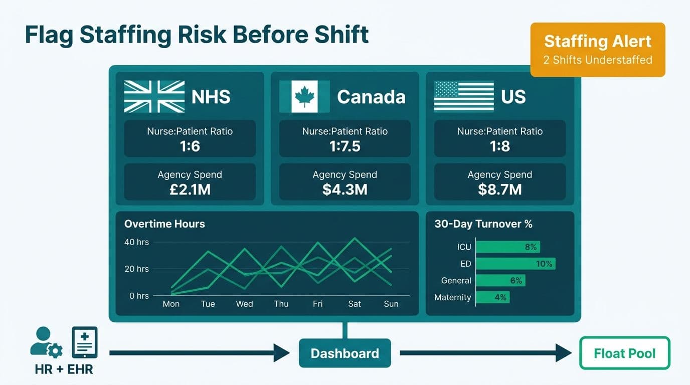
A hospital workforce analytics dashboard aggregates data from HR systems, EHR platforms, and scheduling tools to surface staffing ratios, overtime, and turnover risk across departments. NHS trusts, Canadian health authorities, and US health systems build these views in Power BI to replace manual roster reviews with always-on signals that flag unsafe staffing before a shift begins, giving managers lead time to use internal float pools rather than expensive agency cover.
Key Takeaways
Workforce dashboards track nurse-to-patient ratios, overtime hours, agency spend, and 30-day turnover in a single connected view
Power BI unifies data from EHR, payroll, and scheduling exports without replacing existing hospital systems
Predictive scheduling signals can flag departments at risk of understaffing 48-72 hours ahead, reducing reliance on costly agency staff
HIPAA (US), PIPEDA (Canada), and GDPR (UK/EU) each shape how patient-linked workforce data must be stored and accessed
Workforce analytics sits within a broader hospital data layer that also powers patient flow, readmission, and population health reporting
What Is a Hospital Workforce Analytics Dashboard?
A hospital workforce analytics dashboard is a live reporting layer that pulls data from scheduling platforms, payroll systems, and EHR extracts to track nurse-to-patient ratios, overtime hours, vacancy rates, and staff turnover in one place. Unlike static spreadsheet reports, a well-built dashboard refreshes on a defined cadence - hourly for live ward-level views, daily for trend analysis - and surfaces alerts when thresholds are breached.
For teams building on Managed Power BI for healthcare teams, workforce analytics is typically the first layer deployed because the data sources - payroll exports, scheduling CSVs, and HR system feeds - are the most accessible and the business case - reducing agency spend - is immediately quantifiable.
The core components of a workforce dashboard include:
Staffing ratio panel: nurse and physician headcount per ward, adjusted for acuity level
Overtime tracker: cumulative hours by role and department, with budget-vs-actual variance
Turnover and vacancy heatmap: 30/60/90-day attrition by unit
Agency and locum spend: cost-per-shift for temporary staff versus permanent baseline
Predictive scheduling signal: departments forecast to fall below safe ratio thresholds in the next 48-72 hours
What Metrics Belong on a Healthcare Workforce Analytics Dashboard?
Healthcare workforce analytics dashboard metrics divide into three tiers: operational (refreshed per shift), tactical (weekly), and strategic (monthly or quarterly). Each tier serves a different stakeholder - ward managers need the operational view; HR directors need the tactical layer; CFOs and board committees need the strategic summary.
| Tier | Metric | Common Data Source |
|---|---|---|
| Operational | Nurse-to-patient ratio by shift | Scheduling system + ADT feed |
| Operational | Overtime hours by department | Payroll export |
| Tactical | 30-day turnover rate by role | HRIS |
| Tactical | Agency and locum spend vs budget | Procurement or payroll |
| Tactical | Vacancy rate by unit | HRIS + approved headcount plan |
| Strategic | Time-to-fill (days per open role) | ATS or HRIS |
| Strategic | Cost per agency shift vs permanent FTE | Finance and payroll |
| Strategic | Absenteeism rate | Time and attendance system |
Connecting these metrics to patient-outcome data - such as a hospital readmission rate analytics dashboard or a patient flow analytics dashboard - creates a richer picture. Understaffed wards correlate with longer discharge delays and higher readmission rates, so the workforce layer feeds directly into population health and quality improvement programmes.
Power BI has an extensive library of healthcare-specific community templates and pre-built Power Query connectors for common hospital data sources, which reduces build time for teams starting from scratch.
How Do NHS, Canadian, and US Hospitals Use These Dashboards Differently?
Geography shapes both the data sources and the compliance wrapper around workforce dashboards.
NHS (UK/EU)
NHS trusts typically pull workforce data from the Electronic Staff Record (ESR) and Allocate scheduling systems. GDPR governs how staff data is stored and accessed: even internally, trust teams must maintain a lawful basis for processing and restrict access to named roles. A typical NHS workforce Power BI report is embedded in SharePoint with row-level security mapped to ward manager and directorate roles, so a ward sister in cardiology cannot view surgical nursing data. Where workforce data joins patient records for acuity-adjusted ratios, a Data Sharing Agreement between workforce and clinical teams is required.
Canadian Health Authorities
Most large Canadian health authorities run Infor CloudSuite Healthcare or equivalent scheduling platforms. PIPEDA governs federally regulated entities; provincial privacy legislation (PHIPA in Ontario, HIA in Alberta) covers most clinical workforce data. A typical Canadian health authority Power BI deployment separates clinical staff ratios - held under strict provincial oversight - from administrative turnover metrics, which can be published more broadly to leadership.
US Hospitals (HIPAA)
US hospitals face the most layered compliance environment. HIPAA's minimum-necessary standard applies when workforce data joins patient census data - calculating a nurse-to-patient ratio requires knowing how many patients occupy each ward, and that count is Protected Health Information. Most US analytics teams resolve this by aggregating patient counts to the ward level before they enter the Power BI model, keeping the workforce layer outside PHI scope. A Business Associate Agreement (BAA) with Microsoft covers Power BI Premium and Microsoft Fabric when patient-adjacent data flows through those services.
The AI Workflow Automation for Healthcare Operations guide covers how automation intersects with these compliance frameworks across all three geographies.
How Do You Connect EHR Data to Power BI for Workforce Reporting?
To connect EHR data to Power BI for workforce analytics, teams use aggregated census extracts rather than individual clinical records - this keeps the model outside PHI scope while still enabling ratio calculations at the ward level.
The three most common integration patterns are:
1. Scheduled export via SFTP or secure file share
The EHR - Epic, Oracle Health, Meditech, or similar - generates a nightly ward census extract with patient counts by ward, shift, and acuity level. Power BI reads this via Power Query from a secure network share or Azure Blob Storage. The extract contains only aggregated counts, not patient identifiers.
2. Direct query against the analytics data warehouse
For organizations with an on-premises analytics mart, Power BI can query the warehouse directly via ODBC or a native connector. Power BI Import vs DirectQuery trade-offs apply here: Import mode gives faster dashboard performance; DirectQuery delivers fresher data at the cost of query load on the source system.
3. Microsoft Fabric medallion architecture
Larger NHS trusts and US health systems have rapidly adopted Fabric OneLake medallion pipelines for EHR extracts — in the NHS, this shift accelerated through 2025-2026 as NHS England's Federated Data Platform programme standardised the medallion pattern across acute trusts, with over 40 trusts running Fabric-based data estates by mid-2026. Raw extracts land in the bronze layer; a transformation pipeline aggregates to ward-level in silver; Power BI reads the gold layer. This pattern supports both workforce and patient flow reporting from a single data estate, eliminating duplicated ETL logic.
For any pattern, the workforce semantic model should separate scheduled hours (who was rostered) from actual hours (who worked), so unplanned absence and last-minute agency cover are visible at the shift level.
Power BI vs Dedicated Healthcare Analytics Software: Which Fits Your Hospital?
The Power BI vs healthcare analytics software question is a recurring decision for hospital CIOs. Purpose-built workforce platforms offer pre-configured ratio alerts and compliance-ready audit trails out of the box. Power BI offers flexibility, deep Microsoft ecosystem integration, and lower per-seat cost at scale.
| Criterion | Power BI (Managed Service) | Dedicated Healthcare Workforce Platform |
|---|---|---|
| Setup time | 4-12 weeks for custom build | 3-6 months for enterprise rollout |
| Cost model | Per-user or capacity licensing | Per-seat or site license (typically higher) |
| EHR integration | Via connectors, API, or export | Often pre-built for Epic/Oracle Health |
| Custom metrics | Full DAX flexibility | Limited to vendor-defined metrics |
| HIPAA/GDPR controls | Available via Premium and Fabric | Built-in, pre-audited |
| Microsoft 365 embedding | Native (Teams, SharePoint) | Requires additional integration |
| Predictive scheduling | Custom model or Fabric ML | May be included as a module |
For hospitals already in the Microsoft ecosystem with IT capacity to manage a semantic model, Power BI plus a managed service layer gives greater analytical flexibility at lower total cost. Hospitals with no dedicated analytics team and an existing Epic or Oracle Health enterprise licence may find a bundled workforce module easier to deploy initially - though it typically delivers less cross-departmental insight than a purpose-built Power BI environment.
The Looker Studio vs Power BI 2026 decision guide covers the broader BI platform comparison for healthcare buyers evaluating multiple tools.
How Do Predictive Scheduling Signals Reduce Agency Spend?
Predictive scheduling signals flag wards likely to fall below safe staffing ratios before the gap opens, giving nurse managers 48-72 hours to fill shifts from the permanent roster rather than calling an agency at premium rates.
A practical Power BI implementation draws on three inputs:
Historical absence patterns by day of week, season, and unit - typically two or three years of payroll history
Confirmed approved leave from the scheduling system for the next 10 days
Ward census forecast from the patient flow model, adjusted for seasonal admission trends
A DAX measure calculates expected coverage for each shift across the next five days. When the projected ratio drops below threshold - for example, below 1:6 nurses to patients on a general medical ward - a conditional formatting alert fires on the workforce dashboard. Integrated with Power Automate, that alert becomes a notification to the ward manager with enough lead time to request an internal float pool shift rather than an agency booking.
Suppose a 600-bed US hospital pays $94 per agency shift hour against $48 for a permanent staff equivalent (as of 2026). A dashboard that surfaces and enables managers to fill five avoidable agency shifts per week across all wards — drawing on internal float pool capacity that was previously invisible in disconnected spreadsheets — saves roughly $145,000 annually in avoided premium labor costs, with no change in headcount. The dashboard does not eliminate agency use; it reserves agency cover for genuinely unforeseeable gaps rather than gaps that were predictable three days in advance and went unnoticed.
This predictive layer feeds the revenue cycle reporting stack as well. Lower agency spend improves labour cost per case, a core revenue cycle management dashboard metric that finance teams track alongside charge capture and claims denial rates.
How Does a Workforce Dashboard Fit Into Broader Hospital Analytics?
A workforce dashboard that operates in isolation misses the most valuable signal: the relationship between staffing levels and patient outcomes. Connecting the workforce layer to patient flow, readmissions, and population health views creates a feedback loop that justifies investment across the entire analytics environment.
Key connections:
Patient flow analytics: when census data powers both the patient flow analytics dashboard and the workforce ratio model, the staffing algorithm adjusts dynamically as bed occupancy changes. A surge in ED admissions triggers a workforce alert before the clinical team escalates formally.
Readmission analytics: staffing ratios above safe thresholds consistently correlate with higher 30-day readmission rates in clinical literature. Surfacing both metrics in the same analytical environment lets quality improvement teams test ratio interventions and measure outcome impact over time.
Population health management dashboard: for integrated delivery networks operating value-based care contracts, staffing data informs patient risk stratification. High-risk patient panels require higher staff-to-patient ratios; a population health management dashboard that feeds expected acuity into the workforce forecast produces more accurate shift-level staffing plans.
The finance layer connects directly too. A Power BI FP&A dashboard that pulls labour cost actuals from payroll alongside patient revenue from the billing system gives CFOs a real-time labour cost per case metric - the operational finance signal that most hospital finance leaders identify as missing from their current reporting stack.
---
About Lets Viz: Lets Viz has delivered Power BI and data analytics solutions for US healthcare, UK fintech, Canadian manufacturing, and global SaaS clients since 2020. With a 5.0 Clutch rating and engagements spanning NHS trust reporting migrations, HIPAA-compliant US hospital dashboards, and PIPEDA-ready Canadian health authority analytics, the team brings regulatory depth and technical rigour to every healthcare BI engagement.
If your hospital's staffing reports still live in spreadsheets - or if your workforce, patient flow, and finance data sit in separate tools that never connect - Managed Power BI for healthcare teams explains how Lets Viz builds integrated analytics environments that meet HIPAA, PIPEDA, and GDPR requirements from day one.