Hospital Readmission Rate Analytics Dashboard in Power BI
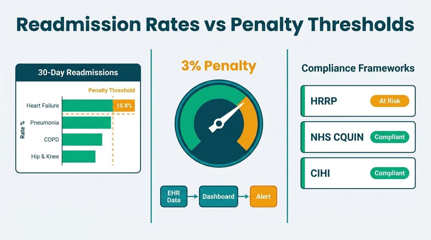
A hospital readmission rate analytics dashboard in Power BI centralizes 30-day readmission data, maps it against regulatory penalty thresholds, and surfaces the root causes behind avoidable returns. Built on clean EHR exports and governed under HIPAA (or NHS and PIPEDA equivalents), the dashboard gives healthcare administrators a single pane of glass for tracking compliance exposure across US HRRP, NHS CQUIN, and CIHI provincial benchmarks.
Key Takeaways
The US Hospital Readmissions Reduction Program (HRRP) penalizes hospitals up to 3% of all base Medicare payments for excess readmissions across six tracked conditions (CMS.gov, 2026).
NHS CQUIN indicators in England tie a portion of provider contract value to quality outcomes including readmission reduction, making dashboard visibility directly linked to organizational revenue.
CIHI publishes provincial 30-day readmission benchmarks that Canadian hospital CIOs use for peer comparisons and accreditation submissions.
A Power BI readmission dashboard requires a HIPAA-aligned data model, row-level security by care unit, and direct integration with your EHR's ADT feed.
Connecting readmission analytics to broader population health management and revenue cycle management views gives executives a complete value-based care picture.
What Is a Hospital Readmission Rate Analytics Dashboard?
A hospital readmission rate analytics dashboard is a structured reporting layer that tracks patients who return to an inpatient setting within a defined window - typically 30 days - after an initial discharge. The dashboard aggregates data from your EHR, claims system, and care management platform to answer three operational questions: which patient cohorts are readmitting, why they are returning, and what the financial penalty exposure looks like under current regulatory frameworks.
For US hospitals, this is not optional reporting. The Centers for Medicare and Medicaid Services (CMS) HRRP program adjusts Medicare payments based on excess readmission ratios for six conditions: acute myocardial infarction (AMI), heart failure, pneumonia, chronic obstructive pulmonary disease (COPD), hip and knee arthroplasty, and coronary artery bypass graft (CABG). An analytics layer makes penalty exposure visible before the payment year closes.
Healthcare analytics teams working in Power BI find that a Managed Power BI for healthcare teams deployment handles the security and refresh architecture that raw EHR extracts alone cannot provide - specifically, automatic incremental refresh on ADT data, row-level security by department, and a HIPAA Business Associate Agreement (BAA) with Microsoft as the underlying cloud host.
The dashboard is also the foundation for broader population health management work. Once readmission cohorts are defined in the data model, the same tables drive discharge planning scores, care gap identification, and post-acute network performance - all critical to value-based care contract compliance.
How Do HRRP, NHS CQUIN, and CIHI Benchmarks Shape Your Dashboard?
Each regulatory framework measures readmissions differently, and a well-designed dashboard accounts for all three if your organization operates across geographies.
| Framework | Jurisdiction | Measurement Window | Penalty or Incentive | Conditions Tracked |
|---|---|---|---|---|
| **CMS HRRP** | United States | 30 days post-discharge | Up to 3% of base Medicare payments (CMS.gov) | AMI, CABG, COPD, Heart Failure, Hip/Knee Arthroplasty, Pneumonia |
| **NHS CQUIN** | England (NHS) | Variable by indicator | Portion of NHS contract value (NHSE annual guidance) | Condition-specific indicators published each financial year |
| **CIHI RACI** | Canada | 30 days all-cause | Benchmark comparison; informs accreditation and funding discussions | All-cause and condition-specific; provincial peer groups |
US hospitals using CMS HRRP data need a rolling 3-year claims window - the program's standard measurement period - mapped to current admission data, plus an excess readmission ratio (ERR) calculation that accounts for patient risk factors. Hardcoded national benchmarks from the CMS HRRP final rule become DAX constants in your model, updated annually when CMS publishes the new payment year file — for FY2027 determinations, CMS released the updated coefficient tables in August 2026, making this a live refresh task for any team currently in build.
NHS Trusts in England face a more dynamic structure: CQUIN indicators change each financial year, so the dashboard needs a parameter table rather than hardcoded thresholds. A UK acute trust might track a CQUIN indicator tied to frailty screening and structured follow-up within 72 hours of discharge - metrics that feed the same readmission date table but require separate visual groupings and a rolling year-over-year comparison against NHSE targets.
Canadian health systems use CIHI's Readmission to Acute Care (RACI) indicator suite. PIPEDA governs patient data handling across most Canadian provinces, with stronger protections under Quebec's Law 25. A hospital analytics team in Ontario would import CIHI's public benchmark files as a reference dataset in Power BI, enabling direct peer-group comparisons without exposing individual patient records to external systems - satisfying both PIPEDA and provincial accreditation evidence requirements in a single report layer.
What Data Sources Do You Need to Connect EHR Data to Power BI?
Connecting EHR data to Power BI is the step that most implementations underestimate. The data model for a readmission dashboard needs at minimum four source tables: patient encounters, diagnoses (ICD-10-CM for US, ICD-10-CA for Canada, ICD-10 for UK), discharge disposition, and post-discharge contact records.
ADT feeds (Admit-Discharge-Transfer) are the backbone. Most major EHR platforms expose ADT data via HL7 v2 messages or FHIR R4 APIs. Power BI connects to these through an on-premises data gateway when the EHR sits on local infrastructure, or via a REST connector when using a cloud-hosted EHR instance. For HIPAA compliance, the gateway must be deployed within your covered entity's network boundary, and all Power BI workspaces handling PHI must reside in a Premium capacity with Microsoft Purview sensitivity labels applied. ADT feeds are also the source of record for patient flow analytics - tracking bed occupancy, length of stay, and discharge timing - making the readmission model a natural extension of existing operational reporting infrastructure.
Claims data from your clearinghouse or payer portal supplements the EHR with readmission events that occurred at other facilities - critical for accurate 30-day tracking when patients seek care outside your network. For NHS Trusts, Secondary Uses Service (SUS) data plays a similar aggregating role, governed under UK GDPR constraints and requiring a Data Processing Agreement with NHS England.
Care management platform exports - care plans, nurse call logs, transitions-of-care checklists - feed the root-cause layer. When a readmission fires in the dashboard, analysts need to see whether a post-discharge follow-up call was completed, whether a prescription was filled, and whether a home health referral was opened before discharge.
For teams choosing between data connection modes, the Power BI Import vs DirectQuery guide covers the latency and governance trade-offs that matter specifically when PHI is in the data path. Most readmission dashboards land on Import mode with scheduled daily refresh, since real-time latency is rarely required and Import mode's in-memory engine handles complex ERR calculations more reliably at scale.
How Do You Build a Hospital Readmission Rate Analytics Dashboard Step by Step?
The build follows five phases: data model, core measures, visual layout, access control, and compliance validation.
Step 1 - Build the Star Schema
Create a DimPatient table (de-identified or with HIPAA-appropriate field masking), a DimDate table for time intelligence, and a FactEncounter table with one row per inpatient stay. Add DimDiagnosis for ICD-10 lookups and DimFacility for multi-site organizations. The readmission flag lives in FactEncounter as a calculated column that checks whether a subsequent admission exists within 30 days of the prior discharge date:
```dax
ReadmissionFlag =
VAR PatientID = FactEncounter[PatientID]
VAR DischargeDate = FactEncounter[DischargeDate]
VAR NextAdmit =
CALCULATE(
MIN(FactEncounter[AdmitDate]),
FILTER(
FactEncounter,
FactEncounter[PatientID] = PatientID
&& FactEncounter[AdmitDate] > DischargeDate
&& FactEncounter[AdmitDate] <= DischargeDate + 30
)
)
RETURN IF(ISBLANK(NextAdmit), 0, 1)
```
Step 2 - Write the Core DAX Measures
The Readmission Rate % measure is the anchor: `DIVIDE([Readmissions], [IndexAdmissions], 0)`. For HRRP compliance, build an Excess Readmission Ratio (ERR) measure that compares your predicted readmissions (risk-adjusted using CMS coefficient tables) to the national expected rate. Import the CMS coefficient table as a static reference dataset so the ERR updates automatically when CMS publishes a new payment year file.
For NHS CQUIN dashboards, parameterize the target threshold using a What-If parameter slicer so quality teams can model different contract year targets without touching the DAX.
Step 3 - Design the Visual Layout
Organize the report across three pages: Executive Summary (aggregate readmission rate vs. benchmark, penalty exposure gauge, monthly trend line), Condition Drill-Down (rate by HRRP or CQUIN condition, peer-group comparison), and Patient Cohort Analysis (risk factor breakdown, discharge disposition mix, care plan completion rate). Use bookmarks to toggle between US, UK, and Canadian regulatory views without duplicating report pages.
Step 4 - Apply Row-Level Security
Define RLS roles by care unit and facility. In the Power BI service, map Azure Active Directory groups to roles - a quality director sees organization-wide data; a unit charge nurse sees only their ward. Document the RLS design as a named technical safeguard in your HIPAA Security Rule risk assessment, or in the equivalent NHS Data Security and Protection Toolkit entry for UK Trusts.
Step 5 - Validate Against the Published Benchmark
Before go-live, load the prior year's CMS HRRP payment determination file and verify that your ERR calculations match CMS's published values for the same period within acceptable rounding tolerance. This validation step is the one most teams skip - and it is the one that provides defensible methodology documentation when payers or accreditation bodies ask for your calculation approach.
For teams building a clinical dashboard for the first time, the FP&A Dashboard in Power BI build guide covers the same star schema and time-intelligence DAX patterns in a financial context and is a useful structural reference for the model design phase.
Which KPIs Should a Readmission Dashboard Track for Value-Based Care?
A revenue cycle management view of readmissions requires more than a top-line rate. The following KPI set covers clinical, operational, and financial dimensions for a complete value-based care compliance picture.
30-Day All-Cause Readmission Rate - tracked against HRRP, CQUIN, or CIHI benchmark as applicable to your jurisdiction.
Excess Readmission Ratio (ERR) by Condition - the CMS-calculated figure that determines penalty magnitude; displayed as a gauge against the 1.0 breakeven threshold.
Projected Annual Penalty Exposure - ERR multiplied by estimated Medicare base payments, updated monthly so finance teams can reserve accurately before the fiscal year closes.
Discharge Disposition Mix - home, skilled nursing facility (SNF), home health, against medical advice (AMA); higher AMA and SNF-to-acute ratios correlate with elevated readmission risk.
Post-Discharge Follow-Up Rate - percentage of patients contacted within 48-72 hours of discharge; a leading indicator for next month's readmission rate.
Care Plan Completion Rate at Discharge - transitions-of-care checklist items closed before the patient leaves the facility.
Readmission Rate by Attending Physician and Care Unit - enables targeted peer-comparison and quality improvement outreach without requiring individual-level PHI exposure at the dashboard layer.
For organizations building a parallel hospital workforce analytics dashboard, integrating RN-to-patient ratios by unit alongside readmission rates can surface staffing-level correlations that purely clinical dashboards miss - a connection increasingly visible in NHS workforce and retention reporting under the NHS People Plan.
How Does Population Health Management Connect to Readmission Analytics?
Readmission analytics is retrospective. Population health management turns it into a prospective intervention tool.
Once the readmission data model is in place, the same FactEncounter table feeds a risk stratification layer. Patients with two or more prior readmissions, three or more chronic conditions, and a documented care gap - missed follow-up, unfilled prescription, no home health referral - form a high-risk cohort that care managers can work proactively before a return admission occurs. In a Power BI population health management dashboard, this cohort appears as a drillable segment on the executive summary page, with a direct workflow handoff to the care management platform.
A US health system operating under a Medicare Shared Savings Program (MSSP) ACO contract uses this connection directly: reduced readmissions lower total cost of care, which increases shared savings distributions at year-end reconciliation. CMS data shows MSSP ACOs collectively generated over $2.1 billion in gross savings in the 2024 performance year (as of 2026); for current contract periods, readmission reduction remains one of the highest-leverage controllable cost drivers under the Enhanced Track, where shared savings rates reach up to 75% — making every avoided return admission directly traceable to ACO distribution. A Canadian regional health authority using CIHI benchmarks faces the same logic under provincial accountability agreements, where readmission rates appear in annual health system performance scorecards reviewed by the Ministry of Health. An NHS Trust in England ties this population-level view to its CQUIN evidence pack submitted quarterly to the integrated care board commissioner.
Predictive readmission models - whether built in Azure Machine Learning and surfaced in Power BI via a scored dataset, or delivered through a clinical decision support integration - feed the same risk stratification table. The AI Workflow Automation for Healthcare Operations guide covers how to connect machine learning outputs to operational dashboards without creating separate reporting silos that fragment the analyst workflow.
HIPAA's Safe Harbor and Expert Determination de-identification methods govern whether patient-level cohort data can flow into a shared analytics workspace in the US. Canadian organizations must additionally satisfy PIPEDA's purposes-of-collection requirement when linking EHR data to population analytics tools. NHS Trusts operate under UK GDPR, which requires a Data Protection Impact Assessment (DPIA) before processing health data at scale for new secondary analytics purposes.
---
About Lets Viz: Lets Viz has delivered data analytics and Power BI solutions for US healthcare organizations, UK fintech firms, Canadian manufacturers, and global SaaS companies since 2020, earning a 5.0 Clutch rating from verified clients. Our Microsoft-certified consultants bring direct experience building HIPAA-governed Power BI deployments, NHS data architecture, and PIPEDA-compliant analytics pipelines across North America and Europe.
If your hospital's readmission analytics needs to satisfy CMS HRRP audits, NHS CQUIN evidence requirements, or CIHI peer benchmarking - without months of internal IT effort - explore our Managed Power BI for healthcare teams service to see how a fully governed, incrementally-refreshed deployment moves you from raw EHR data to boardroom-ready compliance dashboards.