Healthcare Claims Denial Rate Analytics Dashboard Guide
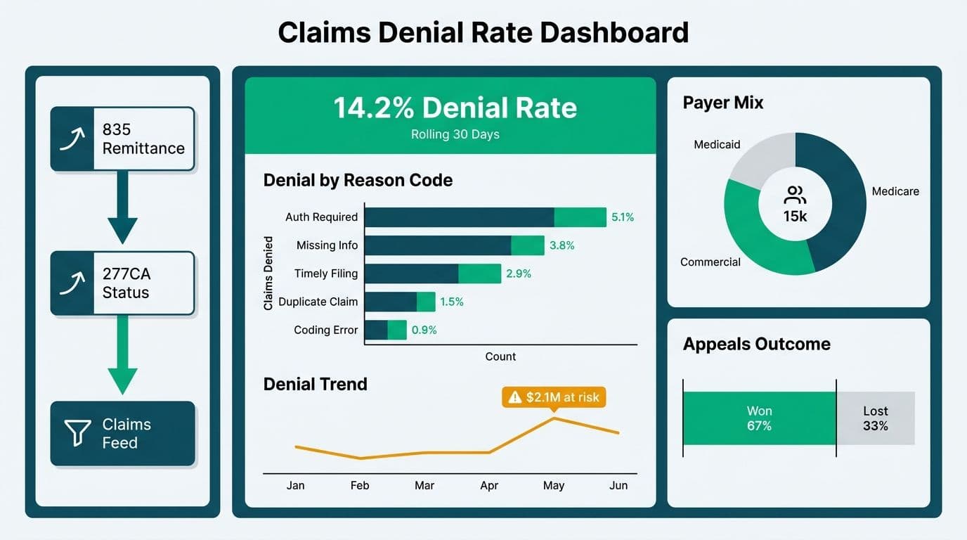
A healthcare claims denial rate analytics dashboard centralises payer mix, denial root-cause categorisation, and appeals tracking into one auditable view for revenue cycle teams. Connected to EHR or clearinghouse exports, it converts raw 835 and 277CA transaction data into actionable visuals that flag where claim revenue is leaking and which payer behaviors drive the most write-offs.
Key Takeaways
- Denial rate dashboards surface three distinct data layers: payer mix trends, denial reason-code root causes, and appeals win/loss performance.
- US teams rely on X12 EDI 835 remittance and 277CA transaction sets; UK NHS trusts reconcile Payment by Results tariff files; Canadian providers work with provincial adjudication exports under OHIP, HIBC, or AHCIP schemas.
- Power BI with a star-schema data model handles the high-cardinality joins between claim lines, payer contracts, and denial codes without performance degradation.
- HIPAA-regulated US environments require row-level security and audit logging before any dashboard goes to production; Canadian PIPEDA and the UK NHS Data Security and Protection Toolkit impose analogous obligations.
- A well-structured dashboard converts a reactive monthly write-off review into a daily, prioritised appeals work queue.
What Is a Healthcare Claims Denial Rate Analytics Dashboard?
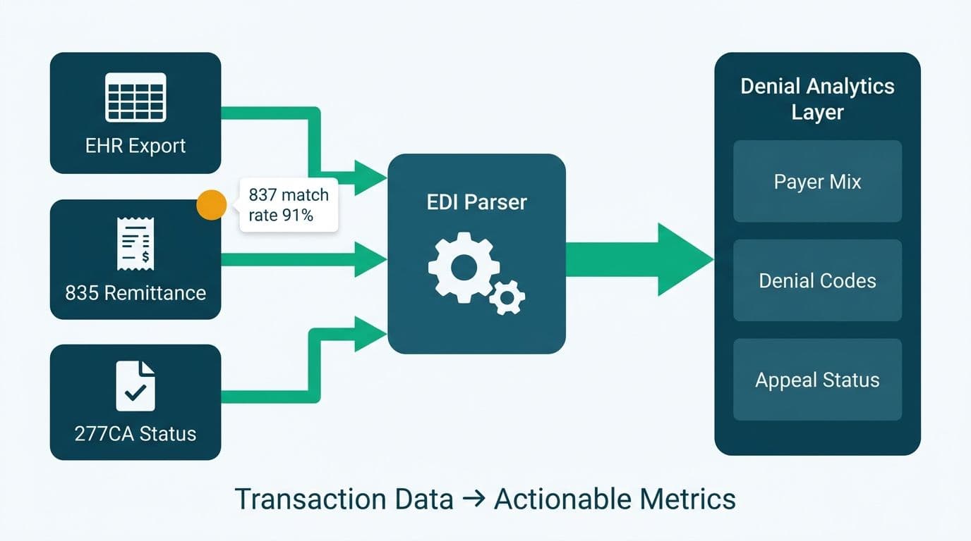
A claims denial rate analytics dashboard is a purpose-built reporting layer that aggregates rejected and denied claims into tracked metrics, attributes each denial to a root cause, and monitors whether the appeal or resubmission succeeded. It sits above the raw transaction systems - clearinghouses, practice management systems, or EHR billing modules - and answers three operational questions: which payers deny the most, why claims are denied, and how effectively the revenue cycle team recovers denied revenue.
For US hospital revenue cycle management analytics, the foundational data inputs are the X12 EDI 835 (remittance advice) and 277CA (claim acknowledgment) files. These contain payer-assigned Claim Adjustment Reason Codes (CARCs) and Remittance Advice Remark Codes (RARCs) that categorise each denial. Pulling these into Managed Power BI for healthcare teams creates the reporting spine from which all downstream visuals derive.
For NHS trusts in England, the equivalent inputs are the Payment by Results (PbR) monthly reconciliation reports and Secondary Uses Service (SUS) submissions. Canadian provincial health authorities - Ontario's OHIP, British Columbia's HIBC, Alberta's AHCIP - produce adjudication response files that carry rejection reason codes under province-specific schemas.
All three markets share one common analytical imperative: understand the denial pattern before the appeal window closes.
How Do You Visualise Payer Mix in a Claims Denial Dashboard?
Payer mix visualisation answers which payers contribute most to both volume and denial burden. The two are rarely proportional: a commercial payer representing 30% of visit volume may generate 55% of denials if its prior-authorisation requirements are stricter than average.
A standard payer mix visual set includes three panels.
Volume vs. denial heat map - a scatterplot with payer-weighted claim volume on the X axis and denial rate percentage on the Y axis. Payers in the upper-right quadrant are high-volume, high-denial and deserve contract renegotiation attention or front-end workflow remediation.
Revenue at risk waterfall - shows gross charges, contractual adjustments, denials, and net collections in a left-to-right flow, broken out by payer tier, so the CFO sees exactly where revenue is leaking before it reaches the bank.
13-month rolling denial trend per payer - a trend line with this time window catches seasonal patterns and shows whether a payer's denial rate is deteriorating after a policy or fee-schedule change.
In a US context, the payer mix segments across CMS (Medicare/Medicaid), commercial insurers, CHIP, and self-pay. A hospital financial dashboard Power BI build embeds payer category slicers so the CFO can isolate revenue exposure by funding source in seconds. UK dashboards mirror this structure with NHS commissioning versus private insurer segmentation. A Canadian provider dashboard might split OHIP-billed encounters from private supplemental payers and workers' compensation boards, with PIPEDA data governance rules requiring consent-based access controls across all data flows.
The foundational principle, consistent across all three markets, is to separate the volume story from the revenue story before layering in denial rate. The Revenue Cycle Management Dashboard Metrics: A Hospital KPI Guide covers the broader KPI framework that contextualises payer mix within the full revenue cycle.
What Metrics Reveal Denial Root Causes?
Denial root causes split into three tiers - administrative, clinical, and contractual - and a well-designed dashboard surfaces all three without conflating them.
Administrative denials arise from eligibility mismatches, missing authorisations, incorrect modifiers, or duplicate claim submissions. These are preventable at the front end of the revenue cycle and should appear in a separate visual panel with a "preventable denial" flag to distinguish them from clinical disputes.
Clinical denials involve medical necessity disputes, level-of-care disagreements, or documentation gaps. These carry higher appeal value but longer resolution timelines. The dashboard should track clinical denial rate by service line - emergency department, inpatient surgery, behavioural health - to pinpoint which service areas generate the most disputable documentation.
Contractual denials occur when a payer applies a rate that differs from the contracted fee schedule. These require a contract-vs-remittance reconciliation report, not an appeal, and belong in a separate underpayment panel rather than the denials work queue.
| Denial Type | Common CARC Codes (US) | Dashboard KPI | Appeal Priority |
|---|---|---|---|
| Eligibility / coverage | CO-27, CO-29 | Eligibility denial rate | Low (prevent at intake) |
| Medical necessity | CO-50, CO-57 | Clinical denial rate by DRG | High |
| Missing authorisation | CO-15, CO-197 | Auth gap rate by payer | Medium |
| Duplicate claim | CO-18 | Duplicate submission rate | Low |
| Contractual adjustment | CO-45 | Underpayment variance | High (contract audit) |
| Coding / modifier error | CO-4, CO-11 | Coding error denial rate | Medium |
NHS Payment by Results reconciliation uses HRG (Healthcare Resource Group) codes as the tariff driver, and SUS portal rejections carry their own reason codes. The analytical logic is identical to the US model: cluster by rejection type, measure frequency and financial impact, and route to the correct operational team. Canadian provincial adjudication systems generate reason codes that map to the same three tiers, though code sets differ by province and require a province-specific lookup table in the Power BI data model.
How Do You Track Appeals Performance in a Multi-Region Claims Dashboard?
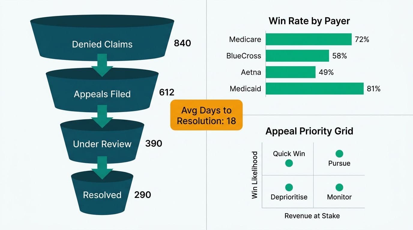
Appeals tracking answers a specific operational question: of the claims that were denied and then appealed, how many were overturned, at what review level, and how long did resolution take?
The core appeals metrics are:
- First-level overturn rate - percentage of first-level appeals that result in full or partial payment from the initial payer review.
- Second-level overturn rate - percentage of escalated appeals won after the payer's internal review board or an independent review organisation (IRO).
- Time-to-resolution by denial type - average days from denial date to final adjudication, broken out by CARC cluster or clinical vs. administrative category.
- Write-off rate by payer - claims that exhausted the appeal window without recovery, expressed as a percentage of original billed charges.
- Appeals ROI - dollars recovered per appeals FTE, a staffing efficiency metric that justifies additional revenue cycle headcount during budget cycles.
In a Power BI model, appeals performance joins to the original claim on the claim number key. Each appeal attempt becomes a row in an appeals fact table linked to the claim dimension, payer dimension, and date dimension. DAX measures then compute overturn rate using CALCULATE with a filter on appeal outcome status, enabling time-intelligence comparisons across rolling quarters without rewriting the measure for each period.
A US hospital dashboard must comply with HIPAA minimum-necessary standards - users should see only the protected health information (PHI) required for their specific role. Row-level security in Power BI enforces this at the dataset layer, preventing a billing analyst for orthopaedics from browsing denial records from the oncology service line. A UK NHS trust running the same appeals model configures access controls aligned with the NHS Data Security and Protection Toolkit (DSPT) and UK GDPR data minimisation requirements. Canadian healthcare organisations must document the lawful basis for each data-sharing relationship between the clinical system and the analytics platform under PIPEDA obligations before the dashboard goes to production.
How Do US Commercial, CMS, NHS, and Canadian Claims Environments Differ?
The core denial analytics logic transfers across markets, but the data schemas and regulatory context differ enough to require deliberate dashboard design decisions at the data-source layer.
| Dimension | US (Commercial / CMS) | UK (NHS PbR) | Canada (Provincial) |
|---|---|---|---|
| Primary claim format | X12 EDI 837 / 835 / 277CA | SUS / PbR reconciliation files | Provincial EDI (OHIP, HIBC, AHCIP schemas) |
| Denial code taxonomy | CARC / RARC | SUS rejection reason codes | Province-specific reason codes |
| Appeals body | Payer internal review / IRO / ALJ | NHS Resolution / commissioner review | Provincial health authority / tribunal |
| Data protection regime | HIPAA / 42 CFR Part 2 | UK GDPR / NHS DSPT | PIPEDA / provincial health privacy acts |
| Tariff / fee schedule | CMS fee schedule / contracted rates | HRG tariff | Provincial fee schedule |
| Self-pay exposure | Significant | Minimal (NHS is free at point of use) | Mixed (supplemental insurer coverage) |
This table illustrates why a single universal dashboard template breaks at the data-source and compliance layer, even when the visualisation logic is shared. The practical approach is a shared semantic model in Power BI with market-specific data connectors and a parameter-driven compliance mode that activates the correct row-level security policy based on deployment region.
Connecting these disparate sources to Power BI requires applying HL7 FHIR data visualisation principles alongside traditional EDI parsing. The Connect EHR Data to Power BI: Epic, Cerner and FHIR Guide covers the technical steps in detail, including FHIR R4 ExplanationOfBenefit resources, which carry denial and adjudication data in a structured, queryable format. Where the EHR supports FHIR API endpoints - Epic's Interconnect and Cerner's Millennium both expose ExplanationOfBenefit with CMS SMART on FHIR scopes - FHIR data visualisation in Power BI enables near-real-time denial feeds that reduce the lag between payer response and work-queue assignment.
How Should Revenue Cycle Teams Structure the Dashboard for Daily Operations?
A denial dashboard that drives a daily work queue outperforms one that feeds a monthly review. Separating the dashboard into three operational views achieves this without overloading any single audience.
Executive view (CFO / CMO): denial rate by payer, revenue at risk by category, and appeals ROI trended over 13 months. This panel integrates naturally with the hospital financial dashboard Power BI suite that the CFO uses alongside operating margin and days-in-accounts-receivable metrics.
Revenue cycle manager view: denial volume by reason-code cluster, worklist prioritisation by appeal deadline, and coder productivity measured by clean-claim rate. Managers use this view to allocate staff across denial types before the appeal window expires.
Analyst / specialist view: raw claim-line drill-through, full CARC and RARC code history per claim, and a contract-vs-remittance variance panel for underpayment detection. This view requires the deepest PHI access and therefore the most restrictive row-level security configuration under HIPAA.
Emergency department claims are a particular pressure point: ED visits generate high denial volume from medical necessity and level-of-care disputes. Embedding emergency department analytics dashboard metrics - triage level distribution, observation-vs-inpatient admission split, and average length-of-stay by payer - alongside the denial rate gives the ED director the context to address the coding patterns that drive unnecessary denials. The emergency department wait time analytics dashboard data, when joined to claims data, can also reveal whether longer ED stays correlate with higher medical-necessity denial rates - a pattern that simultaneously supports staffing and documentation workflow changes.
For teams extending their analytics into population risk and value-based care contracts, the Population Health Management Dashboard: Payer and ACO Guide 2026 shows how payer mix analysis extends into shared-savings calculations where denial rates intersect with quality metrics.
What Are the Common Pitfalls in Denial Rate Dashboard Design?
Three design errors undermine dashboard credibility more reliably than any data quality issue.
Mixed denial rate definitions: some teams calculate denial rate as denied claims divided by total claims submitted; others use denied charges divided by total billed charges. These produce different numbers from the same dataset. Publishing the precise definition in a visible data dictionary panel inside the dashboard ensures every viewer benchmarks against the same figure.
Ignoring zero-pay vs. partial-pay distinctions: a claim paid at zero dollars after a contractual adjustment is not a denial. A claim returned unpaid pending additional information is a pending claim, not a denial. Conflating these inflates the apparent denial rate and sends the appeals team after uncollectable write-offs. The Power BI data model should classify each claim line by payment status code from the 835 file before computing denial rate.
No audit trail for resubmissions: when a biller corrects and resubmits a denied claim, the correction must be traceable in the dashboard. Without a resubmission-linked record, the same claim appears as two denials in a naive count. The fix is to model claim versions with a latest-version flag and report on claim-level outcome rather than transaction-level count.
The Power BI vs Healthcare Analytics Software: Decision Framework explores when a general-purpose BI tool covers the full denial analytics use case versus when a purpose-built revenue cycle management platform justifies the additional licence cost for a given organisation's complexity.
---
About Lets Viz: Lets Viz has delivered data analytics and BI consulting solutions since 2020, working with US healthcare organisations, UK fintech firms, Canadian manufacturing companies, and global SaaS businesses. Rated 5.0 on Clutch, the team specialises in connecting complex, multi-source healthcare data to production-grade Power BI environments designed to meet HIPAA, PIPEDA, and UK GDPR requirements.
Ready to build a denial rate dashboard your revenue cycle team uses every day? Explore Managed Power BI for healthcare teams to see how Lets Viz designs, builds, and maintains compliant healthcare analytics environments at a predictable monthly cost.