Best Chart Types for Hospital Dashboards: A Decision Guide
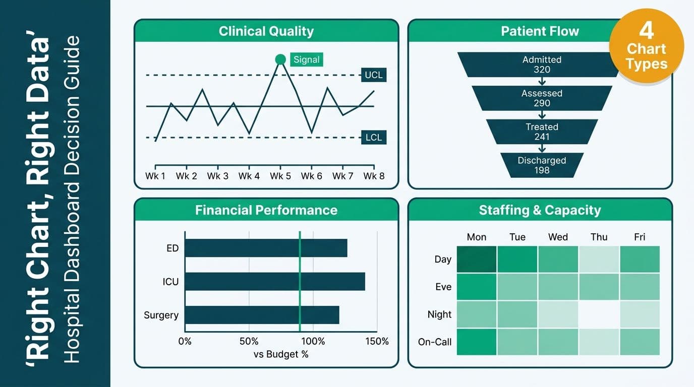
The best chart types for hospital dashboards depend on the data domain: control charts for clinical quality and patient safety metrics, waterfall and funnel charts for patient flow and throughput, bar and bullet charts for financial performance against budget, and heatmaps for staffing and capacity planning. Matching chart type to data type - and to audience literacy - is the single most effective lever for making hospital analytics actionable rather than decorative.
Key Takeaways
Control charts distinguish meaningful clinical deterioration from random variation - a capability bar charts fundamentally cannot provide.
Funnel charts map patient journey drop-off from referral to discharge; waterfall charts show cumulative financial or census changes step by step.
Heatmaps are the fastest way to surface staffing gaps and bed utilization patterns across two time dimensions simultaneously.
Non-clinical stakeholders need annotated, narrative-driven dashboards; clinical staff need high-density, drill-down-capable analytical views.
HIPAA-regulated environments require row-level security, audit trails, and Business Associate Agreements - chart aesthetics are secondary to data governance architecture.
What Are the Best Chart Types for Hospital Dashboards by Data Domain?
A hospital dashboard serves multiple audiences simultaneously: a CMO watching 30-day readmission rates, a CFO tracking cost-per-case against DRG reimbursement, and a charge nurse monitoring hourly bed occupancy. The right chart type is not the most visually impressive option - it is the one that communicates a specific data relationship to a specific audience without requiring interpretation training.
The core principle: match chart type to data relationship, then to audience literacy. A scatter plot revealing correlation between nurse staffing ratios and HCAHPS scores is analytically rich but will lose a board audience entirely. A bar chart framing the same finding - "Units with below-benchmark staffing scored 12% lower on patient satisfaction" - drives a decision in seconds.
Healthcare organizations working with Managed Power BI for healthcare teams consistently report that their fastest governance win is replacing decorative pie charts and gauge charts with purpose-selected visualization types that reflect the data's statistical structure rather than aesthetic convention.
The framework below maps the six core hospital data domains to their optimal chart types:
| Data Domain | Recommended Chart Type | Why It Works | Avoid |
|---|---|---|---|
| Clinical quality (infection rates, mortality, readmissions) | Control chart (SPC) | Distinguishes common from special cause variation | Bar chart (hides process behavior) |
| Patient flow (admissions, LOS, throughput) | Funnel, Gantt, swimlane | Shows sequential drop-off or stage duration | Pie chart |
| Financial performance (budget vs. actual, cost-per-case) | Waterfall, bullet chart | Shows cumulative change and target variance together | Stacked area |
| Staffing and capacity | Heatmap | Visualizes two-dimensional time patterns simultaneously | Single line chart |
| Trend monitoring (ED wait times, daily census) | Line chart with control limits | Communicates direction and statistical process bounds | Bar chart per period |
| Benchmarking (vs. NHS, CMS, or provincial peers) | Grouped bar, lollipop | Clean side-by-side peer comparison | Radar/spider chart |
Which Chart Type Fits Each Hospital Metric Category?
Choosing the best chart types for hospital data visualization becomes clearer when you organize the decision by metric category rather than by data structure alone. Four categories cover the vast majority of hospital dashboard requirements: clinical quality, financial performance, operational efficiency, and patient experience. Each category has a distinct analytical need, and that need determines the correct chart type.
Clinical quality - The core question is "is this metric deteriorating or is this noise?" Control charts (SPC) remain the primary answer, but scatter charts serve a second purpose: revealing correlation between process inputs and quality outcomes. A scatter plot of nurse-to-patient ratios against HCAHPS domain scores shows whether a staffing investment hypothesis holds across units - a relationship a control chart cannot expose on its own.
Financial performance - Bullet charts handle target-versus-actual comparisons efficiently. Cohort waterfall charts go further: by grouping patients into admission cohorts, a cohort waterfall traces how revenue from a specific DRG cohort erodes through denials, adjustments, and write-offs from gross charge to net collection. This gives revenue cycle teams a visualization that a standard period-level waterfall chart cannot replicate, because the cohort dimension isolates payer-specific and DRG-specific leakage patterns.
Operations - Sankey diagrams are the most underused chart type in hospital operations analytics. A Sankey maps patient flow between units - from ED to observation, from observation to inpatient, from inpatient to ICU - with flow width proportional to patient volume. Where a funnel chart shows linear drop-off in a single pathway, a Sankey exposes branching, recirculation, and bottleneck points across the entire patient flow network simultaneously. Heatmaps remain the optimal choice for staffing and bed utilization patterns across two time dimensions.
Patient experience - HCAHPS domain scores (communication, responsiveness, environment, discharge information) are composite indices that require benchmarking against CMS peer groups. Grouped bar charts with CMS percentile reference lines communicate standing within the peer group clearly. Where trend matters more than peer comparison, a small-multiple line chart per domain allows a quality team to track improvement trajectories across all HCAHPS domains simultaneously without the clutter of a single multi-series line chart.
How Do Control Charts Improve Clinical Quality Monitoring?
Control charts - also called Statistical Process Control (SPC) charts - are the most important and most underused visualization type in healthcare analytics. They display a metric over time alongside a calculated mean and upper and lower control limits, enabling a dashboard viewer to immediately distinguish normal process variation from a statistically significant signal that requires a formal response.
A standard bar chart showing monthly surgical site infection rates will appear alarming in some months and reassuring in others based purely on random variation. A control chart of the same data shows whether the process is "in control" - behaving predictably within expected statistical bounds - or whether a specific month represents a genuine deterioration demanding root-cause investigation.
NHS example: NHS England's Model Health System uses SPC charts as the primary visualization type for patient safety reporting, specifically because they reduce unnecessary escalations triggered by normal statistical fluctuation. As of 2026, the Model Health System has extended mandatory SPC adoption across all seven care domains - not just patient safety - following NHSE guidance that SPC literacy be embedded in integrated care board reporting cycles. A UK acute trust reporting to an Integrated Care Board needs to demonstrate whether a spike in delayed discharges is an emerging trend or routine noise - a control chart answers that in seconds, in a format consistent with NHS GIRFT methodology and the care quality expectations of CQC regulators.
US example: Under CMS's Hospital Value-Based Purchasing program, US hospitals report on clinical quality metrics where sustained signals on control charts directly affect reimbursement calculations. A US health system using Power BI can layer SPC visuals over Electronic Health Record (EHR) exports without exposing protected health information (PHI) in the visualization layer - a critical HIPAA compliance consideration when dashboards are shared beyond the clinical team to quality committees, board sub-committees, or external accreditation bodies.
The dominant themes shaping healthcare analytics in 2026 - value-based care, ambient AI documentation in clinical workflows, and payer analytics innovation - all depend on process-level performance thinking that control charts enable. Connecting dashboard data to reimbursement and regulatory outcomes requires visualization types that distinguish real signals from statistical noise, rather than static snapshots that obscure process behavior.
For teams exploring automation pipelines that feed real-time clinical data into SPC dashboards, the guide on AI Workflow Automation for Healthcare Operations covers integration architecture from EHR source systems to the visualization layer.
When Should You Use Waterfall or Funnel Charts for Patient Flow?
Patient flow data has two distinct visualization needs: sequential stage analysis (where do patients drop out of a care pathway?) and cumulative change analysis (how did census build or decline across a 24-hour operational period?). Waterfall and funnel charts serve these two needs respectively, and selecting the wrong chart type erases the insight entirely.
Funnel charts are optimal for referral-to-treatment pathways, emergency department triage-to-discharge flows, and surgical pre-admission processes. Each stage of the funnel represents a transition point where patients either progress or are diverted. Volume shrinks at each stage, and the visualization makes the size of each loss immediately visible - a comparison that a bar chart would require additional mental arithmetic to derive.
Waterfall charts excel at showing how a starting value (morning census) builds or declines through admissions, discharges, transfers-in, and transfers-out to arrive at an ending value (evening census). Finance teams apply the same chart type to trace how gross patient revenue becomes net revenue after contractual adjustments, bad debt, and charity care deductions - a standard US hospital financial reporting requirement under GAAP.
Canadian example: Ontario Health's wait-time reporting framework uses funnel-style visualizations to show provincial-to-regional-to-hospital drop-off in elective access benchmarks. A hospital analytics team building a comparable internal view in Power BI can replicate this structure natively, adding PIPEDA-compliant row-level security to restrict regional comparisons to authorized administrators only - satisfying both the analytical and privacy governance requirements simultaneously.
Which Chart Types Best Represent Healthcare Financial Performance?
Healthcare financial data combines two analytical needs that most generic dashboards handle poorly: variance analysis (actual versus budget versus prior year, by department and service line) and composition analysis (how does total cost break down by cost center, DRG, or payer mix?). The optimal chart selection for each need is different, and conflating them produces dashboards that answer neither question clearly.
Bullet charts are the most space-efficient way to display a metric against its target and its performance range simultaneously - far more informative than gauge or donut charts that show only current value in isolation. A CFO dashboard showing cost-per-adjusted-discharge against budget and against a CMS benchmark peer group benefits substantially from bullet charts over the analytically shallow gauge visual that remains common in healthcare finance reporting.
Waterfall charts handle variance decomposition better than any alternative chart type. When a US hospital's net patient revenue falls short of budget, a waterfall chart can show exactly how much variance is attributable to volume shortfall, payer mix shift, rate changes, and contractual adjustments - the four levers a CFO controls and must communicate concisely to the board.
Grouped bar charts with reference lines are the standard for payer mix and service line profitability comparisons. A UK NHS trust reporting income and expenditure to an Integrated Care Board, or a Canadian health authority reporting to its provincial Ministry of Health, needs clean side-by-side period comparisons that grouped bar charts deliver without the distortion of stacked bars, which make individual segment comparison nearly impossible.
For teams building financial dashboards in Power BI specifically, the FP&A Dashboard in Power BI: A Step-by-Step Build Guide covers the DAX measures and visual configuration needed to replicate variance waterfall and bullet chart patterns in a healthcare financial context.
How Do You Present Hospital Data to Non-Clinical Stakeholders?
Non-clinical stakeholders - board members, hospital administrators, payers, and community health partners - need narrative dashboards, not analytical workspaces. The distinction matters in practice: analytical dashboards expose raw data relationships for expert users who know what questions to ask; narrative dashboards guide a viewer through a pre-determined insight sequence using annotations, callouts, and intentional visual hierarchy.
Four design principles that consistently improve comprehension for non-clinical audiences:
Annotate anomalies in line. If readmission rates spiked in Q1, label the spike directly on the chart - "Post-holiday census surge, discharge planning capacity at 60%" - rather than making the viewer match chart movements to a separate explanatory table. Annotation converts a data observation into a finding a non-clinical reader can act on.
Limit charts per view to three or four. A board-level overview page showing more than four metrics invites attention fragmentation. Reserve drill-through pages for operational granularity and hold the summary view to the metrics that actually drive a governance or budget decision.
Use plain-language labels. "30-Day Readmission Rate" is clearer than "HRRP Metric - AMI/HF/PN Combined." Non-clinical stakeholders will not decode clinical acronyms under time pressure in a board meeting, and requiring them to do so erodes confidence in the dashboard and in the team that built it.
Lead with outcomes, follow with drivers. Show the headline metric first (readmission rate versus target), then the contributing factor (discharge disposition by payer), then the operational lever (discharge planning team capacity utilization). This sequence mirrors how administrators think about intervention and resource allocation.
US example: A US community health system presenting to its board under the CMS Hospital Star Rating framework needs to translate complex quality composite scores into a single trend line with a benchmark reference band - a narrative format that a board member with no clinical background can interpret in under 30 seconds. Analytics teams that apply this annotation-first approach consistently report a reduction in post-presentation follow-up data requests, since board members leave the meeting with questions already answered rather than deferred to the next cycle.
For a platform comparison covering narrative versus analytical dashboard capabilities across healthcare and enterprise BI contexts, the Looker Studio vs Power BI 2026: Decision-Maker's Guide covers this distinction directly in the context of healthcare and regulated-industry BI selection.
What Do HIPAA-Compliant Hospital Dashboards Require?
Designing hospital dashboards is not purely a data visualization challenge - it is a compliance architecture challenge. HIPAA-regulated environments impose requirements on how data is accessed, filtered, and rendered that directly determine which BI platform configurations are permissible and which create regulatory liability.
The core technical requirements for any HIPAA-compliant hospital dashboard:
Row-level security (RLS): A charge nurse should see only her unit's patient-level data; a department director should see her department's aggregate metrics; a CFO should access financial summaries without individual patient records surfacing. Power BI's RLS, enforced at the dataset level and backed by a Business Associate Agreement (BAA) with Microsoft, satisfies this requirement when configured correctly and audited regularly against the organization's role matrix.
Audit trails: HIPAA requires that access to PHI-adjacent data is logged with user identity, timestamp, and data scope accessed. BI platforms used for clinical or operational dashboards must generate access logs that survive a compliance audit - a requirement that eliminates several consumer-grade and open-source visualization tools from consideration in regulated US healthcare environments.
De-identification in the visual layer: When dashboards are embedded in public portals or shared with external ACO partners, payers, or grant funders, the visualization layer must display only de-identified or aggregate data even when the underlying dataset contains PHI. This is a chart configuration and data model discipline, not solely a data engineering decision.
UK and EU note: NHS trusts and EU health systems operate under GDPR and the UK Data Protection Act, which impose comparable access control and data minimization requirements. The Power BI technical implementation is nearly identical - RLS plus workspace-level access governance - though audit documentation requirements and data residency rules differ by jurisdiction under the UK adequacy framework.
Canadian note: Canadian provincial health organizations comply with PIPEDA and applicable provincial health privacy legislation, including PHIPA in Ontario and HIA in Alberta. The same RLS-plus-data-processing-agreement architecture applies, with additional requirements around data sovereignty for certain provincial health programs managed by public authorities.
For teams evaluating the build-versus-buy infrastructure cost question that underlies HIPAA-compliant dashboard decisions, the Microsoft Fabric vs Synapse vs Databricks: TCO Cost Breakdown provides an analytical framework for comparing infrastructure layer costs before committing to a platform.
If your hospital or health system needs a governed, HIPAA-compliant analytics layer that matches the right chart type to the right data domain, Managed Power BI for healthcare teams gives you a dedicated analytics team without the overhead and compliance risk of an in-house BI build.
---
About Lets Viz: Lets Viz has delivered data analytics and dashboard solutions since 2020, serving US healthcare systems, UK fintech firms, Canadian manufacturing companies, and global SaaS organizations. Rated 5.0 on Clutch, the team brings expertise in HIPAA-compliant Power BI implementations, CMS reporting frameworks, and NHS analytics standards - giving healthcare clients both the technical build and the regulatory confidence to deploy dashboards across clinical, operational, and financial domains.
---