10 CFO Power BI Dashboard Adoption Mistakes (and Their Fixes)
The most common CFO Power BI dashboard adoption mistakes come down to ten fixable decisions made before or during deployment: wrong KPI granularity, missing fiscal calendar, broken row-level security, absent data quality gates, licensing mismatches, and five others equally predictable. Mid-market finance teams in SaaS, manufacturing, and professional services consistently encounter the same failures regardless of geography. Every mistake has a known remedy, and most can be applied without rebuilding the underlying model from scratch.
Key Takeaways
- Wrong KPI granularity and a missing fiscal calendar are the top two reasons CFOs abandon dashboards within 90 days of launch
- Broken row-level security exposes board-level compensation and entity-level P&L to the wrong roles - a compliance risk under SOC 2, GDPR, and PIPEDA
- Power BI Pro vs. Premium Per User licensing mismatches cause capacity failures precisely at month-end, when dashboards matter most
- A data quality gate - a validation layer before data enters the semantic model - is the single highest-ROI governance investment
- Change management and metric certification, not technology, are the final barriers to sustained CFO adoption
What Are the Most Common CFO Power BI Dashboard Adoption Mistakes?
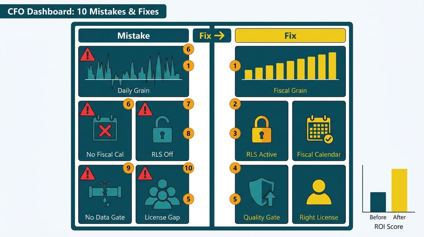
The ten failures cluster into three categories: data architecture mistakes, security and compliance gaps, and adoption and governance failures. Finance leaders building or evaluating Power BI for SaaS finance teams should audit against all three before any dashboard goes live. Teams that skip even one category typically find themselves in a rebuild cycle within 18 months.
| # | Mistake | Root Cause | Recommended Fix |
|---|---|---|---|
| 1 | Wrong KPI granularity | Operational metrics copied into the executive view | Define CFO-layer and FP&A-layer metrics separately |
| 2 | Missing fiscal calendar | Default Gregorian calendar misaligns with 4-4-5 or 13-period fiscal year | Build a dedicated date dimension with fiscal offsets |
| 3 | Broken row-level security | RLS roles mapped to static usernames instead of AAD groups | Sync RLS roles to Azure AD groups; test monthly |
| 4 | No data quality gate | ETL errors flow silently into the semantic model | Add validation queries before each dataset refresh |
| 5 | Wrong licensing tier | Pro assigned where Premium Per User capacity is required | Audit workspace capacity requirements before build |
| 6 | Dataflows vs. datasets confusion | Transformation logic duplicated across multiple datasets | Centralise shared logic in certified dataflows |
| 7 | No drill-through path | FP&A cannot interrogate top-line summary numbers | Add drill-through pages for every CFO-layer KPI |
| 8 | No change management plan | IT builds; finance never adopts | Embed finance champions in every build sprint |
| 9 | No metric certification layer | Definitions drift across teams and tools | Implement a certified dataset with a data dictionary |
| 10 | No executive or mobile view | Desktop-designed reports break on tablets and phones | Build dedicated mobile layout pages for C-suite use |
How Does Wrong KPI Granularity Derail a CFO Dashboard?
Wrong KPI granularity is the most common first failure: developers pull every available metric from the ERP and present it at transaction level, when a CFO needs trend-level summaries at a glance. The dashboard becomes a spreadsheet replacement rather than a decision tool, and adoption collapses within 60 days of launch.
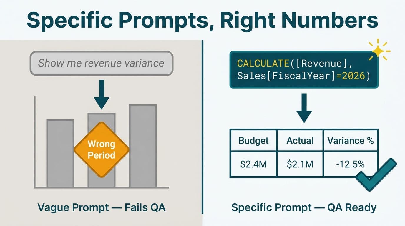
The fix requires a deliberate two-layer model. Define a CFO layer containing only the metrics that drive executive decisions - ARR, gross margin, cash burn rate, Days Sales Outstanding, and headcount cost per revenue dollar. Build a separate FP&A drill layer where analysts can interrogate line items, cost centre splits, and transaction detail. Each layer uses its own report page and its own set of DAX measures scoped to the correct aggregation level. A typical US SaaS finance team needs no more than eight top-line measures visible on the CFO view; everything else lives one drill-through click away.
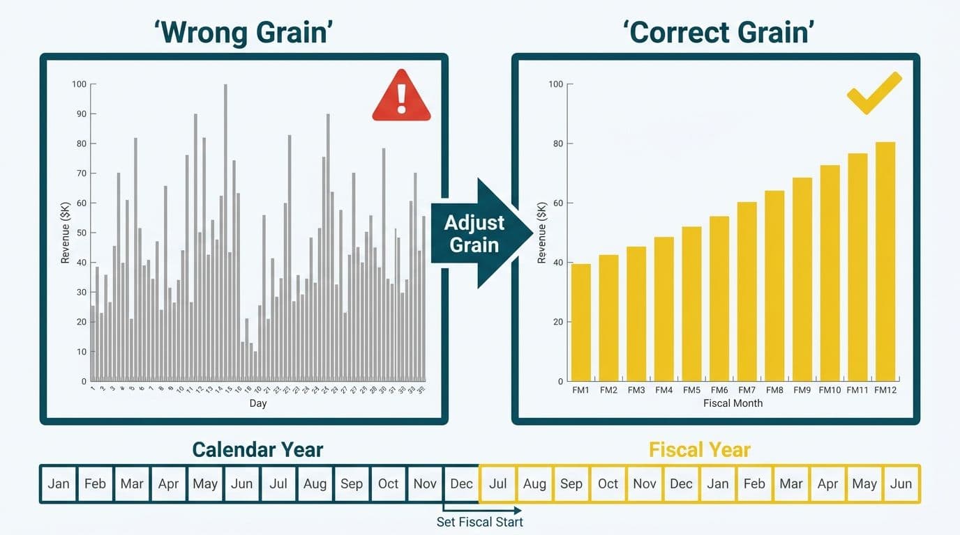
Time granularity matters equally. CFOs reading a weekly dashboard do not need daily fluctuations - they need trend lines and variance to budget. Build the default visual at the correct time grain and expose daily detail only through an analyst-facing drill-through page. This one architectural decision reduces refresh time, improves visual clarity, and significantly increases the probability that a CFO opens the report voluntarily rather than as an obligation.
Why Does a Missing Fiscal Calendar Break Month-End Reporting?
Power BI's built-in date intelligence functions assume a Gregorian calendar. Most mid-market firms operate on a 4-4-5 retail calendar, a 13-period fiscal year, or a fiscal year-end that does not align with December 31. The mismatch means that "prior year same period" and "quarter-to-date" calculations are wrong from day one, and the CFO sees comparisons that cannot be reconciled against the audited board pack.
The fix is a dedicated date dimension table with explicit fiscal year, fiscal quarter, fiscal period, and fiscal week columns, built to match the organisation's specific calendar. Build this table once as a Power BI dataflow - not inside each individual dataset - so all downstream semantic models inherit the same fiscal definitions automatically. A UK fintech firm operating on a tax year ending 5 April, or a Canadian manufacturer running a 52/53-week fiscal calendar, both require this table customised to their specific offsets rather than adapted from a generic template. Once built, every new dashboard on the same environment inherits the correct fiscal logic with zero additional effort.
What Is the Compliance Risk of Broken Row-Level Security in a Finance Dashboard?
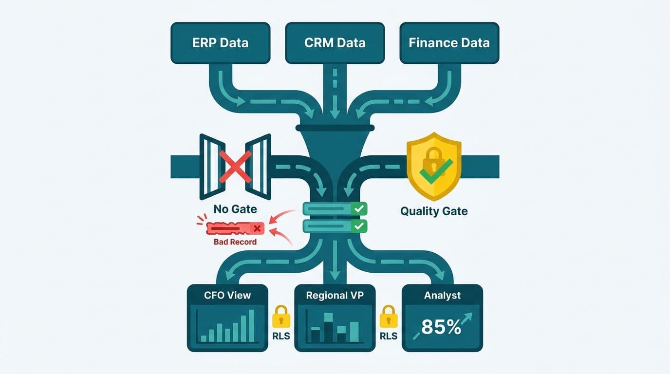
Row-level security (RLS) controls which cost centres, legal entities, or business units a given user can see inside a Power BI report. When RLS roles are defined by static username lists rather than Azure Active Directory group membership, every personnel change - a promotion, a departure, a team restructure - creates a window where the wrong person can view board-level compensation, deal pipeline, or entity-level P&L data.
For US organisations under SOC 2 Type II, UK and EU organisations subject to GDPR, and Canadian companies governed by PIPEDA, an RLS gap is not a dashboard inconvenience - it is an auditable compliance exposure. The correct architecture maps each RLS role to an AAD security group managed jointly by IT and HR, so that personnel changes propagate automatically without manual dashboard updates. Test RLS monthly using the "View as role" feature in Power BI Desktop, and log each test result in your governance record. Our Power BI governance best practices checklist covers this audit step alongside eleven other controls finance teams routinely miss.
How Do You Build a Data Quality Gate Before Data Reaches the CFO?
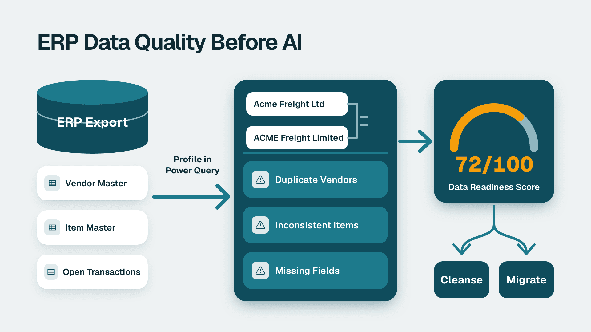
A data quality gate is a set of validation queries that execute after the ETL pipeline completes but before the Power BI dataset refresh is confirmed. Without it, a broken Salesforce sync, a missing intercompany elimination, or a duplicated journal entry flows silently into the semantic model. The CFO sees a polished dashboard built on incorrect figures, discovers the error at a board meeting, and loses confidence in the tool permanently.
Implementation follows a consistent pattern regardless of the ETL tool in use - Azure Data Factory, dbt, or Power BI dataflows. Add a final validation step that checks row counts against expected ranges, flags null values in mandatory fields such as account code or entity identifier, and verifies that closing balances reconcile to sub-ledger totals. If any check fails, cancel the dataset refresh and fire an alert to the data engineering team before any report consumer opens the dashboard.
This gate is especially critical for healthcare revenue cycle analytics dashboards, where a single missing payer code or misclassified charge code can misstate accounts receivable by millions of dollars and trigger a compliance review. For organisations evaluating a managed analytics service for healthcare providers, confirming that the vendor's ETL pipeline includes a documented quality gate should be a mandatory due-diligence question before contract signature.
Power BI Pro vs. Premium Per User: Which Licence Does a CFO Dashboard Need?
Licensing is where mid-market firms make the most expensive quiet mistake in the entire deployment cycle. Power BI Pro costs approximately $10 per user per month and supports report sharing within a Pro-licensed tenant. Power BI Premium Per User costs approximately $20 per user per month and unlocks paginated reports, dataset sizes up to 100 GB, and deployment pipelines - all of which a production-grade CFO dashboard typically requires.
The failure mode is predictable: a team builds on Premium Per User in development, then deploys to a Pro workspace at go-live to reduce the apparent managed Power BI service cost. Paginated P&L reports break immediately. Large financial models exceed the 1 GB dataset limit. Refresh capacity is throttled precisely at month-end. Resolving power bi pro vs premium per user licensing before the build starts - not after the first failed close - is the correct sequence.
| Licence | Monthly Cost | Max Dataset Size | Paginated Reports | Deployment Pipelines |
|---|---|---|---|---|
| Power BI Free | $0 | 1 GB | No | No |
| Power BI Pro | ~$10/user | 1 GB | No | No |
| Power BI Premium Per User | ~$20/user | 100 GB | Yes | Yes |
| Power BI Premium (capacity) | From $4,995/mo | 400 GB | Yes | Yes |
*Source: Microsoft Power BI pricing page, 2026. Always verify current rates with your Microsoft licensing partner before procurement.*
The same decision applies across sectors. A managed Power BI deployment for manufacturing companies tracking shift-level operational efficiency metrics alongside financial KPIs will almost always require Premium Per User at minimum, because combined dataset sizes typically exceed Pro limits within the first quarter of full production use.
What Is the Difference Between Power BI Dataflows and Datasets for Finance Teams?
Power BI dataflows are a reusable ETL and data preparation layer that stores cleaned, transformed data in Azure Data Lake. Semantic models (formerly called datasets) are the analytical layer - measures, relationships, hierarchies, and KPI definitions - that reports consume. When finance teams blur this boundary, transformation logic gets duplicated across dozens of independent datasets, and a single change to the definition of "net revenue" requires a multi-week remediation project touching every report that references it.
The correct architecture centralises all transformation logic - currency conversion, intercompany eliminations, fiscal period mapping, and headcount allocations - inside certified, version-controlled dataflows. Semantic models then import from these shared dataflows and add only analytical logic: DAX measures, KPIs, role hierarchies, and time intelligence patterns. Any finance team that has reconciled two different "ARR" figures from two dashboards built by two different analysts has experienced the exact cost of skipping this separation.
Power BI Model Context Protocol (MCP) is an emerging integration standard that allows AI agents and external tools to query a Power BI semantic model through a standardised interface. SaaS finance teams are beginning to connect MCP-compatible tools to their Power BI models to build AI-assisted variance analysis and natural-language query workflows. MCP requires a clean, well-governed semantic model to function correctly - another reason to resolve the power bi dataflows vs datasets architecture before layering any AI capability on top.
How Do Governance and Change Management Prevent CFO Dashboard Abandonment?
The technology is rarely the reason a CFO stops using a dashboard six months after launch. The reason is almost always a governance failure: metric definitions that diverge between the dashboard and the board pack, a semantic model that nobody certified, or a report showing stale data because an ETL job broke silently and no alert was configured.
A certified metric layer - where a designated dataset owner explicitly marks a semantic model as the authoritative source for a defined set of business metrics - resolves the definition problem. Pair it with a data dictionary that maps each measure name to its DAX formula and the business definition agreed jointly by finance and IT, and the CFO can trust the number on screen without cross-referencing a spreadsheet.
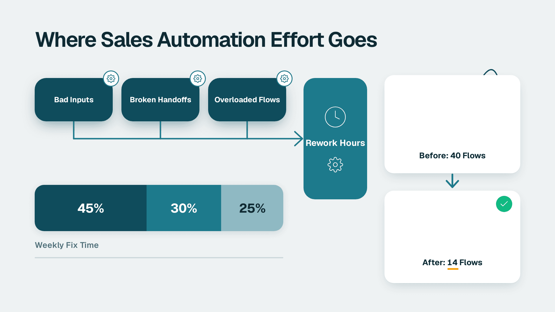
Change management is equally non-negotiable. In organisations where IT builds dashboards without finance embedded in the development cycle, adoption rates remain low regardless of technical quality. Embedding an FP&A analyst as a finance champion in every build sprint - someone who validates calculations, names measures in plain business language, and formally signs off before go-live - is the single most impactful governance investment available. Our guide to evaluating a Power BI managed service provider covers the governance questions to ask before signing with any external delivery partner.
Metric governance is not a one-time event. Schedule a quarterly review where the certified dataset owner, a senior FP&A lead, and the Power BI admin confirm that all measure definitions still match the accounting policy, that RLS roles reflect the current org structure, and that data quality gate thresholds are calibrated to current data volumes. This cadence, documented and assigned to specific owners, is what separates a dashboard that builds trust over time from one that silently erodes it.
What Does a Real Data Access Failure Look Like in a CFO Dashboard?
One constraint we encounter with established Power BI environments illustrates the stakes clearly. A client needed to extract all billing records from an existing Power BI model for an external audit. The Power BI visual export cap is 30,000 rows as a CSV. With 5,042,721 billing rows in the model, that cap made the tool entirely inadequate for audit extraction. The solution was to connect directly to the Analysis Services engine underneath the Power BI service and stream all rows out at approximately one million rows per minute - a pattern that requires the Premium capacity tier and a documented governance policy specifying who can initiate direct engine access and under what conditions.
The lesson for CFOs: before approving any dashboard for production use, map every downstream use case - board packs, audit extracts, regulatory filings, M&A data room exports - and verify that the chosen licensing tier and architecture can serve each one. A dashboard that passes the demo but fails at audit time destroys trust and rarely recovers, regardless of how strong the visualisation design is.
For teams evaluating broader tooling decisions, Looker Studio for finance reporting provides a useful reference point for understanding where managed BI platforms justify their architectural investment relative to lighter-weight self-service alternatives.
If your finance team is experiencing any of the failures described above, our Power BI for SaaS finance teams service page outlines the implementation and managed support options available for mid-market organisations.
---
About Lets Viz: Lets Viz has delivered Power BI implementations and managed analytics services for US healthcare organisations, UK fintech firms, Canadian manufacturing companies, and global SaaS businesses since 2020. The practice holds a 5.0 rating on Clutch and specialises in finance-grade semantic model architecture, row-level security design, and governed data pipelines for mid-market finance teams that require board-ready reporting without enterprise IT overhead.