Power BI Financial Reporting Dashboards: P&L, Cash Flow & Budget
Power BI financial reporting dashboards for P&L, cash flow, and budget-vs-actual tracking are built around three proven templates that pull ERP data into layered, drill-through canvases with KPIs and trend lines on a single screen. A well-structured implementation separates executive summary pages from operational detail, letting CFOs and FP&A teams deliver board-ready financial insight in minutes rather than hours.
Power BI financial reporting dashboard examples span three core templates that finance teams deploy most often: a profit and loss (P&L) summary, a cash flow statement view, and a budget-vs-actual variance tracker. Each dashboard layers KPIs, trend lines, and drill-through analysis onto a single canvas, enabling CFOs and FP&A teams to move from raw ERP data to board-ready insight in minutes rather than hours.
Key Takeaways
Strong Power BI financial dashboards separate executive summary pages from granular operational detail, with drill-through navigation between the two layers
SaaS finance teams should anchor their P&L dashboard on ARR waterfall, gross margin by segment, and churn-adjusted MRR
Cash flow dashboards need a 13-week rolling forecast view alongside historical actuals to support meaningful treasury decisions
Budget-vs-actual dashboards should display variance both in absolute dollars and as a percentage, with conditional formatting to surface outliers instantly
Automating monthly financial reporting in Power BI eliminates manual consolidation by connecting directly to ERP, CRM, and accounting systems via certified data connectors
What Should a Financial Reporting Dashboard Include in Power BI?
A production-ready Power BI financial reporting dashboard must include four structural layers: data ingestion, a semantic model, a visual layer, and access controls. Without all four, the dashboard either breaks at month-end or surfaces numbers that finance cannot trust.
At the visual layer, every financial dashboard should carry:
A KPI header row showing revenue, EBITDA, net income, and cash position against prior period and budget
Trend sparklines for at least 13 months so seasonality is visible at a glance
Variance columns displaying absolute and percentage deviation from plan
Drill-through pages that let a director click from a department total into individual cost centre transactions
A commentary pane for narrative context, typically populated via a SharePoint or Dataverse write-back connector
Role-based row-level security (RLS) is non-negotiable in enterprise deployments. A VP of Sales should see revenue lines but not compensation data. RLS filters are defined at the data model level in Power BI Desktop, not at the report level, which means they hold even when a user exports to Excel. Testing RLS before go-live using Power BI Desktop's "View as" function prevents the most common audit failures in regulated environments.
For a structured view of which metrics to prioritise at each reporting level, 5 Key Financial KPIs Every CFO Should Track covers the core measures and the correct calculation logic behind each one.
According to Market Research Future (2026), the Healthcare Financial Analytics Market is projected to grow at an 8.58% CAGR from 2026 to 2036, driven by regulatory demands for real-time cost visibility - precisely the environment that makes well-structured Power BI financial dashboards essential rather than optional across all industries.
Power BI Financial Reporting Dashboard Examples: P&L Walkthrough
The P&L dashboard is the most-requested financial report type, and the most commonly over-simplified. Here is how a SaaS company typically structures it across three report pages.
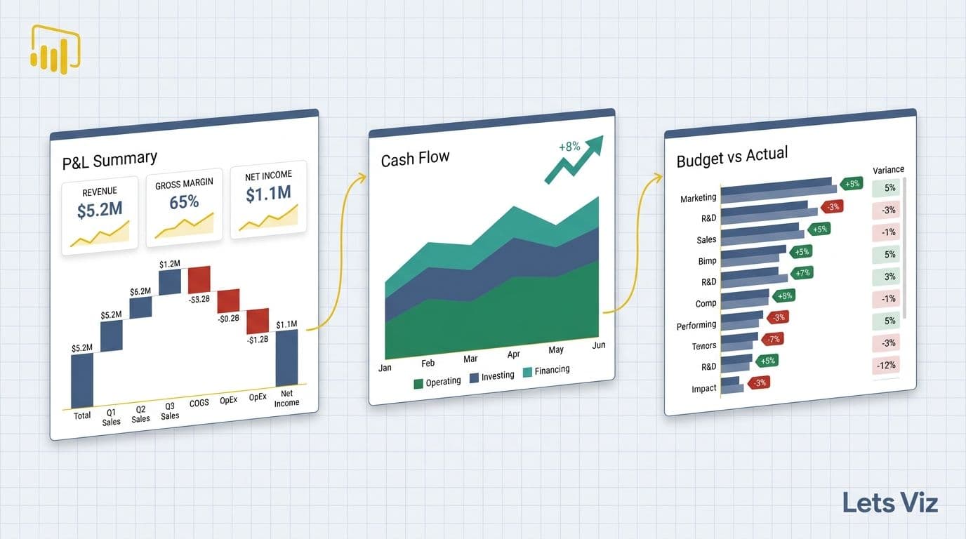
Page 1 - Executive Summary
The top row carries five KPI cards: Total Revenue, Gross Profit, Operating Income, Net Income, and Burn Rate. Below that, a waterfall chart breaks revenue movement from prior month to current month, showing new ARR, expansion MRR, contraction, and churned ARR as separate bars with positive and negative colour coding. A clustered bar chart beneath compares gross margin percentage by product line across the last six quarters, making revenue mix shift immediately visible without a separate analysis.
Page 2 - Department P&L
A matrix visual lists each cost centre (Engineering, Sales, Marketing, G&A) as rows, with columns for Budget, Actuals, and Variance. Conditional formatting turns variance cells red when they exceed 5% of budget and amber between 2% and 5%. A scatter plot in the lower panel maps spend efficiency: the x-axis shows budget attainment percentage, and the y-axis shows the primary output metric for that function - pipeline generated for Marketing, headcount deployed on-plan for Engineering, and so on.
Page 3 - Drill-Through Transactions
This page is hidden from the executive summary view and accessible only via right-click drill-through from a cost centre row. It surfaces a table of individual journal entries with GL code, vendor, invoice date, and amount. Finance teams use this to investigate anomalies without leaving Power BI, eliminating the round-trip to the ERP for routine variance investigations and reducing the analyst time cost of a standard month-end close review.
Copilot for Power BI: what it actually does for a finance team in 2026 walks through how AI-assisted narrative generation can populate the commentary pane on the executive summary page automatically, tested against a realistic SaaS P&L structure.
How Do You Build a Cash Flow Dashboard in Power BI?
A Power BI cash flow dashboard solves one specific problem: converting the static, backward-looking cash flow statement into a live, forward-looking treasury management tool.
The architecture requires two data streams. The first is historical actuals pulled from your ERP (NetSuite, SAP, or Dynamics 365) via a certified Power BI connector or incremental-refresh dataflow. The second is a 13-week rolling forecast model, typically maintained in Excel or a planning tool, imported into Power BI via a SharePoint or OneDrive connector so finance can update projections without touching the report file or engaging a BI developer.
Key visuals for a production cash flow dashboard:
Operating / Investing / Financing waterfall - shows where cash came from and where it went, period-over-period, making the cash conversion cycle visible without reading a table
13-week rolling forecast line overlaid on historical actuals in a combo chart, with the forecast period rendered in a lighter colour to distinguish confirmed data from projection
Days Sales Outstanding (DSO) trend - a line chart that signals AR collection risk before it becomes a liquidity event, updated daily from billing system data
Cash runway tile - a KPI card that calculates months of runway at current burn rate, recalculated automatically on each scheduled refresh cycle
A common design mistake is building the cash flow statement as a simple table visual. Tables do not surface trend breaks or directional signals — a DSO creeping from 42 to 58 days over six weeks is invisible in a tabular view but immediately obvious as an upward slope on a trend line. For context, median B2B DSO across mid-market companies held at approximately 38–40 days in 2026; a drift of 16 days in six weeks represents a material outlier signal that warrants immediate AR intervention, not a routine reporting footnote. The waterfall and combo chart combination is what converts this report from a compliance artefact into an active treasury decision tool that a CFO checks every Monday morning.
For teams connecting cash flow data to live invoice status, Automated Invoice Tracking with Power BI and Power Automate shows how to automate the AR pipeline so DSO data feeds the dashboard without manual exports from the billing system.
According to Future Market Insights (2026), the AI consulting services market reached USD 11.07 billion in 2025 and is projected to grow to USD 90.99 billion by 2035 at a 26.2% CAGR - a figure that reflects the scale of enterprise investment in data-driven financial infrastructure, with real-time cash visibility representing a foundational requirement in that investment thesis.
What Does a Budget-vs-Actual Dashboard Look Like Across Industries?
Budget-vs-actual is the highest-frequency financial dashboard in most finance calendars - running monthly, quarterly, and at year-end review. Its structure differs meaningfully by industry because the primary variance driver changes with the underlying business model.
| Industry | Primary Budget Variance Driver | Must-Have Dashboard Metric |
|---|---|---|
| SaaS | ARR waterfall vs. plan | Churn-adjusted MRR, gross margin by product tier |
| Enterprise Manufacturing | Standard cost variance (material, labour, overhead) | OEE by plant, production cost per unit |
| Healthcare | Payer mix shift and contract rate changes | Cost per case, payer revenue concentration |
| Professional Services | Utilisation rate vs. target | Billable hours attainment, project margin |
| Retail / Consumer | Gross margin by category and store | Promo ROI, inventory turnover, shrink % |
For SaaS companies, the budget-vs-actual dashboard must go beyond simple revenue comparison. The most effective SaaS version tracks ARR waterfall variance (did expansion exceed plan? did churn beat forecast?), gross margin by product tier (because a blended margin can mask a deteriorating infrastructure cost structure), and headcount spend versus hiring plan (often the single largest variance driver in high-growth SaaS environments).
For enterprise manufacturing, the dashboard pivots to standard cost variance analysis - the difference between what production should have cost and what it actually cost, decomposed by material, labour, and overhead. A well-built Power BI version pulls directly from the ERP cost accounting module and surfaces variances by plant, product family, and shift, enabling operations finance to isolate inefficiencies without a week-long manual investigation.
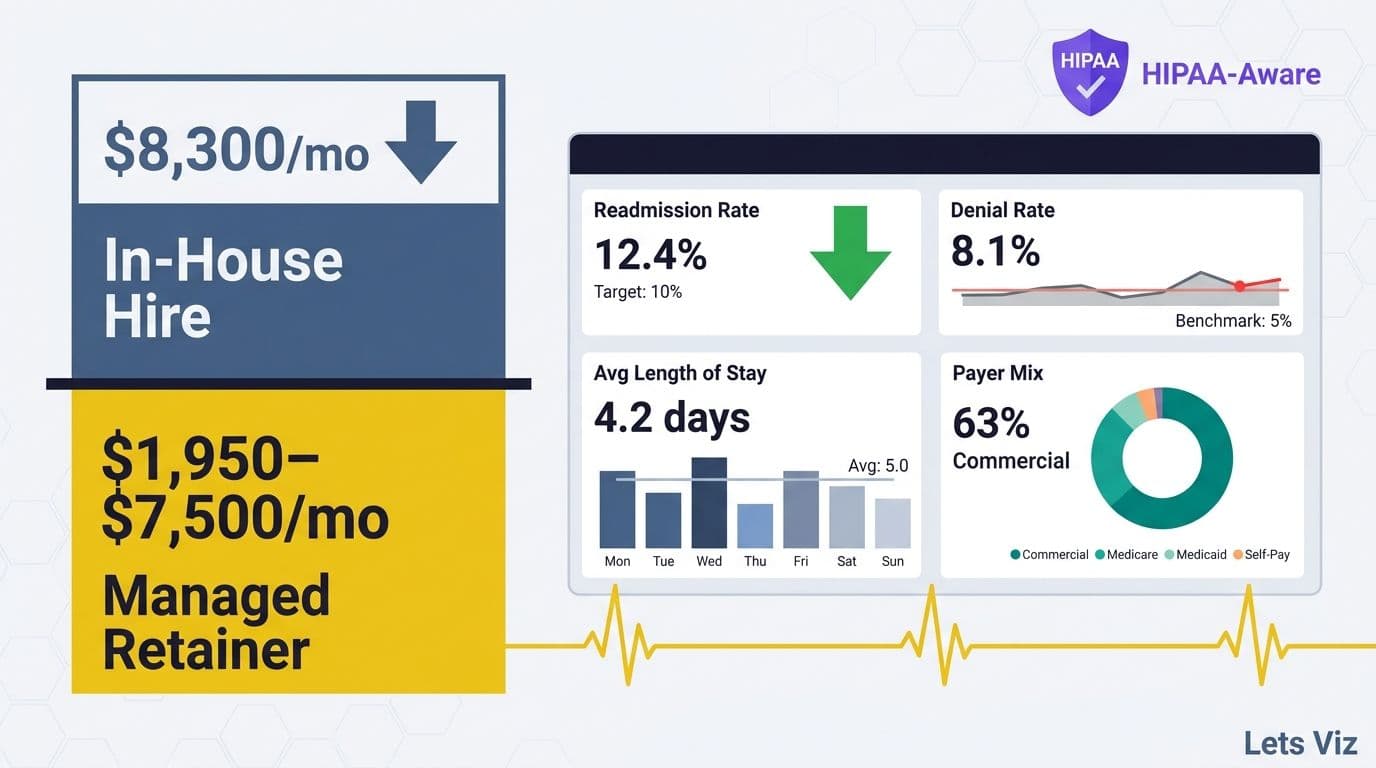
According to MedInsight (2026), the dominant themes in healthcare financial analytics in 2026 are value-based care contracting, AI-driven cost analytics, and payer mix analysis — with early-adopter health systems reporting 12–17% reductions in cost-per-case through AI-driven variance monitoring (as of 2026). Each theme requires a dedicated dashboard tab beyond a standard budget-vs-actual view, adding a layer of complexity that generic dashboard templates cannot support out of the box.
Mid-market companies that lack in-house Power BI capacity to build industry-specific budget-vs-actual dashboards are increasingly using a managed services model. Outsourced Financial Analytics Services for Smarter Insights outlines what that engagement model typically looks like and where it fits within a finance team's existing tool stack.
How to Automate Monthly Financial Reporting in Power BI
Automating monthly financial reporting in Power BI means eliminating the three manual steps that create most of the month-end delay: data extraction from source systems, consolidation across multiple platforms, and report formatting before distribution. Finance teams running fully manual month-end processes typically spend 5–8 business days closing and distributing board-ready reports; teams with automated Power BI pipelines consistently report this compressing to 1–2 days, with the remaining time spent on narrative review rather than data assembly.
Step 1 - Replace manual exports with certified connectors
Power BI ships with certified connectors for most major ERP and accounting platforms. Use these rather than scheduled CSV exports or shared network drive handoffs. Certified connectors support incremental refresh, which means only new or changed rows are pulled on each refresh cycle, keeping load times fast even on multi-year transaction datasets. Teams migrating from manual CSV exports to certified connectors typically reclaim eight to twelve hours of analyst time per month-end close cycle — eliminating the two-hour monthly export ritual that most finance teams running legacy processes still carry, along with the downstream reconciliation work when files land out of sequence.
Step 2 - Build a centralised dataflow
Power BI Dataflows (Fabric Dataflows Gen2 in the Microsoft Fabric ecosystem) let you define transformation logic once and reuse it across multiple reports. A finance team that builds the GL transformation layer once for the P&L report can connect the same cleaned dataset to the budget-vs-actual and cash flow dashboards without duplicating or diverging transformation logic. This is the most consequential structural decision in a multi-dashboard finance reporting environment.
Step 3 - Schedule refresh and configure threshold alerts
Set the semantic model to refresh automatically at a time aligned with the ERP's nightly batch close, typically between 01:00 and 03:00 local time. Configure Data-Driven Alerts in Power BI Service to notify the FP&A analyst via email or Microsoft Teams if a KPI crosses a defined threshold - for example, if operating cash falls below a minimum balance, or if a department's run-rate spend exceeds 110% of monthly budget before month-end.
Step 4 - Layer in AI-assisted narrative generation
Microsoft Copilot in Power BI can generate a plain-language summary of variance analysis on a report page, reducing the time to draft the monthly CFO narrative commentary from roughly two hours to approximately twenty minutes for most teams. The quality of this output depends heavily on data model hygiene: Copilot draws directly from measure descriptions and field names when generating variance language, so models with fully-named DAX measures (e.g. `[Gross Margin % - Current Month]`) and completed data dictionary entries produce accurate, audit-ready commentary, while models with abbreviated or undocumented measures require significant human correction. The output still requires analyst review and does not replace judgment, but it materially compresses the time between report refresh and distribution. The 3 AI features in Power BI that are actually worth using benchmarks this feature against real finance reporting scenarios, including the cases where the output falls short of what a finance team needs.
Financial Reporting Dashboard Best Practices for Healthcare and Enterprise Teams
The practices below separate financial dashboards that drive decisions from those that merely display data.
Separate the semantic layer from the visual layer. Build your data model - calculations, relationships, hierarchies - in a shared semantic model published to the Power BI Service. Reports connect to that model rather than each maintaining a local dataset. When the CFO requests a new cut of the data, you add one measure to the shared model and every connected report inherits it without a rebuild. For healthcare organisations with complex cost allocation logic, this architecture is not optional - it is the difference between a sustainable reporting environment and one that breaks with every system update.
Use bookmarks for scenario switching. CFOs routinely toggle between budget, reforecast, and prior-year comparisons on the same visual. Power BI bookmarks, triggered by button controls, make this possible without duplicating pages. A single P&L page can carry three live scenarios controlled by a button bar at the top, keeping the report surface area manageable for board-level users who are not Power BI natives.
Enforce naming conventions in DAX. Measures named `[Rev]`, `[Margin]`, or `[Var]` create audit risk and cross-team confusion. Name every measure with its full context: `[Gross Margin % - Current Month]`, `[ARR Variance vs. Budget - YTD]`. In regulated industries, well-named measures are a compliance signal as much as a developer convenience, because auditors and board members increasingly open the underlying dataset directly.
Populate the data dictionary. Every calculated measure should have a description field completed in the semantic model. Power BI surfaces these descriptions in the field list and in Copilot's Q&A interface. A documented model trains both human analysts and AI query tools significantly faster, and it reduces the volume of ad-hoc "what does this number mean?" queries that otherwise route back to an already-stretched FP&A team.
Run end-to-end testing before each major reporting cycle. Financial dashboards are not set-and-forget infrastructure. Data source schema changes, ERP upgrades, and platform updates can silently break measures or refresh pipelines — a common failure pattern is an ERP vendor renaming a GL account dimension during a quarterly patch, which silently zeros out an entire cost centre row in every connected report without triggering a refresh error or alert. Build a pre-close validation checklist that compares key measure outputs against a known control dataset before the CFO opens the report, catching data integrity issues before they become a boardroom problem.
---
About Lets Viz: Lets Viz is a data analytics consulting firm with over eight years of experience designing and maintaining Power BI financial dashboards for SaaS companies, enterprise manufacturers, and healthcare organisations across the UK, US, and India. Our certified Power BI specialists have delivered production-grade financial reporting systems for clients ranging from Series B SaaS firms to FTSE-listed enterprises, with a track record spanning P&L automation, cash flow forecasting, budget-vs-actual reporting, and board-level analytics.
If your finance team spends more than a day each month assembling reports that should refresh automatically, explore our Managed Power BI services - designed specifically for SaaS and mid-market finance teams that need production-grade financial dashboards without the overhead of building an in-house BI function.