The 3 AI features in Power BI that are actually worth using (and 4 that aren't)
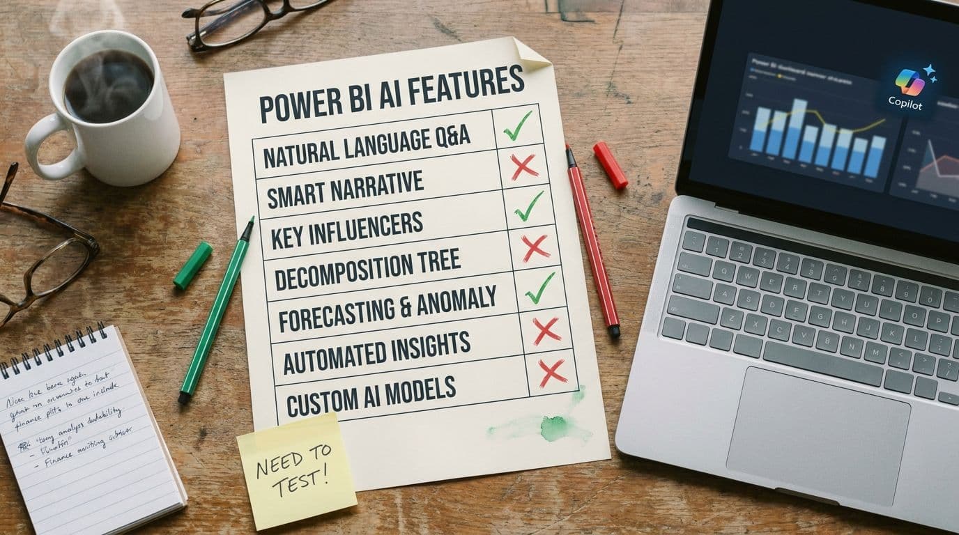
Microsoft has been adding AI features to Power BI for longer than most people remember. Key Influencers came in 2019. Quick Insights predates it. Smart Narrative, Decomposition Tree, Copilot, Copilot-authored measures, Copilot-authored reports — the list is now long enough that most finance teams quietly ignore most of them, turn on one or two, and call it a day.
After testing every one against our realistic SaaS P&L (full methodology here), we think that's roughly the right instinct — just maybe not the right one or two. Here's our opinionated ranking.
The three worth using
1. Copilot-generated executive summaries on a monthly pack
Give Copilot a published report and ask for a four-paragraph executive summary. It will read the visuals, identify the three largest movements, and write a clean structured narrative that uses the same vocabulary as your chart titles. It does not fabricate numbers. It does not invent categories. It produces a useful first draft in under ten seconds.
The catch: it misattributes cause. A dip in ARR from one enterprise churn gets described as 'continued segment softness.' Use the summary for structure and wording, then have an analyst rewrite the 'why' sentences. Net time saved per month pack: about 90 minutes.
Verdict: turn it on. Highest-ROI AI feature in the product today, if you understand the narrative guardrail.
2. Natural-language Q&A — but only for single-dimension questions
'How much did we spend on marketing in March?' 'What was ARR at the end of Q1?' 'Top ten customers by MRR.' These kinds of questions have a single clear answer, and Copilot's Q&A handles them reliably as long as your semantic model has proper descriptions and synonyms. This is the feature that justifies the whole AI pitch for non-analyst stakeholders — it gives them direct access to numbers without pinging the analytics team.
The line to hold: two-dimension questions are not safe yet. 'How did gross retention trend for enterprise customers last quarter?' will look right some runs and silently drop the segment filter on others. Make it clear inside the team which kinds of questions are self-serve and which still need human analysis.
Verdict: turn it on, with explicit scope guidance for the users.
3. The Decomposition Tree (technically AI-assisted, actually just great)
The Decomposition Tree visual lets stakeholders click through dimensions to see what drives a metric. Technically it uses AI to suggest 'high value' and 'low value' next splits, but its real value is that it's an excellent interaction pattern. It gives a CFO or VP a way to explore without needing the analyst on the Zoom call.
The AI splits are occasionally useful. The click-to-explore interaction is always useful. Even without turning on the AI-suggested splits, this visual earns its place on any executive-facing report.
Verdict: use it heavily. Treat the AI suggestions as a bonus, not the point.
The four that aren't ready (or never were)
4. Copilot-authored DAX measures
We tested Copilot writing a 'revenue net of churn' measure. The first attempt compiled, returned a number, and was wrong — it double-counted reactivations. The second attempt, after being told about the bug, compiled and returned a different wrong number. The third attempt, with the definition pasted in, finally produced the correct measure.
The real problem is that the numbers look right. An AI-authored measure that is subtly wrong will ship, get used in a dashboard, get referenced in a board deck, and eventually get caught only because something downstream doesn't reconcile. We've seen this pattern in production more than once.
Verdict: use it for syntax scaffolding on patterns you already know, not for authoring measures you'll trust without testing against a known baseline.
5. Key Influencers
Launched in 2019. On paper: 'what drives this metric?' In practice: a regression visual that surfaces correlations with no judgment about whether they matter. It will tell you that customers who logged in more often had higher retention, which — yes, we knew. It will also surface spurious correlations confidently, and non-analyst stakeholders cannot tell which is which.
Verdict: leave it off for finance-facing reports. It creates more follow-up questions than insight.
6. Quick Insights / Auto-generated insights
The oldest AI feature in the product, and the one that has aged worst. Point it at a dataset and it will produce a deck of 'insights' like 'Revenue has a positive correlation with Month.' Most are useless; the useful ones are obvious; the non-obvious ones are often artifacts of how the data is shaped.
Verdict: skip it. The modern equivalent is a well-instrumented Decomposition Tree.
7. Copilot-authored reports from scratch ('build me a dashboard')
This is the feature that demos beautifully and ships a mess. Copilot will generate a report from a natural-language brief, and the result is always structurally plausible and always missing the things that matter — the actual KPIs your team uses, the right segmentation, the right filters, the cohort-period definitions that your CFO cares about.
The failure mode: it produces something that looks like a dashboard someone else would build, not a dashboard your team would build. Finance reporting is highly customized to how each company thinks about its numbers. No prompt captures that on the first try, and iterating a prompt is usually slower than just building the report.
Verdict: skip it for real reports. Fine for quick exploratory visuals.
The rule underneath all of this
The Power BI AI features that work are the ones where the model is assisting a human workflow — summarizing a report a human built, answering narrow questions on a model a human governed, surfacing splits in a decomposition a human designed. The features that fail are the ones where the model is asked to replace a human workflow — authoring measures, explaining causality, building reports from scratch.
This is the frame we'd use for every future AI feature Microsoft ships in this product. If the feature is assistive, evaluate it for real ROI. If the feature is replacement-shaped, be very careful, and by default leave it off until you can govern it.
Where we come in
Lets Viz runs Managed Power BI for SaaS finance teams — including the governance layer that decides which of these AI features are safe to turn on for your specific estate, and which need work on the model first.
If you want an opinionated partner on this rather than a 'we can enable Copilot for you' consultancy, we should talk.