How to Analyze Hospital Readmission Rates in Power BI
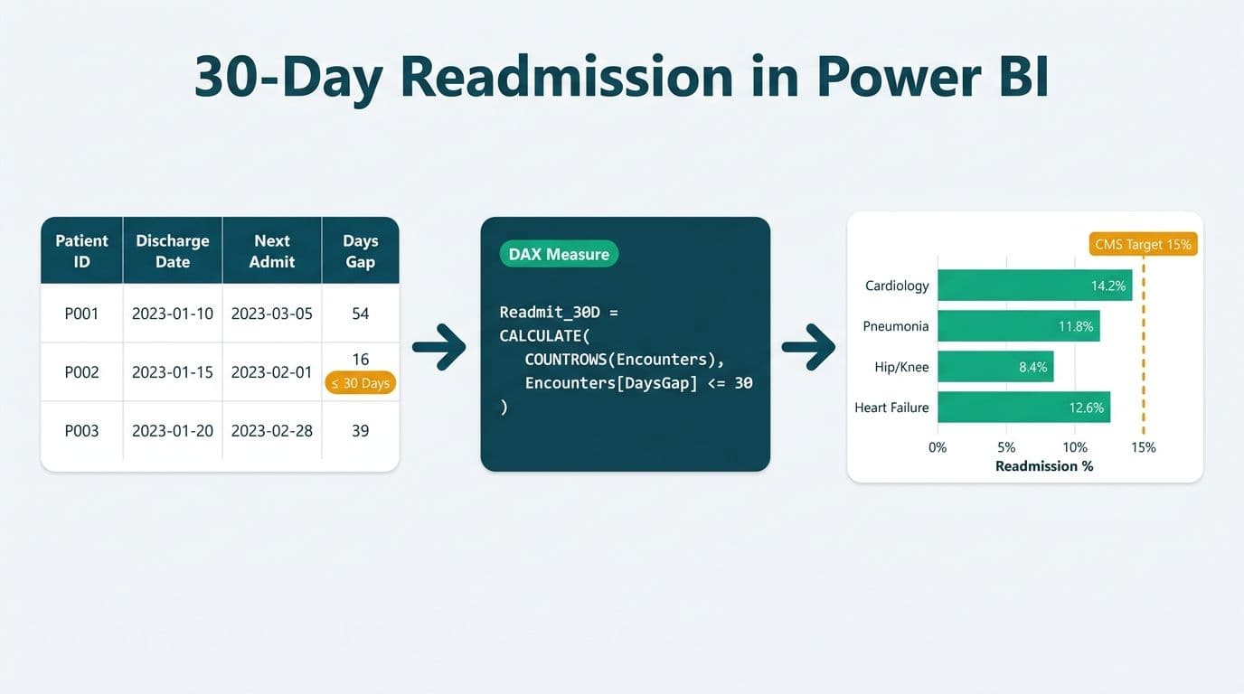
To analyze hospital readmission rates in Power BI, connect your ADT (Admission-Discharge-Transfer) data source, build a date-comparison model using DAX to flag patients discharged and readmitted within 30 days, then layer CMS HRRP, NHS England, or CIHI benchmark targets as reference lines on your visuals. The result is a compliant, drill-through dashboard that surfaces high-risk service lines before your next board review.
Key Takeaways
- A 30-day readmission measure requires a self-join on your patient encounters table, comparing discharge date against subsequent admission dates within the same patient record.
- CMS HRRP, NHS England, and CIHI each publish condition-specific readmission targets that load as static reference tables in your Power BI model.
- Power BI row level security (RLS) is non-negotiable in HIPAA-regulated US environments - each clinical department should see only its own patient cohort.
- DAX time-intelligence functions (DATESBETWEEN, CALCULATE) do the heavy lifting once your date table and fact table are correctly related.
- A well-structured power bi healthcare dashboard template reduces analyst build time and gives leadership a consistent view across service lines.
What Are the Key Readmission Benchmarks? (CMS HRRP, NHS England, CIHI)
Readmission benchmarks differ by country and payer, so your Power BI model should store them as a dedicated reference table rather than hard-coding thresholds in DAX.
| Benchmark | Jurisdiction | Key Conditions | Target or Penalty |
|---|---|---|---|
| CMS HRRP | United States | AMI, heart failure, pneumonia, COPD, CABG, THA/TKA | Payment reduction up to 3% of base DRG |
| NHS England Emergency Readmission Rate | United Kingdom | All-cause emergency readmissions within 30 days | ICB/CCG performance indicator |
| CIHI 30-Day Readmission | Canada | Readmission following acute care discharge | Provincial benchmarking |
In the US, CMS publishes its HRRP methodology in the Measures Methodology documentation on CMS.gov. Hospitals subject to the Inpatient Prospective Payment System are assessed annually, making an accurate Power BI readmission dashboard a direct financial risk management tool - not just a reporting exercise.
UK NHS Integrated Care Boards use emergency readmission rates as a quality signal under the NHS Outcomes Framework. Teams governed by UK GDPR must ensure patient-level data flowing into Power BI is pseudonymized or covered by a valid Data Processing Agreement with Microsoft before any personal data leaves the NHS data environment.
Canadian hospitals reporting to CIHI follow PIPEDA (and provincial equivalents such as PHIPA in Ontario) for patient data handling. CIHI's 30-day readmission metric feeds provincial benchmarking dashboards used by health ministries across Canada.
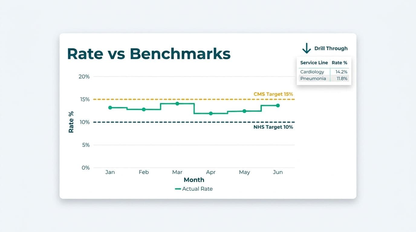
Storing these benchmarks in a `dim_benchmark` table - with columns for `benchmark_name`, `condition_code`, `target_rate`, and `jurisdiction` - lets you slice any readmission visual against the right target using a single slicer.
How Do You Model 30-Day Readmission Data in Power BI?
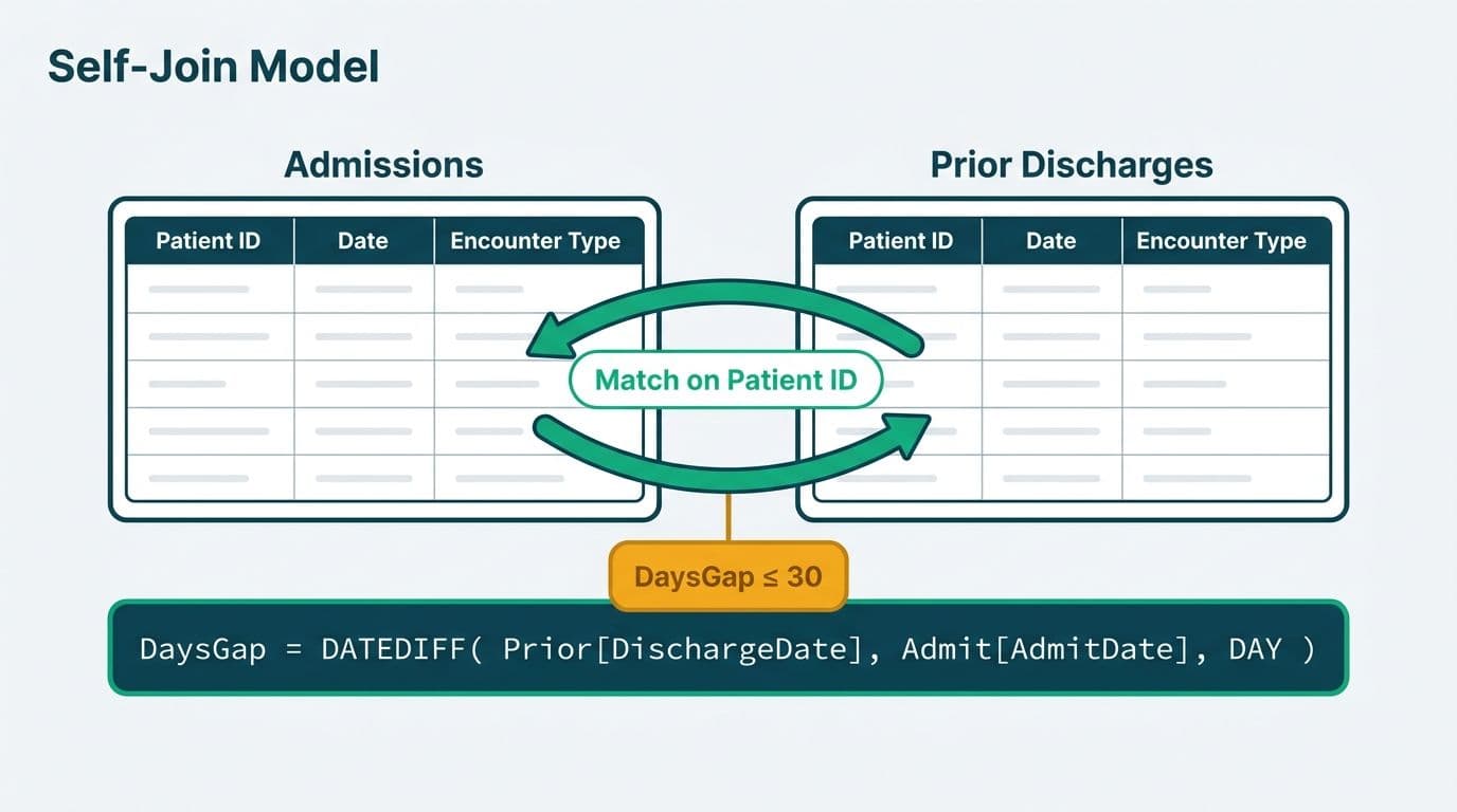
Modeling 30-day readmissions in Power BI starts with a self-referencing patient encounter table. Each discharge event is joined back to the same table to find any admission for the same patient within the next 30 calendar days.
Minimum required columns in your fact encounter table:
- `patient_id` (de-identified per HIPAA Safe Harbor or Expert Determination)
- `admission_date` and `discharge_date`
- `drg_code` or `icd_principal_diagnosis`
- `facility_id` and `encounter_id`
Step 1 - Create the readmission flag in Power Query.
Duplicate your encounter table, rename the copy `Readmissions_Lookup`, and merge back on `patient_id` where `admission_date` (lookup) falls after `discharge_date` (base) and within 30 days. Add a custom column:
```
= Table.AddColumn(Source, "Readmitted_Flag", each
if [Readmission_EncounterID] <> null then 1 else 0)
```
Every inpatient encounter now carries a binary flag: 1 if a readmission occurred within 30 days, 0 if not.
Step 2 - Build the date dimension.
A contiguous `dim_date` table is mandatory for DAX time intelligence. Mark it as a Date Table in model view and relate it to `admission_date` via an active relationship and to `discharge_date` via an inactive relationship activated by USERELATIONSHIP where needed. Without a properly marked date table, DATESINPERIOD returns unexpected results.
Step 3 - Load the benchmark reference table.
Import your `dim_benchmark` table and relate it to the fact table on `condition_group` - a derived column mapping ICD-10-CM codes to the condition buckets each framework uses.
Teams managing this build as part of a broader clinical analytics program benefit from the governance, refresh scheduling, and workspace access management that comes with Managed Power BI for healthcare teams.
For teams extending an existing hospital analytics environment, the companion guide on hospital patient flow and bed capacity dashboards in Power BI covers the ADT data model and encounter table structure in detail.
What DAX Measures Do You Need to Analyze Hospital Readmission Rates in Power BI?
DAX is the calculation layer where readmission rates are computed. Four measures cover the majority of clinical reporting requirements across all three benchmark frameworks.
Observed Readmission Rate:
```dax
Readmission Rate =
DIVIDE(
CALCULATE(COUNTROWS(Encounters), Encounters[Readmitted_Flag] = 1),
CALCULATE(COUNTROWS(Encounters), Encounters[Encounter_Type] = "Inpatient"),
0
)
```
Rolling 12-Month Rate:
```dax
Readmission Rate 12M =
CALCULATE(
[Readmission Rate],
DATESINPERIOD('dim_date'[Date], LASTDATE('dim_date'[Date]), -12, MONTH)
)
```
Benchmark Variance:
```dax
Benchmark Variance =
[Readmission Rate] - SELECTEDVALUE(dim_benchmark[target_rate])
```
A positive value means the facility is above target. Apply conditional formatting to your matrix: red for positive variance, green for negative.
Risk-Adjusted Ratio:
```dax
Risk-Adjusted Ratio =
DIVIDE([Observed Readmissions], [Expected Readmissions], BLANK())
```
A ratio above 1.0 flags the service line for HRRP penalty review. A ratio below 1.0 indicates better-than-expected performance - worth surfacing in the executive summary.
For teams deciding what to compute in Power Query versus DAX, the Power Query vs DAX for calculations in Power BI guide explains which layer fits which transformation type.
How Do You Secure Patient Data with Power BI Row Level Security in Healthcare?
Power BI row level security is not optional in healthcare - it is a HIPAA minimum-necessary requirement for US hospitals, a UK GDPR data minimization obligation, and a PIPEDA accountability principle for Canadian health authorities.
Define roles in Power BI Desktop, then assign Azure Entra ID security groups to those roles in the Service.
Sample RLS role for departmental filtering:
```dax
[department_id] = LOOKUPVALUE(
dim_user[department_id],
dim_user[email], USERPRINCIPALNAME()
)
```
A cardiology analyst sees only cardiology encounters. The CMO role uses a DAX expression returning TRUE() to bypass row filters.
A US health system with multiple acute care facilities typically implements three RLS tiers: facility level for administrators, service line level for department heads, and system level for the CMO and CFO. UK NHS trusts often add a fourth tier - commissioner access restricted to aggregate-only rows, consistent with the NHS Data Security and Protection Toolkit. Canadian health authorities under PIPEDA commonly scope RLS to regional health authority boundaries.
Power BI compliance reporting for healthcare extends beyond RLS. Audit logging in the Power BI Admin portal captures every view, export, and share event. Microsoft Purview sensitivity labels applied to PHI-containing datasets persist when data is exported to Excel or PDF - a critical control when readmission reports reach external payers or accreditation bodies.
For teams choosing between on-premises and cloud hosting, Power BI Report Server vs Power BI Service for healthcare covers the trade-offs relevant to HIPAA Business Associate Agreements.
What Do Power BI Healthcare Dashboard Examples for Readmissions Look Like?
Power BI healthcare dashboard examples for readmissions follow a three-page structure that maps to how clinical leadership actually reviews quality performance.
Page 1 - Executive Summary: KPI cards for overall 30-day readmission rate, benchmark delta, excess readmissions count, and estimated financial exposure. A rolling 12-month trend line overlays the relevant national benchmark as a constant reference. A clustered bar chart breaks observed versus expected rates by condition group.
Page 2 - Facility and Service Line Drillthrough: A matrix visual with facility on rows, condition group on columns, and conditional formatting in cells (green below target, amber within one percentage point, red above). A tooltip page shows the top five attending physicians by readmission count on hover. Drill-through from any cell opens Page 3 pre-filtered.
Page 3 - Patient Cohort Explorer (RLS-gated): Row-level security restricts this page to authorized clinical users. Fields include de-identified patient identifier, primary diagnosis, discharge disposition, payer, and days to readmission. Care management teams use this operationally during discharge planning.
A power bi healthcare dashboard template built on this three-page structure deploys across multiple facilities by changing only the data source connection. Workspace parameters handle facility ID and date range defaults, keeping the semantic model consistent while each site sees only its own data.
How Do Workforce Analytics, Clinical Reporting, and Revenue Cycle Connect to Readmissions?
Readmission dashboards rarely stand alone in a mature health system analytics environment.
Hospital workforce analytics in Power BI surfaces the connection between staffing ratios and readmission outcomes by joining HR shift data to the encounter model on `facility_id` and `discharge_date`. A hypothesis worth testing: nurse-to-patient ratio during the discharge shift versus 30-day readmission outcome by DRG group. Power BI makes patterns like this visible in minutes rather than weeks of manual analysis.
For health systems running clinical trial data reporting in Power BI, the readmission model's date-dimension pattern extends naturally to trial endpoint timelines. The key addition: FDA 21 CFR Part 11 audit trail requirements and ICH E6(R2) Good Clinical Practice standards apply alongside HIPAA, requiring additional validation controls before Power BI serves as the primary reporting layer for regulated trial data.
A power bi revenue cycle management dashboard extends the readmission model into financial territory. A US hospital facing a 1.5% HRRP penalty on Medicare base DRG payments benefits from a revenue cycle view that surfaces the penalty exposure by condition group and tracks it month over month - giving the CFO a concrete target for care management investment.
A hypothetical NHS Trust in England might connect A&E re-attendance rates to community care pathway gaps, using NHS Digital extracts loaded via Azure Data Factory - governed under UK GDPR pseudonymization and access-logging requirements throughout.
A Canadian regional health authority reporting to CIHI would store patient data in Canadian Azure regions (Canada Central or Canada East), apply Microsoft Purview sensitivity labels to all PHI datasets, and scope report access to provincial health ministry reviewers via RLS - meeting PIPEDA accountability obligations at every layer.
For teams evaluating whether Power BI meets the full healthcare compliance bar before committing to this architecture, HIPAA compliant BI tools for hospital data visualization provides the platform evaluation framework.
---
About Lets Viz: Lets Viz has delivered data analytics and Power BI solutions since 2020 for clients across US healthcare, UK fintech, Canadian manufacturing, and global SaaS - earning a 5.0 rating on Clutch. Our team designs HIPAA-compliant readmission dashboards, implements Power BI row level security across multi-facility health systems, and manages ongoing dataset refresh and governance so clinical teams can focus on outcomes, not infrastructure.
If your team is ready to move from static readmission reports to a live, benchmarked Power BI model, Managed Power BI for healthcare teams outlines how we scope and deliver this engagement.