7 CFO Dashboard Power BI Layout Examples for Finance Teams
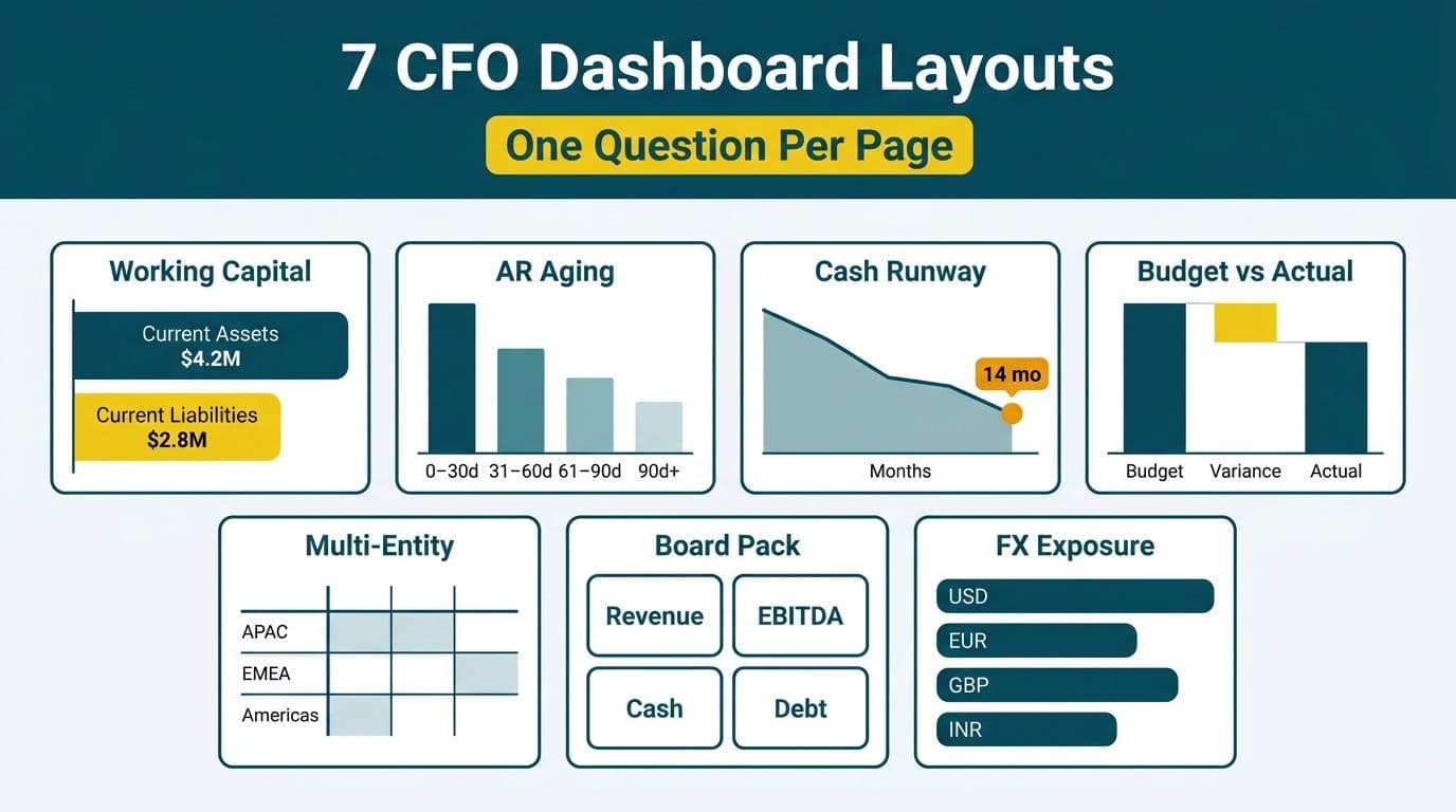
A CFO dashboard in Power BI typically arranges financial KPIs into a command-center view, with drill-through pages for each metric group. The seven layouts below - working capital, AR aging, cash runway, budget vs actual, multi-entity consolidation, board pack, and FX exposure - each solve a distinct reporting problem and require a specific canvas structure to deliver answers at the executive level in under five seconds.
Key Takeaways
- Each CFO dashboard layout must answer one primary financial question per page - not twelve.
- Power BI's CALCULATE function drives most financial variance measures across all seven layouts.
- Import mode suits most CFO use cases; Direct Lake or DirectQuery applies only for real-time ERP feeds or very large datasets.
- Multi-entity and board pack layouts require row-level security (RLS) as both a UX control and a compliance requirement.
- All seven layouts can be built in Power BI Desktop and deployed to the Power BI service without additional licensing beyond a Pro or PPU workspace.
What Makes an Effective CFO Dashboard Layout in Power BI?
An effective CFO dashboard places the primary financial answer - a KPI card or variance figure - at the top left of the canvas, where the eye lands first. It reserves drill-through pages for the detail a controller or FP&A analyst needs, and it avoids the impulse to fill every pixel with a chart.
When designing dashboards as part of a Power BI for SaaS finance teams engagement, three structural decisions shape every layout before a single visual is placed. First, page size: 16:9 for screen presentations and 8.5x11 or A4 for board packs destined for PDF export. Second, data mode: import for monthly close packages and snapshot data; DirectQuery or Direct Lake for live ERP feeds. Third, row-level security: by legal entity, cost centre, or currency region.
For US companies bound by SOC 2, UK and EU organizations under GDPR, and Canadian businesses subject to PIPEDA, RLS is a compliance control as much as a UX decision. Layout discipline matters more than visual variety - a working capital dashboard cluttered with twelve chart types fails faster than a clean four-panel grid.
The 7 CFO Dashboard Power BI Layout Examples
Each layout below specifies the canvas structure, the core DAX pattern, and the audience it serves. These are design blueprints a Power BI developer can implement in a day.
1. Working Capital Dashboard
Primary question: Is the business generating or consuming cash from operations this month?
Canvas structure: Four large KPI cards fill the top row - current ratio, quick ratio, days sales outstanding (DSO), and days payable outstanding (DPO). Below them, a clustered bar chart shows working capital over 13 rolling months. A waterfall visual in the lower right breaks down the month-over-month change into receivables, payables, and inventory movements. A date slicer in the top-right corner anchors the entire report to the selected fiscal period.
Core DAX pattern: `Working Capital = [Current Assets] - [Current Liabilities]`. The month-over-month change measure wraps `CALCULATE` around the same measure with `DATEADD('Date'[Date], -1, MONTH)` to pull the prior-month balance without duplicating logic.
Who uses it: US SaaS CFOs monitoring cash conversion cycles; UK fintech finance directors watching regulatory liquidity ratios; Canadian manufacturing finance teams managing inventory-heavy working capital swings. The layout works for any company on a monthly close cycle.
2. AR Aging Dashboard
Primary question: How much revenue is at risk of becoming bad debt, and from which customers?
Canvas structure: A stacked bar chart grouped by aging bucket (current, 1-30 days, 31-60, 61-90, 90+) anchors the left half of the canvas. The right half holds a customer-level matrix showing balance by bucket, sortable by total exposure. Three KPI cards above the matrix display total overdue, percentage overdue, and weighted average days outstanding. A slicer panel at the top filters by sales rep, region, and customer segment, driving all visuals simultaneously.
Core DAX pattern: Bucket assignment uses a calculated column with IF/SWITCH logic on invoice age. A measure using `CALCULATE` with `FILTER` isolates balances in each aging bucket: `Overdue Balance = CALCULATE(SUM(AR[Balance]), AR[AgingBucket] <> "Current")`. For the complete data model and full DAX, the Accounts Receivable Aging Dashboard in Power BI build guide covers the implementation end to end.
Data note: Import mode is correct here. AR aging snapshots are posted at month-end or daily end-of-day - there is no business case for DirectQuery on data that changes once a day at most.
3. Cash Runway Dashboard
Primary question: At the current burn rate, how many months of cash does the business have?
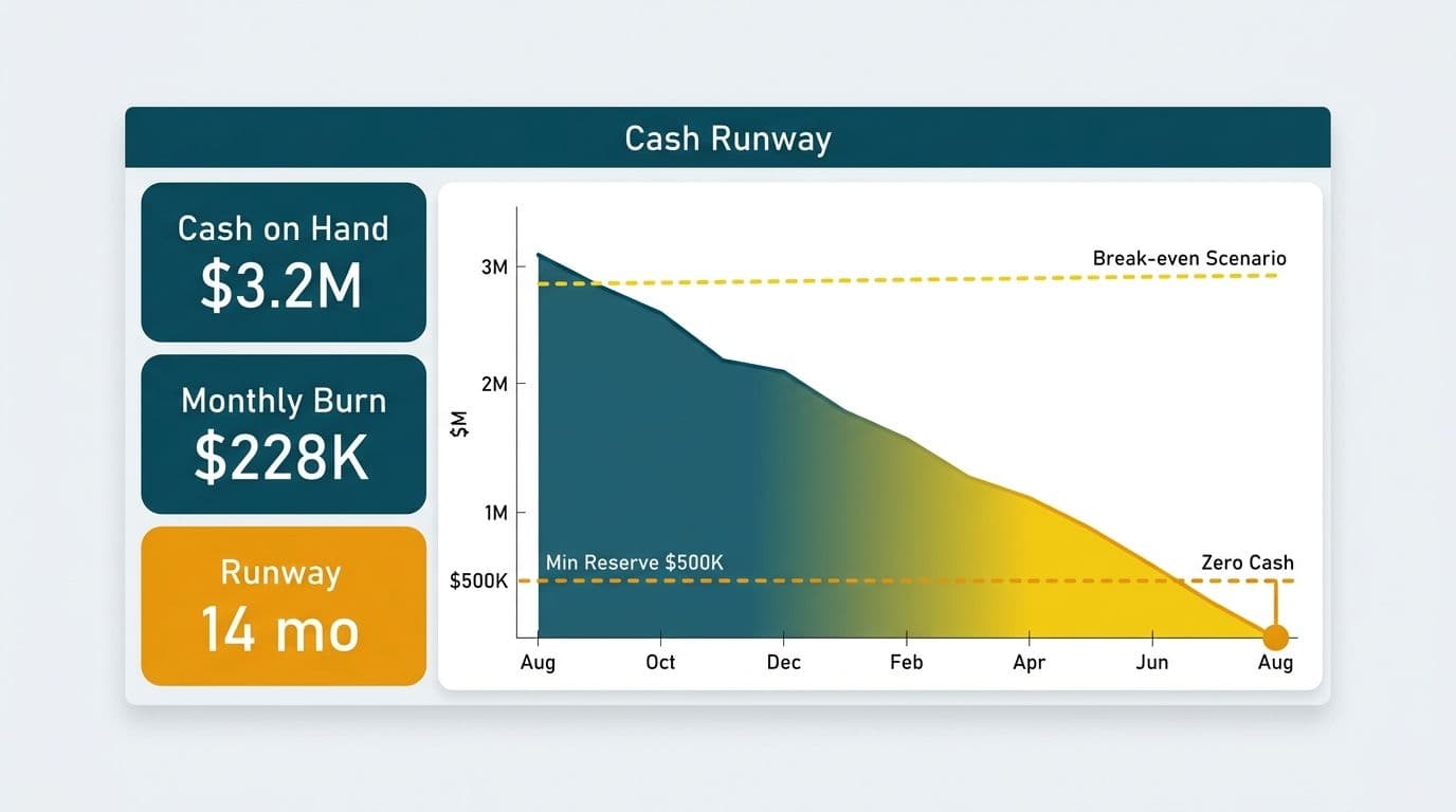
Canvas structure: A single large number card showing runway in months dominates the top centre. Below it, a line chart plots actual cash balance by month alongside a projected trendline extending 12 months forward. A scenario table - optimistic, base, and pessimistic burn-rate assumptions - lets the CFO toggle projections using a What-If parameter slicer. A second card shows the projected date when cash reaches zero under the base scenario.
Core DAX pattern: `Runway Months = DIVIDE([Cash Balance], [Monthly Burn Rate])`. The burn rate measure uses `AVERAGEX` over a rolling three-month date window defined by `DATESINPERIOD`. The What-If parameter is created through Power BI Desktop's built-in 'New parameter' feature, which generates a disconnected table and numeric range slicer automatically - no custom DAX required for the slider itself.
Who uses it: Pre-revenue startups, Series B/C SaaS companies, and any organization preparing a board funding update. A UK fintech or Canadian scale-up approaching a funding round will often export this page as a single PDF slide for investor materials.
4. Budget vs Actual Dashboard
Primary question: Where is the business over or under budget, and by how much?
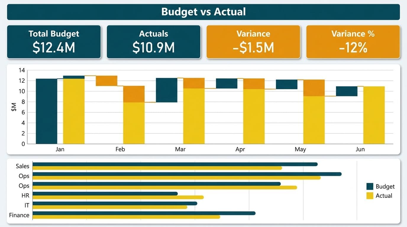
Canvas structure: A variance waterfall visual is the centrepiece, showing how actual revenue and costs diverge from the budget baseline. KPI cards in the header row display total revenue variance, total operating expense variance, and EBITDA variance - each with conditional formatting (red for adverse, green for favourable). A matrix below the waterfall enables drill-down by department and general ledger account. A toggle slicer switches between YTD and current-month views.
Core DAX pattern - how CALCULATE works in Power BI DAX for variance: Each variance measure wraps `CALCULATE` around the SUM with a filter argument that isolates either actual or budget rows in a single fact table that holds both record types: `Revenue Variance = CALCULATE(SUM(Financials[Amount]), Financials[Type] = "Actual") - CALCULATE(SUM(Financials[Amount]), Financials[Type] = "Budget")`. Percentage variance uses `DIVIDE` to avoid errors when a budget line is zero or missing.
Compliance note: US companies subject to Sarbanes-Oxley (SOX) should document the data lineage from source ERP to published report. Power BI's sensitivity labels and the admin portal's lineage view provide the audit trail auditors expect during management accounts reviews.
5. Multi-Entity Consolidation Dashboard
Primary question: What is the group's financial position across all legal entities?
Canvas structure: A top-level page shows consolidated P&L and balance sheet KPIs. A slicer panel on the left lists all entities, allowing the CFO to select one, several, or all. Drill-through pages provide subsidiary-level income statements and balance sheets. For multinationals, a filled map visual shows revenue contribution by country. Intercompany eliminations appear as a separate entity row in the detail matrix, allowing the CFO to trace consolidation adjustments line by line.
Core DAX pattern: Consolidation requires an entity hierarchy (group, region, entity). The group total measure uses `CALCULATE` with `ALLSELECTED` to compute totals across all selected entities while still respecting user-applied slicers on the page - the key trick that separates a consolidation layout from a simple filter-based report.
Data architecture: Multi-entity consolidation is where import mode starts to strain if the ERP holds years of history across 20 or more subsidiaries. When data lives in a Microsoft Fabric Lakehouse, Direct Lake mode in Power BI delivers a near-real-time view without the full query overhead of DirectQuery. The Fabric Lakehouse finance analytics guide covers this architecture in detail for FP&A teams managing group reporting.
Geographic compliance note: A Canadian holding company consolidating US and EU subsidiaries must address PIPEDA for Canadian entity data and GDPR for EU subsidiary data as separate workspace and RLS configurations - not a single toggle.
6. Board Pack Dashboard
Primary question: What does the board need to understand in the next 30 minutes?
Canvas structure: Board pack layouts are designed to be read, not explored. Set the page size to A4 or 8.5x11 in Power BI Desktop before building any visuals. Each page covers one topic - revenue summary, cost summary, cash position, or a single strategic KPI. Minimize slicers to zero or one per page. Place narrative context in a text box directly on the canvas, not hidden in a tooltip. Board members should not need to hover over any visual to understand the data.
Export tip: Power BI's PDF export feature, documented in Microsoft's 2025 Power BI service release notes, preserves page layout and conditional formatting. Build board pack pages using only native Power BI visuals - bar chart, card, matrix, text box - because AppSource custom visuals sometimes fail to render in PDF mode. Test the export before the board meeting, not during it.
Who uses it: Any CFO preparing quarterly board materials. In the UK and EU, where board governance under the Companies Act and the EU Corporate Sustainability Reporting Directive (CSRD) is increasingly prescriptive about financial disclosures, a clean PDF export is also an audit-readiness tool.
7. FX Exposure Dashboard
Primary question: How does currency movement affect the group's reported results?
Canvas structure: A currency exposure summary table occupies the top half of the canvas, showing revenue and cost by currency pair (USD/GBP, USD/EUR, USD/CAD) alongside the budget rate, the current spot rate, and the translation gain or loss at current rates. A line chart below plots the running FX impact by month. A rate reference table - populated from a daily currency feed or manual entry - acts as the dimension for all rate lookups.
Core DAX pattern: FX translation uses `SUMX` and `RELATED` to join the currency rate dimension to each transaction row. The gain or loss equals local currency amount multiplied by the spot rate minus the same amount multiplied by the budget rate. The rates table joins to the fact table on both date and currency code - a composite key that requires careful relationship handling in Power BI Desktop.
Who uses it: US SaaS companies billing UK and EU customers in local currency; Canadian exporters with USD-denominated revenue; UK fintechs holding multi-currency treasury positions. When a 5% sterling or Canadian dollar move can shift reported EBITDA by seven figures, this layout earns its place in the weekly CFO review.
How Do the 7 CFO Dashboard Layouts Compare?
| Layout | Primary Question | Recommended Data Mode | Key DAX Pattern | Best Export Format |
|---|---|---|---|---|
| Working Capital | Cash generation vs consumption | Import | CALCULATE + DATEADD | Screen or PDF |
| AR Aging | Bad debt risk by customer | Import | CALCULATE + FILTER | Screen |
| Cash Runway | Months of cash remaining | Import + What-If | AVERAGEX + DATESINPERIOD | PDF slide |
| Budget vs Actual | Over/under budget by department | Import | CALCULATE + DIVIDE | Screen or PDF |
| Multi-Entity Consolidation | Group position across entities | Import or Direct Lake | CALCULATE + ALLSELECTED | Screen |
| Board Pack | Board-ready financial summary | Import | Display-focused | |
| FX Exposure | Currency impact on reported results | Import | SUMX + RELATED | Screen |
When Should You Use DirectQuery or Direct Lake for CFO Dashboards?
For most CFO dashboards, import mode is the right default. Financial close data updates daily or monthly, not by the second, and import mode delivers faster query performance and broader DAX support than DirectQuery.
DirectQuery makes sense when the source ERP holds hundreds of millions of rows that push a Power BI dataset over its size limits, or when live intraday data is genuinely required - for example, a treasury cash position dashboard that must reflect same-hour bank feeds.
Direct Lake - available when data lives in a Microsoft Fabric Lakehouse - reads directly from Delta Parquet files without a full import. The dataset stays current as the lakehouse updates, with near-DirectQuery freshness and near-import query performance. For a multi-entity consolidation dashboard that needs same-day journal entries across 30 subsidiaries, Direct Lake is the practical answer. The power bi directlake vs directquery vs import mode decision ultimately comes down to data volume, refresh frequency, and whether the organization has a Microsoft Fabric capacity in place.
For teams that want this architecture decision made correctly from the start, Power BI for SaaS finance teams outlines how we scope and deliver finance analytics projects, including the data mode recommendation for each layout type.
How Do You Govern CFO Dashboards Before Sharing?
Governance is the step most finance teams skip and later regret. Before sharing any of the seven layouts above beyond the immediate finance team, apply four controls:
1. Row-level security (RLS): Define roles by entity, department, or geography. A multi-entity dashboard without RLS will expose the full group P&L to subsidiary-level viewers who should see only their own entity.
2. Sensitivity labels: Apply a 'Confidential - Finance' label in the Power BI service so that exported PDFs carry the data classification. This is required under many GDPR and SOC 2 data handling policies, and is a best practice for Canadian organizations governed by PIPEDA.
3. Workspace separation: Keep CFO dashboards in a dedicated Premium or PPU workspace with a small, explicit list of editors. Avoid shared workspaces where any member can republish.
4. Refresh monitoring: A budget-vs-actual report based on a failed data refresh is worse than no report. Configure refresh failure alerts in the Power BI service, or use a Managed Power BI service to monitor refresh health as part of an ongoing support agreement.
For a comprehensive governance checklist aligned to these layouts, the Power BI governance best practices guide covers all twelve control points finance and BI teams need to address before a CFO dashboard goes into production.
---
About Lets Viz: Lets Viz has delivered Power BI and analytics solutions since 2020, serving US healthcare organizations, UK fintechs, Canadian manufacturing companies, and global SaaS finance teams. The firm holds a 5.0 rating on Clutch across verified analytics engagements.
If your finance team needs any of these seven CFO dashboard layouts built, validated, or migrated to a Fabric Lakehouse architecture, explore Power BI for SaaS finance teams to see how we scope and deliver finance analytics projects.