Mastering Financial Statements in Power BI: A Step-by-Step Guide

Creating Financial Statements in Power BI? Here’s How to Make Them Look Great and Work Even Better
Building financial statements in Power BI isn’t just about getting the numbers right—it’s also about how you present them. They need to be clear, polished, and easy to understand. That’s where this method for creating custom financial layouts comes in—it strikes just the right balance between functionality and professional design. And the good news? You can do it too. Let’s walk through how.
Why Financial Statements Can Be a Bit Tricky
Designing financial reports in Power BI has its own set of challenges. Here’s what you’re usually up against:
Rigid Structure Requirements
Financial statements follow strict formatting rules—think clear section headers, sub headers, and the right sign conventions for things like revenue and expenses. Power BI’s standard table visuals just don’t give you that kind of flexibility out of the box.
Not-So-Flexible Formatting Tools
Power BI is great for analysis, but when it comes to formatting? It can feel a bit limiting, especially if you’re used to Excel or other reporting tools that give you more control over the look and feel.
A Tough Choice Between Looks and Interactivity
Sometimes, making your report look great means losing some interactivity. And that’s not ideal—you want both.
That’s exactly why this approach is so useful. It lets you build sleek, professional-looking financial statements that still feel dynamic and interactive—no fancy custom visuals required.
Getting Started: Build the Foundation First
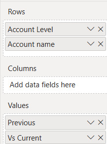
Step 1: Set Up Your Template
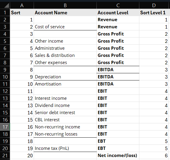
Before diving into any numbers, you’ll want to lay down a solid framework for your report. Start by adding a blank table visual in Power BI. From there, bring in a template table—this could be something you’ve already set up in Excel or pulled from a live data source. Think of this template as your report’s blueprint—it sets up how your rows and columns will be arranged and gives your report a clear, organized structure to build on.
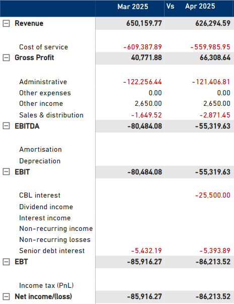
Step 2: Turn It Into an Income Statement
Now comes the fun part—bringing the table to life with financial data. You’ll map columns to key metrics like Revenue or Cost of Goods Sold (COGS), while the rows represent different time periods or account types. Then, using slicers and some smart DAX formulas, you shape the table into a working income statement. The end result? A dynamic, professional-looking report that mirrors a classic financial statement—only now, it’s interactive and powered by your data.
Adding Measures & Signs: Making the Numbers Work
Now that your layout is in place, it’s time to bring in the actual numbers—and this is where calculated measures come in. You’ll start adding key financial metrics like revenue, expenses, and variances using DAX formulas.
One thing that’s super important here? Getting the signs right. You don’t want income and expenses showing up with the same formatting—that would get confusing fast. That’s where something like the “Invert Sign” logic in DAX comes into play. It flips the signs where needed, so expenses show up as negatives (or however you prefer), and income appears correctly too.
Not only does this make your report easier to read, but it also keeps everything consistent—so no matter where you look in the report, the data is always presented the same way.
PnL Value =
VAR Result =
IF(
ISINSCOPE('Account Name (PnL)'[Account name]),
SWITCH(SELECTEDVALUE('Account Name (PnL)'[Account Name ]),
"Cost of service",[COGS (Current)],
"Other income",[Other income (Current)],
"Administrative",[Admin (Current)],
"Sales & distribution",[Sales & distribution (Current)],
"Other expenses",[Other expenses (Current)],
"Depreciation",[Depreciation (Current)],
"Amortisation", [Amortisation (Current)],
"Interest income",[Interest income (Current)],
"Dividend income",[Dividend income (Current)],
"Senior debt interest",[Senior debt interest (Current)],
"CBL interest",[CBL interest (Current)],
"Non-recurring income",[Non-recurring income (Current)],
"Non-recurring losses",[Non-recurring losses (Current)],
"Income tax (PnL)",[Income tax (Current)]
),
SWITCH(SELECTEDVALUE('Account Name (PnL)'[Account Level]),
"Revenue",[Revenue (Current)],
"Gross Profit",[Gross Profit (Current)],
"EBITDA",[EBITDA (Current)],
"EBIT",[EBIT (Current)],
"EBT",[EBT (Current)],
"Net income/(loss)",[Net income/(loss) (Current)]
))
RETURN
Result
Bringing Your Report to Life with Conditional Formatting
Now that your data’s all set up, let’s make it pop. This is where conditional formatting comes in—it’s all about making your report easier to read and more visually engaging.
Use Color to Guide the Eye
Highlight your totals, subtotals, and headers with different colors so they stand out. It helps your audience instantly know what they’re looking at.
Add Background and Font Colors
With a bit of conditional formatting, you can quickly spotlight key trends. A splash of color in the right place can say a lot more than a long paragraph ever could.
Icons & Data Bars for Extra Impact
Want to make your report even more intuitive? Try mixing in icons and data bars. They’re great for giving quick visual cues and telling the story behind the numbers at a glance.
The best part? You can do all of this using Power BI’s built-in formatting tools—no need for extra visuals or third-party add-ons.
Comparing Time Periods: Giving Your Data Some Context
Looking at numbers in isolation doesn’t always tell the full story, that’s where period comparisons come in. Whether it’s Month-over-Month (MoM) or Year-over-Year (YoY), these comparisons help you see how things are really going over time.
We’ll show you how to add sparklines, extra metrics, and simple visual cues right into your table. These little touches make it super easy for anyone viewing the report to spot trends, understand what’s changed, and make smarter decisions fast.
Balance (Current) =
VAR _date = EOMONTH(MAX('Date(Filter)'[Date]),0)
VAR _TTM =
CALCULATE(SUM('Monthly TB'[Balance]), CalendarTable[End of Month] <= _date && CalendarTable[End of Month] > EOMONTH(_date,-12))
VAR _month = MONTH(_date)
VAR _year = YEAR(_date)
VAR _YTD =
CALCULATE(SUM('Monthly TB'[Balance]), MONTH(CalendarTable[End of Month]) <= _month, YEAR(CalendarTable[End of Month]) = _year)
VAR _quarter = QUARTER([Current (CM) date])
VAR _Q =
CALCULATE(SUM('Monthly TB'[Balance]), QUARTER(CalendarTable[End of Month]) = _quarter, YEAR(CalendarTable[End of Month]) = _year)
VAR _M =
CALCULATE(SUM('Monthly TB'[Balance]), MONTH(CalendarTable[End of Month]) = _month, YEAR(CalendarTable[End of Month]) = _year)
RETURN
SWITCH(SELECTEDVALUE('Switch Period'[Period]),"Monthly",_M,"Quarterly",_Q,"YTD",_YTD,"TTM",_TTM)
Making It Interactive: Matrix Visuals & Row Hierarchies
Want to take your report up a notch? The matrix visual is your best friend.
Drill-Down Made Easy
With grouped rows, users can dig into the details or zoom out for a broader view—whenever they need to. It’s an interactive way to explore data without feeling overwhelmed.Expand and Collapse Rows
No one wants to scroll through a wall of numbers. This feature lets you open just the sections you care about and hide the rest, keeping things clean and focused.Indented Rows & Subtotals
Add some structure with indented rows and clear subtotals. It not only helps organize your accounts but also makes your report easier to read and more visually polished.
Putting It All Together: The Final Polish
You’re almost there—now, it’s time to clean things up and make your report shine.
Tidy Headers and Row Names
Clear, well-labeled rows and columns make a big difference. It’s all about making your report easy to read and professional briefly.Get Your Totals Right
Double-check those subtotals and grand totals—they need to be spot-on to reflect your financial story accurately.Add the Finishing Touches
Little details matter. Align those currency symbols, add some clean borders, and make sure everything lines up just right. It’s what turns a good report into a great one.
Why This Approach Just Works
This method strikes a great balance between being powerful and practical:
- No Fancy Add-Ons Needed: You’re using only Power BI’s built-in tools, so it’s easier to manage and share your reports.
- Super Flexible: Whether your data changes, or you add new time periods or account levels, the structure adapts easily.
- Interactive by Design: Users can drill down, sort, and slice data however they like—no extra work needed.
- Looks Totally Professional: The result doesn’t just function well—it looks like something straight out of a boardroom presentation or annual report.
Final Takeaways: Building Your Own Reports
Step | Action |
1️⃣ | Start with a basic table or matrix using a standalone table as your layout guide. |
2️⃣ | Map columns to financial metrics and rows to periods or accounts. |
3️⃣ | Use DAX to create measures and manage value sign handling. |
4️⃣ | Apply conditional formatting smartly for headers, totals, and flags. |
5️⃣ | Add period comparisons and interactive elements. |
6️⃣ | Use matrix visuals for hierarchies and drill-down features. |
7️⃣ | Refine labels, formatting, and totals for polished presentation. |
By following this approach, you’ll be able to create income statements, balance sheets, cash flow statements, and variance reports that are both powerful and visually stunning—all within Power BI’s native capabilities.
Frequently Asked Questions :
Financial statements require us to follow a specific structure, including distinct headers, subheaders, and correct sign handling for income and expenses. They often feel constrained by Power BI’s native tools when we try to balance interactive features with polished, professional layouts.
We start by creating a blank table visual and importing a template from Excel or another data source. This template helps us structure our report, setting up rows and columns to represent financial metrics and time periods.
DAX is our go-to tool for building calculated measures, ensuring correct handling of positive and negative values, and applying logical rules for clear and accurate data presentation.
With conditional formatting, we can highlight totals, subtotals, and headers using colors, icons, and data bars. These enhancements make it easier for them to quickly interpret trends and focus on what matters.
Absolutely! Power BI’s matrix visual lets us create grouped rows, offer expand/collapse functionality, and use indented rows to represent hierarchies clearly and interactively.
We include features like sparklines, year-over-year (YoY), and month-over-month (MoM) metrics, along with visual indicators. These tools help them quickly understand trends and analyze performance.
Check out other helpful Power BI Blogs
- What are the different types of Data Analysis?
- Choosing the Right BI tool – Follow these major guidelines
- Complete Financial Modeling Guide for Microsoft Power BI
- Financial Dashboard Examples for Better Decision-Making
- How to Format a Power BI visualization
- The Ultimate Guide to Tableau Business Dashboards: Templates, Key KPIs, and Examples
- How to build Dynamic X and Y Axis in Power BI Using Parameters?

If you are looking forward to getting your data pipeline built and setting up the dashboard for business intelligence, book a call now from here.