Tableau – Waterfall charts
In previous blogs, we have discussed how we can create advanced charts in tableau and it’s quite interesting and fun to create these charts/visualization. In this part, we are going to discuss how we can create a waterfall chart having a stepwise process to it. We will have simple steps for creating one of the most important and fun charts. But let’s first discuss What is waterfall chart and for what reason it is created?
“A waterfall chart is a form of data visualization that helps in understanding the cumulative effect of sequentially introduced positive or negative values. These intermediate values can either be time-based or category based.”(WIKIPEDIA)
It shows gradual increment or decrement in other words we can say the transition from start and end of values & has running total with increment and decrement of the value. The waterfall chart shows how each factor has created an impact of having the total value.
Now let’s c have an example for creating a Waterfall chart.
For example:- Create a Waterfall chart where it should tell us about the profit made by every sub-category.
Here, we are using the sample superstore data set for this example.
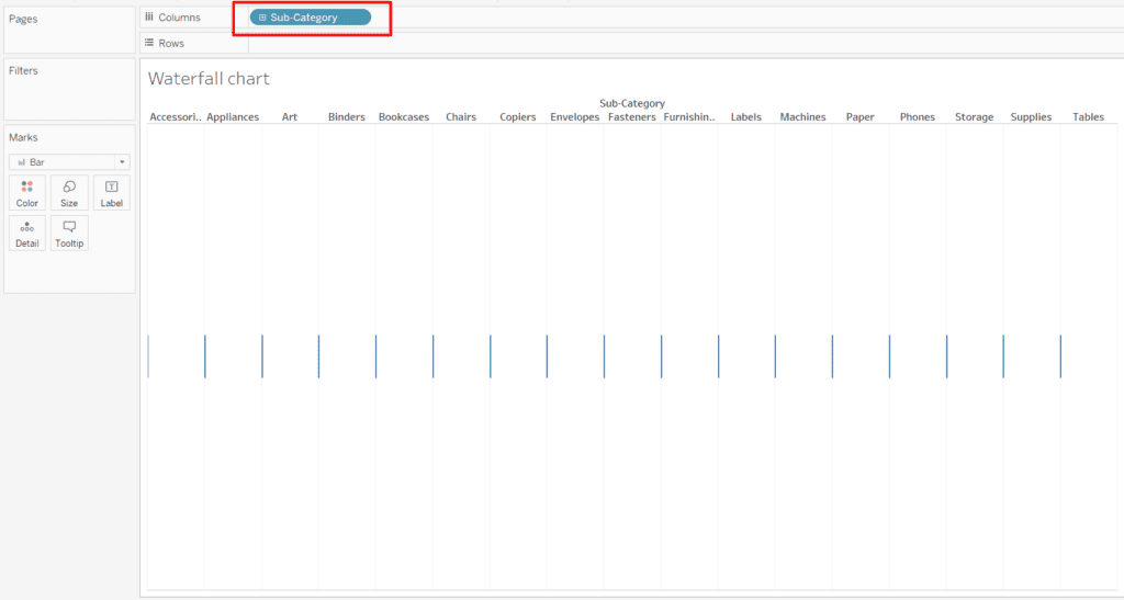
- Open the tableau desktop and load the sample superstore dataset. From there drag the Subcategory to the Columns.
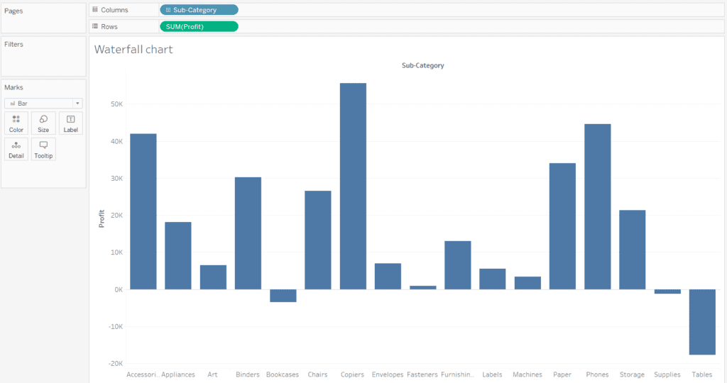
- Now in the example, we have to calculate the profit of each sub-category. So drag the profit measure to rows. Use the aggregation SUM() as SUM(Profit).
- Now as we see in the marks card on the left, the mark type is selected as Bars here. So go to the mark type and change it to GANTT Chart.
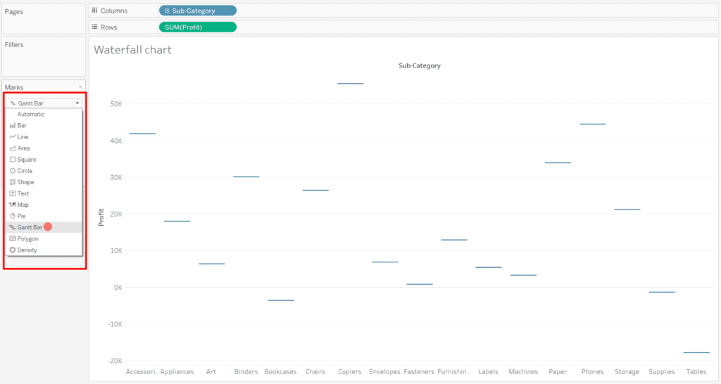
This will give individual flat points of the profits.
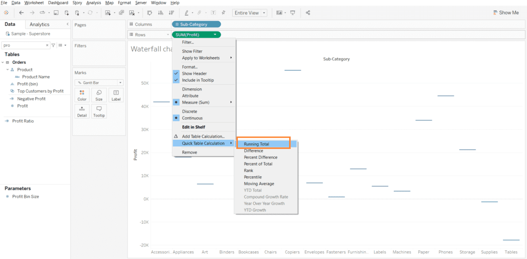
- Next, we will add a Quick calculation to profit. In the quick calculation, we add the Running Total to the SUM(Profit). We right-click on SUM(Profit) from the drop-down, select Quick Table Calculation and then select Running Total.
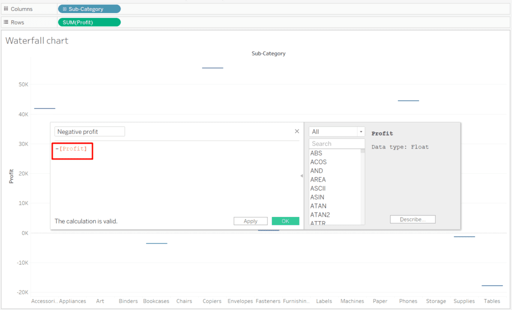
- Now we will create a calculated field by Right-clicking on the profit in the data pane and selecting “Create calculated field”. In the calculated field, we will have -[Profit] as our formula that will give us negative of profit field values.
- Drag this created field on the marks card to size and drag SUM(Profit) to the color shelf of the marks card.
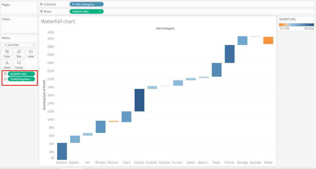
- Now we need to duplicate the measure in the row shelf to have another chart of the same. After duplicating the measure in the row shelf, make the duplicated measure a Gantt chart.
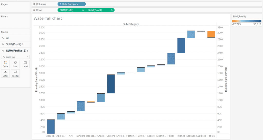
- Merge both measure by clicking on the dual axis.
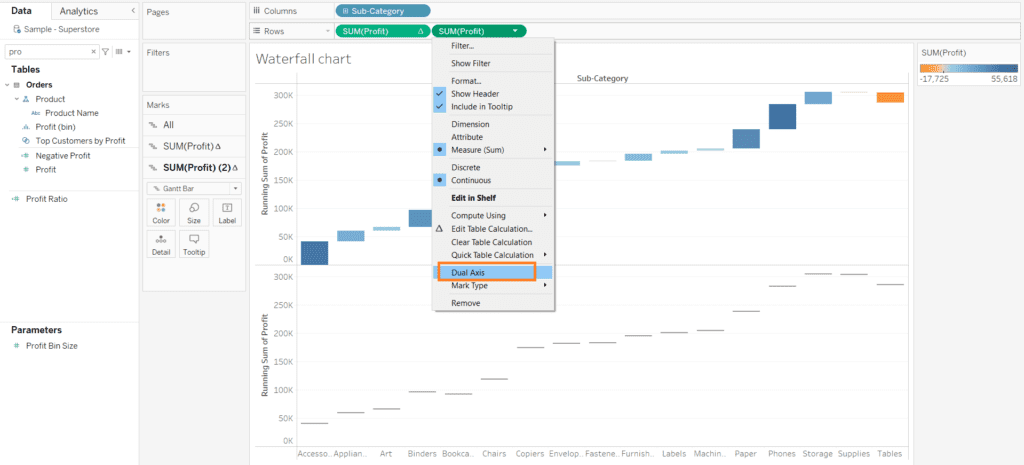
- By this, we can see that maximum of the subcategory has managed to give high profits. Over on the right, we have access to all the changes and in case of need, we can change the card as per our need. In the chart, we can see the bars moving towards to dark blue color show us profit side and the bars moving to orange section shows a negative profit.
Now this concludes this blog, here we learned what is waterfall chart and how we can create it.
Some other tableau blogs to check out:
- How to create a rounded bar chart in Tableau
- How to create a donut chart in Tableau
- Edit Table calculation in Tableau
- Switch Between YoY and MoM using Parameter Selection
- Create and synchronize dual axis in Tableau
Follow us on Twitter, Facebook, Linkedin, and Tableau Public to stay updated with our latest blog and what’s new in Tableau.