Charts have the magical ability to turn numbers that are hard to understand into beautiful, easy-to-read pictures. As Data Analysts we found it difficult most of the time, to choose the best chart to show our data. So with this Data Visualization Chart Picker Blog, you will never feel confused to make the right Data visualization.
In this blog post, I’m going to show you how to make data visualization skills supreme with Chart Picker. The ability of right Chart Picker is a powerful tool that makes it easy to create beautiful, interactive, and Insights driven charts.
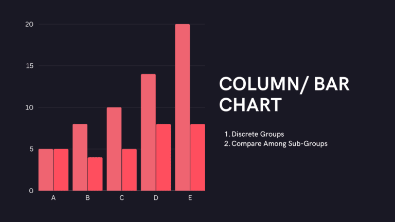
1. Column/ Bar Chart
Use this chart to compare information that has been put into separate groups. Whether it’s how much money you make each quarter or how the scores of different teams compare.
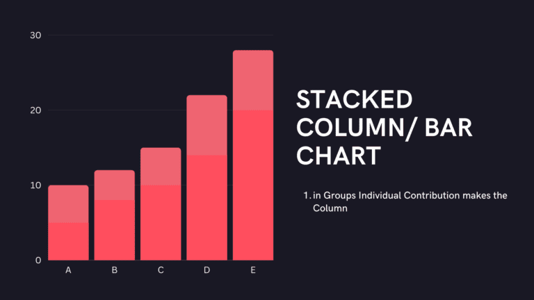
2. Stacked Column/ Bar Chart
This chart shows the contribution of individual stacks that make up the columns. For example, quarter-wise sales (represented as stacks) for each region
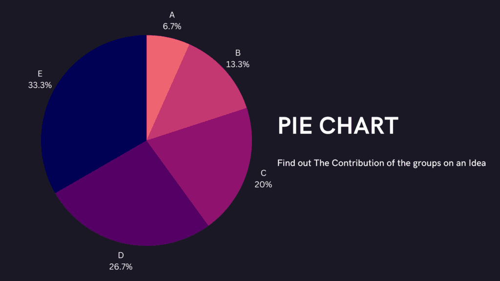
3. Pie Chart
Use this chart to find out the contribution of parts to a whole set. Like which expense this month has eaten up your income-pie the most. Or say, sales distribution across regions.
4. Donut/ Ring Chart
A doughnut chart is like a pie chart that looks like a ring or doughnut. This chart, too, shows how each part fits into the whole.

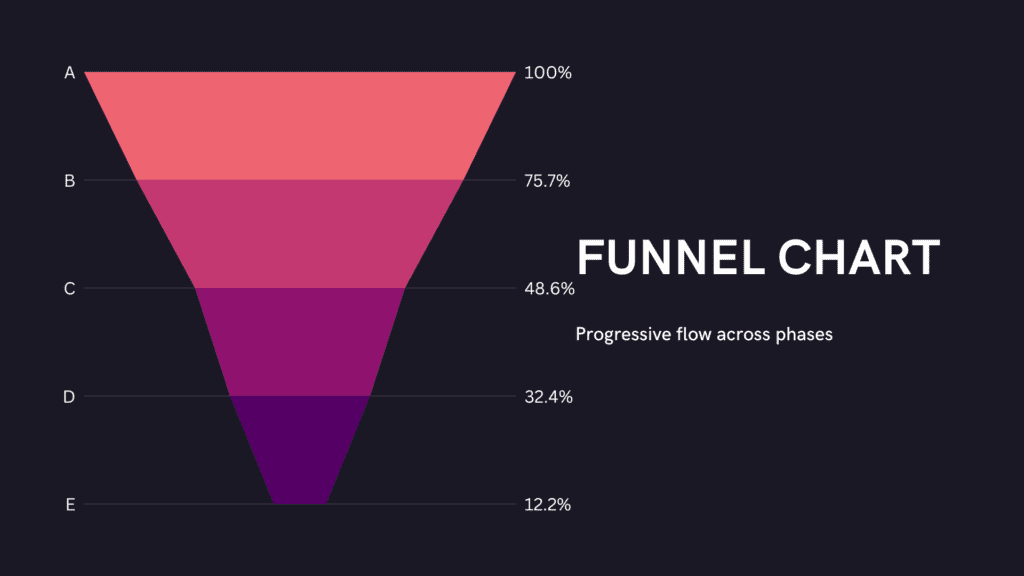
4. Funnel Chart
Choose this chart to show how a business metric changes or decreases over time. For example, think about how your leads turn into real sales at different stages, such as marketing-qualified leads, sales leads, and won leads.
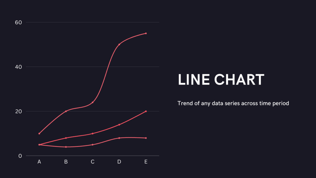
5. Line Chart
Pick this chart to visualize the trend of any data series across any time period. Just like visualizing the roller-coaster ride that your favorite stock went through in the last quarter.
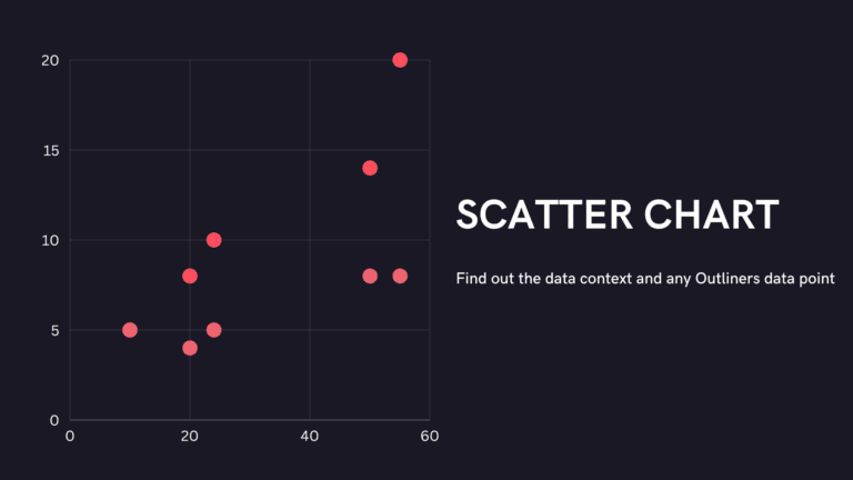
6. Scatter Plot
Typical use of the scatter chart is to plot sporadic data with uneven intervals. It is used for the comparison between two numerical. Useful to find out Outliers in the dataset.
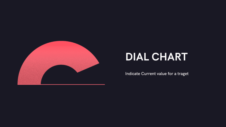
7. Dial Chart
Pick this chart to indicate the current value in a range. Dial charts are a perfect fit for your business and executive dashboards to show KPI Widgets.
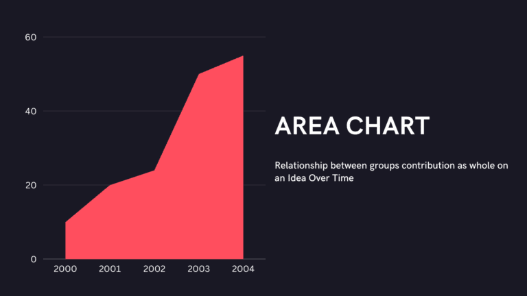
8. Area Chart
Area charts shade the area beneath the lines and therefore help you more readily compare data magnitudes. They are mainly useful for emphasizing the change in metrics across time. For instance, change in sales figures over a particular time period.
9. Stacked Area Chart
A stacked area chart shows the relationship of parts to a whole. With this chart, find how much the individual stacks or factors have contributed to the total value, across time.

10. Combination Chart
This is a mix of bar and line charts, as the name suggests. Choose this chart when your data series are of different types. Or, to show a different set of data along with the main set. For instance, if the total sales for all regions are shown as bars, the average sales and return on investment can be shown as separate lines on the same chart.

As you can see, business intelligence has a lot to offer businesses of all sizes across all industries. If you’re not already using BI in your decision-making process, now is the time to start!
Check out other helpful Tableau charts below
- What are the different types of Data Analysis?
- Choosing the Right BI tool – Follow these major guidelines
- How to create a rounded bar chart in Tableau
- Edit Table calculation in Tableau
- Switch Between YoY and MoM using Parameter Selection
- Add Map Layers in Tableau
- Create and synchronize dual axis in Tableau
Follow us on Twitter, Facebook, Linkedin, and Tableau Public to stay updated with our latest blog and what’s new in Tableau.

If you are looking forward to getting your data pipeline built and setting up the dashboard for business intelligence, book a call now from here.
#analytics #data #business #artificialintelligence #machinelearning #startup #deeplearning #deeplearning #datascience #ai #growth #dataanalytics #india #datascientist #powerbi #dataanalysis #tableau #businessanalytics #businessanalyst #businessandmanagement #dataanalyst #businessanalysis #analyst #analysis #powerbideveloper #powerbidesktop #letsviz