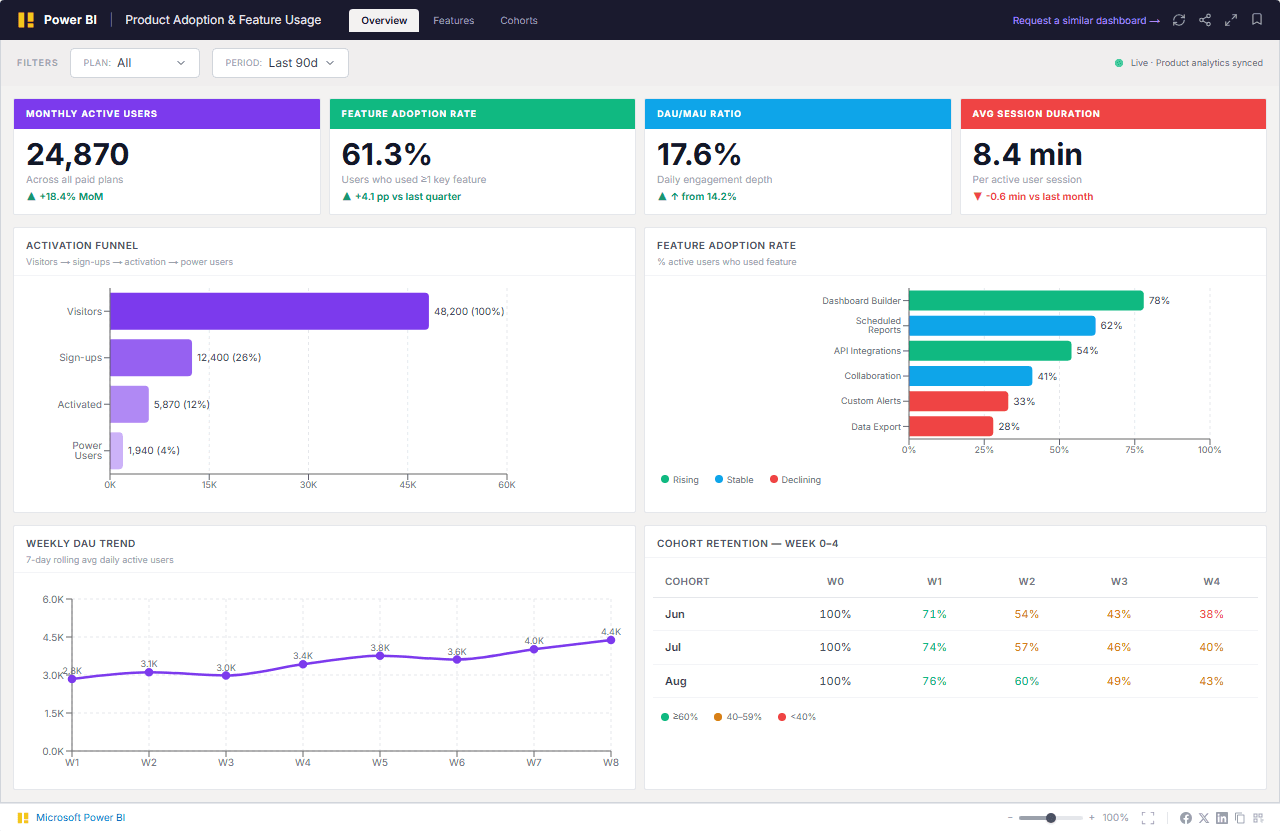
Monthly Active Users
24,870
Unique users who performed at least one meaningful action in the past 30 days
▲ +18.4% month-over-month
Real-time SaaS product health analytics — activation funnel conversion, feature adoption by plan tier, weekly DAU trending, and cohort retention — built to help product and growth teams identify adoption gaps before they become churn signals.
Powered by modern analytics tools including
Power BI, Tableau, Zoho and Looker.
Trusted by teams across 15+ countries
Real impact, clearly measured. These KPIs show the tangible outcomes of data-informed strategy.
24,870
Unique users who performed at least one meaningful action in the past 30 days
▲ +18.4% month-over-month
61.3%
Percentage of active users who used at least one premium feature this period
▲ +4.1pp vs Q2 average
17.6%
Daily Active Users divided by Monthly Active Users — proxy for engagement depth
▲ +3.4pp from 14.2% last month
8.4 min
Average time a user spends in the product per session across all plan tiers
▼ -0.6 min vs last month
How we turned fragmented data into a single source of truth—and what we achieved.
Most SaaS product teams can see their total MAU in the product analytics tool, but that headline number hides everything that matters — which features are actually driving retention, which plan tiers are underengaged, where users are dropping off in the activation funnel, and whether this quarter's cohorts are retaining better than last quarter's. Product managers pull separate exports from Mixpanel, Amplitude, and the CRM to answer these questions — a process that takes days and produces a snapshot that is already stale.
We built a Power BI semantic model that connects your product analytics platform (Mixpanel, Amplitude, or Segment), CRM, and data warehouse into a single adoption dashboard — refreshed daily for product team decisions and weekly for leadership reporting. The model shows activation funnel conversion from visitor to power user, feature adoption rates by plan tier so you can see which features are unlocked vs unused, DAU/MAU ratio trending for engagement depth, and cohort retention tables so you can compare new cohort retention against historical benchmarks in a single view.
Find answers to common questions about this dashboard and our process.
We support Mixpanel (via Export API and JQL), Amplitude (via Export API and Behavioral Cohorts API), Segment (via warehouse destination — Snowflake, BigQuery, Redshift), and Heap (via SQL connector). For teams that have already centralized event data in a data warehouse, we connect directly to Snowflake, BigQuery, or Redshift and build the feature adoption logic in the semantic model layer. The integration approach is confirmed in the scoping call based on your current analytics stack and data governance requirements.
From Lets Viz
Let's build something extraordinary together. Book a free consultation with our experts today.