Featured Dashboard

Population Health & Outcomes Dashboard

Risk-stratified analytics for ACOs, health systems, and managed care organizations — from chronic condition burden to care gap closure, in under 14 days.

Powered by modern analytics tools including

Power BI, Tableau, Zoho and Looker.

Population Health & Outcomes Dashboard — interactive Power BI dashboard preview

Trusted by teams across 15+ countries

100+
Clients Served
300+
Dashboards Delivered
50,000+
Hours Saved
5.0★
Rating · 15 Reviews
Trusted by teams at
Audience

Who This Dashboard Is For

Ideal For

  • ACOs, IPAs, and physician groups participating in MSSP, Direct Contracting, or Medicare Advantage risk contracts
  • Health system population health and care management departments using Epic, Cerner, or Meditech
  • Managed care organizations and health plans tracking HEDIS and CMS Star measures
  • Colorado health systems including UCHealth, SCL Health (Intermountain), and Denver Health value-based care divisions
  • Organizations with a payer mix of Medicare, Medicaid, and commercial that need segment-level risk reporting

Not Ideal For

  • Fee-for-service practices with no value-based care contracts — there is no shared savings to protect
  • Organizations without EHR or claims data access — manual data entry does not scale to population analytics
  • Groups under 500 attributed lives — the statistical noise at small population sizes makes risk scores unreliable
By the numbers

Metrics That Drive Decisions

Real impact, clearly measured. These KPIs show the tangible outcomes of data-informed strategy.
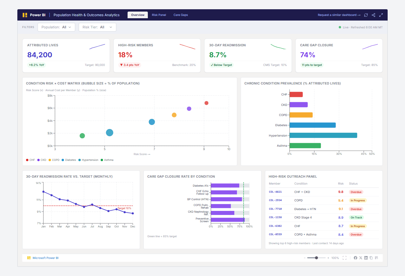
Attributed Lives

84,200

Total patient population under value-based care contract

+6.2% YoY

High-Risk Members

18%

Patients in top risk tier requiring active outreach

▼ 3.4 pts YoY

30-Day Readmission

8.7%

Hospital readmissions within 30 days of discharge

Below 10% CMS target

Care Gap Closure

74%

Percentage of identified care gaps closed in the measurement period

11 pts to 85% target

From challenge to success

From Siloed EHR Reports to a Real-Time Risk Command Center

How we turned fragmented data into a single source of truth—and what we achieved.

The challenge

Health systems and ACOs operating under value-based contracts lack a unified view of population risk. Claims data lives in the payer portal, EHR data is fragmented across Epic modules, and care management teams are working from 30-day-old Excel exports. High-risk patients fall through the cracks — and avoidable admissions erode shared savings.

  • Epic reporting tools don't surface cross-condition risk scores or care gap closure rates at the population level
  • Payer-provided reports arrive 30–45 days late, making proactive intervention impossible
  • Care management teams lack a shared panel view — coordinators work from separate spreadsheets with no unified member ID
  • HEDIS measure tracking is done manually in Excel, with no drill-through to individual patient records

Our approach

We built a Power BI semantic model on top of a unified claims + EHR staging layer (Snowflake or Azure Synapse) that surfaces risk scores, care gaps, and readmission trends in real time. The dashboard cross-filters by population segment, risk tier, and chronic condition — so care coordinators can prioritize outreach by the members who matter most.

  • Ingest claims (FHIR or 837/835 EDI) and EHR data (Epic FHIR API or Clarity reporting database) into a unified staging layer
  • Build hierarchical condition categories and risk scores aligned to CMS HCC or Johns Hopkins ACG methodology
  • Power BI semantic model with RLS so care coordinators see only their attributed panel
  • Care gap closure tracked against HEDIS and CMS Star measure definitions

What we achieved

Reduced high-risk member identification from 30 days to same-day
Care gap closure rate improved from 61% to 74% in 6 months post-launch
30-day readmission rate dropped below 10% CMS target for the first time
Care coordinators reduced outreach list preparation from 4 hours/week to 15 minutes
Shared savings improved by $1.4M in first performance period after dashboard go-live
Results verifiedRead full case study

Frequently Asked Questions

Find answers to common questions about this dashboard and our process.

The dashboard connects to Epic (via FHIR API or Clarity reporting database), claims data (837/835 EDI files or payer FHIR feeds), and optionally a care management platform (Arcadia, Innovaccer, or Health Catalyst). We can also ingest CMS MBI-level claims for Medicare Advantage populations. The exact source set is confirmed during the scoping call.

From Lets Viz

Ready to Transform Your Data?

Let's build something extraordinary together. Book a free consultation with our experts today.