How Looker Dashboards Help Your Business Thrive: Benefits, Key KPIs, and Templates
In the fast-evolving landscape of modern business, data has become a vital resource for making informed decisions quickly and efficiently. However, many organizations struggle to transform this data into valuable insights. Looker Dashboards provide a powerful solution by delivering clear, interactive visualizations that help businesses track performance, measure key metrics, and make data-driven decisions. With these dashboards, companies can gain real-time insights, monitor KPIs, and drive growth with confidence. By simplifying complex data analysis, Looker Dashboards enable businesses to stay ahead and succeed in today’s data-centric environment.
In this post, we’ll explore what Looker Dashboards are, the key benefits they offer businesses, and how you can effectively create and utilize them. Whether you’re a beginner or an experienced user, this guide will provide you with the knowledge you need to leverage Looker for business success.
What Are Looker Dashboards?
Looker Dashboards are interactive, customizable visual displays of business data that make it easier to track and analyze key metrics. Whether you’re monitoring sales performance, marketing campaigns, or customer satisfaction, Looker helps you transform complex data into simple, digestible visualizations.
What sets Looker apart from traditional reporting tools is its ability to provide deep, actionable insights with minimal effort. Instead of relying on static reports, Looker enables users to interact with the data, drill down into specifics, and adjust visualizations on the fly. This interactive, self-service model allows decision-makers to explore data as needed, promoting agility across the organization.
Challeges Solve by Looker Studio Dashboard
1. Challenge: Data Silos Across Departments
Q: How does Looker Dashboard address the issue of data silos in businesses?
A: Looker helps break down data silos by integrating data from various sources (such as Google Analytics, BigQuery, and other business applications) into a unified dashboard. This ensures that all teams—whether marketing, sales, or finance—have access to the same data, promoting collaboration and consistency across departments.
2. Challenge: Slow and Static Reporting
Q: How does Looker solve the challenge of slow and outdated reporting?
A: Looker Dashboards provide real-time data updates, so reports are always up-to-date. This eliminates the need for time-consuming manual updates or static reports. With Looker, businesses can access live insights, allowing teams to make decisions based on the latest data without waiting for periodic reports.
3. Challenge: Difficulty in Data Interpretation
Q: How does Looker make complex data easier to understand and interpret?
A: Looker Dashboards transform complex data into clear, visually engaging charts and graphs. The interactive nature of Looker allows users to explore data by drilling down into specific metrics and KPIs, helping both technical and non-technical users understand the insights and make data-driven decisions with confidence.
4. Challenge: Lack of Data Accessibility and Transparency
Q: How does Looker improve data accessibility across an organization?
A: Looker enhances data accessibility by providing a central dashboard that can be shared across teams in real time. This transparency ensures that all stakeholders, from executives to department heads, have access to the same insights, helping them stay aligned and informed, regardless of their technical background.
5. Challenge: Inefficient Decision-Making Processes
Q: How does Looker help improve decision-making within organizations?
A: Looker Dashboards offer actionable, real-time insights that allow decision-makers to make data-driven decisions rather than relying on guesswork or intuition. With customizable views and interactive features, Looker enables users to explore key metrics in depth, ensuring that decisions are based on the most accurate and current data available.
6. Challenge: Limited Customization in Reporting Tools
Q: How does Looker provide more customization than traditional reporting tools?
A: Looker allows users to fully customize their dashboards based on business needs. Whether you need specific visualizations, filters, or data views, Looker provides the flexibility to tailor dashboards to your goals. This customization ensures that every user—from analysts to executives—sees the data that matters most to them.
7. Challenge: Difficulty Scaling with Growing Data Needs
Q: How does Looker handle the growing data needs of businesses as they scale?
A: Looker is designed to scale with your business. As your data grows, Looker’s cloud-based infrastructure ensures that performance is never compromised. Businesses can handle larger datasets without any slowdown, making Looker a reliable solution for both small teams and large enterprises.
8. Challenge: Lack of Real-Time Collaboration
Q: How does Looker improve collaboration within teams when working with data?
A: Looker fosters collaboration by allowing teams to easily share dashboards and insights in real time. This facilitates discussions around the data, enabling teams to make collective decisions faster and stay aligned. With Looker, everyone is working from the same data, improving cross-functional collaboration.
9. Challenge: Inefficient Use of Resources
Q: How does Looker help businesses save time and resources in reporting and data analysis?
A: Looker automates the reporting process by providing real-time dashboards that update automatically. This reduces the need for manual data entry, custom report generation, and time-consuming analysis. By streamlining these processes, Looker helps businesses save time, reduce errors, and focus resources on more strategic initiatives.
10. Challenge: Lack of Insight into Business Performance
Q: How does Looker help businesses gain deeper insights into their performance?
A: Looker Dashboards provide detailed visualizations of business performance across key metrics. With customizable views and interactive features, Looker allows users to drill deeper into the data, uncovering trends and insights that would otherwise go unnoticed. This empowers businesses to make proactive decisions to optimize performance.
Benefits of Looker Dashboard:
1. Data Centralization
With Looker Studio, you can bring data from multiple platforms and sources into one unified view. No more jumping between different apps or tools to gather insights. You can track all your business KPIs in a single dashboard for a comprehensive analysis.
2. Real-Time Insights
Gone are the days of waiting for reports. With Looker, you get access to real-time data, meaning you can track performance, customer behavior, and other key metrics instantly. This makes it easier to respond to changes and opportunities quickly.
3. Customizable and Interactive
Unlike traditional static reports, Looker dashboards are interactive and allow you to drill down into the data for deeper insights. Want to view specific trends over time or break down data by region or team? You can do that with just a few clicks. The customizability also allows you to display data in a way that aligns with your business goals.
4. Enhanced Collaboration
Looker dashboards aren’t just for individuals; they’re made for teams. You can share dashboards across your organization, enabling different departments to view and act on the same data. Whether it’s marketing, sales, or finance, everyone can stay aligned and make decisions based on the same up-to-date information.
5. Improved Decision-Making
Dashboards make data more accessible and understandable, which ultimately leads to better decision-making. By clearly visualizing key metrics and trends, Looker empowers decision-makers at all levels to act on data with confidence.
Examples of Looker Dashboards with Templates with Key KPIs for Business
Effective dashboards are built around Key Performance Indicators (KPIs) that align with strategic business objectives. Let’s explore some KPIs across various domains:
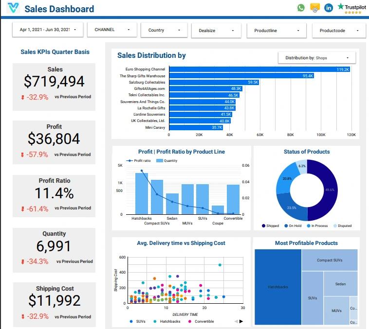
1. Sales Dashboard
A Sales Dashboard provides real-time insights into sales performance, helping decision-makers track revenue, identify trends, and forecast future sales.
Key Use Cases:
- Monitor overall sales performance.
- Analyze regional or product-specific sales.
- Identify high-performing sales reps.
Key KPIs:
- Sales: Represents total revenue generated from products or services sold within a specific period. It’s key for evaluating overall sales performance and growth.
- Profit: The amount of money left after subtracting all expenses (cost of goods sold, operational costs) from total revenue, showing the company’s financial success.
- Profit Ratio: Calculated by dividing profit by sales revenue, this ratio indicates how efficiently a company converts sales into actual profit, reflecting profitability.
- Quantity: Refers to the number of units of products sold in a given time. It helps track sales volume and demand for specific items.
- Shipping Cost: Total expense incurred for shipping products to customers, influencing profit margins and helping assess the cost-effectiveness of delivery strategies.
Explore more: Sales Dashboard Templates
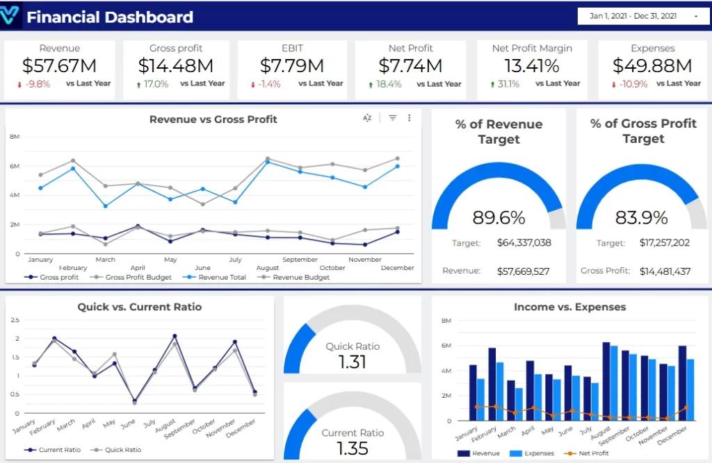
2. Financial Dashboard
A Financial Dashboard consolidates financial metrics, enabling business leaders to track revenue, expenses, and profitability at a glance. This dashboard integrates data from accounting software and provides drill-down capabilities for specific accounts or expense categories. Key insights are displayed using waterfall charts and trend lines for better forecasting.
Key Use Cases:
- Monitor cash flow.
- Compare budgeted vs. actual expenses.
- Track financial health over time.
Key KPIs:
- Revenue:
Revenue refers to the total income generated by a business through its core operations, such as sales of goods or services, before any expenses are deducted. - Gross Profit:
Gross Profit is the difference between revenue and the direct costs of producing goods or services. It measures a company’s ability to produce efficiently and maintain profitability. - EBIT (Earnings Before Interest and Taxes):
EBIT represents a company’s profitability before accounting for interest expenses and taxes. It indicates how well a company generates profit from its operations. - Net Profit:
Net Profit, also known as the bottom line, is the amount left after all expenses, taxes, and interest are subtracted from total revenue. It reflects the company’s overall profitability. - Expenses:
Expenses are the costs incurred in the process of running a business, including operational, administrative, and production costs. Monitoring expenses is crucial for maintaining profitability.
Explore more: Financial Dashboard Templates
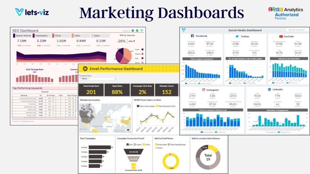
3. Marketing Dashboard
A Marketing Dashboard tracks campaign performance, ROI, and lead generation effectiveness, helping optimize marketing strategies. This dashboard integrates data from Google Ads, social media platforms, and email campaigns, showcasing insights through funnel visualizations and scatter plots for campaign comparisons.
Key Use Cases:
- Evaluate campaign effectiveness.
- Analyze customer engagement trends.
- Optimize ad spending.
Key KPIs:
1. Organic Traffic Growth
Tracks the increase in visitors coming to your site from organic search results, reflecting the effectiveness of your SEO efforts and content strategy.
2. Conversion Rate (From Organic Traffic)
Measures the percentage of organic visitors who take a desired action, helping assess the effectiveness of landing pages and calls to action.
3. Keyword Rankings
Monitors how well your site ranks for targeted keywords in search engine results, providing insight into your SEO performance and visibility.
4. Bounce Rate
Indicates the percentage of visitors who leave the site after viewing only one page, highlighting potential issues with user engagement or content relevance.
5. Backlinks (Quality and Quantity)
Tracks the number and quality of backlinks to your site, signaling authority and trustworthiness, both crucial for improving search engine rankings.
Explore more: Marketing Dashboard Templates
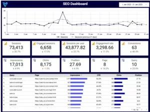
4. SEO Dashboard
An SEO Dashboard tracks website performance metrics, helping teams optimize search engine visibility and traffic. Integrated with Google Analytics and Search Console, this dashboard uses line charts and scatter plots to visualize trends in organic traffic and rankings.
Key Use Cases:
- Monitor keyword performance.
- Analyze organic traffic trends.
- Optimize page load speeds.
Key KPIs:
- Sessions: Sessions measure the total number of visits to your website, tracking the frequency of user interactions within a specified time frame. More sessions indicate higher traffic.
- Engagement Rate: This KPI tracks user interactions, such as likes, comments, or shares, as a percentage of total visitors. A higher engagement rate signals better audience interest and content relevance.
- Conversion: Conversion rate shows the percentage of users completing a desired action, like purchasing or signing up, from total visitors. It reflects the effectiveness of your website in driving goals.
- Impressions: Impressions indicate the number of times your content, ads, or pages appear in users’ feeds or search results. High impressions show broad content visibility, even if users don’t click.
- Clicks: Clicks refer to the number of times users interact with links or ads on your site. It’s a direct indicator of user interest in specific content or offers.
Explore more: SEO Dashboard Examples
5. Logistics Dashboard
A Logistics Dashboard tracks supply chain and distribution metrics to ensure smooth operations and cost efficiency. This dashboard provides a bird’s-eye view of logistics efficiency, using Gantt charts and heatmaps to highlight bottlenecks.
Key Use Cases:
- Monitor delivery timelines.
- Optimize shipping costs.
- Track inventory turnover.
Key KPIs:
- Packages Shipped (YTD)
This KPI tracks the total number of packages shipped year-to-date (YTD). It reflects the volume of shipments and helps assess operational performance and shipping capacity. - Billed Weights (Lbs.) YTD
Measures the total billed weight of packages shipped (in pounds) for the year. This helps in understanding shipping volume, cost calculations, and capacity planning. - Accessorial Charges (YTD)
This metric tracks additional charges incurred during the shipping process, such as fuel surcharges or special handling fees. Monitoring this KPI helps control extra costs and optimize logistics expenses. - Total Damage Cost
This KPI calculates the total cost associated with damaged goods during transit. A higher damage cost indicates areas for improvement in packaging, handling, and overall logistics processes to reduce losses. - Transportation Cost
Tracks the total cost of transporting goods, including fuel, labor, and vehicle maintenance. Monitoring transportation costs ensures budget efficiency, helps identify cost-saving opportunities, and improves overall operational effectiveness.
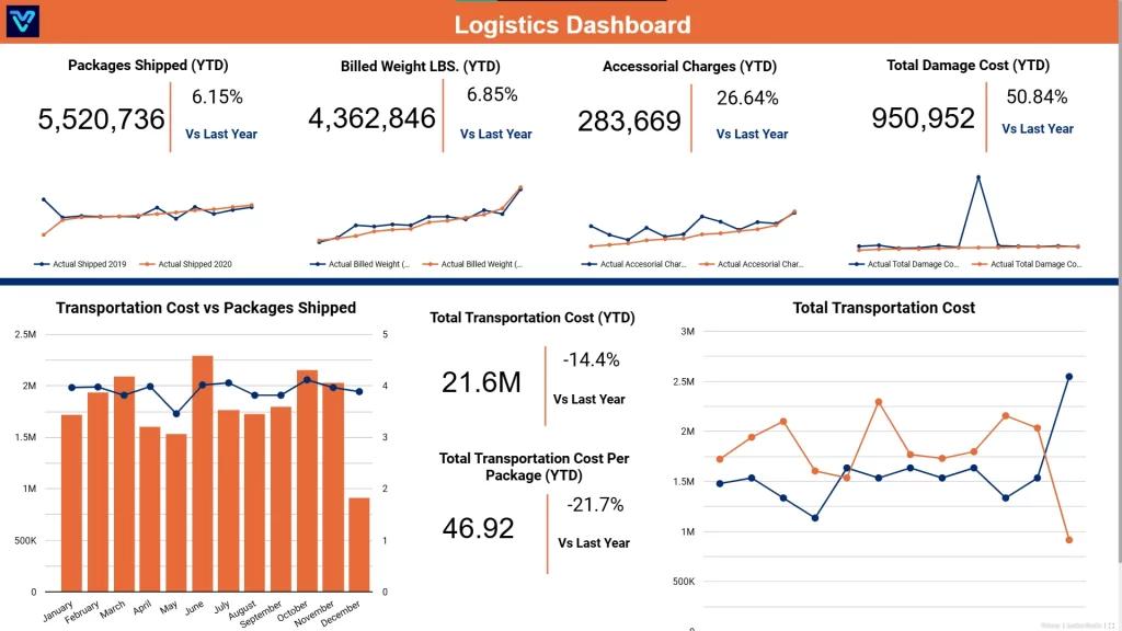
Explore more: Logistics Dashboard Template
6. Google Search Console Dashboard
Google Search Console Dashboard provides insights into website performance, indexing status, search traffic, mobile usability, and potential issues. It helps optimize SEO, track user interactions, and improve site visibility.
Key Use Cases:
Monitor Search Traffic
Track Mobile Usability Issues
Analyze and Improve Site Performance
Key KPIs:
Impressions: Represents the number of times your website appears in search results, helping measure visibility and reach in Google searches.
Clicks: Shows the number of times users clicked on your site’s link from search results, indicating the effectiveness of your search listing.
CTR (Click-Through Rate): The percentage of impressions that resulted in clicks, reflecting the appeal and relevance of your search results to users.
Average Position: The average rank of your website’s pages in search results, helping you assess how well your pages perform in search rankings.
Tabular View: Displays search data in a table format, allowing you to analyze various metrics, such as impressions, clicks, and positions for better decision-making.
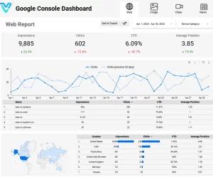
Explore more: Google Search Console Dashboard
Certified Looker Studio Consultants

Let’s Viz offers top-notch Expirenced Looker Studio Consultants to boost your analytics capabilities. Our expert Looker Studio Consultants team have created Looker Studio dashboards and reports to transform raw data into actionable insights.
With our Looker Studio professionals , you can make informed decisions, optimize your user experience, and drive effective marketing strategies. Partner with Let’s Viz to unlock the full potential of your data.
Explore More : Looker Studio Consultant
How to Design an Effective Looker Studio Dashboard
Keep It Simple
Focus on the most important metrics to avoid clutter. Use clear visuals and remove unnecessary elements to ensure users can easily interpret the data.Use Consistent Colors
Use a consistent color palette to create visual harmony and help users quickly understand different categories or data trends, without causing confusion.Leverage Interactive Filters
Include filters to allow users to drill down into data and customize the view. This makes the dashboard more dynamic and user-focused.Organize Layout Logically
Group related metrics together and place the most important KPIs at the top or center. This structure improves readability and prioritization.Ensure Data Accuracy and Clarity
Double-check your data sources and formulas to avoid errors. Use clear labels and tooltips to ensure that all visualizations are easy to interpret.
Frequently Asked Questions
Looker Dashboards are customizable, data-driven tools that help businesses visualize and analyze their data in real-time. They provide insightful reports and metrics that allow you to make informed decisions. With Looker Dashboards, you can gain deeper insights into your business operations, improving performance and efficiency.
Looker Dashboards present data in an easy-to-understand format, helping business leaders quickly identify trends, patterns, and potential problems. This real-time visibility enables faster, more accurate decision-making, ultimately enhancing business agility and competitiveness.
Common KPIs to track in Looker Dashboards include sales growth, customer retention, conversion rates, average order value, and website traffic. These metrics give you a comprehensive view of your business’s performance, helping you monitor goals and optimize strategies.
Yes, Looker Dashboards can integrate seamlessly with various business tools such as Google Analytics, Salesforce, and Amazon Web Services (AWS). This integration ensures that you can centralize all your data for easier analysis and reporting.
Looker Dashboards are highly customizable. You can create personalized reports, set up automatic data refreshes, and design dashboards tailored to specific teams or business objectives. This flexibility ensures that your team gets the most relevant data for their needs.
Looker offers a range of pre-built templates that can help you get started quickly. These templates cover various industries and functions, from sales and marketing to finance and operations. You can also customize templates to fit your unique requirements.
Looker Dashboards allow businesses to monitor key metrics over time by visualizing historical data and trends. This feature helps you measure performance, spot areas for improvement, and track the effectiveness of strategies or initiatives over months or years.
Yes, Looker is designed to be user-friendly and intuitive. Non-technical team members can easily navigate dashboards, customize reports, and draw insights from the data without needing advanced technical skills. Looker’s clean interface makes data analysis accessible to all users.
Yes, Looker Dashboards are fully responsive and can be accessed on mobile devices. This means you can access important data and reports anytime, anywhere, ensuring you stay connected and informed even when you’re on the go.
See also: Looker Studio SEO Dashboard →