How to build Dynamic X and Y Axis in Power BI Using Parameters?

Why to use Dynamic X and Y Axis in Power BI?
Creating flexible and interactive data visualizations in Power BI is crucial to addressing diverse user needs and scenarios. Static X and Y axes can limit data exploration, reducing the interactivity and insights that reports can offer.
Dynamic X and Y axes, powered by parameters, enable users to switch between different fields or metrics within a single chart, eliminating the need for multiple visuals. This feature proves invaluable in various situations, such as:
- Dynamic Comparisons: Users can toggle between categories, time periods, or metrics to uncover trends and relationships.
- Optimized Layouts: A single, adaptable chart replaces the need for multiple visuals, saving space and simplifying report design.
- Improved User Interaction: Customizable visuals give end-users greater control, making reports more intuitive and tailored to their needs.
In this blog, we’ll provide a step-by-step guide to implementing dynamic X and Y axes using parameters, helping you create interactive and customizable Power BI visualizations.
How to create X and Y Axis in Power BI?
In this tutorial of build Dynamic X and Y Axis in Power BI, our goal is to dynamically update the field values on the X or Y axis of a chart by selecting a value on a slicer. For instance, the Y-axis in the graphic below contains numerical values, whereas the X-axis has category values. Along with the X-axis, we also want to be able to dynamically adjust the field (measure).
This may be done by building a slicer that allows us to dynamically adjust the field values on each axis using field parameters. Let’s investigate our options.
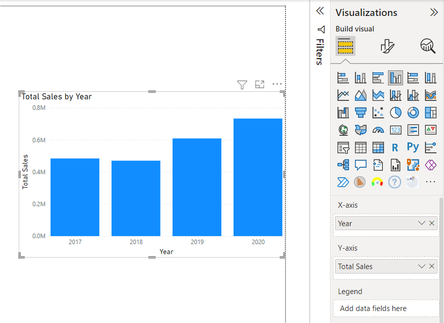
I loaded a dataset into Power BI as shown below to serve as an example. We want to switch between each metric and the chosen category field on the fly.
For instance, on the same chart, we could wish to dynamically transition between showing Total Sales by Sub-Category or Total Profit by Year.
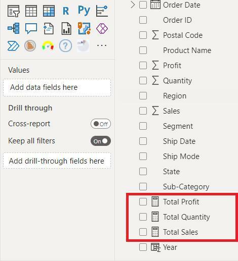
As our categorical variables, we want to utilize the Year, City, and Sub-Category columns; as our numerical fields, we want to use the Total Sales, Total Quantity, and Total Profit measures.
The next step is to create a Measure for every date.
You may need to build more or fewer measurements in your situation; simply modify it to fit your company’s needs. Overall, the measurements and columns I made for this example are shown in the figure below.
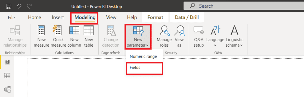
The next step is to group the data we wish to view on the X or Y axis using Field Parameters as shown below. To begin, choose the “Modeling” tab from the Power BI desktop’s top menu, as shown below. Then, as shown below, click the dropdown for “New Parameter” and choose “Fields” from the list of alternatives.
In the image below, the Field Parameters window opens.
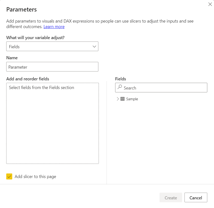
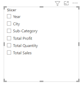
You have the option of changing the name of the parameter to something other or leaving it as is. As seen in the figure below, I renamed this to “Slicer.” I will next drag the fields I require for my X and Y axes into my expanded tables on the right-hand side. To have a slicer built for you automatically, you must leave the “Add a slicer to this page” check box selected. Then click “Create.” Look below.
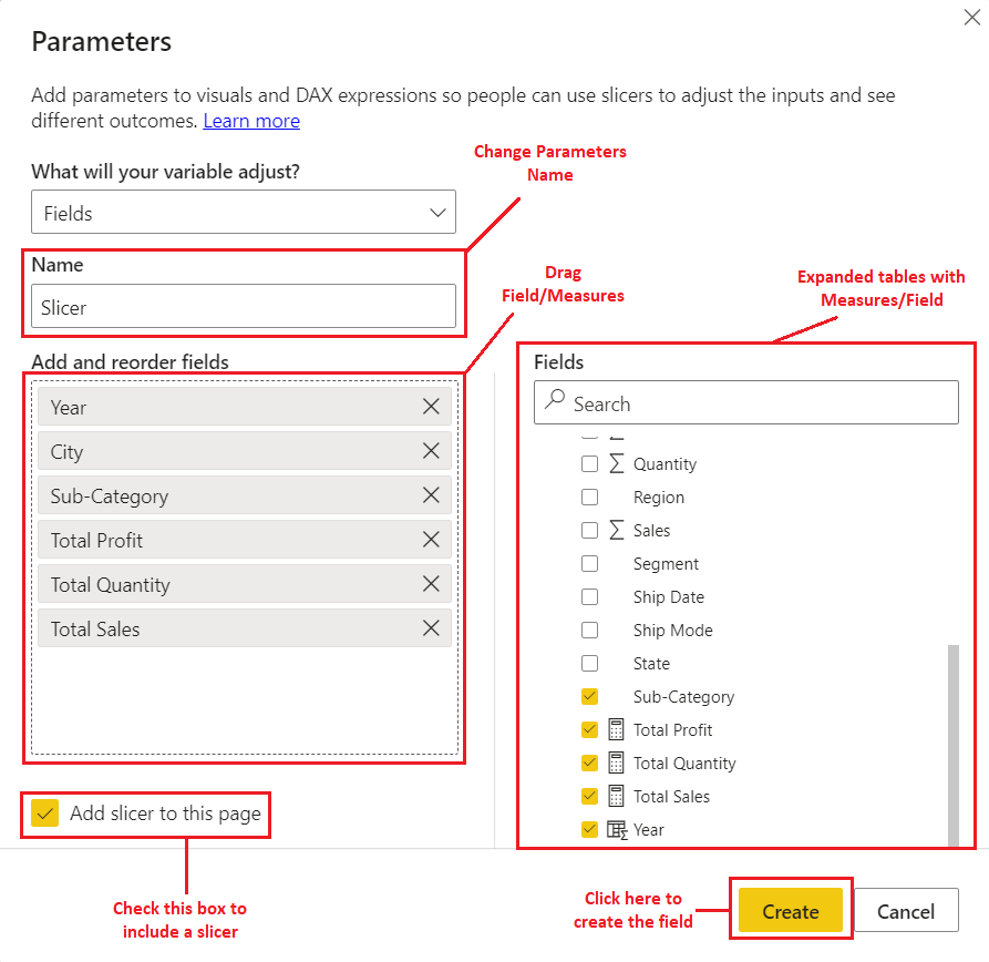
The “Add and reorder fields” part of the preceding diagram’s “Add and reorder fields” section will automatically be included in the slicer created by the generate action.
Additionally, DAX code is produced as seen below.
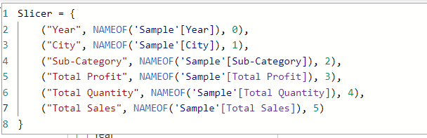
Next, we must specify which fields belong on the X-axis and which belong on the Y-axis. To do this, we must add a grouping that would produce an “X-axis” and “Y-axis” grouping to the resulting DAX code.
We may put “Total Quantity,” “Total Sales,” and “Total Profit” on the Y-axis group because, according to our prior understanding, all fields for the Y-axis should be numerical, and we can put the other elements—which are categorical fields—on the X-axis group.
There are two methods to do this: either we change the code above, or we add additional columns to the database constructed for the field parameters. Let’s start by altering the produced code as shown below to learn how to go about doing it.
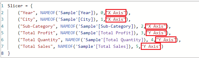
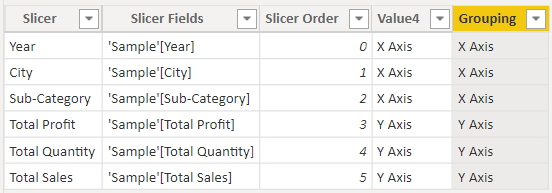
I added a new column with two separate values to the code previously mentioned (“X Axis” and “Y Axis”). As seen in the picture below, the new column is assigned the general name “Value4” however, this name may be altered just like any other column name.
The alternative option to make this grouping is to use DAX to build the column in the same manner as other columns. To do this, as seen below, we may utilize the DAX IF function to add a new column.
![]()
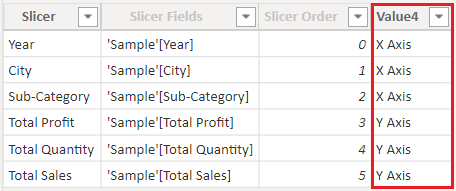
Below is a screenshot of this DAX-created column’s output.
Next, as indicated in the figure below, we must utilize the “Slicer” (or “Parameter” in your instance if you did not alter the name before). As we previously described, it will automatically detect which fields belong on which axis.
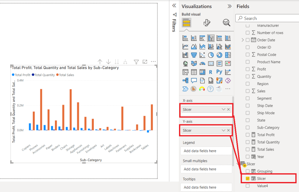
Next, drag “Value4” or the “Grouping” column we made to the top of the “slicer” (or “Parameter” in your instance) as shown in the figure below to apply the grouping to the slicer visual we built. Including all X axis fields in the X axis group and all Y axis fields in the Y axis group, should generate the grouping.
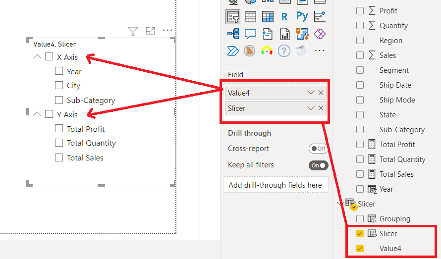
Now that the rendered visual has been created, we can choose a field from the X-Axis group, such as Year, and Ctrl-click on a field from the Y-Axis group, such as Total Profit, to view it.
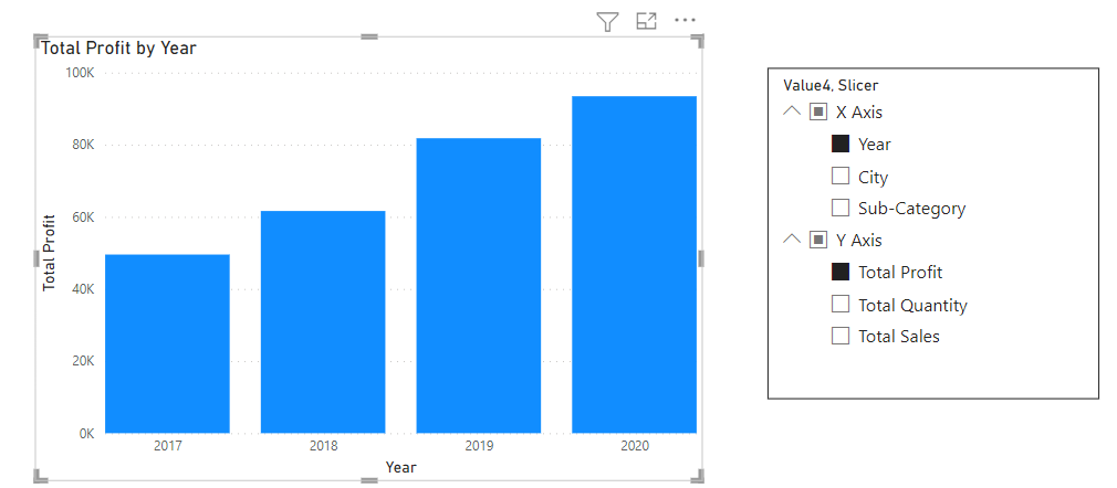
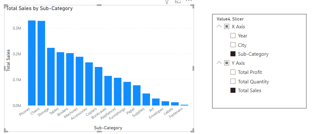
Simply click on Year in the X-axis group and Ctrl-click on Total Sales in the Y-axis to modify the fields on the X and Y axes, such as Sub-Category on the X-axis and Total Sales on the Y-axis. The displayed image ought to appear as follows.
As you can see, business intelligence has a lot to offer businesses of all sizes across all industries. If you’re not already using BI in your decision-making process, now is the time to start!
For more customizable options, feel free to avail our Power BI Consulting Services and explore tailored solutions to meet your specific needs.
Check out other helpful Power BI Blogs
- What are the different types of Data Analysis?
- Choosing the Right BI tool – Follow these major guidelines
- Power BI Advantages Over Tableau
- Zoho Analytics vs Power BI: Which One is right for you?
- How to Format a Power BI visualization
- Build a Calculated field using DAX in Power BI
- Job Roles and Responsibilities in Power Bi

If you are looking forward to getting your data pipeline built and setting up the dashboard for business intelligence, book a call now from here.
#analytics #data #business #artificialintelligence #machinelearning #startup #deeplearning #deeplearning #datascience #ai #growth #dataanalytics #india #datascientist #powerbi #dataanalysis #businessanalytics #businessanalyst #businessandmanagement #dataanalyst #businessanalysis #analyst #analysis #powerbideveloper #powerbidesktop #letsviz