Financial Services
Audit-ready dashboards & revenue protection

Eliminate repetitive tasks and human error. Our AI-driven workflows streamline your operations, allowing your team to focus on high-value strategic growth.
Most growing businesses don't have a data problem — they have a system problem.
Reports take days to prepare and are outdated by the time they're reviewed
Data is scattered across Excel, CRM, accounting, ERP, and internal systems
Different teams report different numbers for the same metric
Leadership doesn't fully trust dashboards or reports
Manual reporting consumes hours every week
No real-time visibility into business performance
Dashboards Built for Real Decisions. Power BI, Looker Studio, Zoho and Tableau dashboards designed for CEOs, CFOs, and operations teams — with the right KPIs, clean visuals, and role-based access.
One Source of Truth, Fully Automated. We connect all your systems — CRM, ERP, finance, POS, marketing, and APIs — into a single, reliable data pipeline.
Built to Grow With Your Business. Your data foundation matters. We design clean, scalable architectures that won't break as volume or complexity increases.
A structured, low-risk approach built for clarity, speed, and scale.
No guesswork. No shortcuts. Built with enterprise-grade discipline.
Step 1 of 4
We understand your business goals, KPIs, stakeholders, and existing data landscape before building anything.
We integrate data from all relevant systems, apply validation rules, and create a reliable single source of truth.
We model metrics correctly and design dashboards that decision-makers actually use.
We automate refreshes, alerts, and workflows — with testing, monitoring, and documentation.
A snapshot of how teams use data when it's built right.
Teams save 15+ hours weekly on manual reporting, redirecting focus to strategic initiatives.
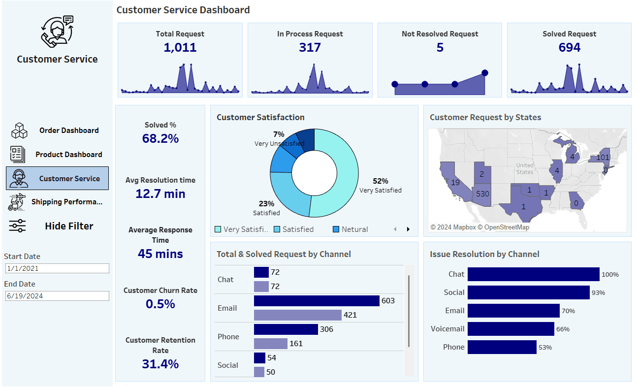
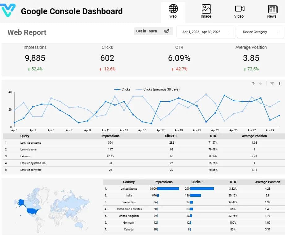
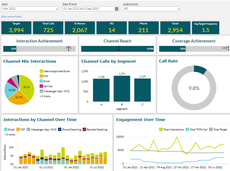
Explore dashboard examples by department, industry, and tool — then request a similar build.
From BI to warehouses — we integrate with what you already use and modernize what slows you down.


Have been working with Lets Viz technologies team for over a year now and it has been a very productive engagement. Team has a bunch of professionals who deliver on time and are always available for any questions or changes required. It has been an awesome experience and look forward for continued support in years to come. Good Luck team!!

Consultant-led approach, not just dashboard development
We work best with teams that rely on data to run operations and make decisions.
Audit-ready dashboards & revenue protection
Revenue intelligence & product telemetry
Margin guardrails & merchandising clarity
Throughput, downtime, and cost-to-serve clarity
Program visibility that's citizen-first
If your business runs on data, we're a strong fit.
We deliver controller-grade financial analytics that transform how your finance team operates. Our dashboards provide real-time cash visibility, automated reconciliations, and sophisticated forecasting with scenario planning. Every metric is built with regulatory compliance in mind. From month-end close acceleration to revenue protection, our solutions give leadership confidence while keeping regulators satisfied. We integrate with your existing ERP systems, ensuring data accuracy and eliminating manual reconciliation.
Leverage our comprehensive expertise across data engineering and web development to enhance your revenue through tailored data solutions and custom applications.
Clear scopeTransparent pricingNo surprises
Timeline varies based on complexity, but typically ranges from 4-8 weeks. Simple dashboards can be delivered in 2-4 weeks, while enterprise solutions with multiple data sources may take 8-12 weeks.
We integrate with a wide range of data sources including databases (SQL Server, PostgreSQL, MySQL), cloud platforms (AWS, Azure, GCP), APIs, Excel files, and popular business tools.
Yes, we provide comprehensive training for your team during deployment and offer ongoing support packages. Every project includes documentation, video tutorials, and a knowledge base.
Pricing depends on scope, complexity, and requirements. We offer transparent pricing after understanding your needs. Contact us for a free consultation and customized quote.
Absolutely. We excel at collaborating with in-house teams. We can work alongside your team, provide outstaffing resources, or take full ownership of the project.
Our dashboards are built with executive usability in mind. We focus on clarity, performance, and actionable insights rather than overwhelming data.
Typical projects range from 4–12 weeks depending on scope. Discovery and small deliverables can be 2–4 weeks; full dashboards or pipelines with multiple sources often run 6–10 weeks. We outline timeline and milestones during the initial scoping.
Yes. We work with clients across the US and globally. We use async collaboration, overlapping hours where needed, and clear communication so time zones and location are not a barrier.
We support major BI and data platforms including Power BI, Looker Studio, Tableau, Zoho Analytics, and Sigma. We also build on cloud warehouses (BigQuery, Snowflake, Redshift, Azure SQL), ETL tools (n8n, dbt, Fivetran), and APIs.
We follow security best practices: row-level security, role-based access, and encrypted connections. We work within your existing governance and can align with SOC 2 or similar frameworks. Data stays in your environment unless you request otherwise.
We provide handover documentation, training, and a support window. Many clients choose ongoing retainer support for new reports, integrations, or optimizations. We can also set up monitoring and alerting so you know if something needs attention.
High-signal posts and playbooks — swap placeholders with real blog content later.

When I first started building scenarios in Make.com, I thought automation was just about moving data from one app to another. But then I discovered aggregators—and suddenly, my workflows went...

When I first started building automation workflows in Make.com, I quickly realized that the real magic isn’t just in connecting apps—it’s in transforming the data between them. Data rarely comes...
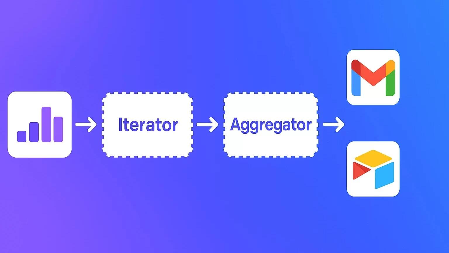
If you’ve ever built complex automations in Make.com, you’ve probably noticed that data doesn’t always arrive in neat, single-item packages. Sometimes it comes in lists, arrays, or collections — like...

When I first started building automations in Make.com, I thought handling dates and times would be simple — until I discovered how quickly things get confusing with time zones, formats,...
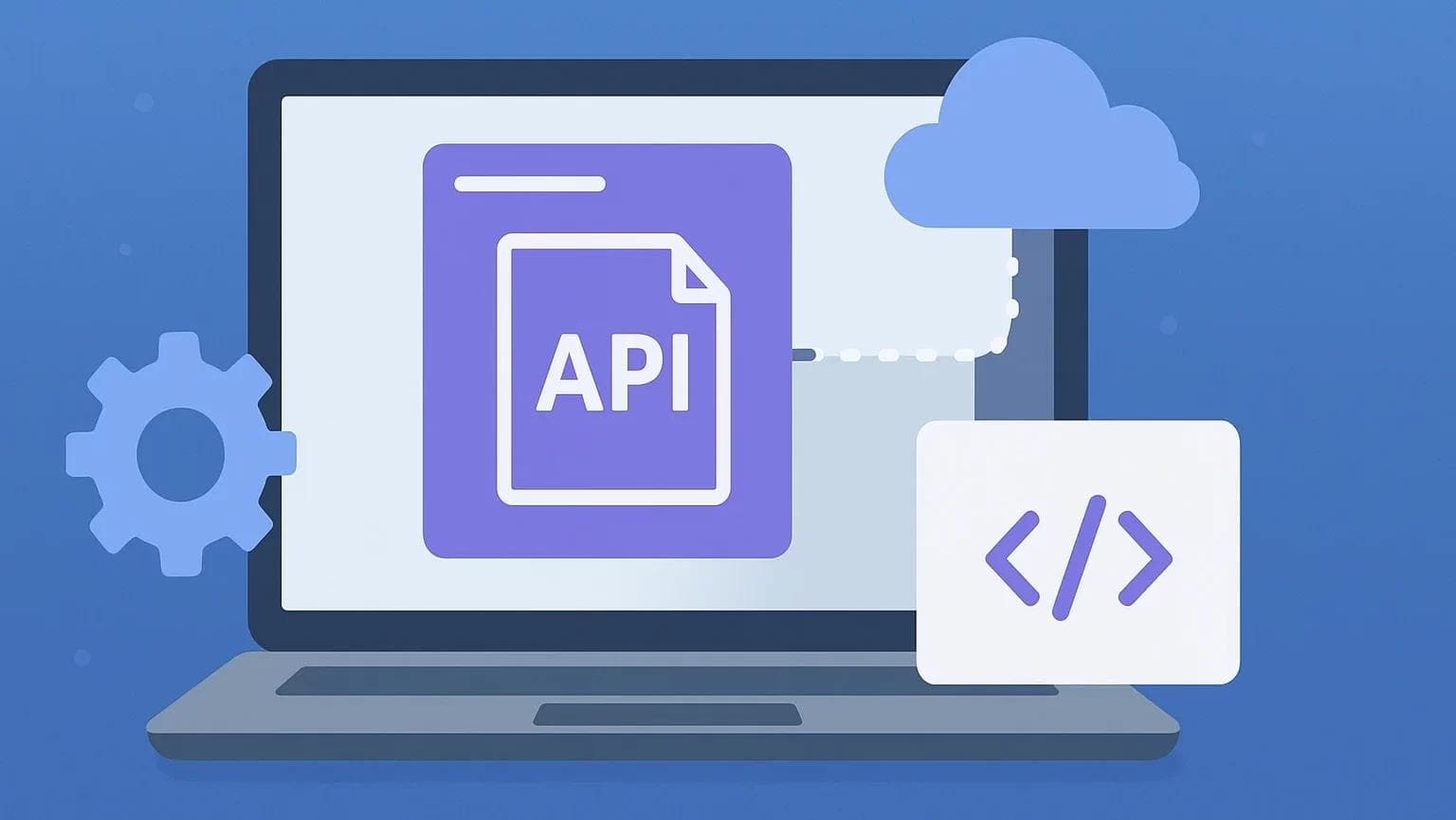
When I first started building automation scenarios in Make.com (back when it was still Integromat!), I quickly realized that not every app I wanted to connect had a prebuilt module....
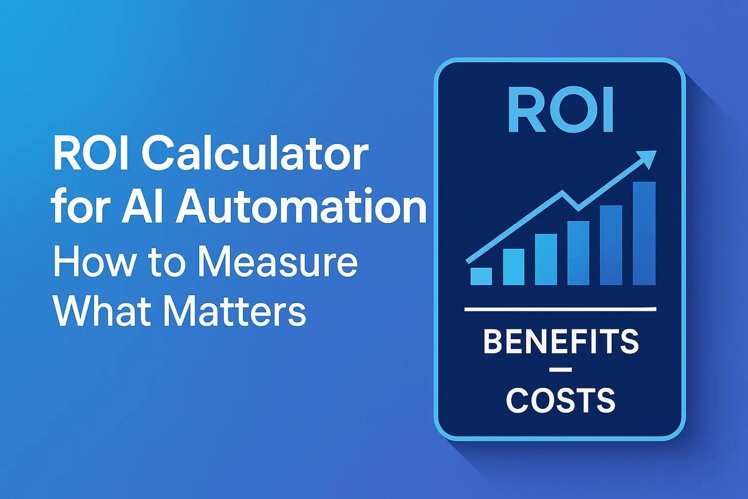
TL;DR An AI automation ROI calculator helps businesses quantify the financial impact of their automation initiatives. To measure what truly matters, focus on metrics like cost savings, time efficiency, error...
Talk directly with a data architect — not a salesperson.
NDA-safeNo obligationClear next steps