Executive Dashboard Best Practices: How to Design Dashboards Leaders Actually Use
TL;DR: An executive dashboard must deliver clarity, context, and confidence — fast. The best executive dashboards focus on business outcomes, not just metrics. Follow these best practices: align KPIs with strategy, simplify visuals, highlight trends, ensure real-time accuracy, and design for mobile use. Done right, dashboards become indispensable decision tools for leadership — not just another BI report.
Why Most Executive Dashboards Fail
Every executive wants “data at their fingertips,” yet over 60% of BI projects fail to deliver meaningful insights to leadership (Gartner, 2024). The issue isn’t the lack of data — it’s the design and usability of executive dashboards.
Executives are busy. They need dashboards that summarize the state of the business in minutes — not hours. But many dashboards overwhelm users with clutter, irrelevant KPIs, and static visuals.
So how do you design an executive dashboard people actually use? Let’s explore a framework that blends data strategy, UX design, and business intelligence best practices to create dashboards that drive real executive engagement.
What Makes an Executive Dashboard Different?
Executive dashboards are not operational dashboards. They are designed for strategic insight, not tactical monitoring.
| Type | Audience | Focus | Example Metrics |
|---|---|---|---|
| Operational Dashboard | Managers, Analysts | Daily performance tracking | Conversion rates, production uptime |
| Analytical Dashboard | Data teams | Deep trend analysis | Customer segments, lifetime value |
| Executive Dashboard | C-suite, Board | Strategic decision-making | Revenue growth, EBITDA, NPS, YoY performance |
Executives need dashboards that summarize “What’s happening, why, and what to do next.”
How to Design Executive Dashboards People Actually Use
1. Start with Strategic Alignment (Not Data)
Before choosing charts or KPIs, ask:
“What decisions will this dashboard support?”
Link KPIs to strategic goals (e.g., revenue growth, market expansion, operational efficiency).
Use frameworks like Balanced Scorecard (Kaplan & Norton) to structure metrics into four perspectives:
Financial
Customer
Internal processes
Learning & innovation
Pro tip: Limit to 6–8 key metrics — more dilutes focus.
2. Focus on Questions, Not Data Dumps
Executives rarely need raw numbers — they need answers to strategic questions.
Common executive dashboard questions:
Are we on track to hit quarterly goals?
Which business units drive most profit growth?
What risks or red flags are emerging?
Design your dashboard around these questions → insights → actions flow.
3. Visualize Hierarchically: “Top-Down” Storytelling
Executives scan, not analyze. Design using a top-down visual hierarchy:
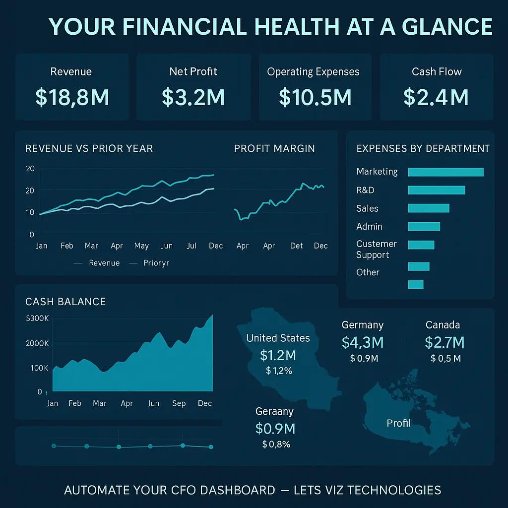
At the top → KPIs that summarize business health (e.g., revenue, profitability, customer retention).
Middle section → Breakdown by segment, region, or department.
Bottom section → Trends, forecasts, or variance drivers.
Use color sparingly — green = on track, red = attention needed.
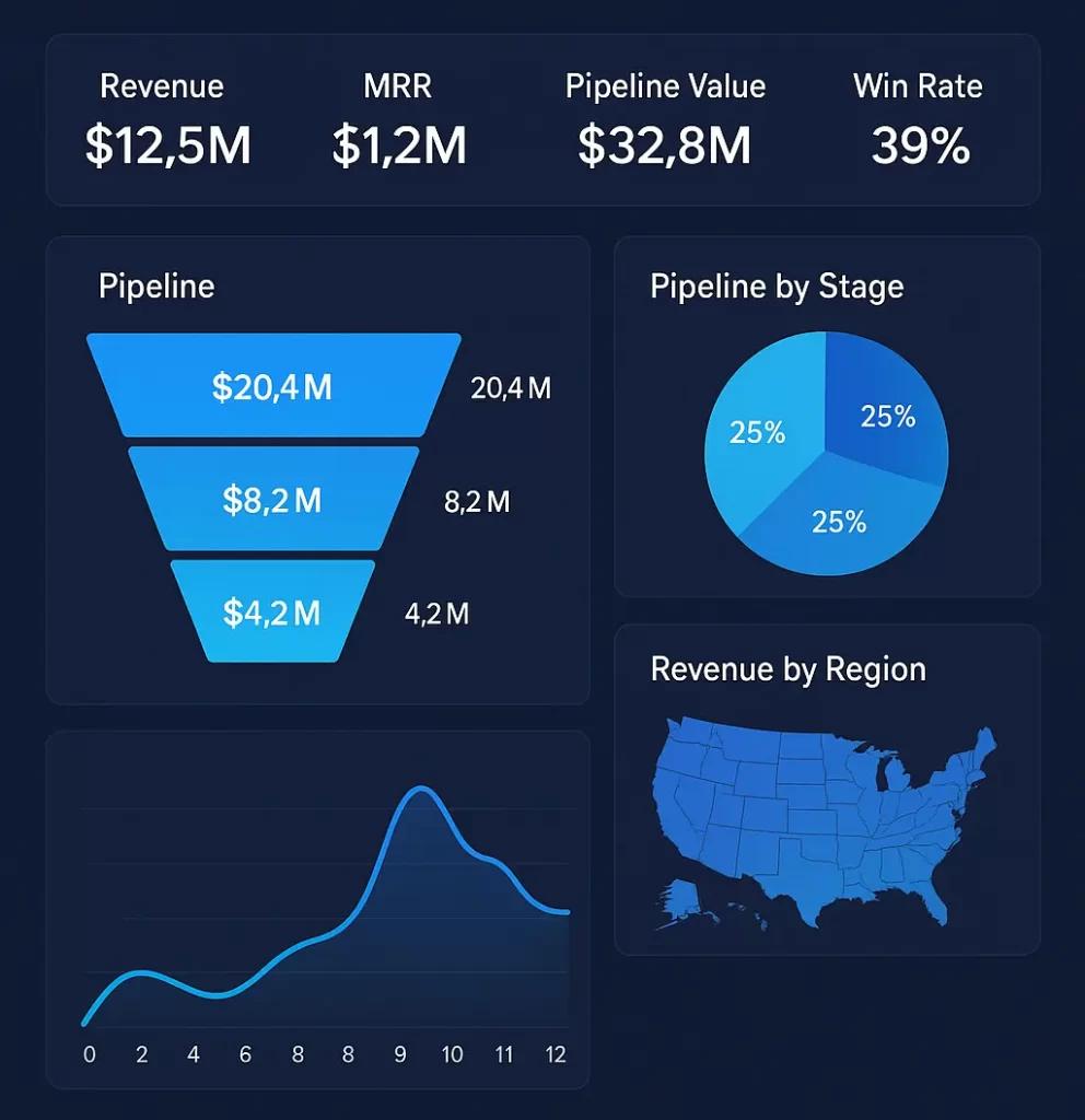
4. Choose the Right Visualization Types
| Purpose | Recommended Visual | Example |
|---|---|---|
| Trend over time | Line chart, area chart | Revenue growth by month |
| Comparison | Bar/column chart | Sales by region |
| Composition | Donut/pie chart | Product mix contribution |
| Correlation | Scatter plot | Marketing spend vs. ROI |
| Target tracking | Bullet chart | EBITDA vs. goal |
Keep visuals simple and consistent — no 3D charts or unnecessary gradients.
5. Prioritize Data Quality and Refresh Frequency
Nothing kills dashboard adoption faster than wrong or stale data.
Automate data refresh using tools like Power BI, Tableau, or Looker Studio.
Integrate with your CRM, ERP, and marketing data sources.
Highlight data freshness visibly (“Last updated: 2 hours ago”).
🧭 Related read: How to Build Marketing Dashboards that Drive Growth
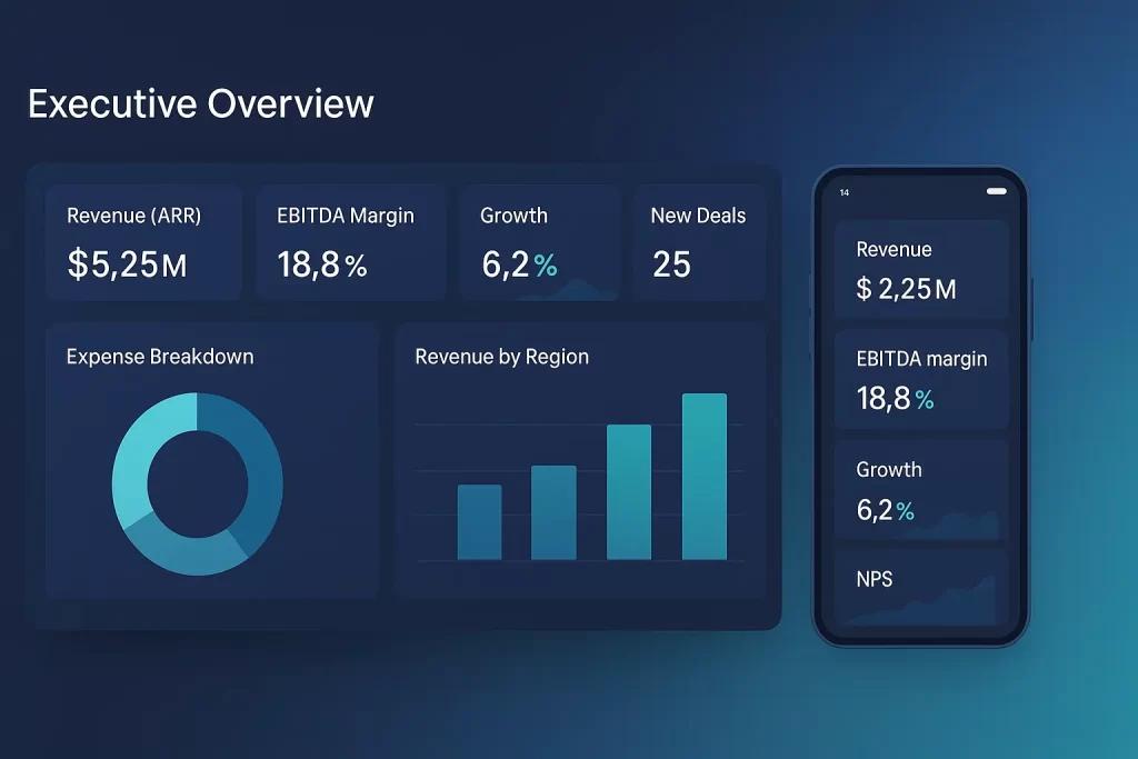
6. Make It Mobile and Executive-Friendly
Executives often review dashboards on tablets or phones.
Use responsive layouts.
Prioritize vertical scrolling, not horizontal panning.
Use mobile filters for self-service views.
Modern BI tools like Power BI mobile, Tableau Mobile, and Google Looker Studio support optimized mobile layouts.
Prefer to browse dashboard by a BI tool?
Looker Studio Gallery ↗ ◍ Zoho Gallery ↗ ◍ Power BI Gallery ↗ ◍ Tableau Gallery ↗
7. Context is King — Add Explanations
Executives don’t just want numbers — they want narratives.
Add small contextual layers:
Annotations → e.g., “Revenue dip in Q2 due to supply chain disruption.”
Variance explanations → highlight YoY or MoM changes.
Trend indicators → arrows, spark lines, or summary texts.
8. Enable Drill-Down but Keep It Optional
Executives want summary first, details on demand.
Provide drill-down paths into regions, product lines, or teams.
Avoid overwhelming them upfront.
Keep loading times fast.
This approach improves usability and confidence in the data model.
9. Design for Behavior Change, Not Just Insight
A great dashboard inspires action.
Use visual cues to trigger behavior:
Highlight metrics needing attention.
Add simple CTA-like text: “Explore declining customer segment.”
Combine with automated alerts (via Slack, email, or BI notifications).
👉 Example: Automate Slack Alerts from Google Sheets in n8n
10. Test, Iterate, and Gather Feedback
Launch dashboards as minimum viable products (MVDs).
Conduct usability sessions with 2–3 executives.
Ask: “What’s the first thing you notice?” and “What’s missing?”
Iterate monthly — dashboards should evolve with strategy.
🧠 Remember: A dashboard is a living product, not a one-time report.
📊 Case Study: Executive Dashboard Transformation
A mid-sized SaaS company in the UK restructured its executive dashboard using these principles:
Before:
25+ metrics crammed into a single Tableau view
No link to strategic goals
Rarely accessed by leadership
After (Post Redesign):
Focused on 7 core KPIs (ARR, churn, NPS, CAC, LTV, GM%)
Monthly trends and variance explanations added
Interactive drill-down into regions
Result:
+47% increase in executive engagement
Decision-making cycle reduced from 3 days to 4 hours
🧠 Framework: The “C³ Dashboard Design Model”
To ensure adoption, apply the C³ Model — Clarity, Context, and Continuity.
| Pillar | Description | Example |
|---|---|---|
| Clarity | Present key metrics clearly with consistent visuals | Use line charts for trends, limit to 8 KPIs |
| Context | Add narrative layers to explain why metrics change | Include annotations and variance text |
| Continuity | Keep dashboards aligned with evolving business goals | Review and update KPIs quarterly |
💡 Tools & Tech Stack Recommendations
| Category | Tools | Notes |
|---|---|---|
| BI Visualization | Power BI, Tableau, Looker Studio | Use brand colors & consistent styles |
| Data Automation | n8n, Make.com, Zapier | Automate data sync from multiple sources |
| Data Warehousing | BigQuery, Snowflake, PostgreSQL | Centralize data for reliability |
| Collaboration | Slack, Teams, Notion | Embed dashboards for easy access |
👉 You can explore Make.com automations to integrate alerts and BI workflows seamlessly.
📈 Checklist: Executive Dashboard Best Practices
✅ Define KPIs aligned with strategy
✅ Limit to 6–8 core metrics
✅ Use consistent, simple visuals
✅ Add annotations and narratives
✅ Enable real-time updates
✅ Make it mobile responsive
✅ Gather executive feedback regularly
✅ Integrate automated alerts
Include 6–8 high-impact KPIs tied to business strategy — revenue, profit, NPS, customer retention, and efficiency metrics. Avoid operational data overload.
Ideally in real time or at least daily. For financial dashboards, weekly refreshes may suffice depending on data stability.
KPI dashboards track departmental metrics; executive dashboards summarize company-wide performance for decision-making.
Power BI, Tableau, and Looker Studio are top contenders. Power BI is preferred for enterprise integrations; Looker Studio suits smaller teams.
Involve them early in design, focus on decision-usefulness, simplify layouts, and ensure real-time, accurate data feeds.
AI can generate predictive insights, automate anomaly detection, and summarize performance using natural language (e.g., “Revenue grew 8% MoM due to regional sales spike”).