
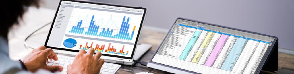
Tableau is a very powerful tool for all your data visualization information. It’s a tool to create powerful and super intuitive data vizualization reports. This is an extremely efficient system for data reporting and calculating other metrics. These metrics help the business owners or the organizations to watch all the required data trends, and do future predictions for now and the future. It’s a very efficient tool, if you can leverage its power and have knowledge to understand that data. If you can interpret that data, then it can create great business opportunities. Reading tableau reports can help you make data driven decisions.
The importance of Data
Most Businesses or organizations that rely on data don’t even have the capacities and the knowledge to even understand the basics of data, let alone taking leverage of the data and performing on data driven decisions.
So, how do you take data analytics and make a report that can help you in understanding all the data metrics and stats in a simple and concise manner.
This is where the tableau report comes in and helps any organization or business to perform their level best with data reading assistance tools.
How to read a Tableau Report
The great solution to read the data visualization and data reports is to create a Tableau report and how great Tableau consult can help you to do that?
The tableau report can help you to identify all the data insights, help in further data analysis and communication of data insights to different teams and for further processing.
If you are working on it and finding it challenging to understand that data, then there is a certain aspect that is required for data understanding and analysis.
Let’s look at how to really analyze a tableau dashboard to help to make better data driven decisions.
Understanding the purpose and the contextual aspects
Before going into the details of tableau reports and all the details of Tableau Dashboards, you should ask some basic questions that will be much more assistive to further the clarity of Tableau understanding.
- What is that specific goal or the relevant question here that the report is trying to solve?
- What is the exact target audience of this report?
- Under data analysis, what exactly are the data limitations and data analysis metrics?
Solving these questions can provide a clear view, and the direction, and provide proper expectations that you will get from a Tableau Report.
Recognizing the main aspects of the tableau report
A tableau report consists of multiple aspects like Dashboards, stories or worksheets. A worksheet can be defined as a single data structure in it, where there is an option of creating multiple tables, charts or maps and other visualizational aspects.
Further, if we talk about a dashboard, it consists of a combination of multiple worksheets, that may be arranged on a single page and further you can do interactions with this data in multiple forms.
A Story can be defined as a combination of many dashboards in sequential form to provide a common narrative or theme, that helps in deriving the proper data analyses to the targeted audience.
Reading the Tableau Report
When you further analyse the Tableau report, you need to recognize these key factors that can help in dashboards, story and worksheets. Here are these key points to help in proper understanding of Tableau reports .
- The main title and further the subtitle, that is the basis of understanding about what exactly the Tableau report is trying to convey.
- The parameters and filters that can really drive the direction and perspective of data analysis.
- The tooltips and legends that can further help in understanding the context of sizes, shapes, labels and colors of all the visual elements.
- The scales and axes that further define the data values through data range and data distributions.
- The attributes that define the marks and further the mark types.
- The relationship between data variables and their comparison defined by chart layouts and chart types.
- What exactly are the findings using different annotations and captions.
Interpreting the data visualization aspects
After the basic identification of Tableau Report, you can further start interpreting the data and the visualization to help with more meaningful insights. You can start looking for trends, correlations, patterns and outliers in the data and further look at the causations. You can further do predictions about that data and how the data can be of use.
- Defining the proper trends related to the data.
- What are the main data influencing factors?
- What are the outliers in that data and what is creating those exceptions?
- Can the different dimensions and causations be relatable and if they are negatively and positively affecting it?
- What is the final summary and proper takeaways of the reports?
Report Interaction Process
The major advantage of any Tableau Report that is created by Tableau developers is the user intuitiveness and being dynamic in nature. Here is a list of main ways to do proper interaction with tableau:
- Changing the perspectives or data subsets using the set parameters or filters.
- Using navigational aspects like URL, trigger actions, selection, menu and hover and change the views.
- Using proper tooltips to identify the specific mark of data or data points etc.
- To select a view and further can do zoom or panning for further details .
- Using different functions and sorting the data using appropriate dimensions or measures.
- Using commands like share or export to further save that snapshot or link of that particular view.
These are the report interaction processes that can further help in tackling the full advantage of Data driven analytics in a Tableau report.
Different Types of tableau Dashboards
There are different types of Tableau solutions that can help different sectors. Some of the Tableau Dashboards for different industries that are provided by us at Let’s Viz are:
- Finance Dashboards
- SEO Dashboards
- Logistics Dashboards
- Sales Dashboards
- Marketing Dashboards
- Management Dashboards
1. Finance dashboard
Track your Financial data in one dashboard in real time with great accuracy and take better financial decisions for the organization with Finance Dashboard. From tracking financial performance to identifying trends and future prediction, get the power to every financial knowhow from Let’s Viz today.
2. Sales Dashboard
Get all the sales data under one dashboard that will transform all your sales metrics into proper data to measure every sales metric like KPIs and monthly, years or quarterly results. A great Sales dashboard will help you identify your sales goals from Let’s Viz.
At Let’s Viz we are one of the best tableau professional services and help our customers make better data driven decisions in different sectors in industries.
Conclusion
Tableau reports are very promising and powerful tools to help any organization make better data driven decisions. With the acquired knowledge from this blog, you have the full understanding on how to read tableau reports. At let’s Viz we provide a Tableau solution through Tableau Consultants that can help you take leverage of your data. Contact us today for your Tableau Solutions.